In this QuickStart, we will build a card-based product catalog in Sigma using Repeater and Single Row containers.
We'll design one card template, let Sigma render it across every row in the source table, and wire a click action that opens a focused detail modal for any product.
The same pattern works for any browseable record set — products, employees, locations, projects.
Along the way you'll learn how to:
- Apply source-level data prep — column formatting, calculated columns, and filters — so every downstream element inherits a clean view
- Build a
Repeated containerthat renders one card per row from a single template - Use the
Formulainput type to combine fields and transform values inline - Add interactive filter and sort controls so users can shape the gallery
- Build a
Single Row containerinside aModalto deliver focused product detail - Wire card clicks to the detail view using Sigma's
Set single row containeraction
Throughout this QuickStart, we'll follow a familiar app pattern:
- Master view (Repeater Container): a scrollable gallery of cards, one per product
- Detail view (Single Row Container): a focused layout for a single product, opened from a card
This is the same pattern users see in real estate apps, product catalogs, project boards, and CRM record pages. The same building blocks scale from ten records to thousands.
While that sounds like a lot, you'll likely spend more time thinking about the design; Sigma makes the rest simple.
For more information on Sigma's product release strategy, see Sigma product releases
If something doesn't work as expected, here's how to contact Sigma support
Target Audience
The typical audience for this QuickStart includes users of Excel, common Business Intelligence or Reporting tools, and semi-technical users who want to try out or learn Sigma.
Prerequisites
- Any modern browser is acceptable.
- Access to your Sigma environment.
- Some familiarity with Sigma is assumed. Not all steps will be shown, as the basics are assumed to be understood.

We'll build a visual product catalog using Sigma's sample COLD_PROVISIONS database. The PRODUCTS table is a strong fit — it has image URLs, descriptive attributes, pricing, and brand colors that let us design rich card layouts without any external image hosting or data prep.
Create a new workbook:
- From the Sigma home page, click
Create new>Workbook - Add a new
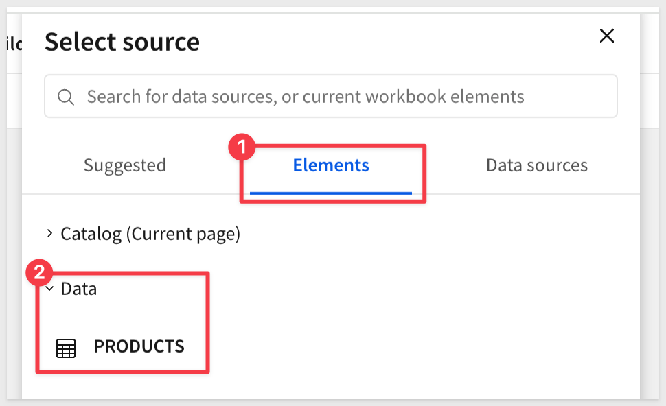
Tableelement from the element bar,Datagroup. - In the data source picker, browse to your sample data connection and select
COLD_PROVISIONS>PRODUCTS
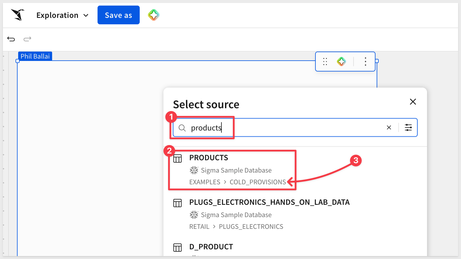
The PRODUCTS table contains everything needed to power both the gallery and the detail view:
MAIN_IMAGE_URLandALTERNATE_IMAGE_URL: image references Sigma will render directly on each cardPRIMARY_COLOR_HEX: a brand color used for accents and conditional stylingTAGS,ALLERGENS,CATEGORY,PRODUCT_LINE: attributes that drive filters and sortingCOST_PER_UNIT_USD: numeric value for the card's price labelIS_FROZEN: boolean used later for a conditional badgeDISCONTINUED_DATE: lets us hide retired products from the gallery by default
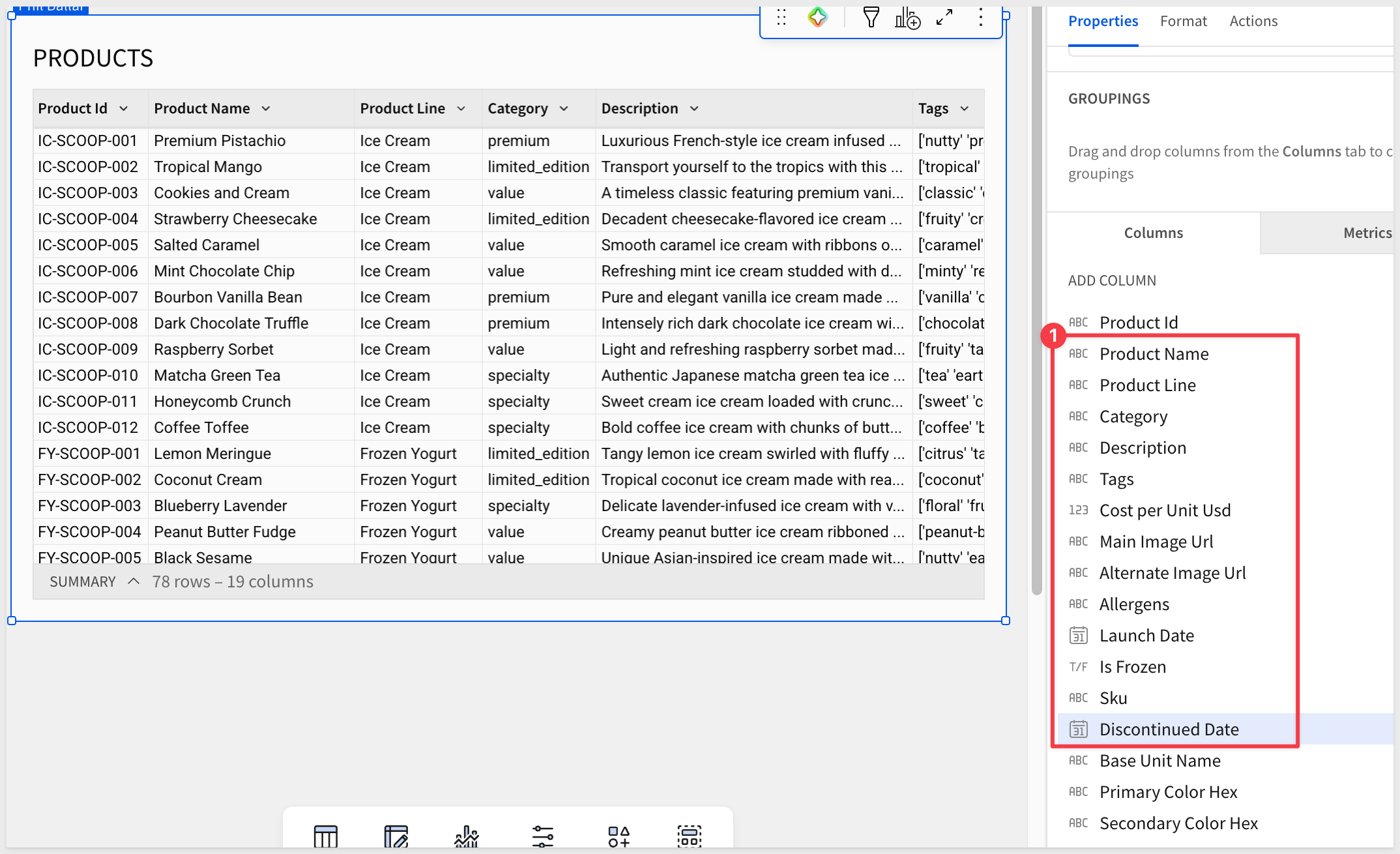
Format the cost column:
The raw COST_PER_UNIT_USD values carry many decimal places (e.g., 1.322736457), which won't read well on a card. Clean it at the source so it's right everywhere downstream:
- Click the
COST_PER_UNIT_USDcolumn header and open the column menu - Choose
Formatand select$:
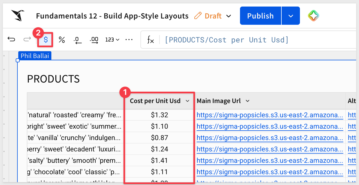
While a simple example, it is best practice to handle data prep here — get the source view right once, then build on top of it.
Before proceeding, let's save the workbook.
- Click
Save asin the workbook toolbar - Name the workbook:
copy-code
Fundamentals 12 - Build App-Style Layouts
Select a destination folder of your choice.
- Click
Saveto commit
Before building the gallery, separate the data from the UI by splitting them across two pages. This keeps the raw PRODUCTS table available for reference while giving the app its own clean surface.
Set up your workbook pages:
- Rename the current page from
Page 1toData— this is where the sourcePRODUCTStable lives - Add a new page and name it
Catalog— the gallery and detail view will be built here - Right-click on the
Datapage tab and selectHide page. This prevents users without permission from seeing this page.
Add the Repeated container:
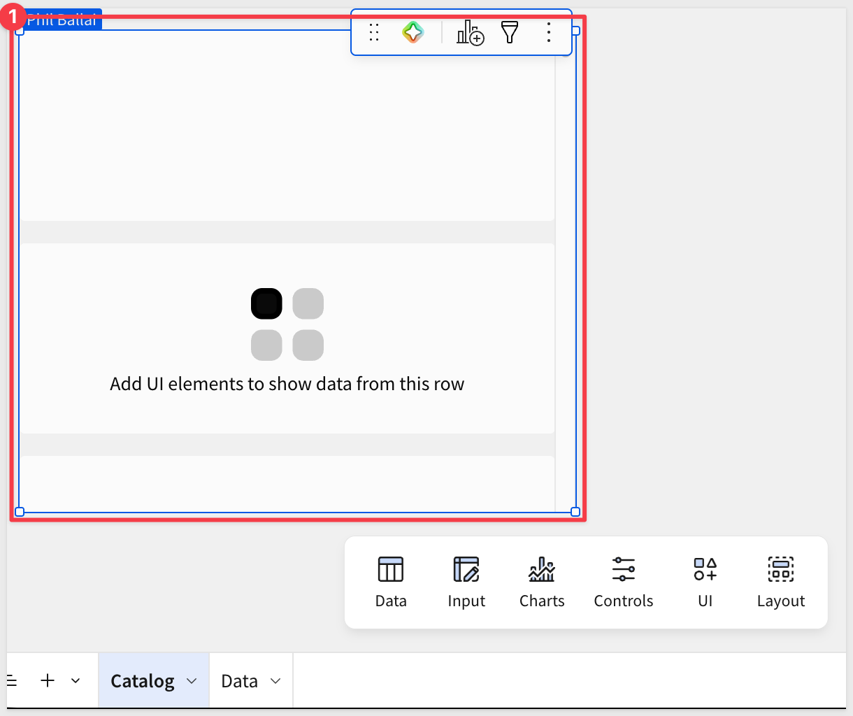
The Repeated container takes the PRODUCTS table and renders one card per row using a single template you design. Whatever you place inside the template cell — images, text, formatted values — Sigma scales across the full dataset.
- On the
Catalogpage, add aRepeated containerfrom theElement bar>Layoutgroup:
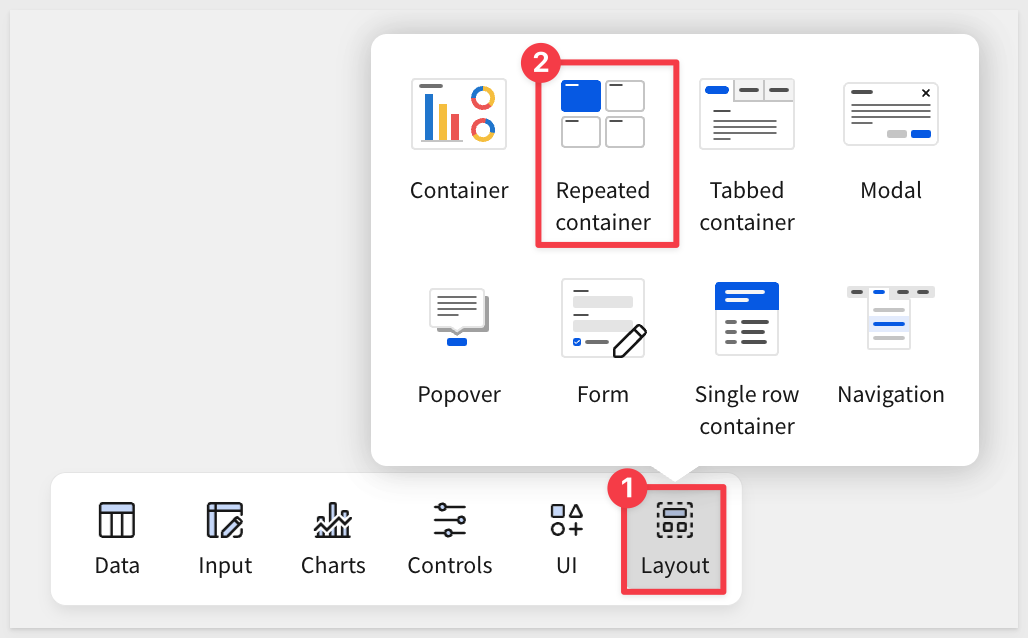
- Choose
PRODUCTSfrom theDatapage as the data source for the container:
The container will appear on the page as a blank template cell with a placeholder:
Design the card template:
Now we can use the card, placing elements inside the template cell. Each element you add becomes part of the per-row design Sigma clones across the dataset.
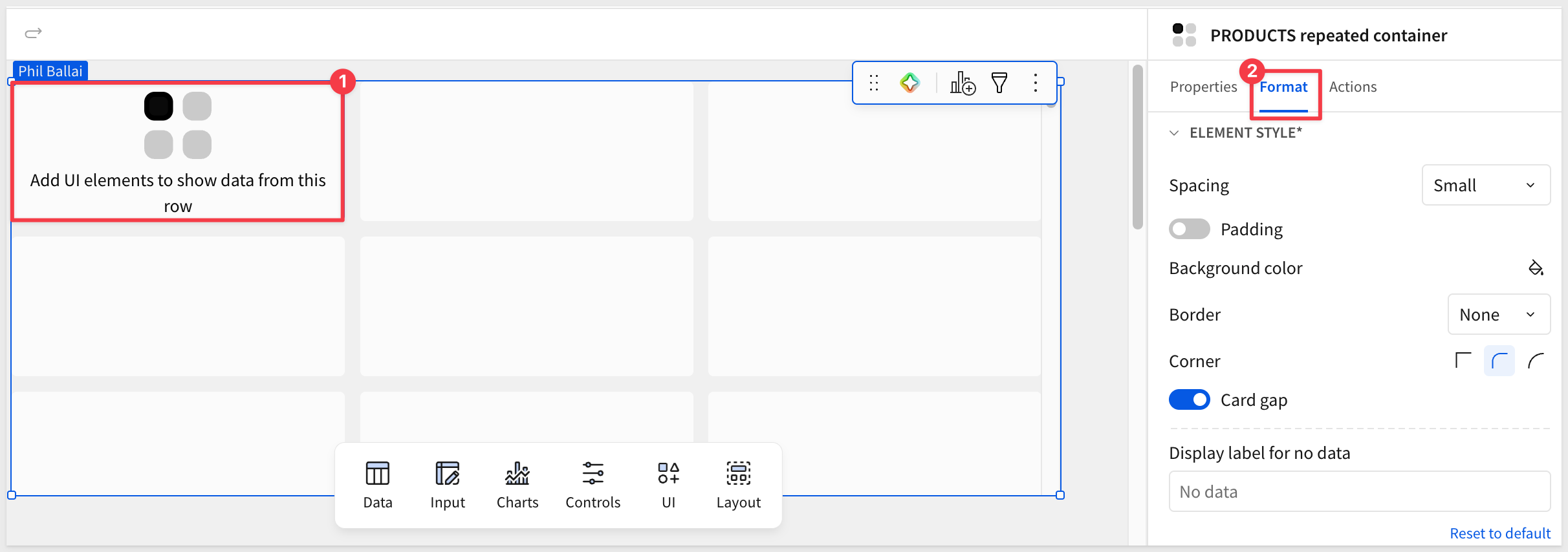
- Experiment with the
Formatoptions to suit your preference:
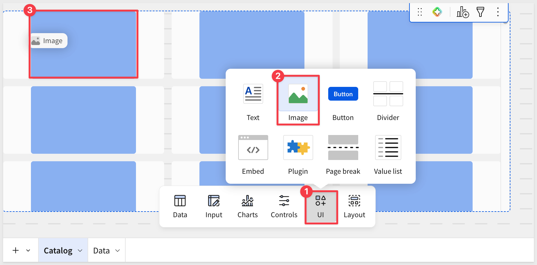
- Add an
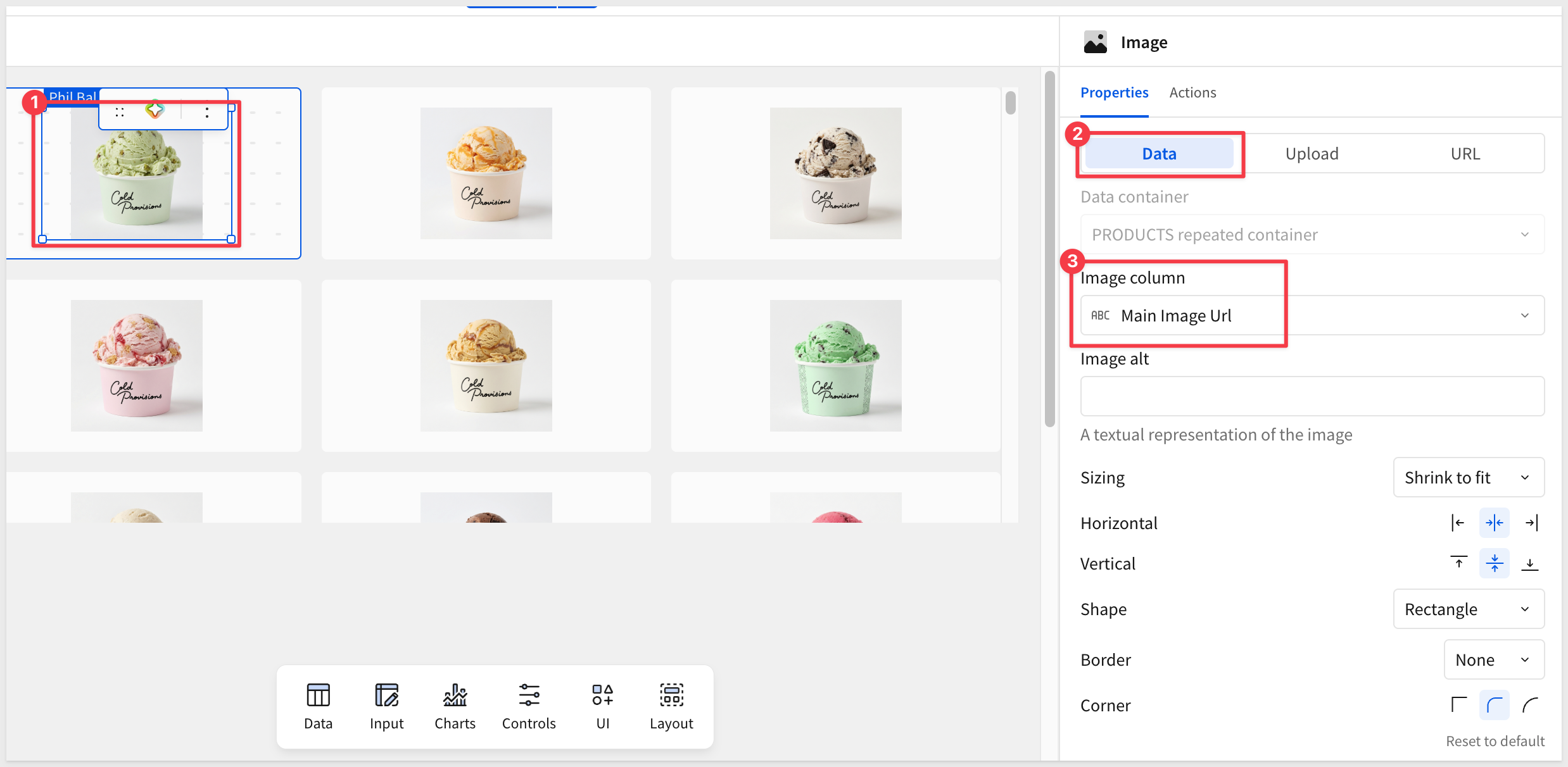
Imageelement from theUIgroup, centering it nicely in a cell. Don't fret over the design yet, it's best to place all the elements first and tweak the design last:
- Reference
MAIN_IMAGE_URLas the source; size it to occupy the upper portion of the card:
- Add a
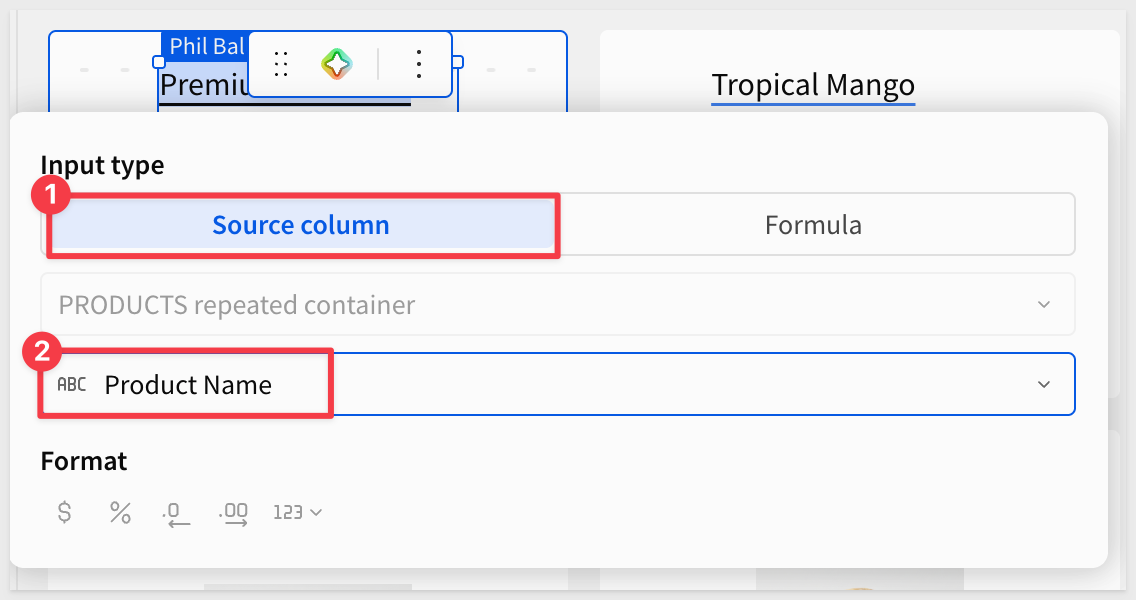
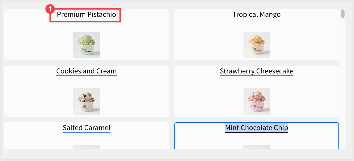
Textelement from theUIgroup and bind it toPRODUCT_NAMEfor the primary card label (press the=key to access the configuration panel):
- Add a second
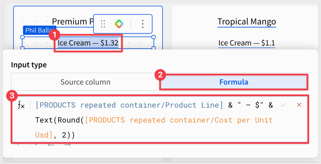
Textelement from theUIgroup, then switch theInput typetoFormula. Sigma references columns inside a Repeated container by their full path —[Container name/Column display name]:
[PRODUCTS repeated container/Product Line] & " — $" & Text(Round([PRODUCTS repeated container/Cost per Unit Usd], 2))
This combines the product line and the price into a single subtitle (for example, Ice Cream — $1.32).
Preview the gallery:
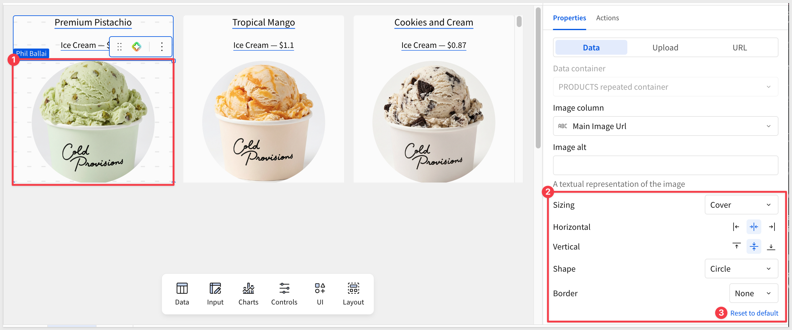
Sigma now renders one card per product across the full table. Now is a good time to play with the various configuration options for both the Repeater element and the image element embedded inside it.
Of course, there is a link to Reset to default if things get too far afield.
For example:
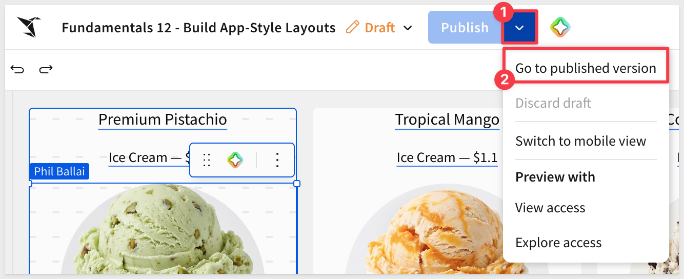
Publish the workbook and Go to published version:
Scroll the container to confirm every row in PRODUCTS is reflected as its own card — no manual duplication, no row-by-row work:
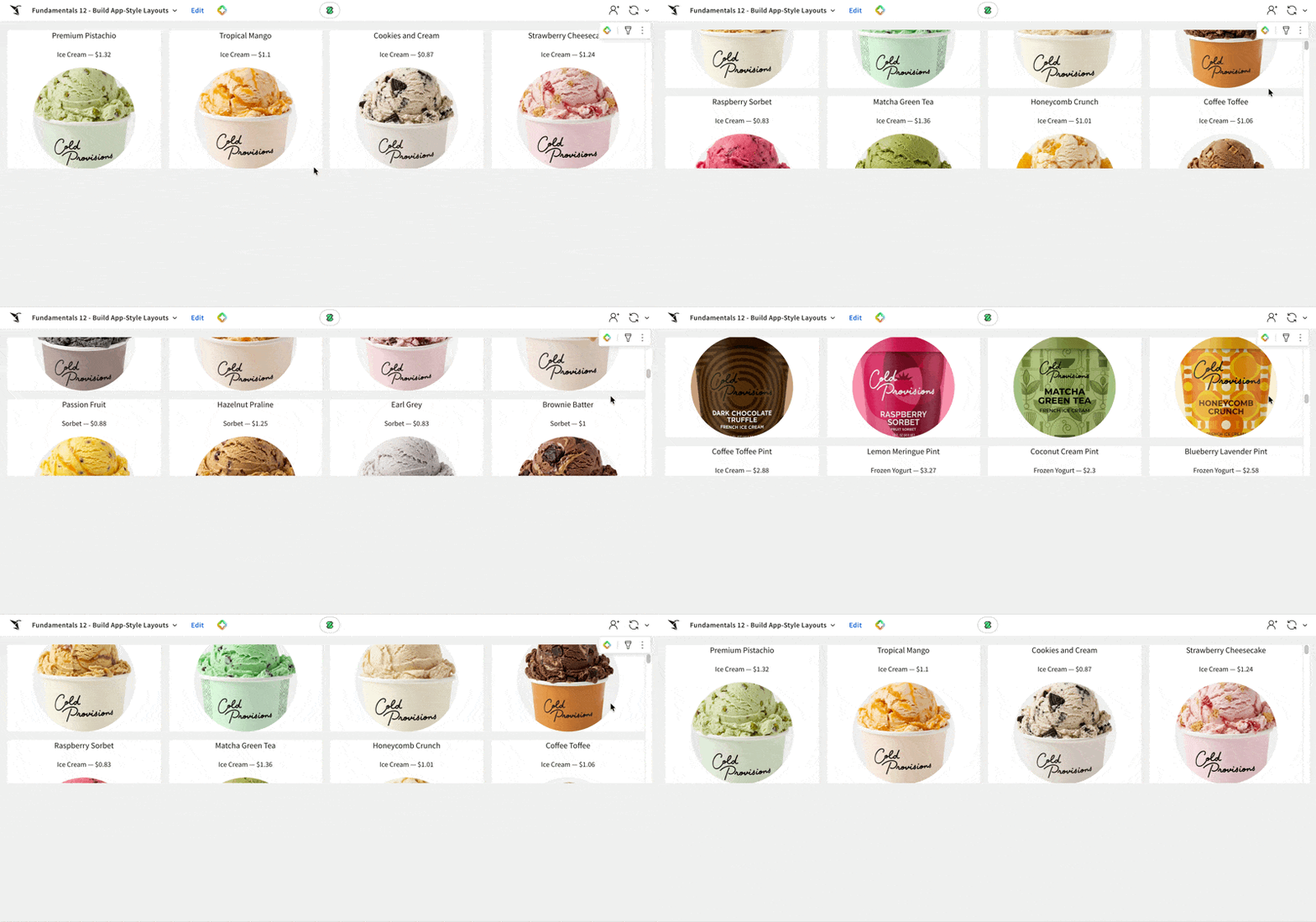
A closer look at the gallery and data table reveals a small problem: discontinued products are mixed in with active ones. These are the ones with valid dates in the Discontinued Date column.
We missed this in the data prep — no big deal, since Sigma lets us fix it at the source and have every downstream element pick up the change automatically. Once that's sorted, we'll add a category control and a default sort so users can shape the view.
Add an "Is Active" indicator column at the source:
Rather than filter directly on the date, create a named calculated column that resolves to true or false. A self-documenting boolean makes the intent obvious to anyone opening the workbook later — and the same column can power any future view that needs to scope to active products.
- Switch to the
Datapage and select thePRODUCTStable - Add a new column to the right of the existing columns and name it
Is Active - Enter the following as the column formula:
IsNull([Discontinued Date])
The column resolves to true for active products and false for discontinued ones.
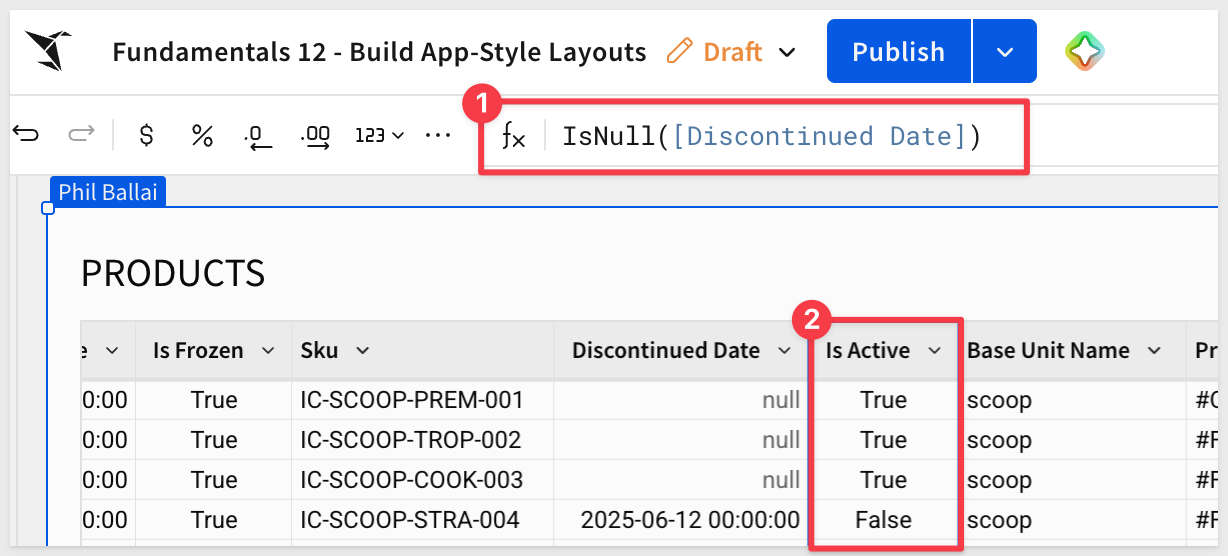
Filter the source table on the new column:
- Add a filter on
Is Activeand configure it to keep rows where the value istrue:
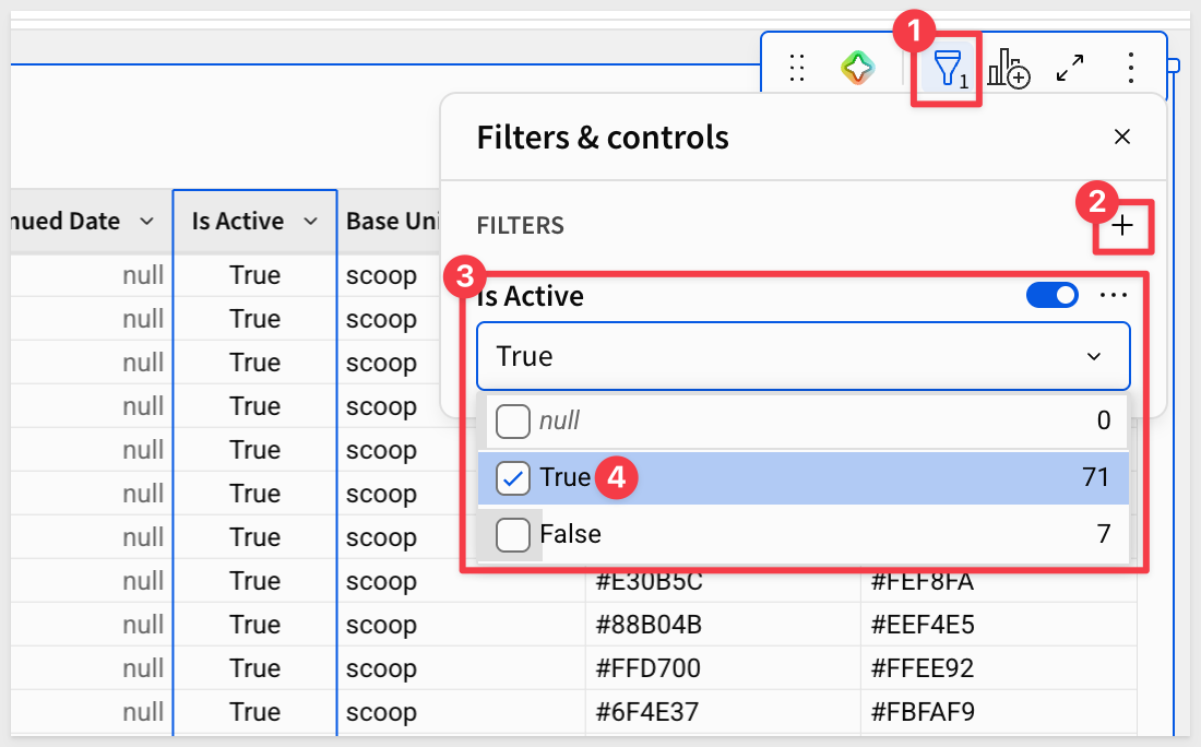
Return to the Catalog page — the gallery has refreshed to hide retired products. No changes needed to the Repeated container itself as the data is filtered at the source.
Add a category control:
Let users narrow the gallery to a category — this is the kind of interactivity that turns a static layout into a usable app.
- From the
Element bar, add aControls>List valueelement above the gallery - Set the data source to
PRODUCTSand the column toCategory - In the control's
Targetssection, target thePRODUCTS repeated containerandCategorycolumn, so the selection drives the filter:
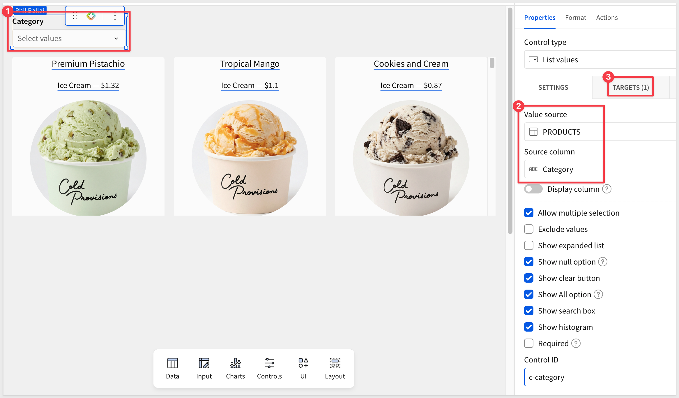
Test it by selecting a category and watching the gallery refresh to only the matching cards.
The Repeated container gave us a browsable gallery. Now we'll add a detail view — a Single Row container that focuses on one product at a time, opened from a card. The detail lives inside a Modal so the gallery stays in context behind it.
Add a modal:
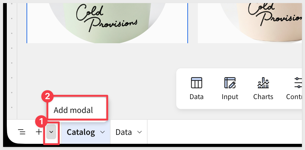
- Add a
Modalto use as the single row container page:
- Name the modal's page tab
Product Detail - Modals stay hidden until triggered; users never see this page tab.
Add a Single Row container inside the modal:
- On the
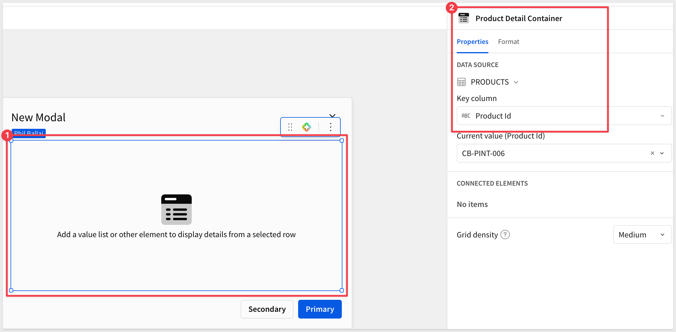
Product Detailmodal page, add aSingle Row containerfrom theLayoutgroup inside the modal - Set the data source to
PRODUCTSon theDatapage - Choose
Product Idas the unique identifier - Rename the container
Product Detail Containerin the upper right corner — the click action wired up later will target this container by name:
Design the detail layout:
A typical detail layout uses two columns — a larger image on the left, an attribute stack on the right. This is just a suggestion; there are no strict rules, so be creative.
- Select the
New Modaltext, delete the text and press the=key to access the formula editor. Use this formula, which resolves to the selected product's name:copy-code
Upper([Product Detail Container/Product Name])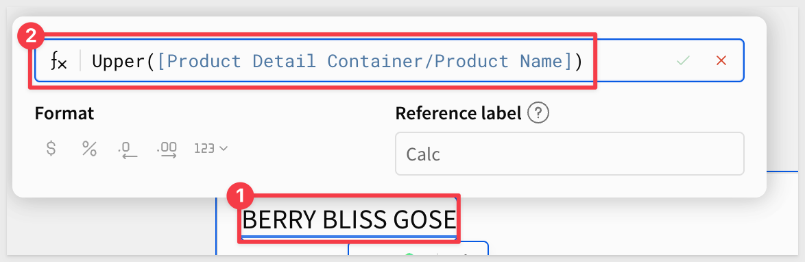 - Left side: an
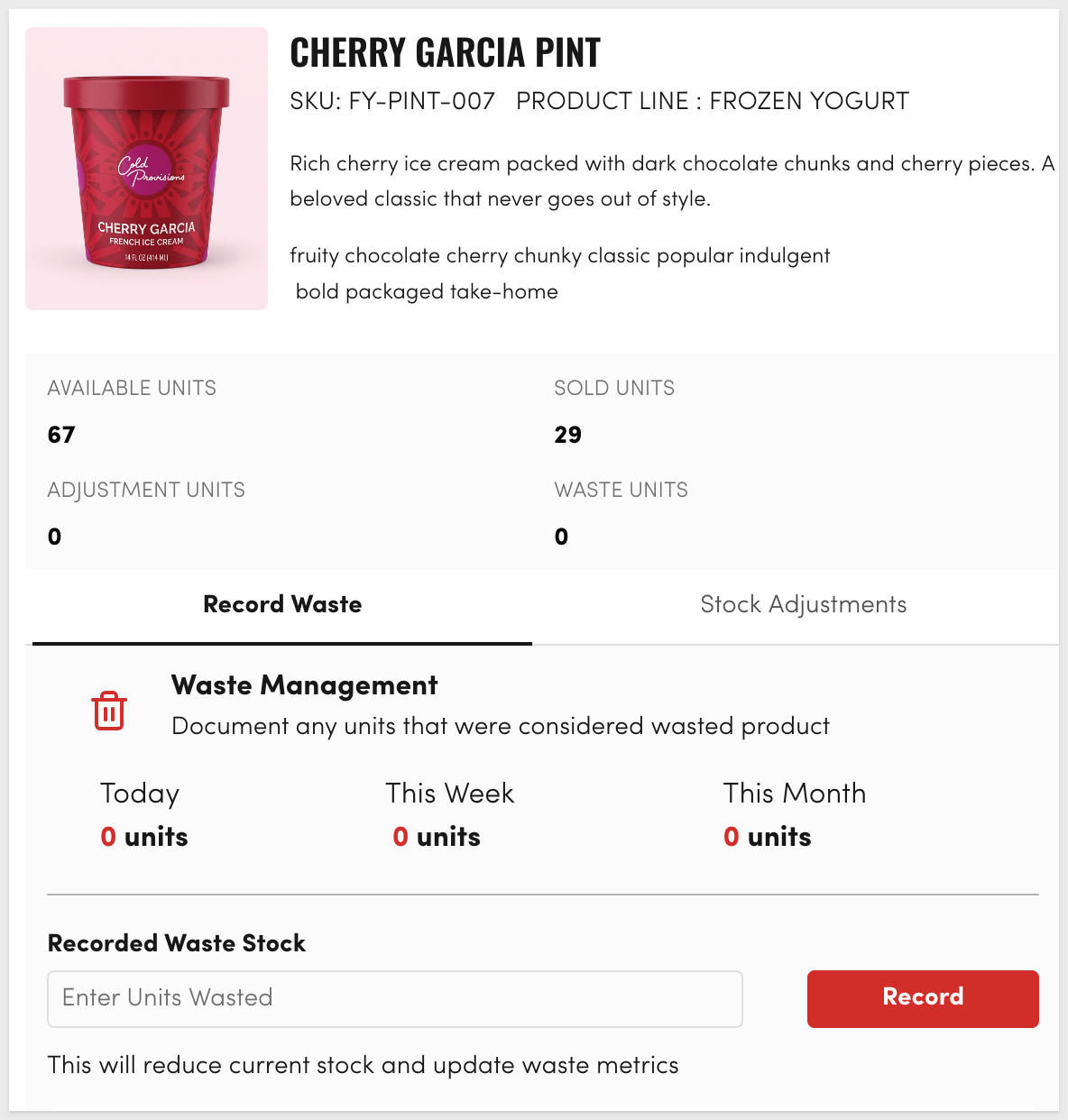
 Imageelement bound toMAIN_IMAGE_URLas shown earlier - Right side, stacked from top to bottom: - ATextelement bound toCATEGORY, styled as a heading - ATextelement bound toCost per Unit Usd: - ATextelement bound toDESCRIPTION- ATextelement bound toALLERGENS: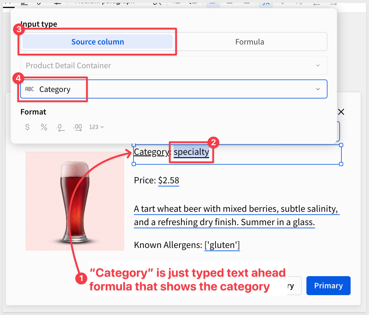 Make the layout your own; there are no wrong answers, just make it as easy and obvious for the users as possible. Here is a different example that is more built-out, using a few more data elements, design and actions:
  Wire the card click to set the row and open the modal: Sigma has a purpose-built action —
 Set single row container— that hands the clicked row off to the detail view. No source-table filters, no duplicate datasets, no state cleanup. The click runs a short sequence: first set the row, then open the modal. - Return to theCatalogpage and select the Repeated container's template cell, taking care to select the whole individual cell or an element inside a cell - In theElement panel, chooseActions- Configure the defaultAction Sequencewith two actions, in order: - Action 1:Set single row container— selectProduct Detail Containerand set value from theProduct Idcolumn: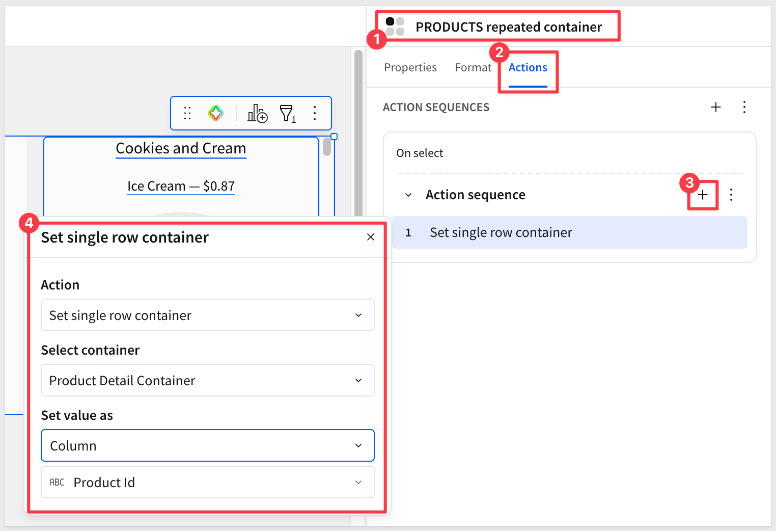 - Action 2:
 Open modal— selectProduct Detail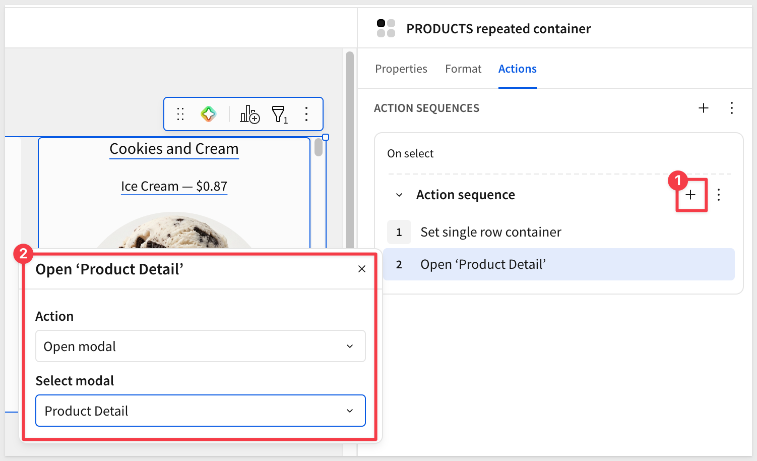
Publishthe workbook andGo to published version. Click any card in the gallery — the modal opens and the Single Row container displays that product's row. Closing the modal needs no extra action; the next click simply overwrites the selected row: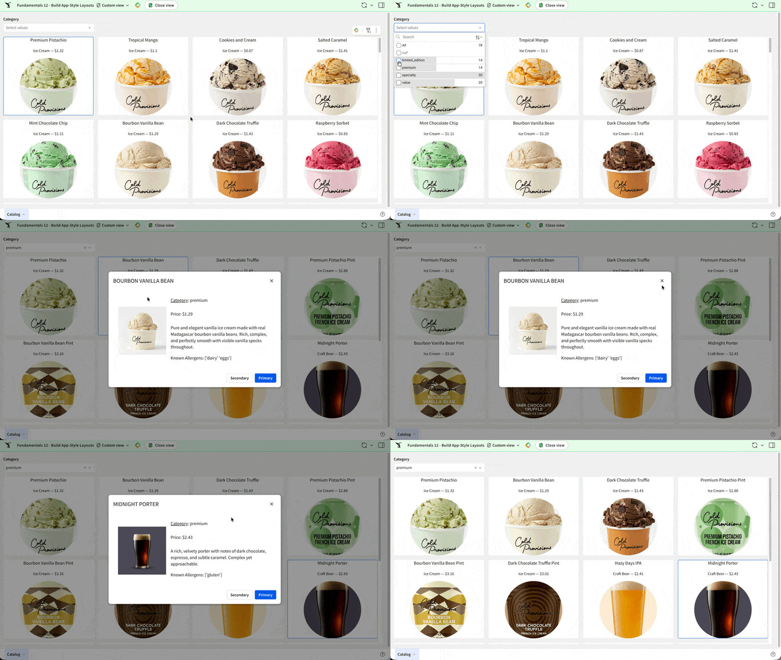 ## What we've covered Duration: 5 In this QuickStart, you turned a structured product table into an app-like catalog — a scrollable gallery of cards, each clickable to reveal a focused detail view. The card geometry was designed once and scaled automatically across every row in the source, and the same source table drives both the gallery and the detail through Sigma's reactive data flow. The patterns are broadly reusable across any domain with a meaningful "thing" — products, employees, locations, projects, customers: - The
 Repeated containerturns a well-structured table into a card gallery with one template and zero per-row work, and reflows automatically across screen widths - TheSingle Row containerpaired with aModaldelivers focused detail without leaving the workbook or duplicating data - TheSet single row containeraction is Sigma's purpose-built handoff between master and detail — no source-table filters, no state cleanup - Source-level data prep (column formatting, calculated columns, filters on the source table) keeps the rules in one place so every downstream element inherits a clean view - TheFormulainput type turns text elements into programmable surfaces, combining fields and transforming values inline The bigger takeaway is what wasn't required: - No front-end code. - No separate detail dataset. - No state management to remember which row is selected. Sigma's containers, actions, and reactive data flow handle the wiring, so the time goes into the product experience instead of the plumbing — which is what moves teams from operational reporting to operational apps. Additional Resource LinksBlog
Community
Help Center
QuickStarts
Be sure to check out all the latest developments at Sigma's First Friday Feature page!