One of the many challenges developers face when building applications is usability, and a common problem is making it obvious that a user needs to scroll to see more data.
This problem can be compounded when embedding content from any external application; even Sigma embeds.
Scroll bars on both parent and iframe content can significantly impact the user experience, often in a negative way. Here's why:
- Confusion and difficulty navigating: When both the parent page and the iframe have scroll bars, it can be confusing for the user to navigate. They may not immediately recognize which scroll bar is active, leading to a disjointed and potentially frustrating experience.
- Nested scrolling: If the iframe content is longer than the parent page's height, users might have to deal with nested scrolling. This means they have to scroll down within the iframe before being able to continue scrolling on the parent page. This is generally considered poor user experience design and can be very frustrating.
- Aesthetically unpleasing: Multiple scroll bars can make the page look cluttered and messy, which can detract from the overall aesthetic of the website.
- Limited view of content: If an iframe has a scroll bar, it means that all the content isn't immediately visible to the user. This might cause users to miss important information if they don't realize they need to scroll within the iframe.
- Mobile unfriendly: On mobile devices, where screen real estate is limited, scroll bars within iframes can be particularly problematic. Users may accidentally scroll within the iframe when they intended to scroll on the parent page, or vice versa.
To avoid these issues, it's generally best to avoid having scroll bars on both the parent and the iframed content. This can usually be solved by making by making both the iframe and parent page responsive, so that the iframe adjusts its size based on the content it contains and the size of the viewport.
In essence, making an iframe dynamic or responsive is about ensuring that the content within the iframe is accessible, user-friendly, and looks good on all devices and window sizes. It's about creating a better, more consistent user experience.
Since Sigma uses iframes for embedding, this issue is fairly easy to avoid.
In this QuickStart, we will use the local host application we created in Embedding 01: Getting Started
For more information on Sigma's product release strategy, see Sigma product releases
If something is not working as you expect, here's how to contact Sigma support
Target Audience
Semi-technical users who will be aiding in the planning or implementation of Sigma with embedding. No SQL or technical data skills are needed to complete this QuickStart. It does assume some common computer skills like installing software, using Terminal, navigating folders and copy/paste operations.
Prerequisites
- A computer with a current browser. It does not matter which browser you want to use.
- Access to your Sigma environment.
- Embedding 01: Getting Started is required to complete this QuickStart.

Before we can dig into this topic, we need to configure an embed for our host application to use.
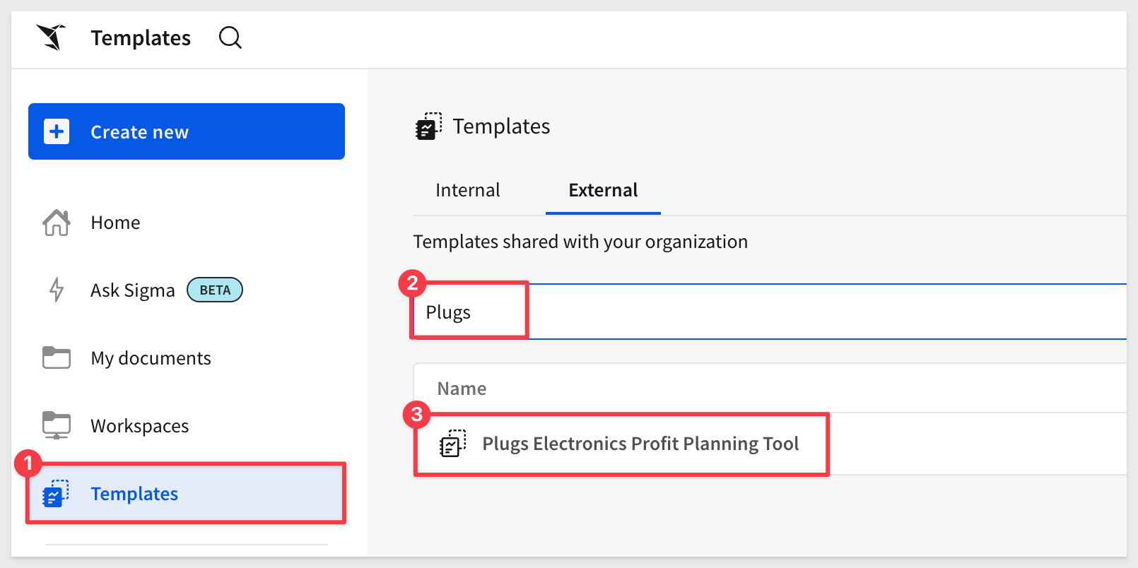
We'll use one of the prebuilt templates included in all Sigma instances.
After logging into Sigma, navigate to Templates and click the Plugs Electronics Profit Planning Tool example to open that template:
Click Save As and name the workbook Embedding 11 Responsive Embeds.
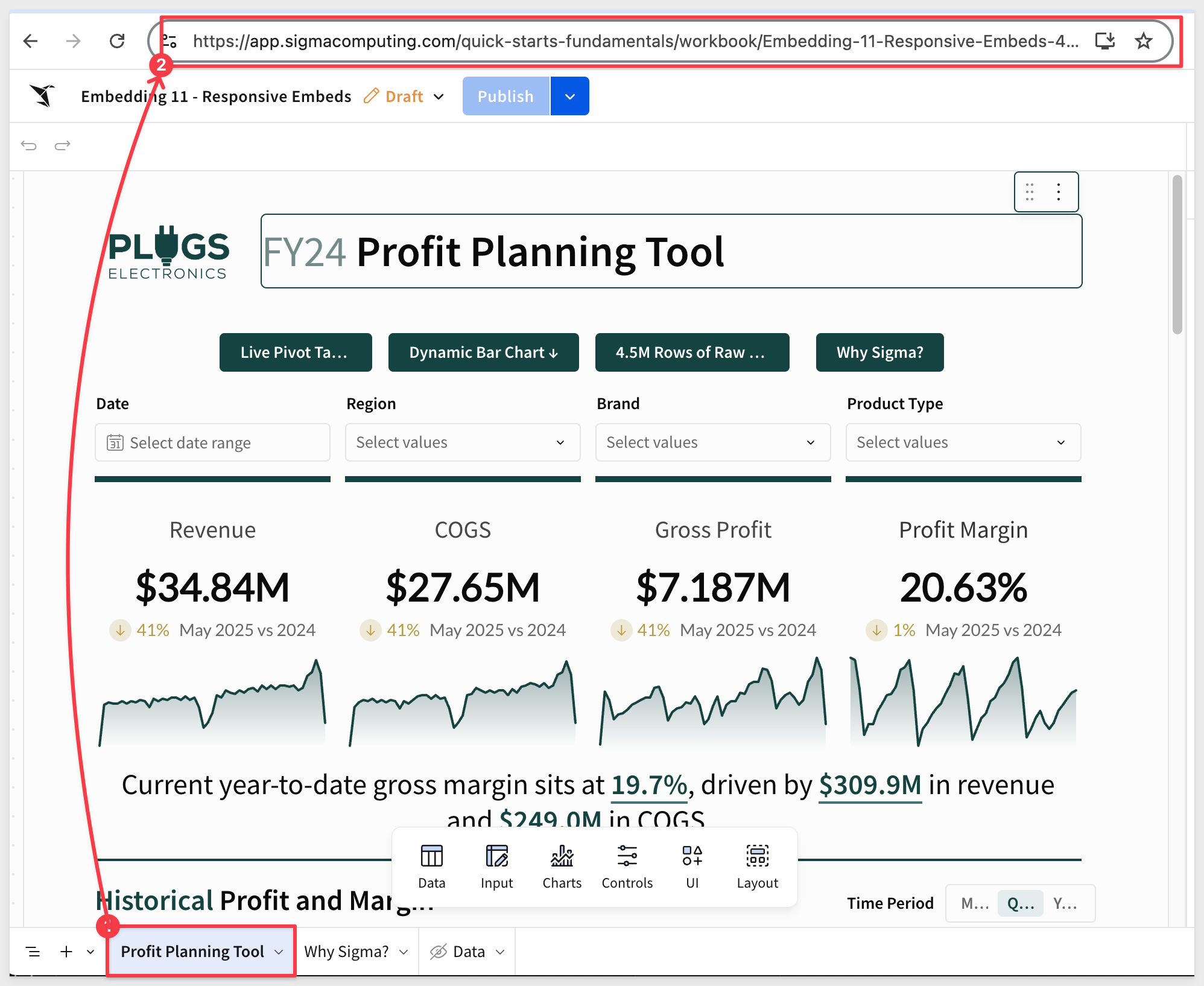
Make sure the workbook is in published mode.
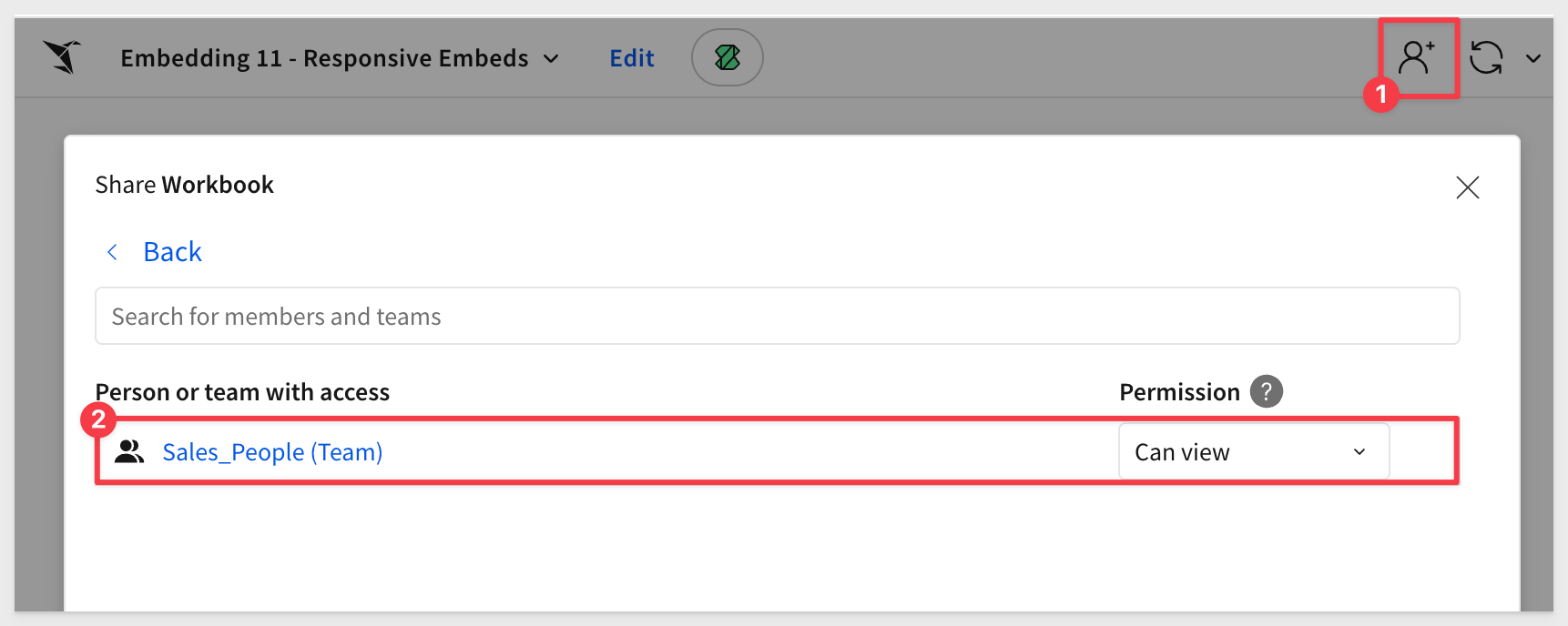
Share the workbook with the Sales_People team we created in the Getting Started QuickStart:
Click on the Profit Planning Tool page tab and copy the URL directly from the browser.
Because we selected a page tab, we'll need to adjust the URL slightly as documented in What URL to use
The correct URL syntax for a page is:
https://app.sigmacomputing.com/{organization-slug}/workbook/{workbookname}-{workbookUrlId}/page/{pageId}
The key item to replace is:
- ?:nodeId with /page/
- The pageId is the same value as shown for nodeId
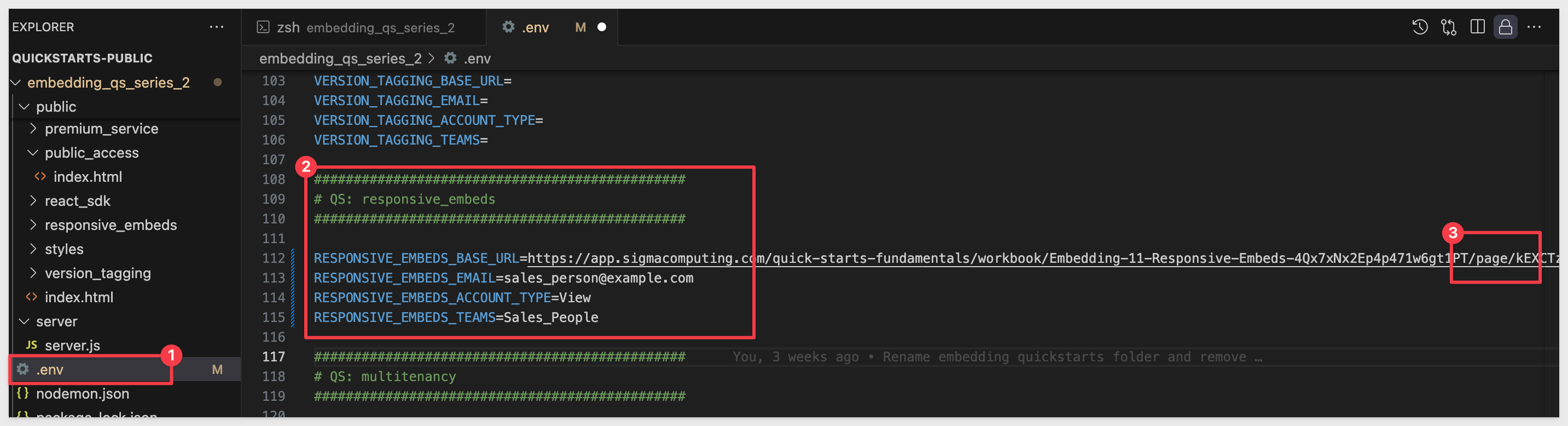
Use this adjusted URL as the value for RESPONSIVE_EMBEDS_BASE_URL in your .env file, then save your changes.
We also set the other parameters to the same values used in Getting Started and confirmed we still have values for CLIENT_ID and SECRET:
Open a new Terminal in VSCode, navigate to the embedding_qs_series_2 directory, and start the Express web server by running:
npm start
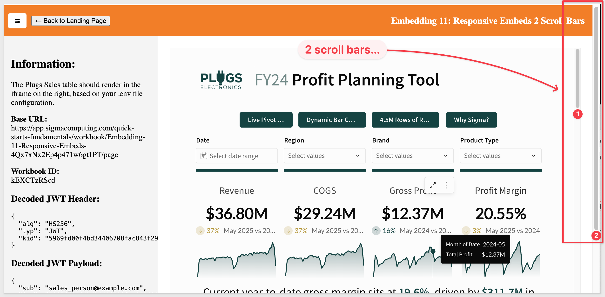
Open http://localhost:3000/responsive_embeds/2bars.html in a browser:
The page will load the embedded content along with the .env parameters that are being used.
Notice that both the browser and the iframe have scroll bars:
Since we are embedding content that is created in Sigma, it is not always possible to ensure that the Sigma content will "fit" inside a static iframes dimensions, since the content may vary depending on use-case.
Without control over the iframe's content, it's challenging to have a fully dynamic solution that adjusts to the exact height of the content every time.
Given the initial constraint, one approach might be to:
1: Set a default height for the iframe that should ideally fit most of the content you expect to embed.
2: Allow the iframe to scroll if its content exceeds this default height.
This ensures that:
1: The parent application remains without a scrollbar, providing a cleaner overall look.
2: The iframe will only show a scrollbar when absolutely necessary (i.e., when its content exceeds its set height).
This approach provides somewhat of a balance between user experience and practicality, given the constraints, but does not fully address the issue of scroll bars.
In this scenario, even when the browser is full screen, the embedded content we have elected to provide from Sigma will be too long, and thus the iframe requires a scroll bar.
The parent page, however, should still avoid having a scroll bar.
For this example, we will simply allow the iframe to scroll, but ensure the parent page does not.
Open this page in the browser:
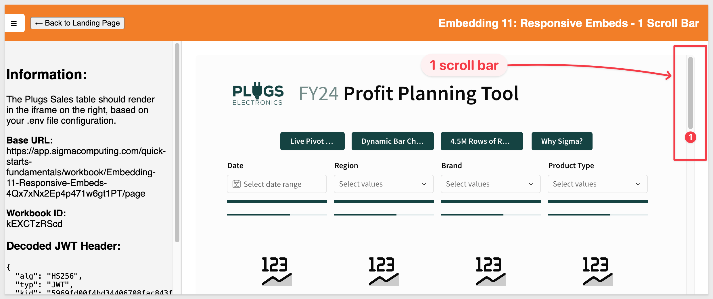
http://localhost:3000/responsive_embeds/1bar.html
Now we only have one scroll bar (in the embed) and the parent application does not present a scroll bar regardless of how we resize the browser:
The is because we replaced two css styles and adjusted the iframe too.
The CSS adjustments made are:
body {
  display: flex;                     /* Uses Flexbox for vertical layout */
  flex-direction: column;           /* Stacks children vertically (top to bottom) */
  height: 100vh;                    /* Sets the body height to 100% of the viewport */
  margin: 0;                        /* Removes default body margin (prevents scroll gap) */
  font-family: sans-serif;         /* Applies a clean, readable font */
}

iframe {
  width: 100%;                      /* Makes the iframe fill the full horizontal space */
  height: 100%;                     /* Makes the iframe fill the full height of its container */
  border: none;                    /* Removes default iframe border */
  border-radius: 6px;              /* Applies rounded corners to the iframe */
}
The iframe adjustment made is:
<iframe id="sigma-embed" src=""></iframe>
The calc() function in CSS can be used to dynamically compute values for various properties. This method is ideal when your page has a fixed-height topbar and you want the iframe to fill the rest of the viewport without causing scrollbars.
While calc() can be powerful in many scenarios, it's important to understand its limitations and its applicability to your specific case.
In our example, the calc() function can be used to compute dimensions based on various units, combinations of units, or viewport sizes.
For example, if we want the iframe to take up the full viewport height minus some space for a header, we could use calc().
Here's how we might style the iframe using calc():
iframe {
  width: 100%;
  height: calc(100vh - 4rem); /* Adjusts for fixed header height */
  border: none;
  border-radius: 6px;
}
When we use height: calc(100vh - 4rem) on the iframe, we're telling it to take up the entire remaining viewport height beneath the header. That eliminates the need for the page itself to scroll, as long as:
- The body has no extra vertical content
- The iframe content itself is sized/responsive correctly inside the Sigma workbook
To save time, we've pre-built a page that demonstrates this method.
Browse to this URL:
http://localhost:3000/responsive_embeds/1bar.html
A Few Things to Note:
In summary, while calc() is a valuable tool in CSS for dynamic calculations, it doesn't immediately solve the scrollbar issues.
It helps set dimensions based on known values based on other known dimensions or viewport sizes, but it won't "dynamically" adjust the iframe's height based on its content.
Sigma emits a JavaScript event that allows us to dynamically adjust the iframe height, based on the content's actual height.
This is especially useful when the content inside the iframe can change dynamically, leading to different height requirements.
This approach can fully resolve iframe scrollbar issues when used correctly.
The event we'll use is workbook:pageheight:onchange, which is emitted by Sigma.
We can use this event to adjust the iframe's height in real-time, ensuring that the iframe always matches the height of its content.
We pre-built a page for you to save time. Browse to this URL:
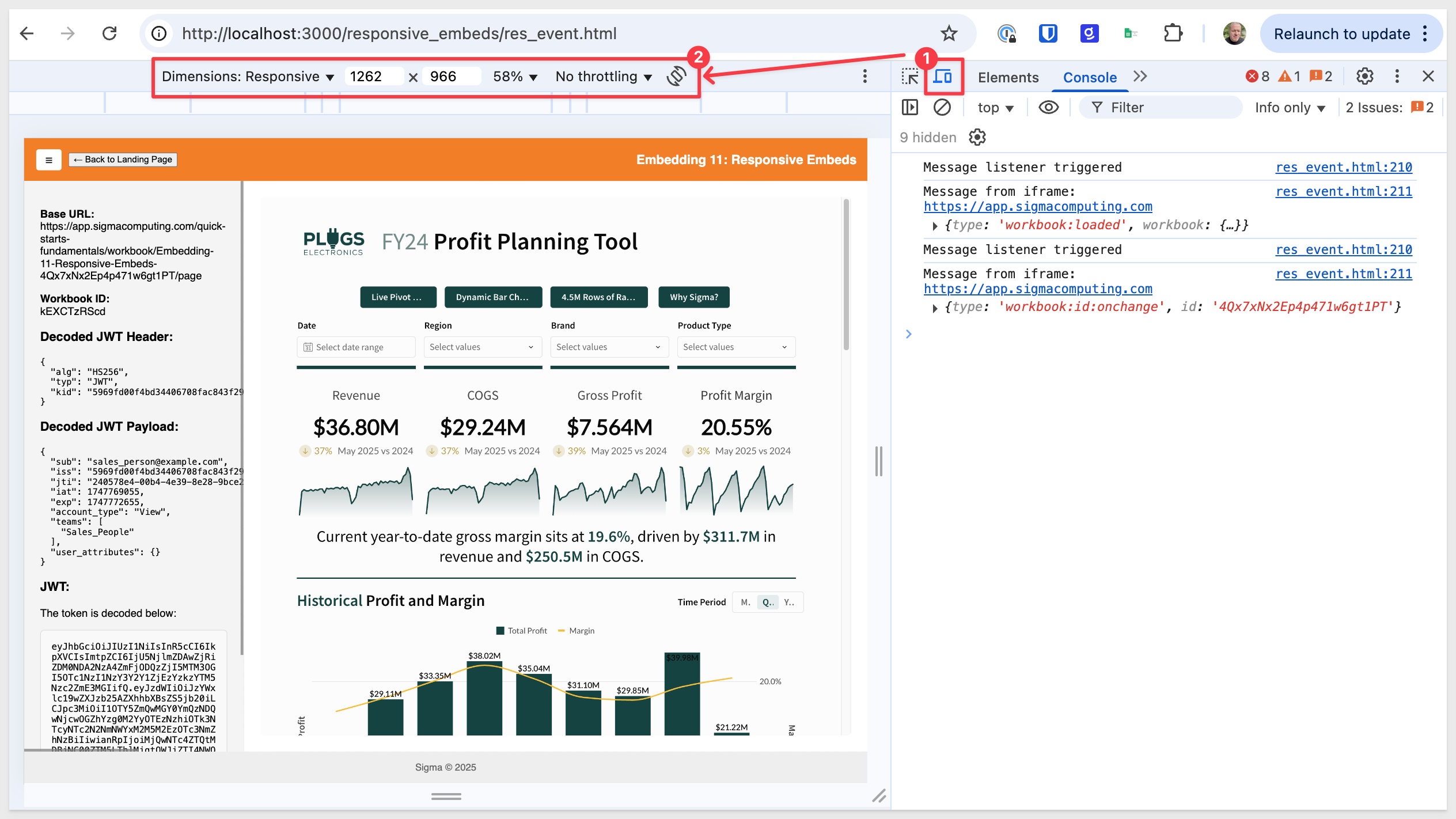
http://localhost:3000/responsive_embeds/res_event.html
Open your browser's developer tools (F12) and click the device toggle icon (top-left) to open the device simulation toolbar.
This allows us to test different common device types as well as plain Responsive:
What's involved
Here are the steps required to integrate the workbook:pageheight:onchange event, along with the code used.
1: Listen for the Event:
We added a global event listener to the window object to capture message events sent by the Sigma iframe using the postMessage API. This is because cross-document communication (like between a parent page and an iframe) uses the postMessage method and message event.
// Global message event listener to capture messages from the Sigma iframe
window.addEventListener("message", (event) => {
2: Adjust the iframe Height:
When the event is received, we check if its type matches ‘workbook:pageheight:onchange' and then adjust the iframe height based on the pageHeight value provided.
 // Respond to the Sigma event indicating the iframe content height has changed
  if (event.data?.type === "workbook:pageheight:onchange") {
    const newHeight = event.data.pageHeight;

    // Ensure the height is a number and the iframe reference is valid
    if (typeof newHeight === "number" && sigmaIframe) {

      // Dynamically resize the iframe to fit the embedded content
      sigmaIframe.style.height = `${newHeight}px`;
In the sample code:
<ul>
    <li>The iframe is dynamic because it adjusts its height in real-time based on the content height, thanks to the Sigma event.</li>
    <li>It's also responsive in width because it adjusts to the full width of its container, ensuring it looks good on all screen sizes.</li>
</ul>
For more information, see Implement inbound and outbound events in embeds
In this QuickStart, we learned how to implement a responsive Sigma embed inside an HTML page using both CSS and JavaScript.
While the best approach depends on your use case, we hope this QuickStart helped you better understand how to embed Sigma responsively.
Additional Resource Links
Blog
Community
Help Center
QuickStarts
Be sure to check out all the latest developments at Sigma's First Friday Feature page!