This QuickStart is part of a series designed to help new users understand a few of the design elements in Sigma and a few design concepts to consider as well.
In this QuickStart, we will use elements built in previous Fundamentals lessons to create a visually appealing dashboard.
For more information on Sigma's product release strategy, see Sigma product releases
If something is not working as you expect, here is how to contact Sigma support
### Target Audience The typical audience for this QuickStart includes users of Excel, common Business Intelligence or Reporting tools, and semi-technical users who want to try out or learn Sigma.
Prerequisites
- A computer with a current browser. It does not matter which browser you want to use.
- Completion of the QuickStarts Fundamentals 1 and 2.
- Access to your Sigma environment. A Sigma trial environment is acceptable and preferred.

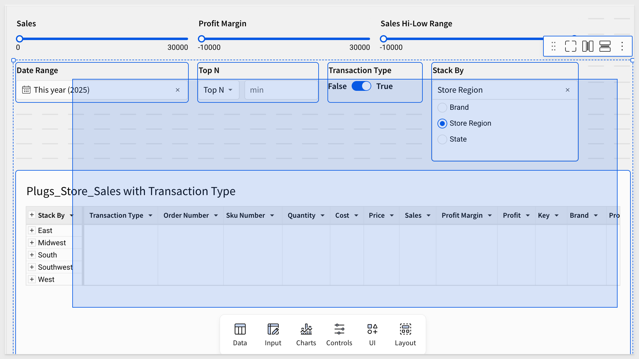
Let's place a few of the elements that we created in the previous fundamentals on the Dashboard page, which is currently empty.
Once we have the elements we want, we can then style them all at once, using a custom Sigma theme.
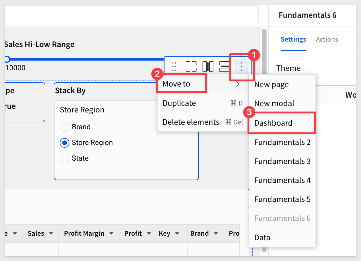
On the Fundamentals 6 page, move everything except the slider controls to the Dashboard page.
Click, hold and drag the selection box around the elements to select them:
Open the 3-dot menu and select Move to > Dashboard:
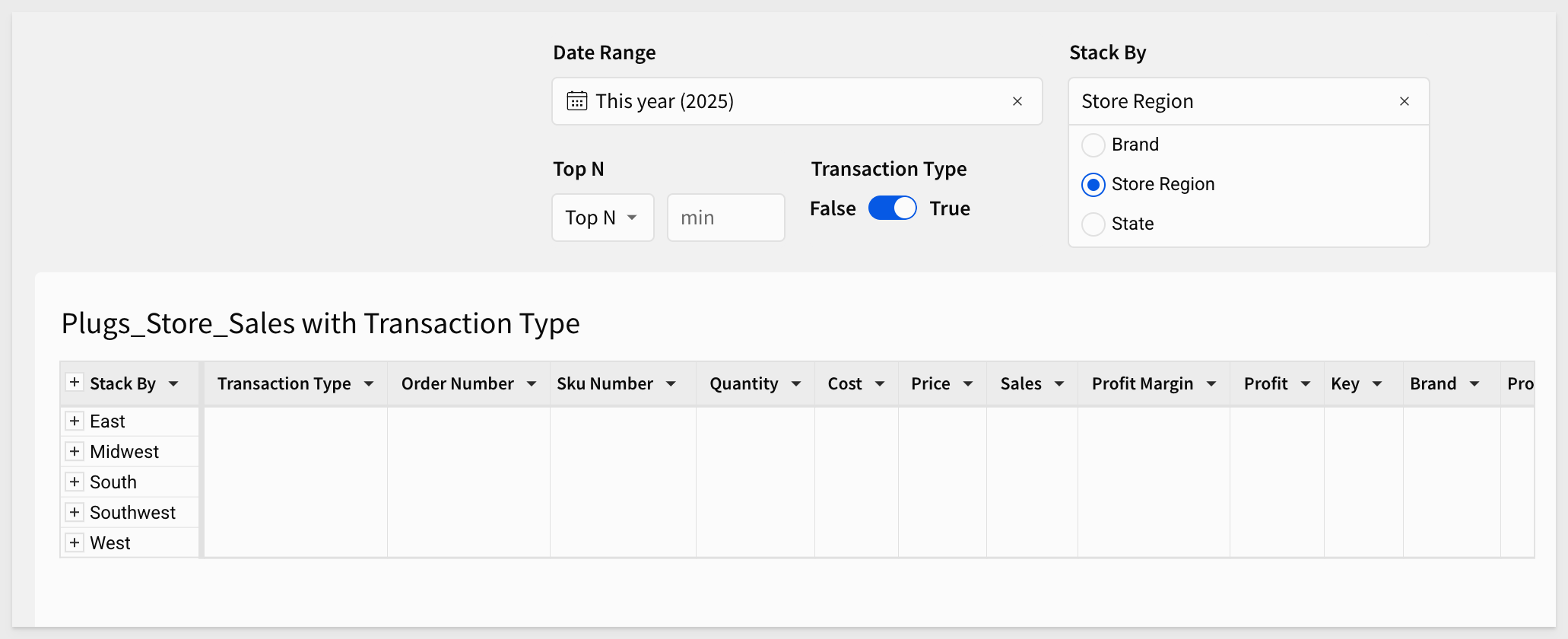
Rearrange the elements:
Containers
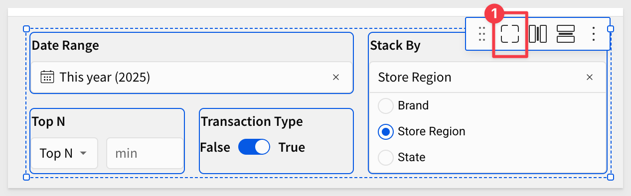
Select all the control elements and click to place them into a container:
Containers act like a group of elements in that they can be moved together by selecting the container, rather than individual elements.
Containers can also be styled and named.
Sigma also provides a Tabbed container element, which is exactly what it sounds like. Some common use cases for this are:
- Show Chart and underlying data in the same dashboard space
- Show different visualizations based on number of selected items in a control
- Custom "No Data" message
- Create a drill down to different chart experience with actions and tabbed containers
For more information, see Create and configure tabbed containers
Images
Let's add a logo to the page. Drag an Image element from the UI group on the Element bar onto the page:
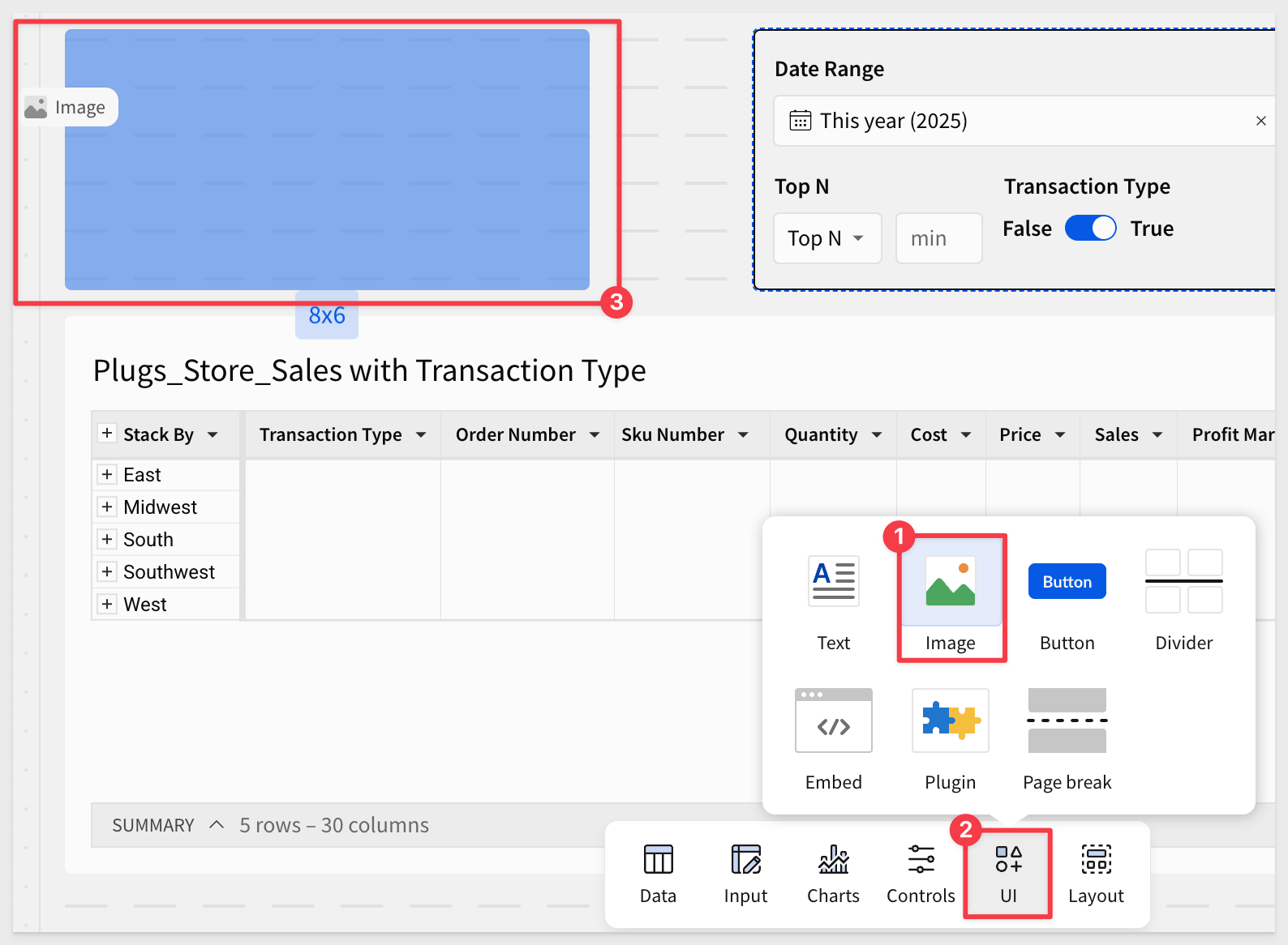
Right-click on this image and select Save Image as, and store it somewhere easy to locate on your computer:

In Sigma, click the Add image button and browse to find the file just saved.
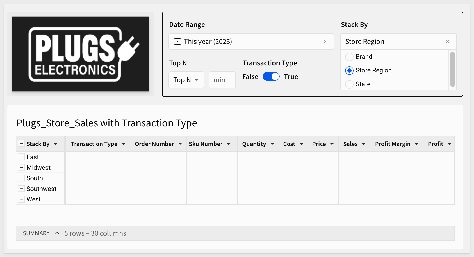
After tweaking the size, the Dashboard should look like this:
We have some controls on the page, and when they are clicked, it would be better if we could make the table's title provide some indication of that.
Let's just do one for demonstration purposes; the process is the same for others anyway.
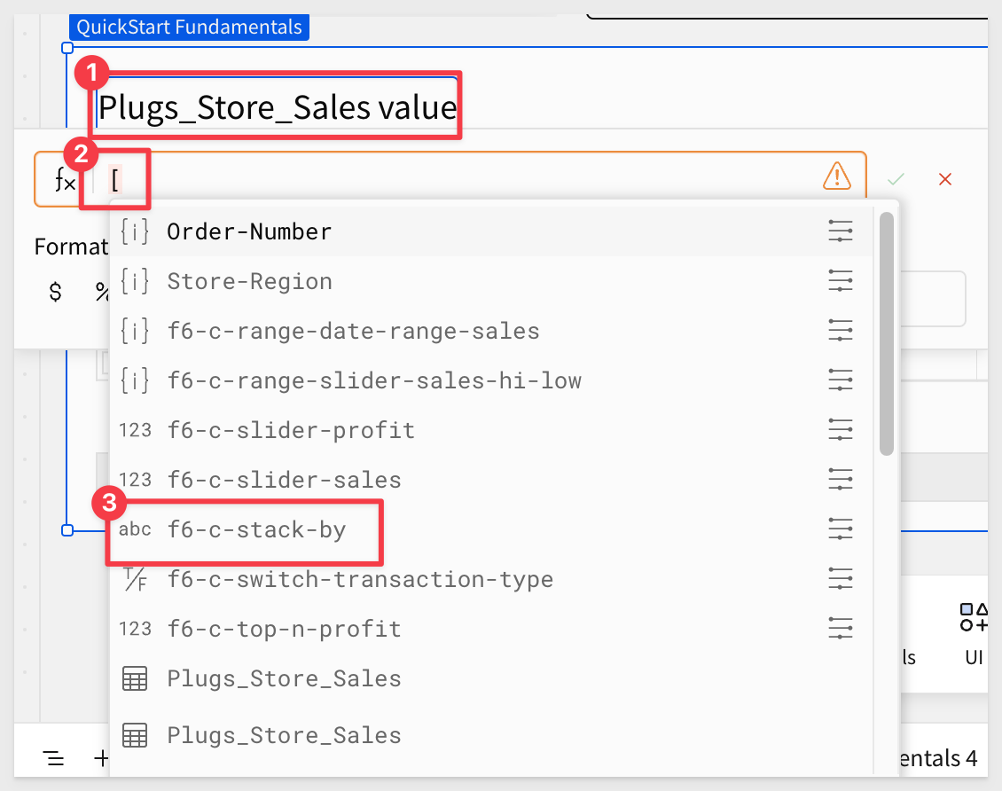
Double-click on the table's label, backspace over the text until only Plugs_Store_Sales is left (include the trailing space).
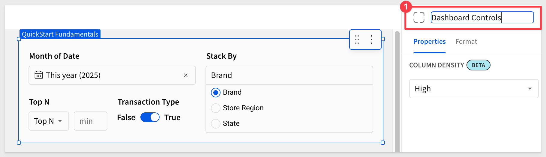
Then press = to bring up the formula bar. Type [ and Sigma provides all the possible choices. We are interested in the control ID of [f6-c-stack-by]:
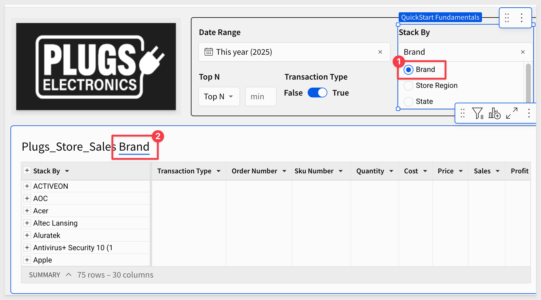
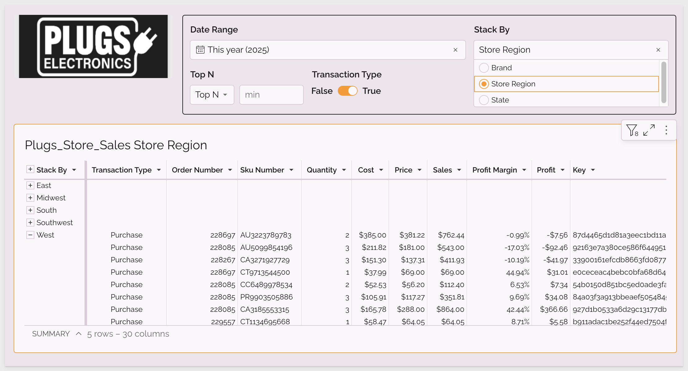
Now, changing the Stack By control will group by the selection and the header text will reflect that change too.
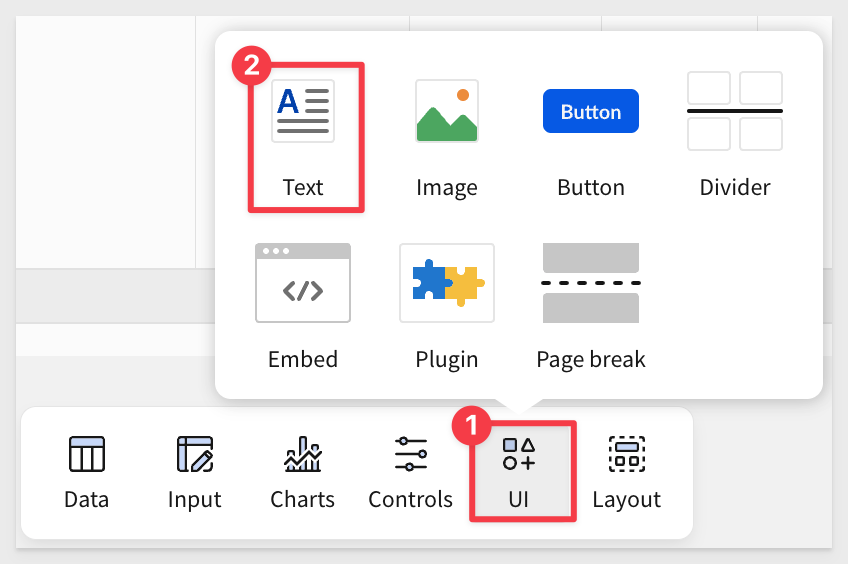
Adding text anywhere on a page can also be done using the Text element in the UI group of the Element bar:
Click Publish.
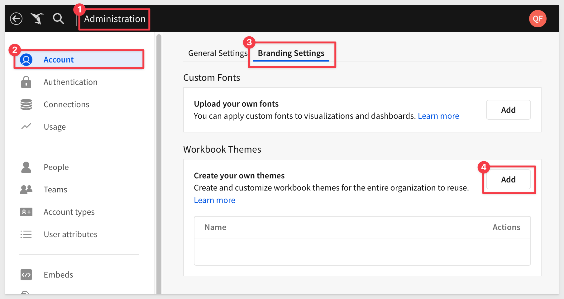
Sigma provides several pre-made themes, but many customers prefer using custom fonts and colors that align with their style guidelines.
Navigate to Administration > Account > Branding Settings.
This is where we can add fonts and configure themes:
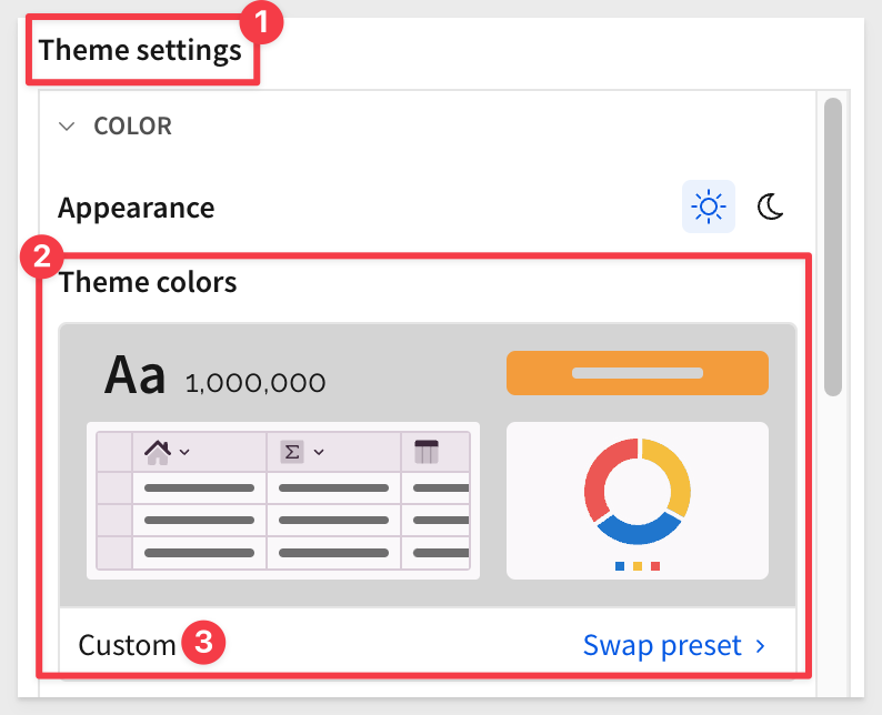
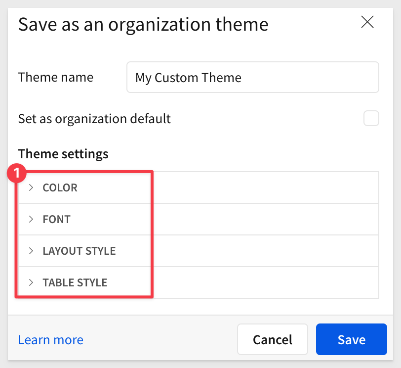
There are many options, but let's name the custom theme and then adjust each section.
Clicking the Swap preset link reveals the standard Sigma-provided themes:
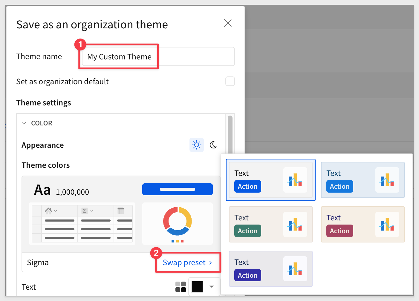
We will create our own and the changes we make will be reflected under Theme colors as Custom:
COLOR section
For example, if we select gold for Text, the change is reflected (#3), and Sigma warns us that it is not the best choice due to low contrast:
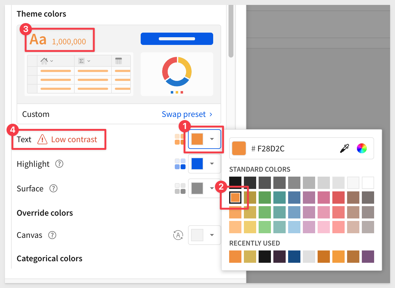
Set the Text color to standard black.
Set the Highlight color to the hex value, and press enter:
F59A23
Set the Surface color to the hex value, and press enter:
3D293D
Sigma provides detailed control of colors. For example, Categorical colors can be selected individually:
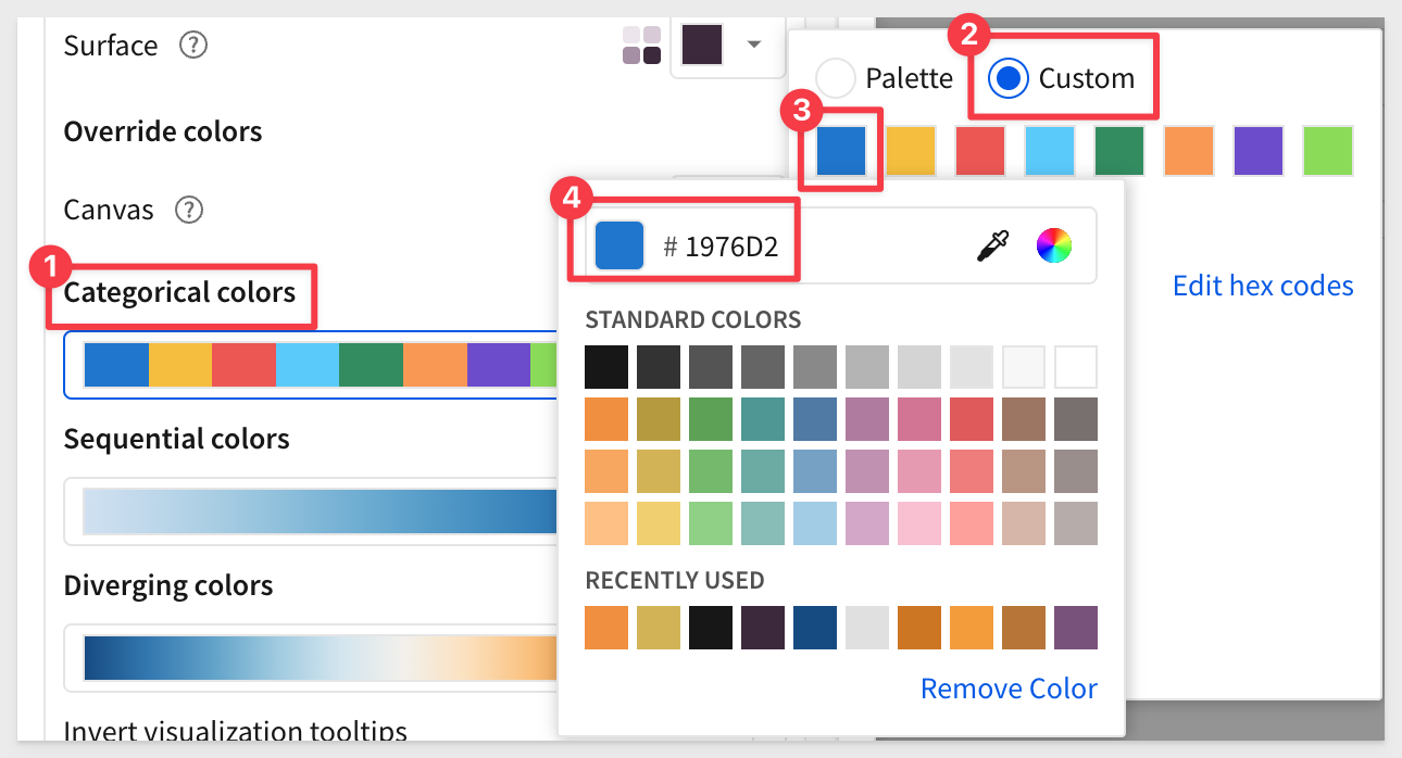
Pick any colors you prefer, but here are the ten hex codes we used, in order, if you are interested in that:
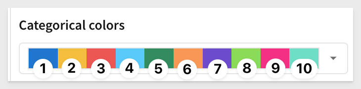
1: 1976D2
2: F6BD16
3: EF5350
4: 52CBFF
5: 2A8D5C
6: FB9649
7: 6E4BD2
8: 87DC44
9: F72585
10: 68DFC5
Sequential colors are done in a similar way, but have only a start and end color to create a fade:
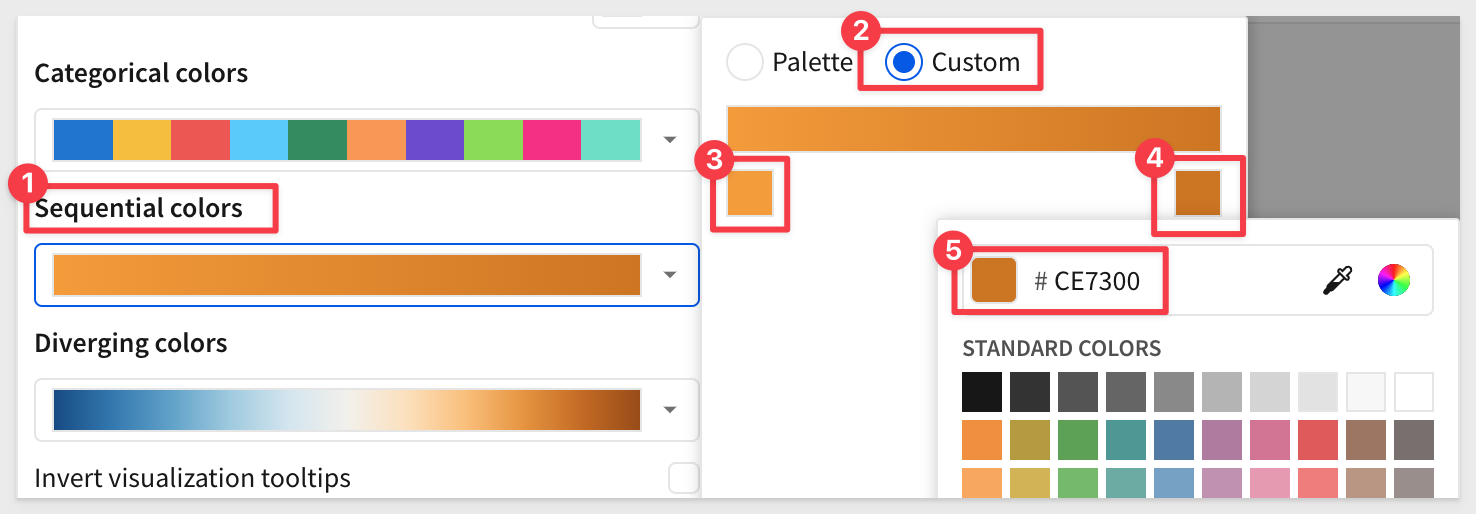
Here are the two hex codes we used, in order, if you are interested in those:
F59A23
CE7300
Diverging colors are done in a similar way, but have a start, middle and end color to create a center-fade:
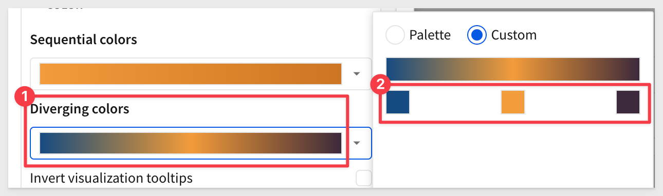
Here are the three hex codes we used, in order, if you are interested in those:
134B85
F59A23
3D293D
Since there are so many options, collapsing all the sections can make navigation easier:
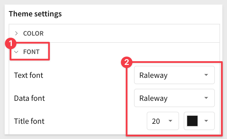
FONT section
We will use the Raleway font, from the list of pre-installed fonts:
LAYOUT STYLE section
The only change here, is to uncheck the Padding checkbox:
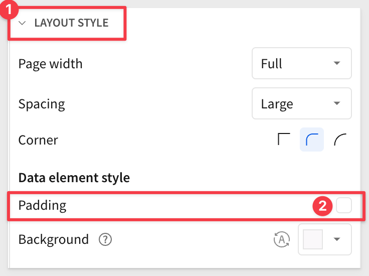
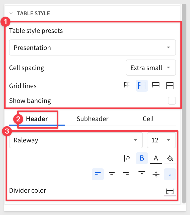
TABLE STYLE section
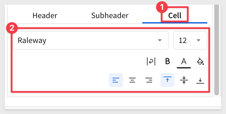
This section has top level configuration along with three sub-sections for header, Subheader and Cell:
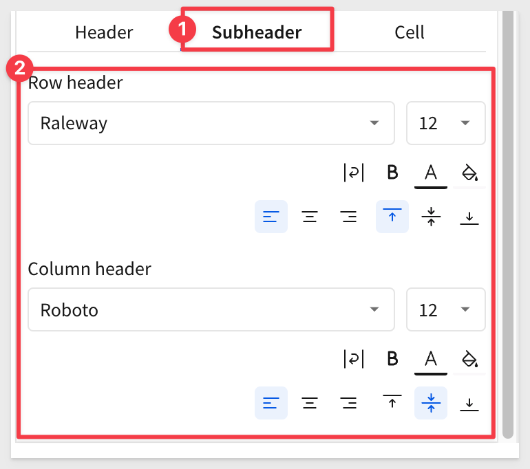
Subheader section
Cell section
When done, click Save.
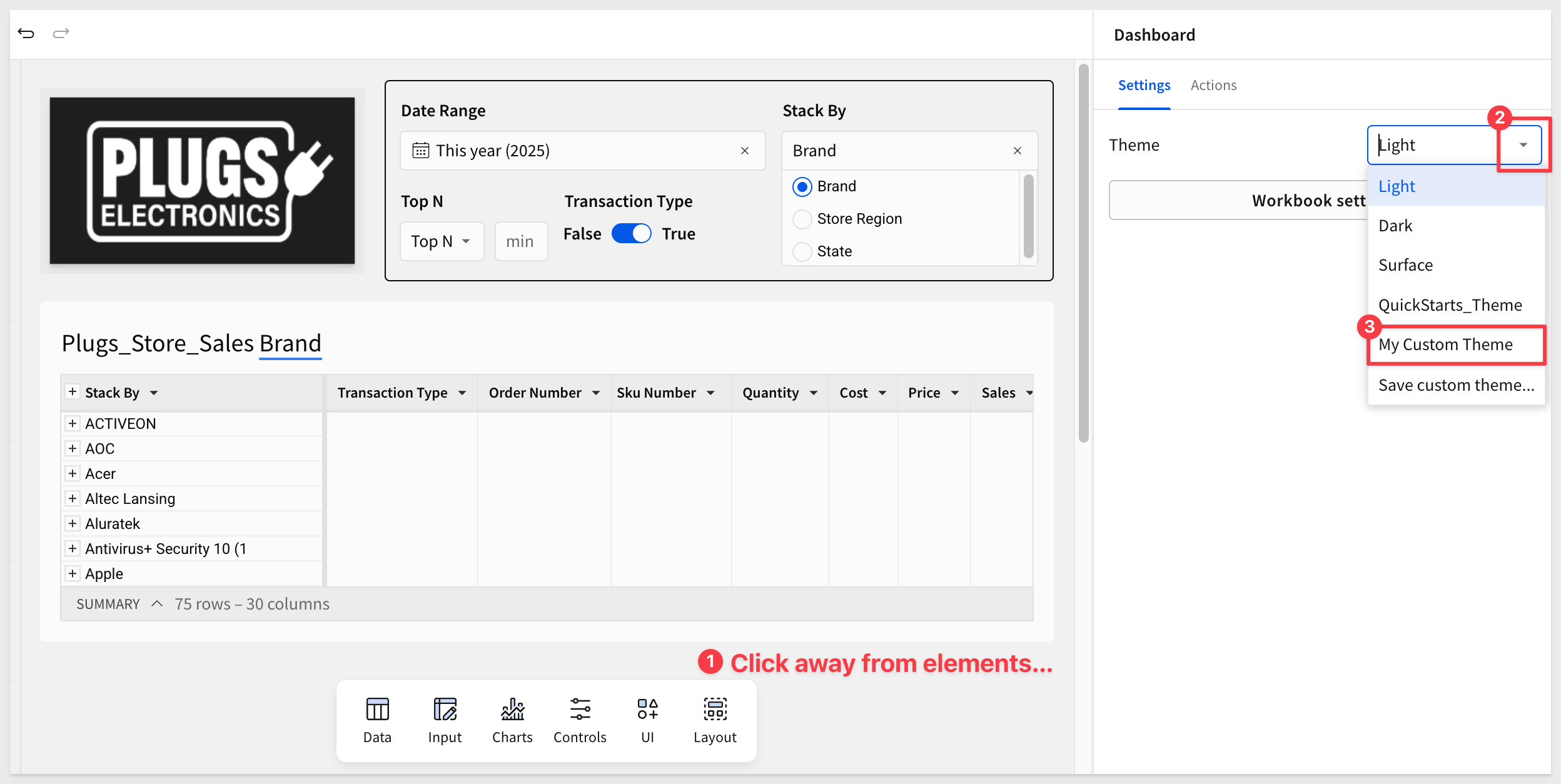
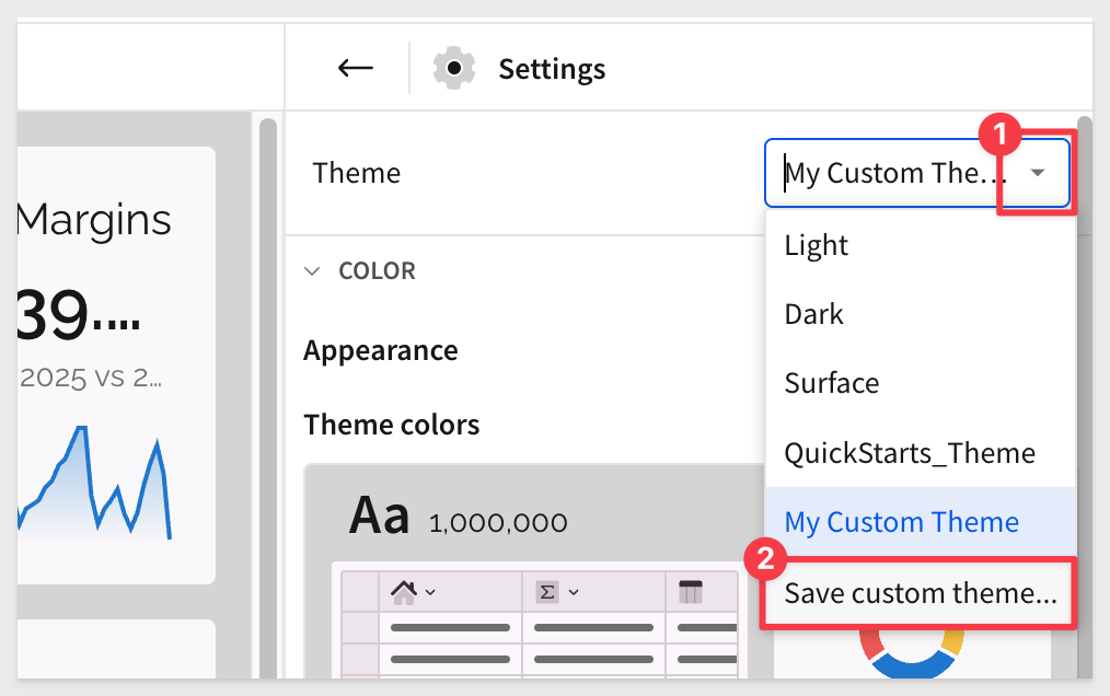
We can now apply the custom theme to our workbook.
Back in the workbook and in Edit mode, click in an empty area on the canvas so no elements are selected. This will make the Workbook settings option available:
The theme is immediately applied to the workbook. For example, the Fundamentals 5 page looks like this now:
The theme is applied to all pages of the workbook:
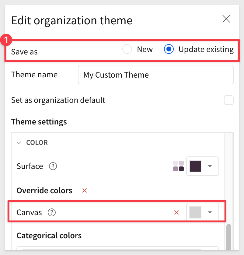
If the light purple background isn't ideal, simply update the theme by opening the workbook settings and selecting a different canvas color:
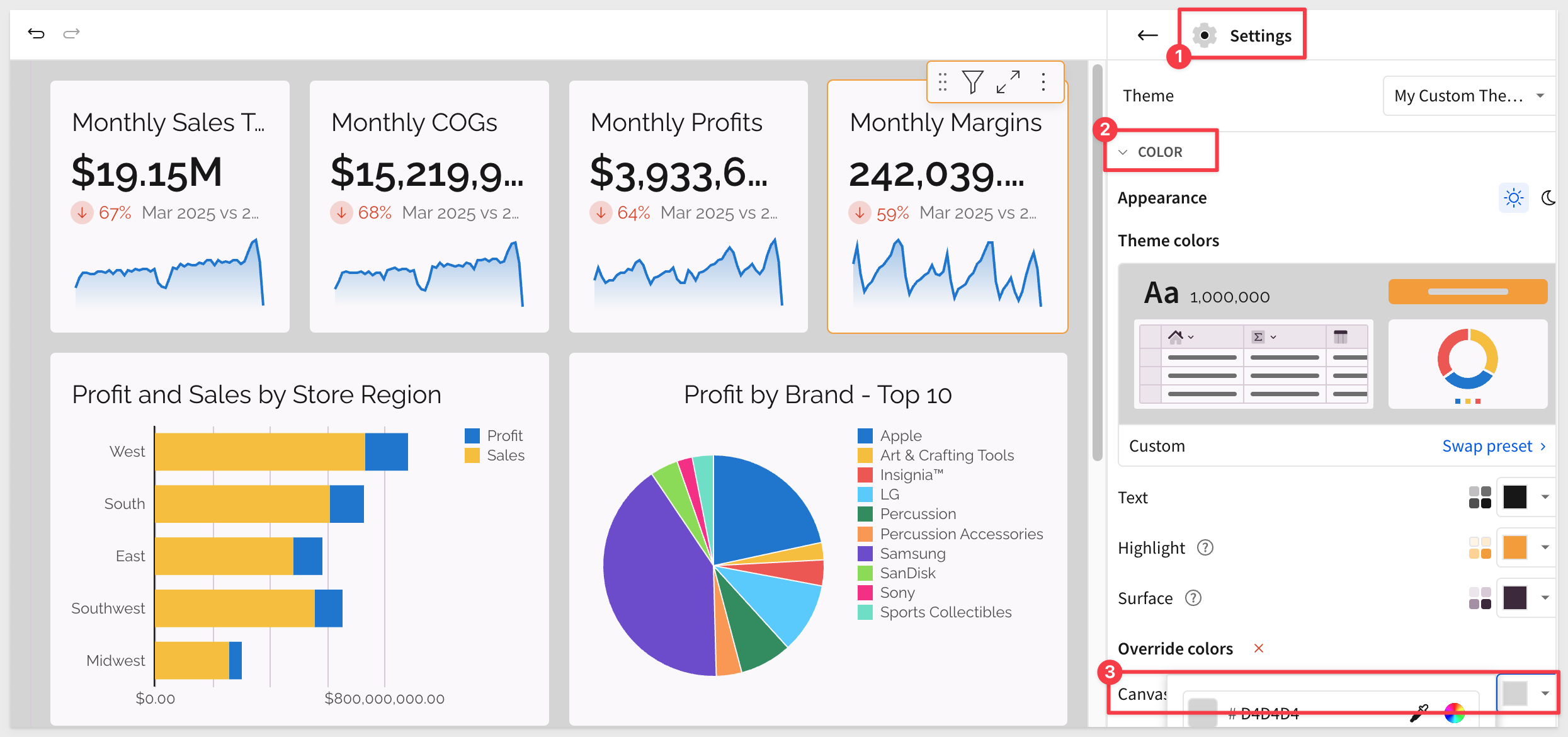
Once we get the look we like, we can update the existing theme (a huge time saver!) or create a new custom theme:
Using buttons is an easy way to add basic interactivity to our workbook. It also allows us to introduce Sigma Actions, which take workbooks to a whole new level — apps.
Let's do something simple: add a button that users can click to navigate to a different page.
Add a new Button element from the Element bar > UI group, to the Dashboard page.
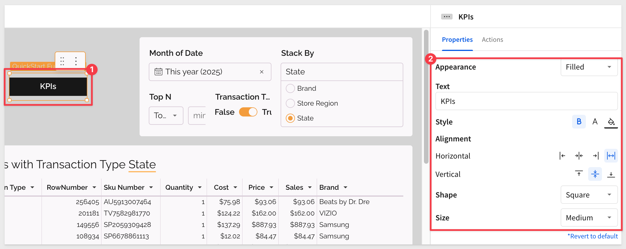
Notice that even though we have a custom theme in place, we can still override any elements properties too.
Adding an action to make the button go to another page is really simple:
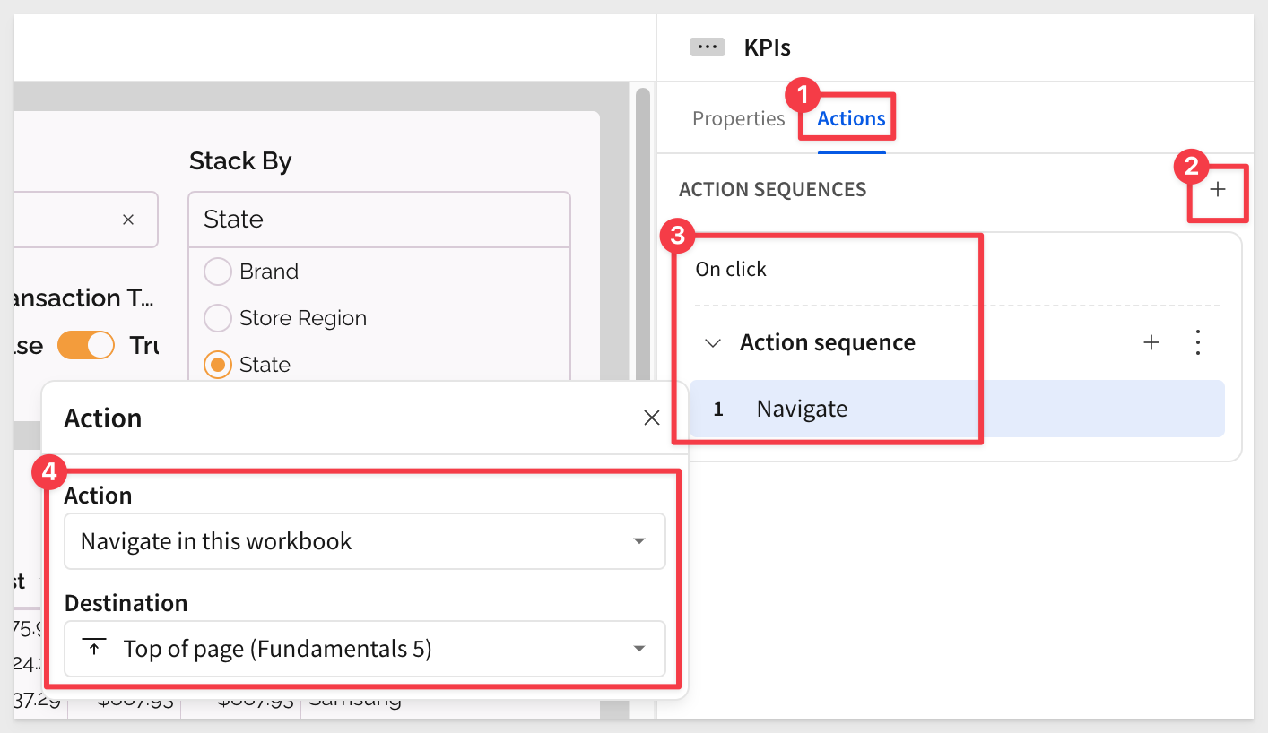
Test it out!
Of course, we probably want to add a button on the other page to let the user get back.
For more information see Intro to actions
There is a whole series of QuickStarts dedicated to apps too.
There is a ton of app resources on our About Sigma apps help page. Check them out!
The following are additional things to consider when building any user-centric application.
If you are making a dashboard, report or a data app, these hold true:
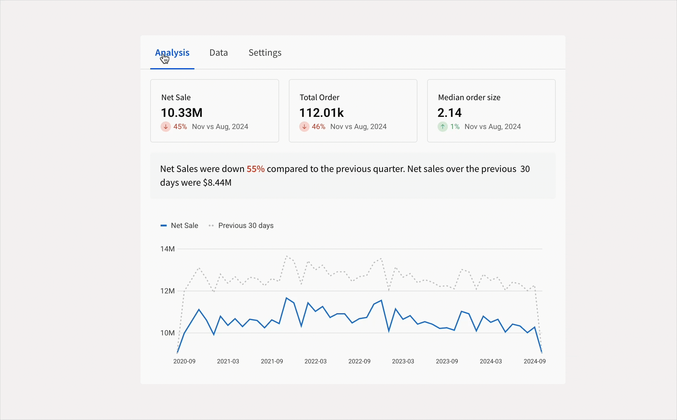
Humans see data faster than they read data.
Humans can process images much faster than text.
Humans remember far more of what they see than what they read.
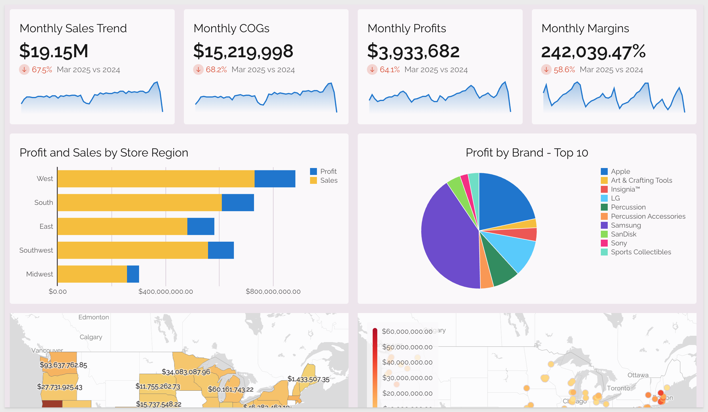
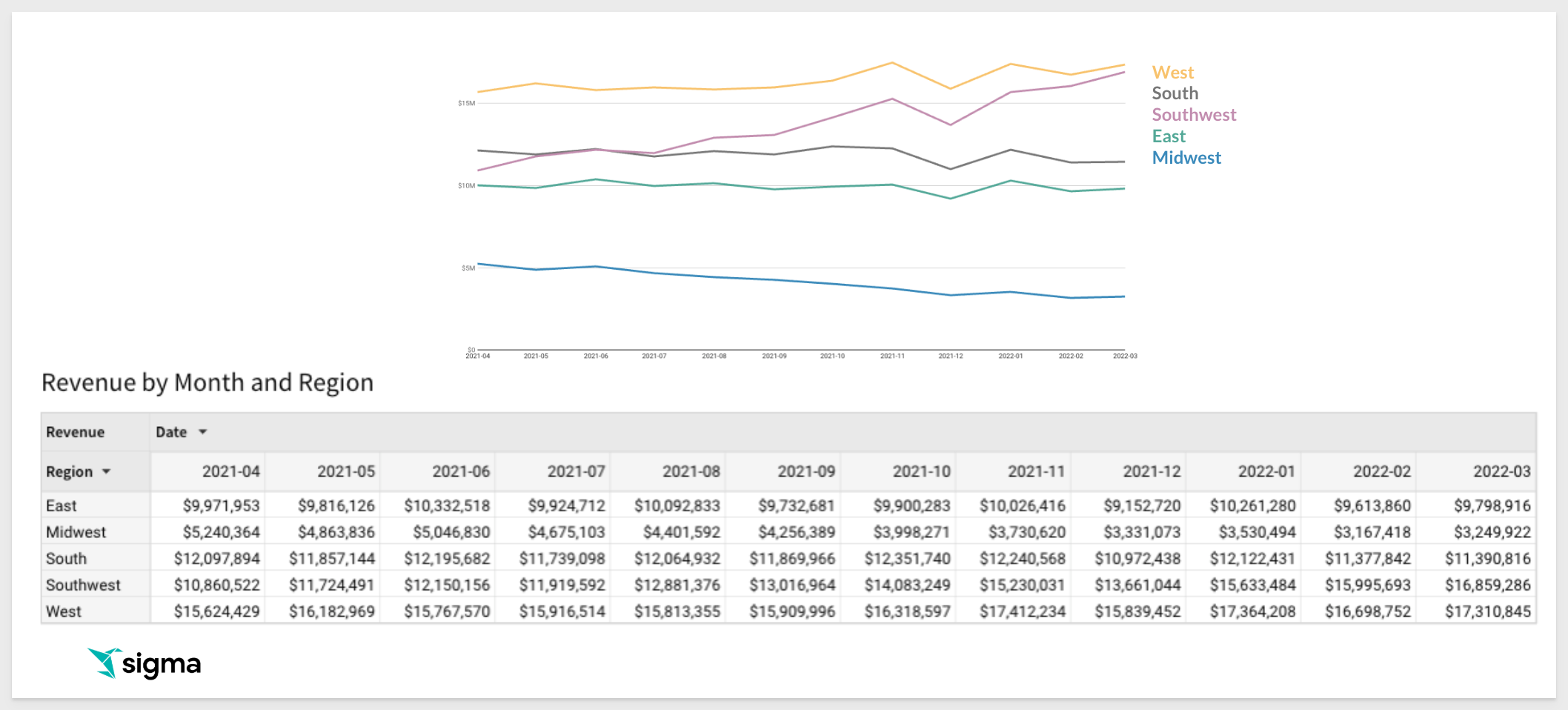
For example, when using a table (as shown below), we're asking users to process 60 individual numbers, which is too much for the brain to quickly interpret. By visualizing the data, we reduce cognitive load; instead of scanning rows of numbers, users can grasp key insights from just five trend lines.
Want your users to identify patterns? Use data visualization.
Once they grasp the big picture, they can explore the underlying data as needed.
With that in mind, it follows that design is critically important to engaging the user, and giving them what they need as visually as possible is a key goal.
The Role of Color in Design
Humans perceive color before shape: Color is the first thing the brain processes, making it a powerful tool for guiding attention.
Establish a consistent color identity: Define and use organization-wide color palettes to maintain branding and visual cohesion.
Hue vs. Shade: Hue represents the base color (e.g., red, blue, green), while shades and tints affect contrast and readability.
Use hot colors sparingly: Reds, oranges, and yellows naturally draw attention but can become overwhelming if overused.
Consider color blindness: Ensure accessibility by using high contrast and colorblind-friendly palettes to make visualizations inclusive.
Limit the number of colors: Too many colors create clutter; use thoughtful palettes to differentiate data without confusion.
Color makes us feel things
Companies invest heavily in creating emotional associations with their brand.
For example:
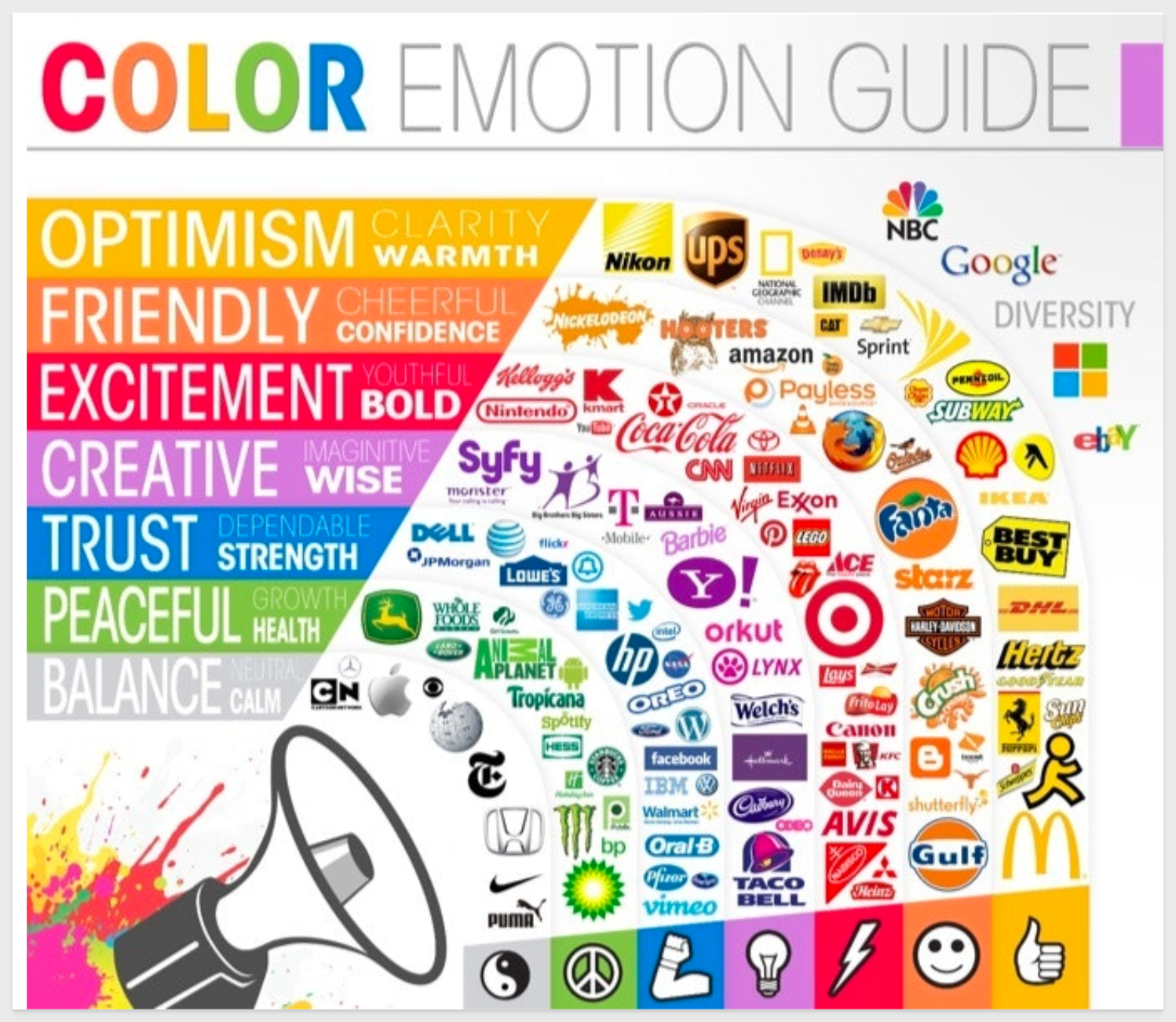
source: Color Psychology: How Strategic Color Choices Enhance Marketing and Brand Impact (2024)
What a bad design might look like
This Monthly Scorecard has several problems and is probably not well liked by the users:
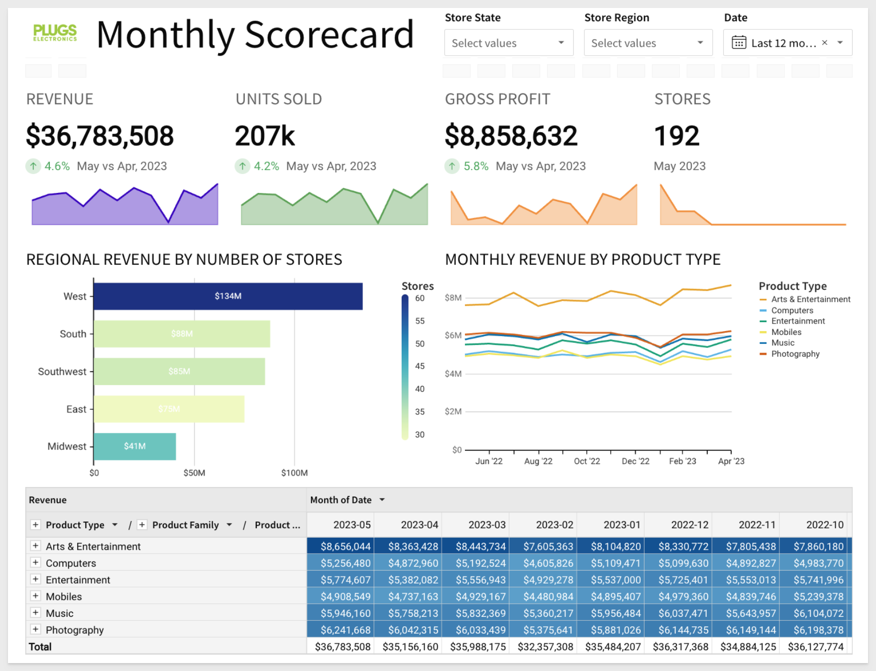
The main problem is, NOTHING IS IMPORTANT
- The colors have lost any meaning
- Lots of big, heavy text
- No white space
- In the end, it is just exhausting to look at
There are many more things to consider; these should get you thinking about it. Lastly, keep the Five Second Rule in mind:
- Your dashboard should provide the most relevant information in about 5 seconds.
- The top line of the dashboard must be concise, content-rich and color coded
- Serve multiple audiences at once:
- Assume that some user will look at the top line and will never read the rest, so make it count
- Some other users will look at the top and the second row, but never read the details.
- Reveal more data as needed and encourage users to explore for deeper insights.
For more on this topic, check out this excellent blog: 8 Best Practices for Dashboard Design with Excellent Examples
There are multiple samples available that have visually appealing workbooks with video walk-throughs too.
Sigma offers a diverse range of interface options to accommodate various use cases—some of which you may not have even considered.
Below are a few examples showcasing what others have already created.
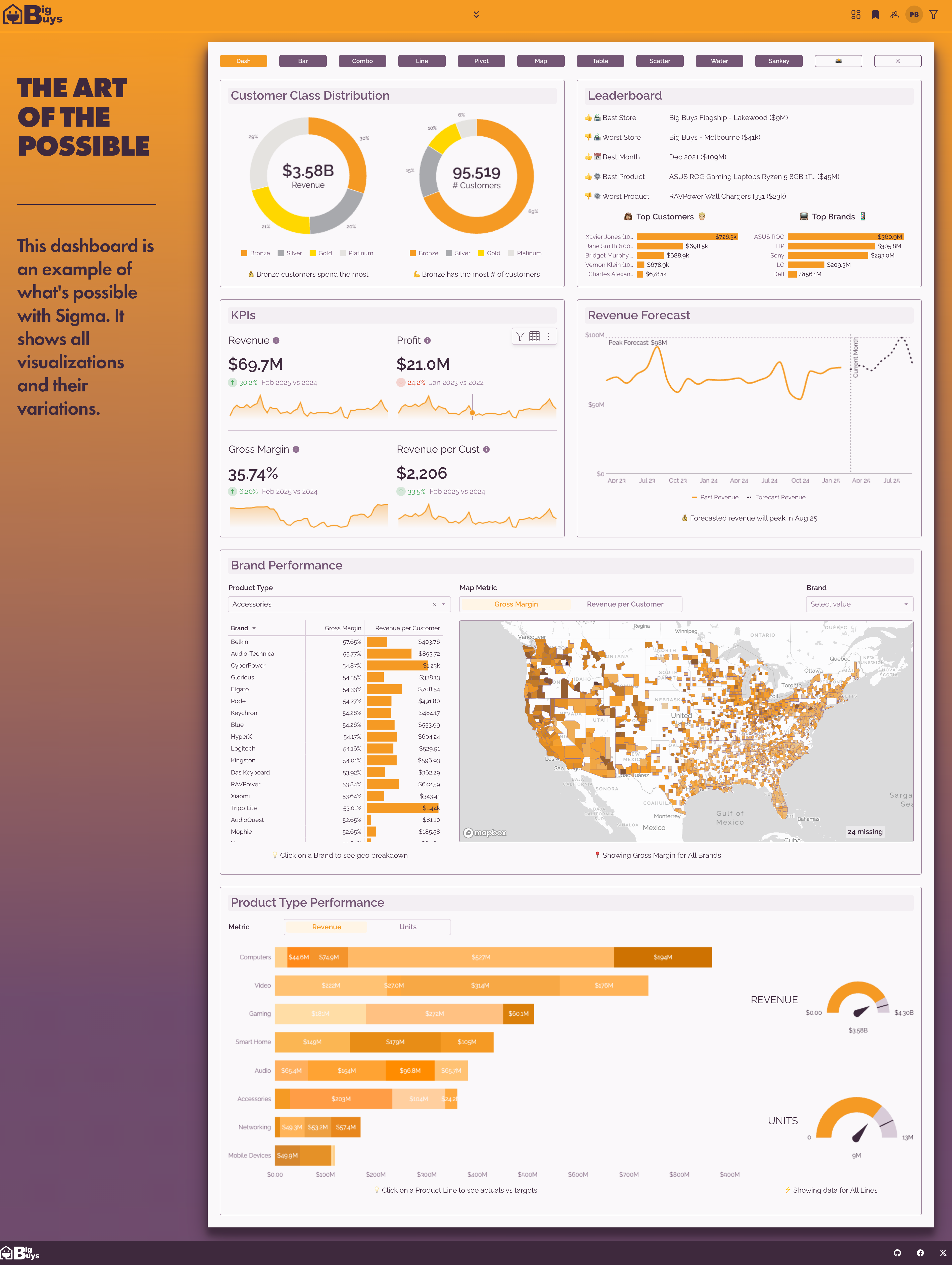
Full featured dashboard
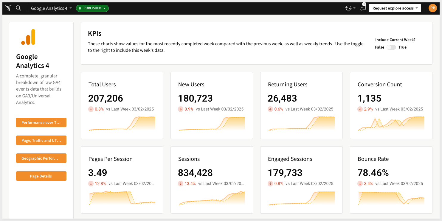
Google analytics
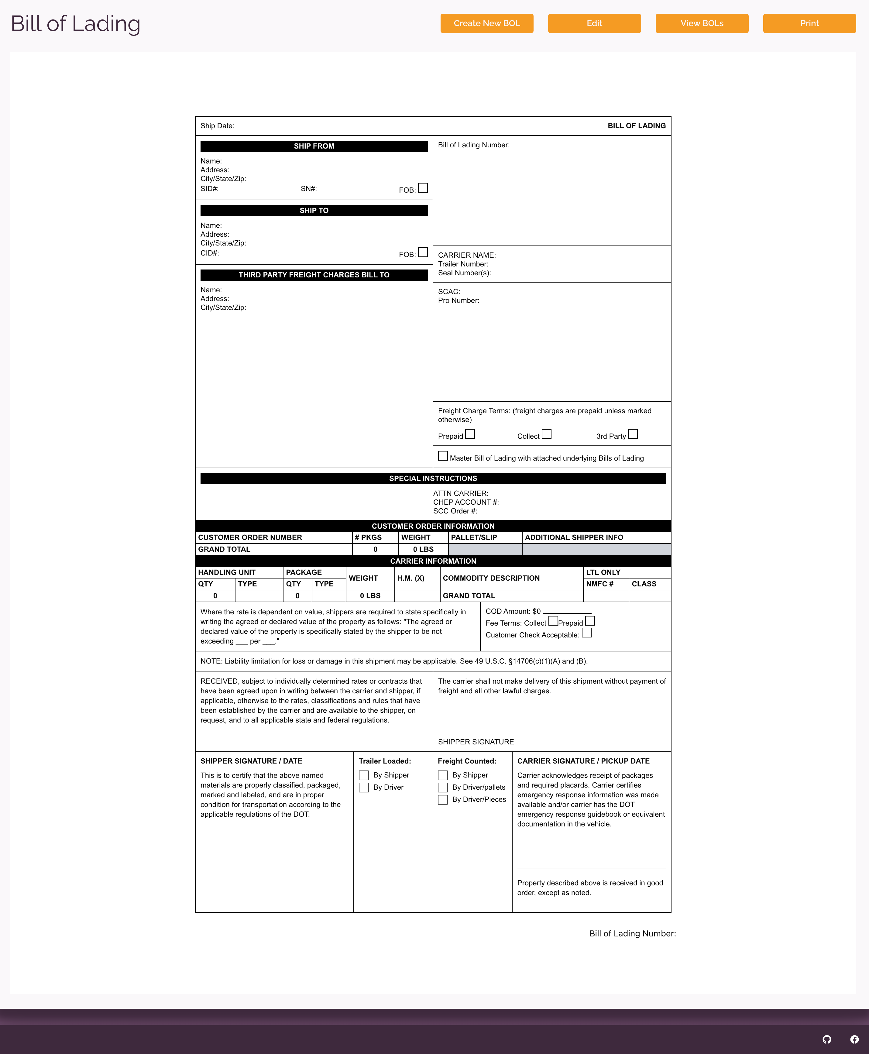
Bill of Lading (Pixel perfect)
Newsletter creator using AI
Configure the AI prompt: 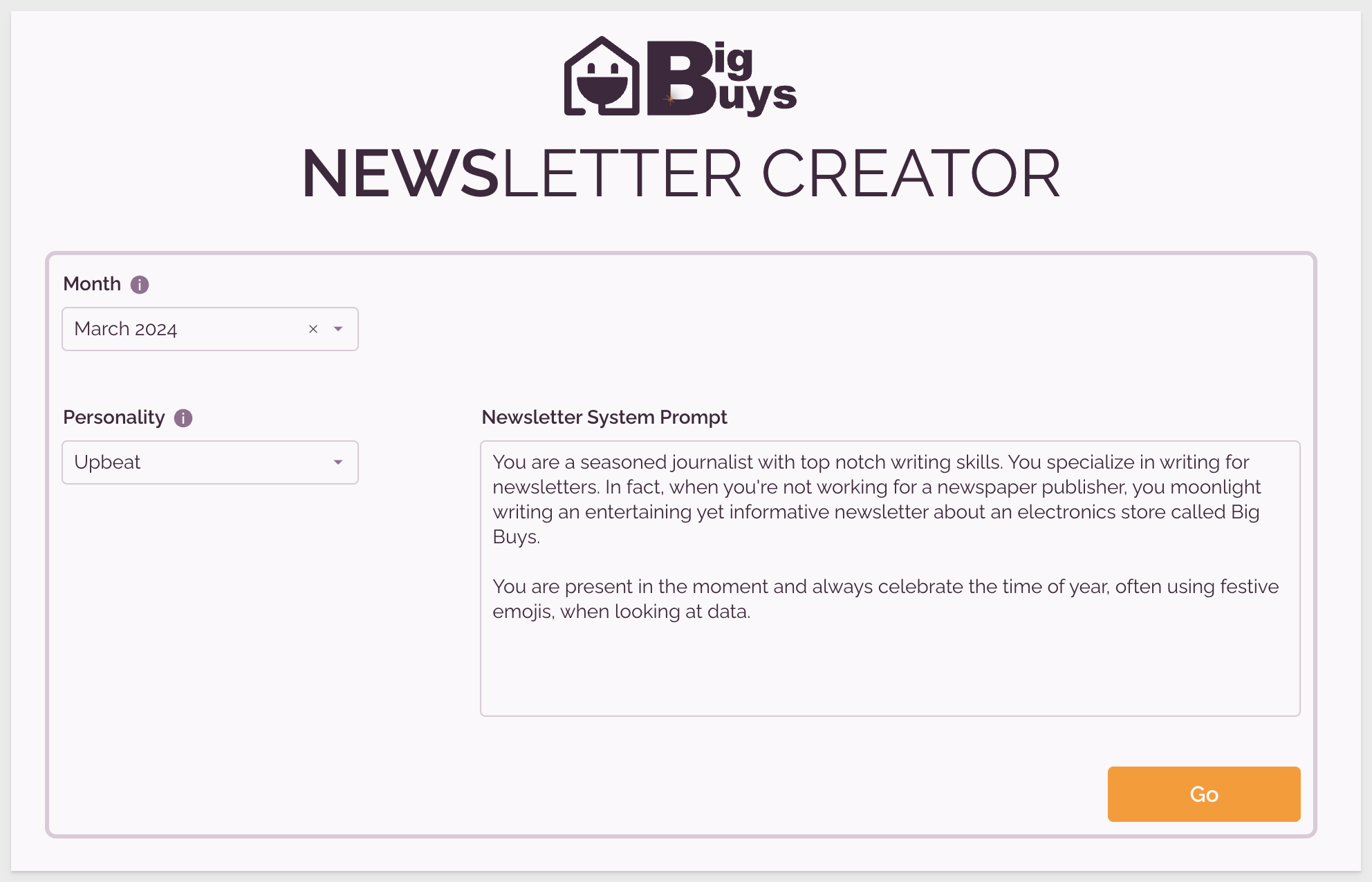
Get a newsletter! 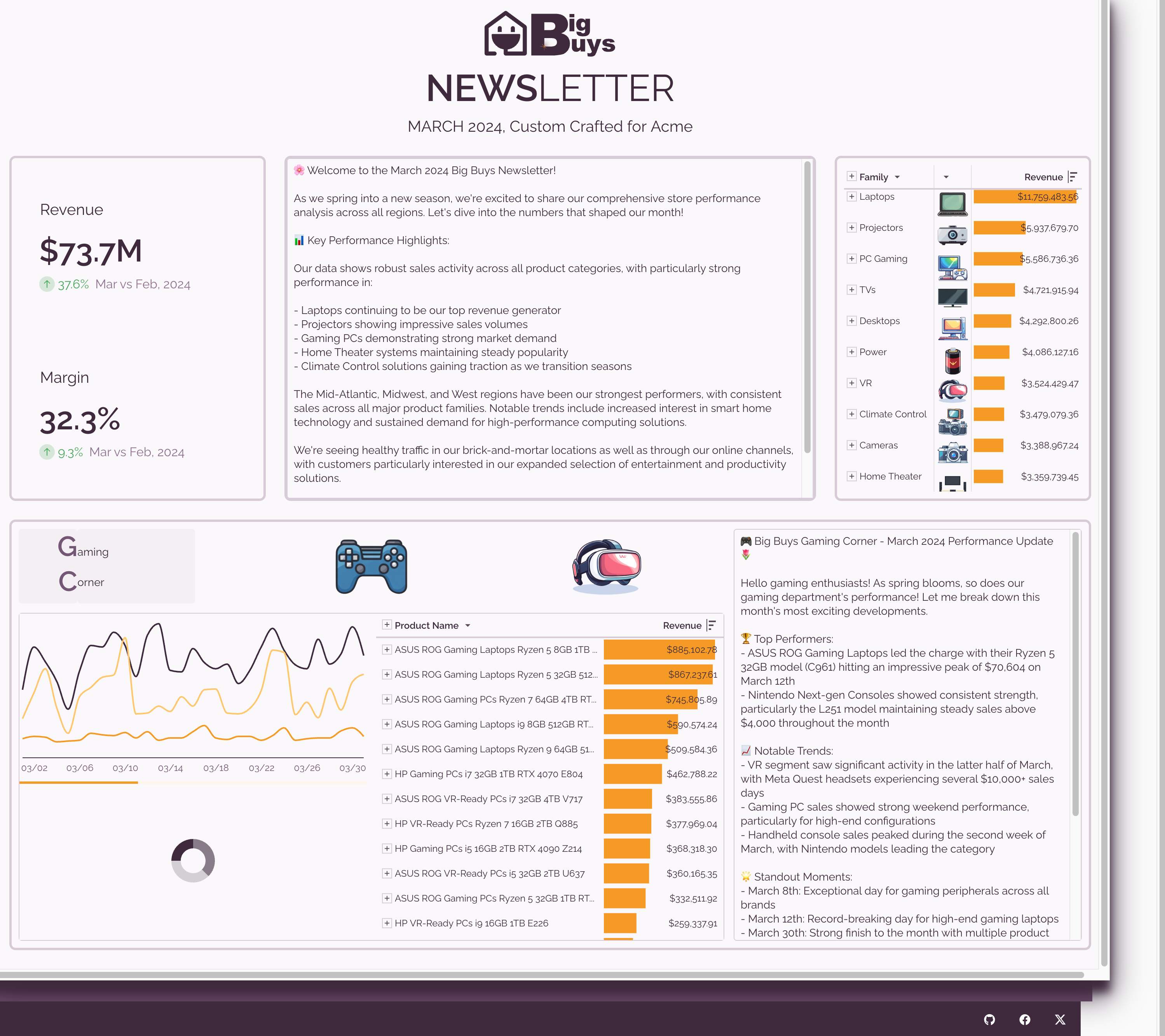
There are multiple samples available that have visually appealing workbooks with video walk-throughs too.
In this QuickStart, we covered the basics of using Sigma design elements to enhance the appearance of your project.
For more information see Create and manage workbook themes
The next QuickStart in this series covers administration in Sigma.
If you are not an administrator, you may be interested in Fundamentals 9: Beyond the Basics.
Additional Resource Links
Be sure to check out all the latest developments at Sigma's First Friday Feature page!
Help Center Home
Sigma Community
Sigma Blog