Period over period (PoP) analysis, while conceptually straightforward, can be challenging to understand and execute effectively.
These periods can be days, weeks, months, quarters, or years, depending on the context and objectives of the analysis.
They can also include rolling periods (rolling 30 days, rolling 12 months), or Month-To-Date, Quarter-to-Date and Year to Date.
These types of PoP comparisons of two KPIs - current vs historical - are often used at the top of executive dashboards.
In this QuickStart, we will focus on the PoP analysis scenarios, where two specific time periods are selected and compared, against key metrics or data points between these periods. It does not cover building two timelines, current vs past, next to each other. Comparing two historical timelines (rather than just two dates) will be a subject of another, future document, not covered here.
For more information on Sigma's product release strategy, see Sigma product releases.
Target Audience
This QuickStart is designed for data analysts, business strategists, and marketing professionals who want to effectively utilize period over period analysis using Sigma.
Prerequisites
- A computer with a current browser. It does not matter which browser you want to use.
- Access to your Sigma environment.
- Some familiarity with Sigma is assumed. Not all steps will be shown as the basics are assumed to be understood.
What You'll Learn
A basic understanding of PoP analysis and how to use Sigma effectively when creating related content.

Business leaders often want to know how well their business is performing today, compared to past results. Dashboard developers need to understand how to best interpret the intent of the business and translate it into specific Period over Period (PoP) requirements. This chapter covers some general rules and common mistakes of interpreting the business need into robust, professional business logic, related to historical comparisons.
Let's look at some common scenarios, starting with the basic Year-over-Year logic.
Basic logic (sometimes ok)
Measuring revenue on an annual basis is very common, and it's easy. You want until the end of the year, then generate my report. Then we can do the same for the previous year, and compare the two numbers. Simple, right?
That is a good start, but what if I don't want to wait until the end of the year to see if the business is on track?
If I want to check regularly, perhaps weekly or even every day, does the comparison support that? That is where things get more interesting.
Period-To-Date logic (ok)
Enter Year-To-Date (YTD), which is usually measured as the revenue from Jan 1st of the current year, and until yesterday.
Once we calculate our YTD revenue, we can also calculate the Previous YTD, defined as Jan 1st of the previous year, through 1 year ago yesterday. YTD and Prev YTD can be recalculated as often as you like, even daily, and gives an "in-progress" comparison. Good, right?
Well, the problem with the Period-To-Date logic - it is not particularly accurate early in the year.
For example, if we look at our YTD on Jan 15th, our sample size includes just 15 days of data, and one small snow storm can skew our numbers and make them look worse than they really are.
The quality of the YTD comparison gets better later in the year, but it is pretty unreliable early in the cycle. So what is the solution? Enter Rolling Periods.
Rolling Periods (best)
Rolling periods are year-over-year calculations that calculate the rolling 12 months, as of yesterday, and compare them against the same period of the year before.
Rolling 12 months revenue is generally comparable in scale to the full year's revenue except it can be calculated at any time throughout the year, and then compared to 12 rolling months of the year before.
For example, if today is March 10th 2024, then the rolling 12 months revenue will focus on the 12 month period from March 10th, 2023 through March 9th, 2024.
Previous 12 month Revenue will focus on March 10th, 2022 through March 9th, 2023.
So which one of these 3 methods should I use?
For the reasons explained, when the business is looking for annual comparisons but doesn't want to wait till the end of the year to learn the numbers, it should consider the rolling 12 months (current vs previous years), plus possibly YTD vs prev YTD.
Here are some more common PoP-related business examples, and how to best translate them into technical logic.
Business ask: measure current month's sales, compared to past sales.
Key question to ask: will you be checking this number once a month, or throughout the month?
If the response is: we want to track this KPI several times throughout the month, then:
Consider building: Sales for rolling 30 days, compared to the same period last year.
They mentioned months, but you replaced it with 30 days - why?
Answer: First, some months have 31 days while others may only have 28 days, so a fixed 30-day window gives us a more fair comparison.
Even more importantly, comparing the current, incomplete month against the previous complete month doesn't make sense - your business may be doing better this month, but the current incomplete month will often show lower Sales, when compared to the entire previous month.
Why not current month-to-date vs previous month to date?
Answer: Because current month-to-date has wild sample size fluctuations throughout the month, and, early in the month, when MTD has just a couple of days, MTD vs Prev MTD is unreliable.
Why pick the baseline as last year, vs last month or quarter?
Answer: Many businesses have seasonal fluctuations around the summer and the holiday season. Because of that, by default, unless you have a strong reason to do otherwise, your safest baseline comparison is the same period last year.
We never want to be explaining to an executive (go ahead if you really want to!) that a 15% sales drop in January vs December in fact represents a business uptick (compared to the 20% Dec to Jan drop in previous years).
Now, comparing the last 30 days with the previous 30 days sometimes makes sense, depending on the business context, but, all other things being equal, we generally want the same period last year to be the default starting point, since it applies most often and avoids the common pitfalls.
By the same token, if the business asks for current quarter vs past results, and they want to check this number daily or weekly, then:
Consider building Sales for Rolling 90 days vs same 90 days last year.
Remember, business users are rarely deep experts in data analytics, but they do generally want period over period to reflect the actual relative state of the business.
So interpreting the intent and advising them on the most robust business logic is a critical part of an analysts job. Ideally, we want the Sigma expert to steer people towards the most robust and meaningful logic.
OK, so now that we know what to build, how to do it in Sigma?
Rolling periods are the most robust Period-over-Period comparisons and Sigma supports them, but they require some additional work, This is detailed in section PoP Without The Wizard
Feel free to jump directly to that section or continue reading for even more information, along with an example using Sigma's PoP Wizard which will fit simplified use cases too.
What is involved?
Period over period (PoP) analysis is a method of comparing metrics or data points across different, but comparable, time periods.
In general, these factors require consideration when creating a PoP analysis:
Why PoP is important - common use cases
PoP is widely used across industries and these are the most common reasons why:
As you can see, gaining insights into what drives changes in data over time is invaluable in a variety of technical and business contexts. This is why it's so widely used across almost any industry.
There really is no end to the ways companies need to leverage PoP analysis.
The common thread is always to identify a meaningful change, and react to it as fast as possible, in order to operate efficiently and drive better outcomes.
Technical considerations
While it is tempting to just "jump right in" and start comparing values based on different time periods, there are some things to keep in ming at all times.
Sigma provides users of different skill levels the benefit of two ways to create PoP analysis. For less technical users, we provide a "wizard-based" interface that makes creating PoP analysis a breeze. For the more technical users, we provide all the functions and tools to create any PoP analysis they may want.
Which route you choose is up to you, and we will show examples of both to help you see the difference.
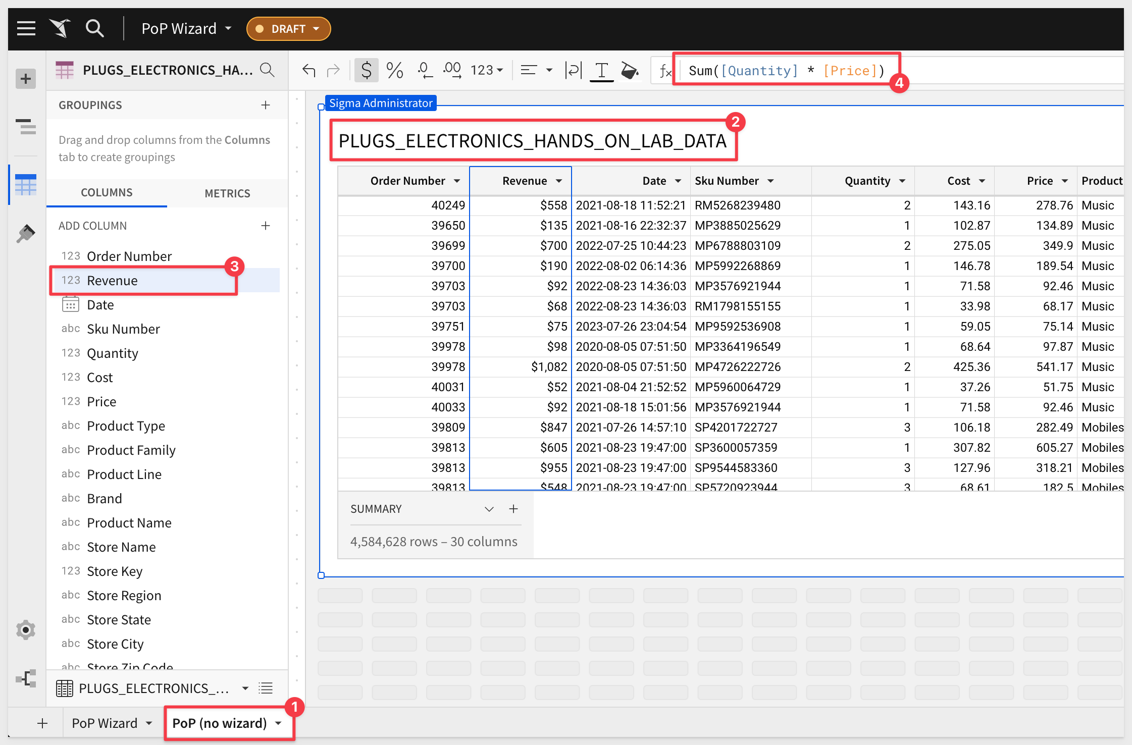
Sample Data
For both methods, we will use the PLUGS_ELECTRONICS_HANDS_ON_LAB_DATA table which is made available to all customers via the Sigma Sample Data connection.
If you are unsure how to build a workbook based on this data, please review the QuickStart: Fundamentals 1: Getting Around.
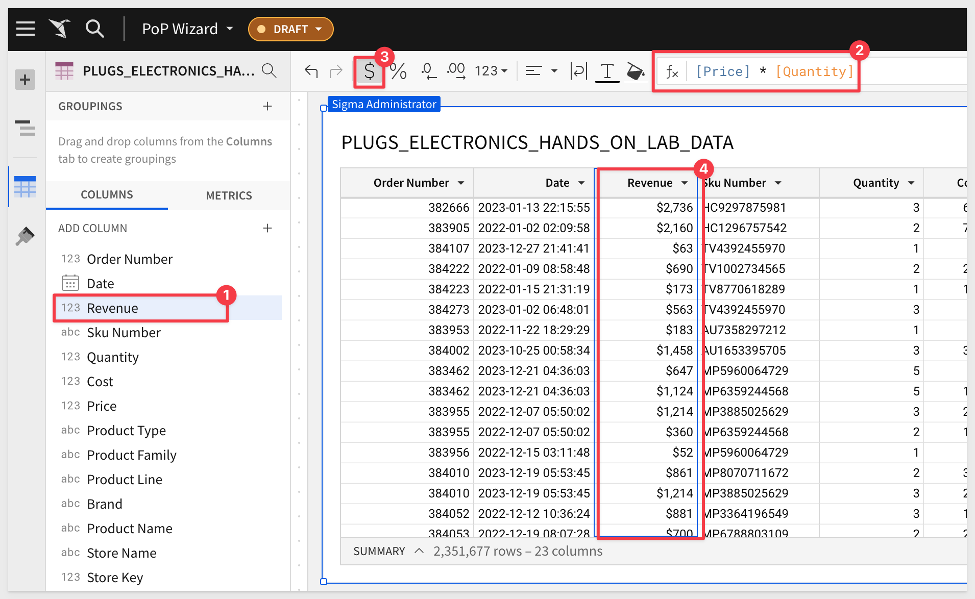
We also need to calculate the line item Revenue, as this table does not supply it. This is really simple to do in Sigma:
Columns can be added by clicking the + in the Element Panel / Columns sidebar, and we prefer to click the column we want to create the new column next to. For example, to create the new column to the right of the Date column:
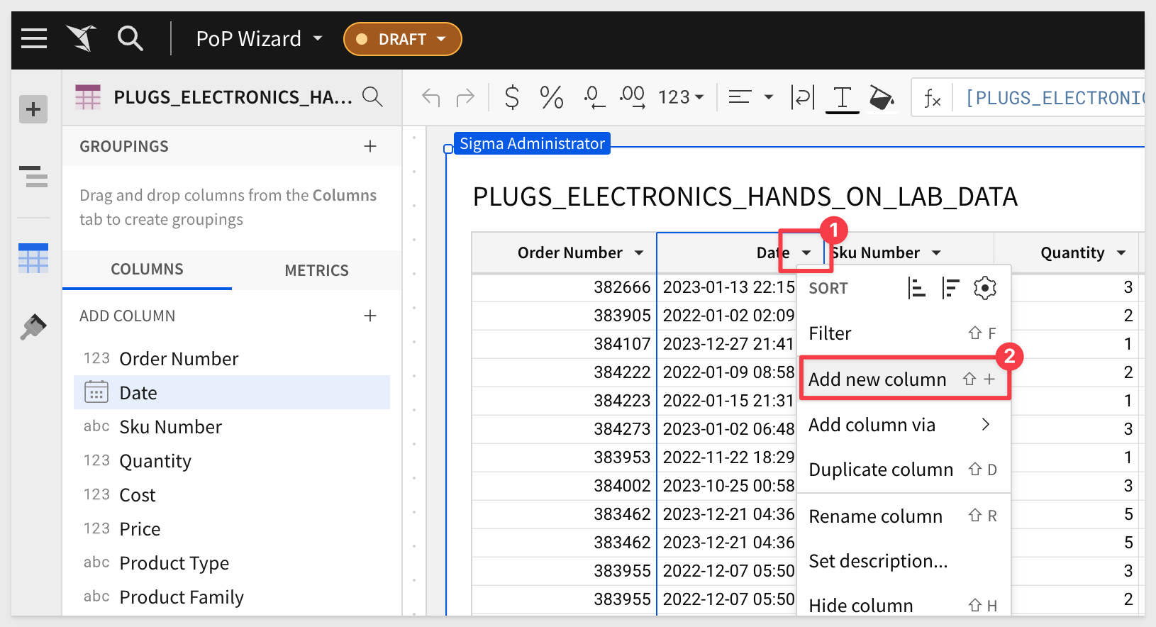
Rename this column to Revenue and set its formula to:
[Price] * [Quantity]
Save your workbook.
Sigma's guided workflow for building period-over-period analyses provides a quick and convenient way to create basic historical comparisons.
It allows users to generate dynamic period comparisons, without entering complex custom formulas, then easily visualize the results to identify trends, patterns, and anomalies.
For this example we are interested in holiday sales in December, over time. To do this, we will use Sigma's PoP wizard to create a grouped table that shows the revenue, amount of difference, and percentage change year over year.
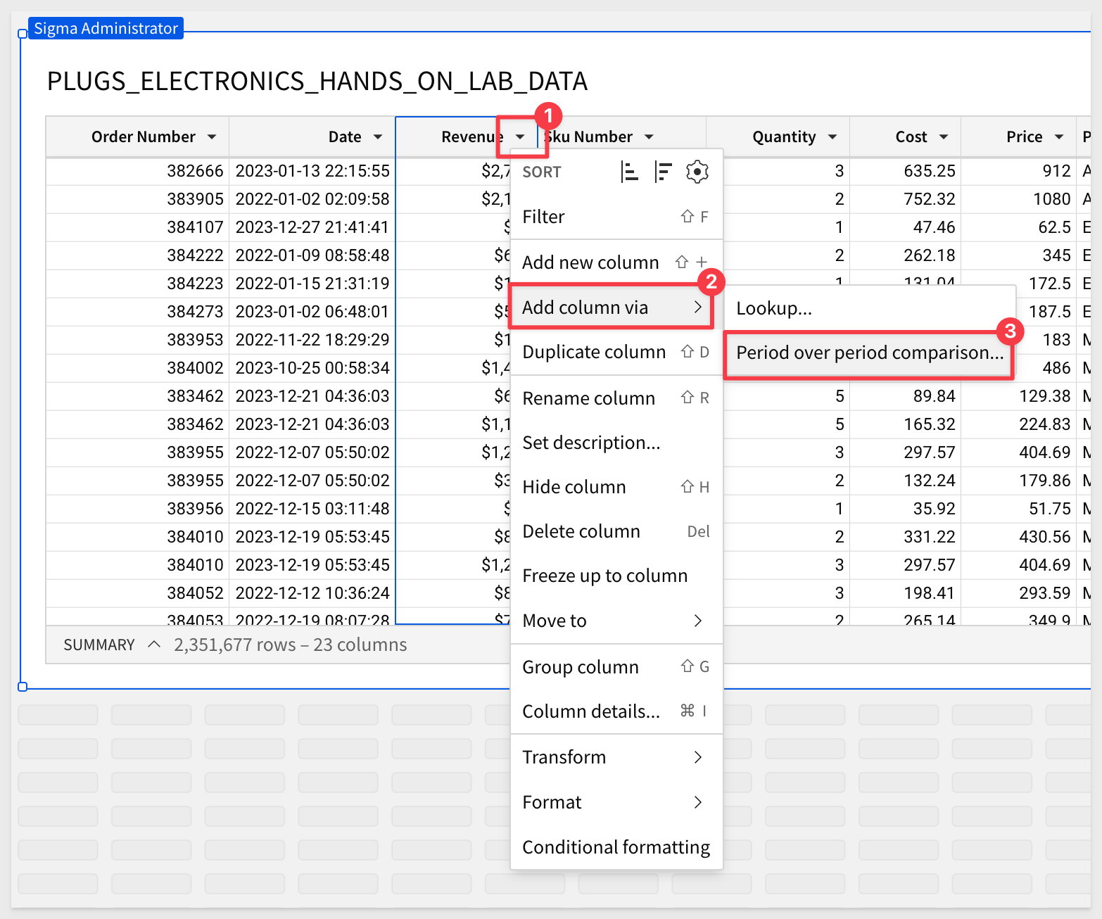
Open the Revenue column's menu and select Add column via > Period over period comparison...:
We are presented the PoP Wizard where we can configure for the output we are interested in. In this case, we want to sum revenue, using the date column and compare the Same month last year:
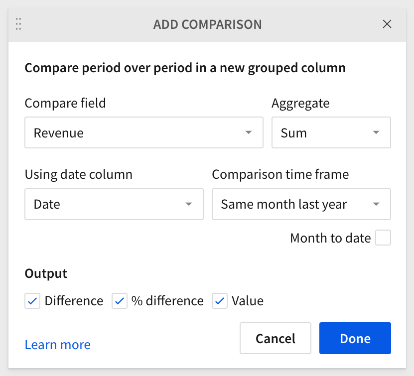
To read more about all the options that are available, and there are many, refer to Sigma's documentation on PoP analysis.
Three calculations are created for us by the wizard (number 1 in the screenshot) and the table is grouped by Date for us too:
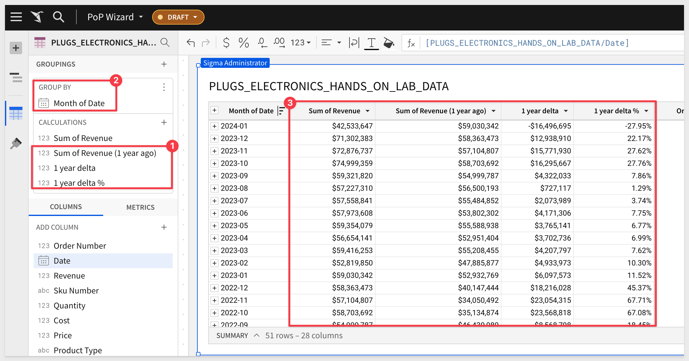
This gets us close to what we wanted but we are showing all the months for each year and we only really wanted December sales.
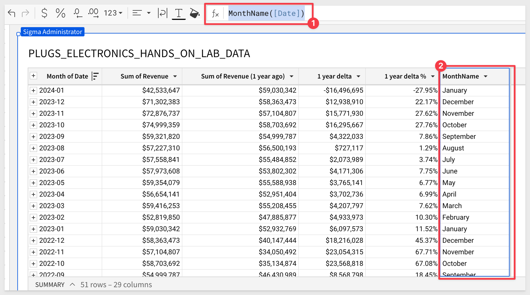
A simple way to achieve this is to add a column for MonthName (anywhere in the table really), and set the formula to:
MonthName([Date])
This will provide the name of the month for each row, based on the Date column:
Now we simply set a new filter on the MonthName column to only show December:
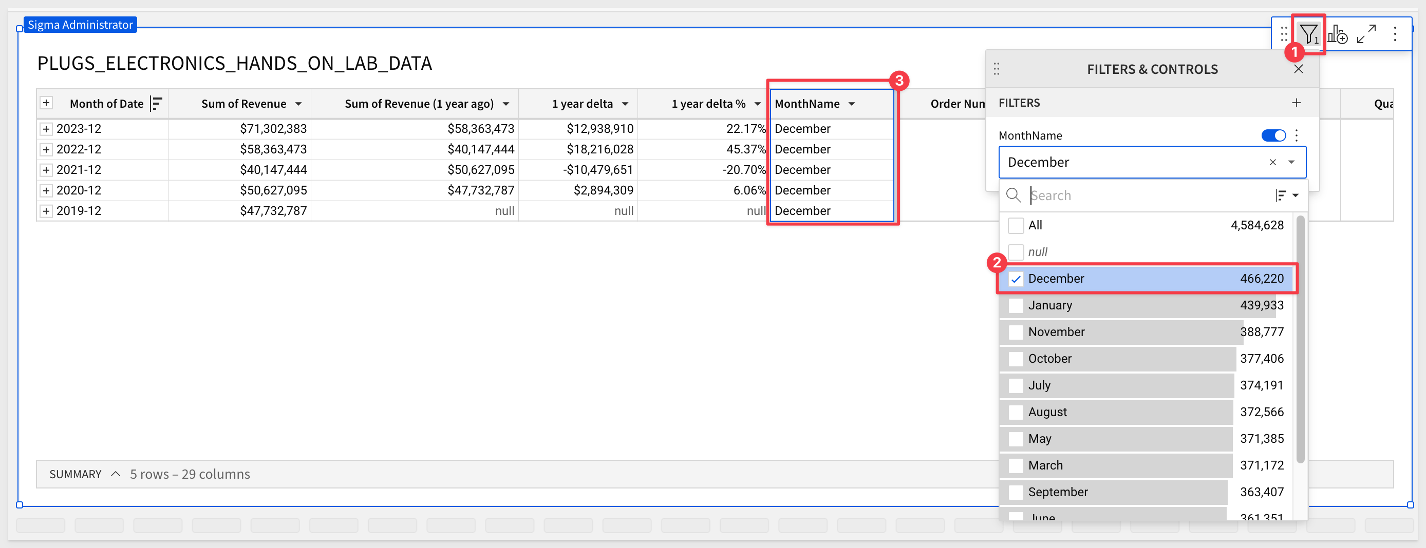
Since 2019 is the last year, there are nulls in the data for 2018 (in this example). We filter on one of the columns having a null value and uncheck the check from Include nulls:
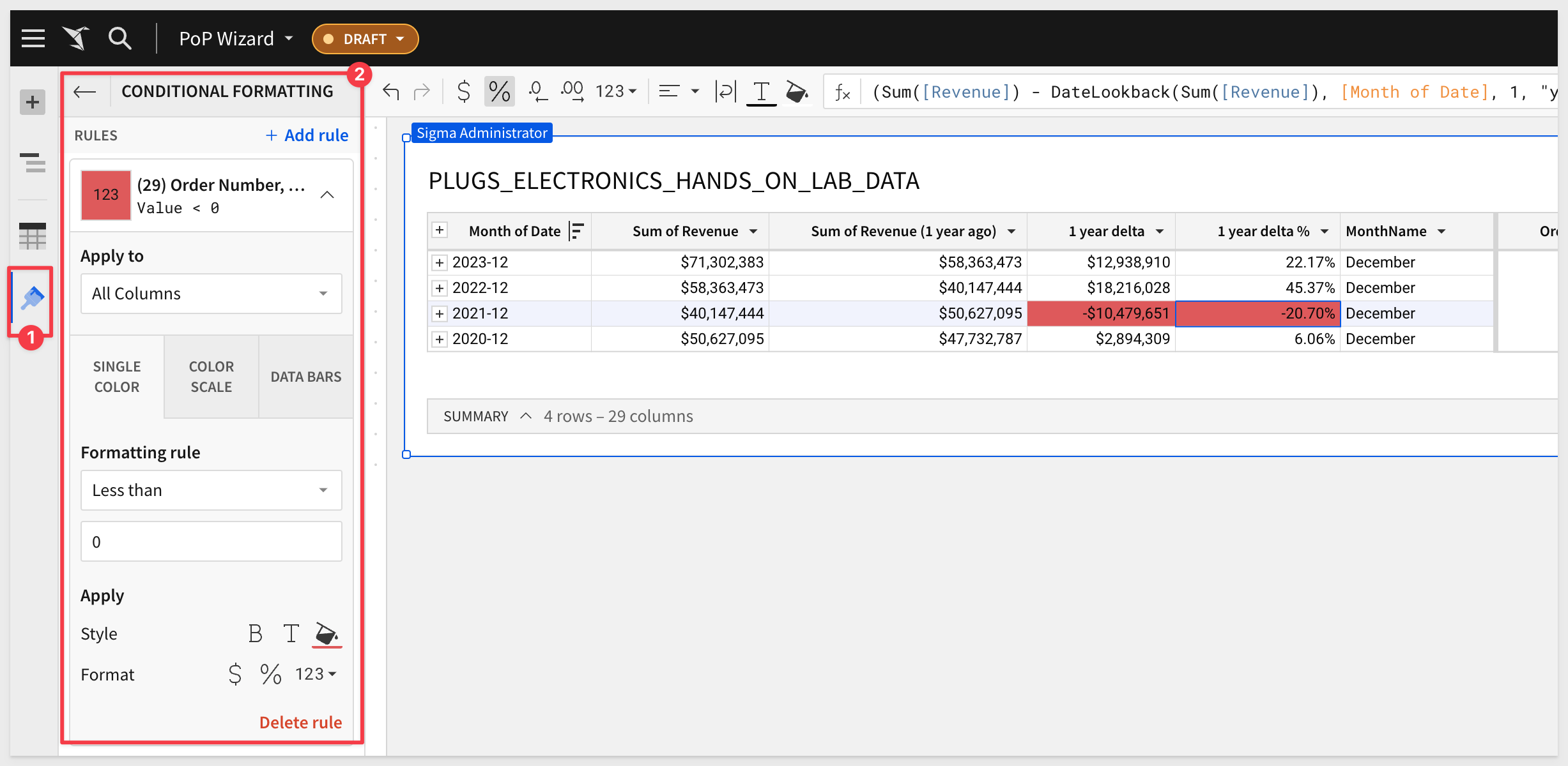
We now have our analysis and can easily further manipulate it or build child visualizations from this base table.
We added simple conditional formatting to negative value cells:
Sigma's PoP wizard is a great time-saving feature for users looking for quick answers, but it only supports simple logic. That's because wizards tend to limit the power in exchange for ease of use and speed.
Rolling period comparisons require a little more work, but easy to do in Sigma.
Let's do a similar PoP analysis to we did in the last section, but expand it just a little more, use rolling 30 days, and also present the data in a different way.
New page with sample data
Our starting point will be a new Page in the workbook we last used.
On this new Page we will add the PLUGS_ELECTRONICS_HANDS_ON_LAB_DATA table which is made available to all customers via the Sigma Sample Data connection.
 ### Add summary columns Click on the word `Summary` (as shown below) and click the `+` to add a new summary item and select `New summary` from the top of the list:
 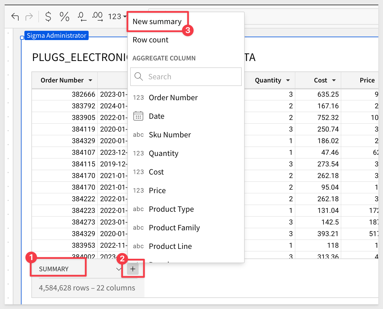 Click on the up arrow on the new `Summary`, which has the default name of `calc`. Select `Rename column` and set its name as `Period Start`:
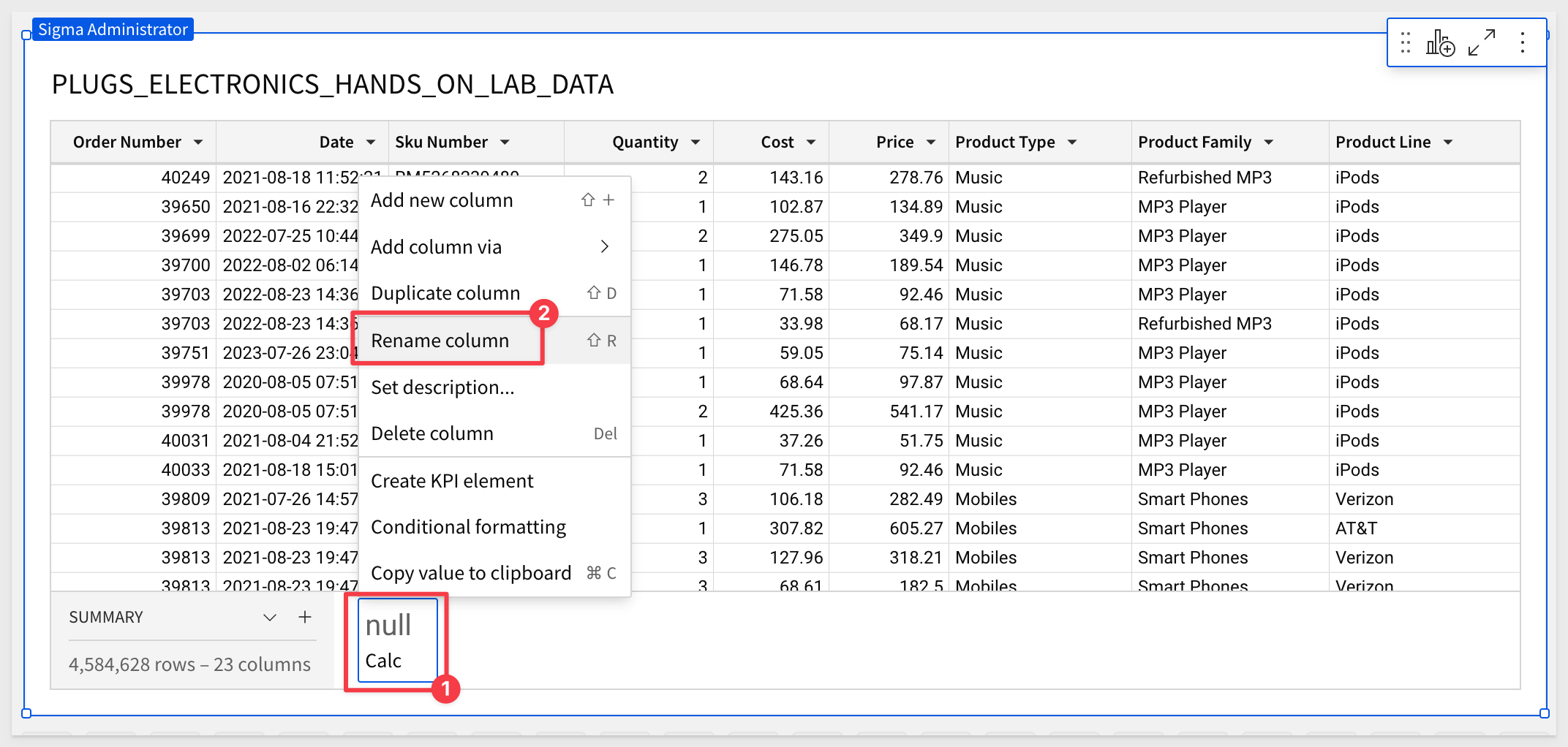
Repeat this process, adding new summaries for:
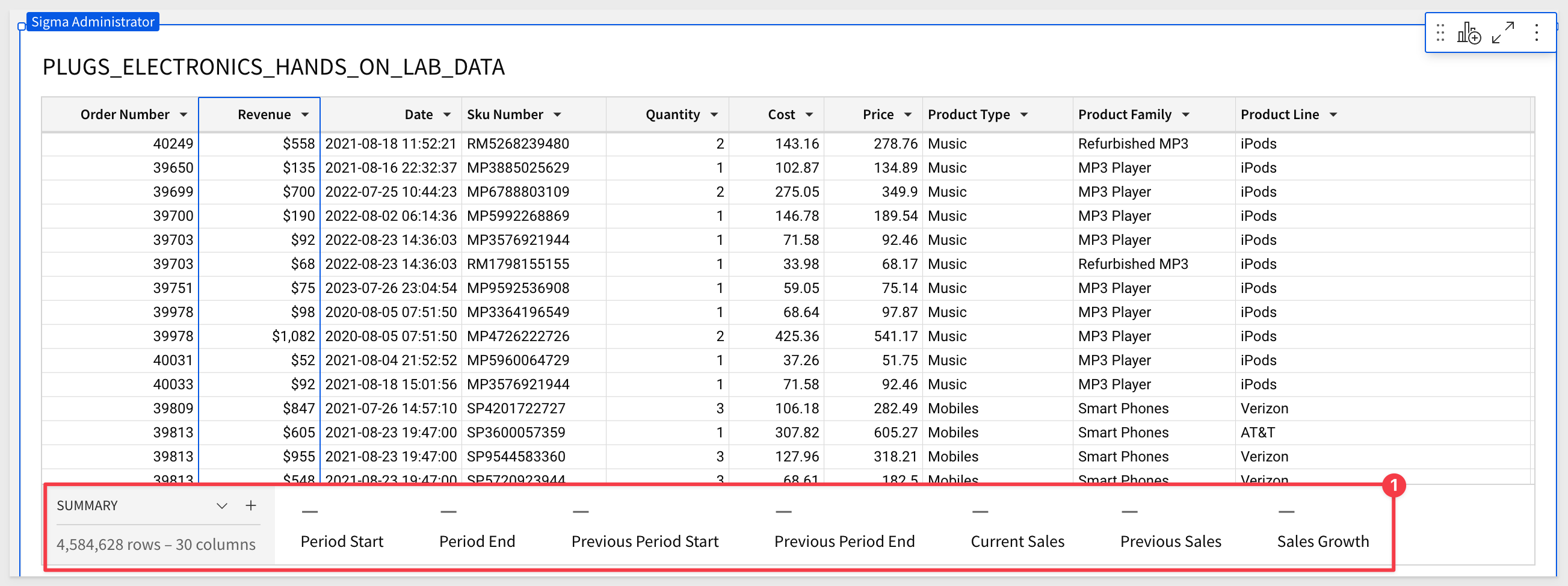
You table should now look like this:
Add calculations
Now that we have our "framework", let's figure out the start and end dates for each time frame using two simple date functions; DateAdd() and Today().
For the Period Start date of the current period, which is 30 days before the end date.
Select the Period Start summary and set its formula to:
DateAdd("day", -30, [Period End])
```

This will evaluate to `null` at first because we have not set a formula for `Period End`. That is fine, proceed.

<img src="assets/pop15.png" width="800"/>

Next, select the `End Period` summary and set its formula to:
```copy-code
DateAdd("day", -1, Today())
```

Now we have values for `Period Start` and `Period End`:

<img src="assets/pop16.png" width="800"/>

We just need to repeat this process to add calculations for the `Previous Period Start` and `Previous Period End` summaries. For those two, use these calculations:

For `Previous Period Start`, the previous period is one year before the current period's start date. You can find it by subtracting one year:
```copy-code
DateAdd("year", -1, [Period Start])
For Previous Period End, the previous period is the same as the current period's end date, but one year earlier. You can find it by subtracting one year:
DateAdd("year", -1, [Period End])
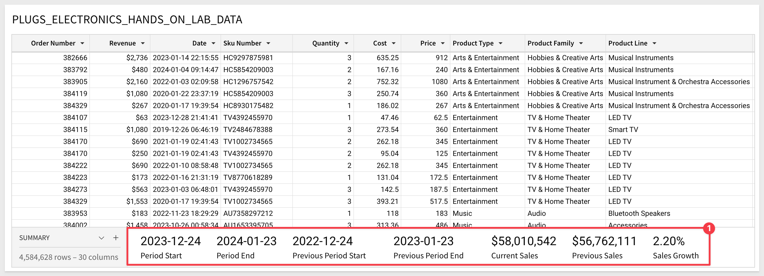
To find Current Sales for the current time frame, we need to add up the sales that happened between the start and end dates, for the current period:
SumIf([Revenue], Between([Date], [Period Start], [Period End]))
To get more information on SumIF, click here.
To find the sales for the previous time frame, add up the sales that happened between the start and end dates for the previous period, using this formula:
SumIf([Revenue], Between([Date], [Previous Period Start], [Previous Period End]))
For the last summary, we need to calculate the percent of sales growth. To do this, we subtract Previous Sales from Current Sales, then divide that by sales from Previous Sales.
Here is that formula:
(([Current Sales] - [Previous Sales] ) / [Previous Sales])
Our table now looks like this:
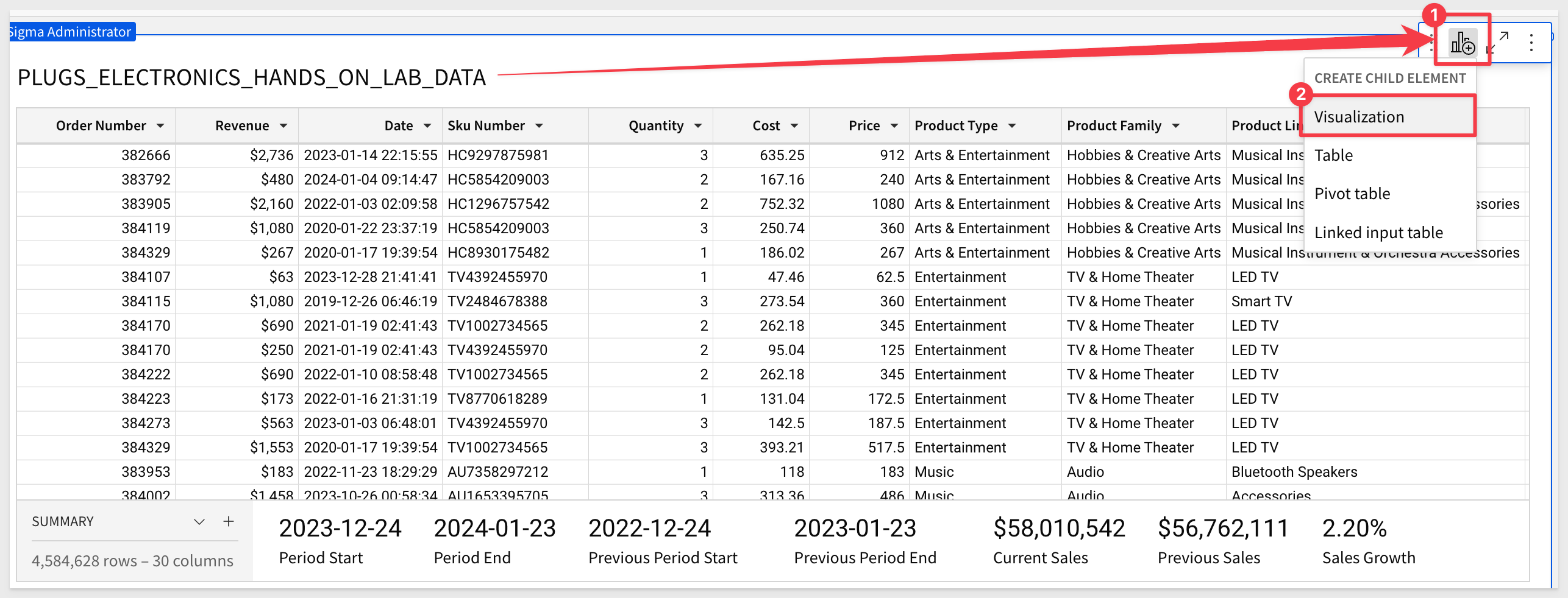
Now that we have summary values, we can use them to drive some visualizations.
Add KPI Charts
Key performance indicator (KPI) charts highlight single metric values and are a great way to simply present performance or progress toward goals.
To learn more about how Sigma performs calculations, check out this QuickStart.
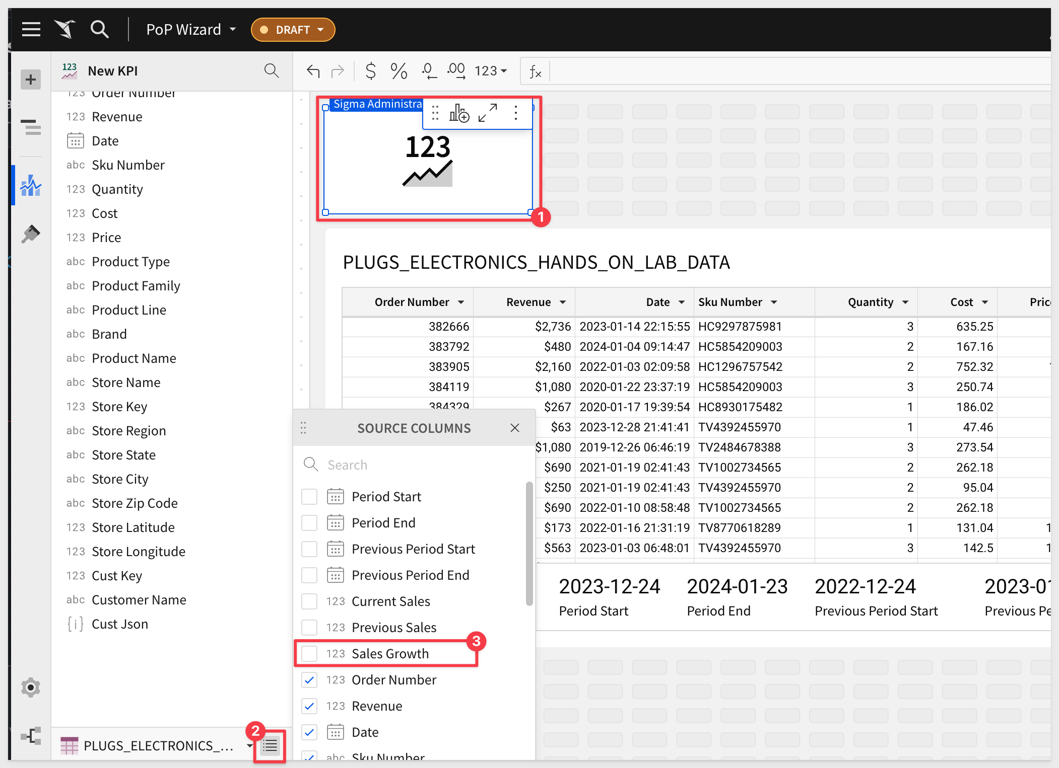
To add a new child element to our table, click the icon to Create Child Element and select Visualization:
Hover and open the dropdown menu for column sources, and check the box next to Sales Growth to make it visible in your KPI Chart:
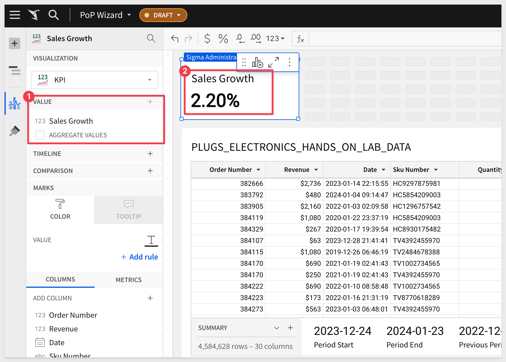
From the column list in the element panel, drag the column Sales Growth into the Value shelf and make sure to uncheck aggregate values.
When aggregate values is unchecked, it tells Sigma to take the source field and display it as it is, rather than summarizing data.
Adding more KPIs is simply a matter of repeating this process for any other summary values we would like to use.
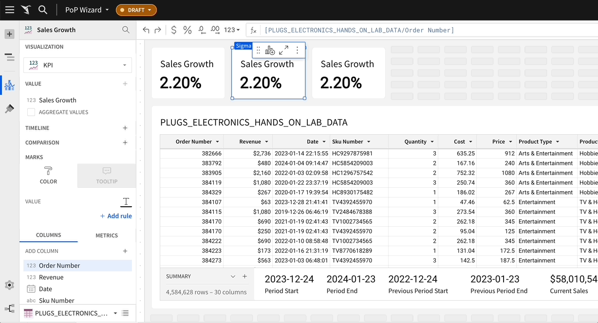
For example, if we add Current Sales and Previous Sales and do a little adjustment to the layout.
A few ways to do this but one quick way is to select the existing KPI, opening its menu and selecting Duplicate:
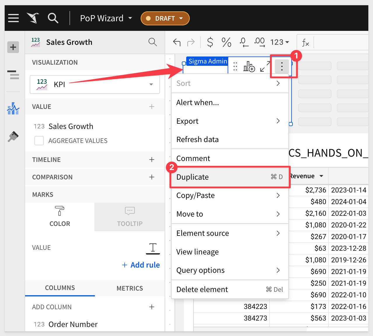
After doing that twice, we can drag the new column over the existing one for each new KPI. This action will replace the columns accordingly:
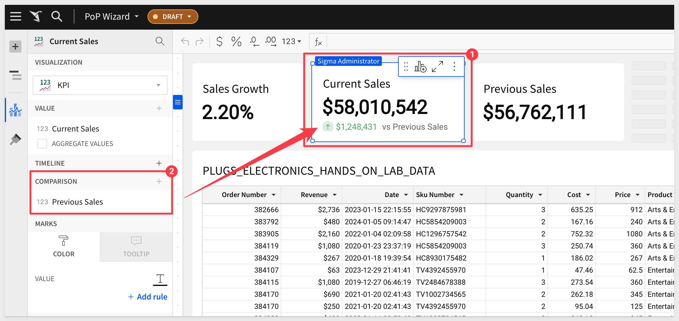
A nice finishing touch is to add a Comparison column to the Current Sales KPI:
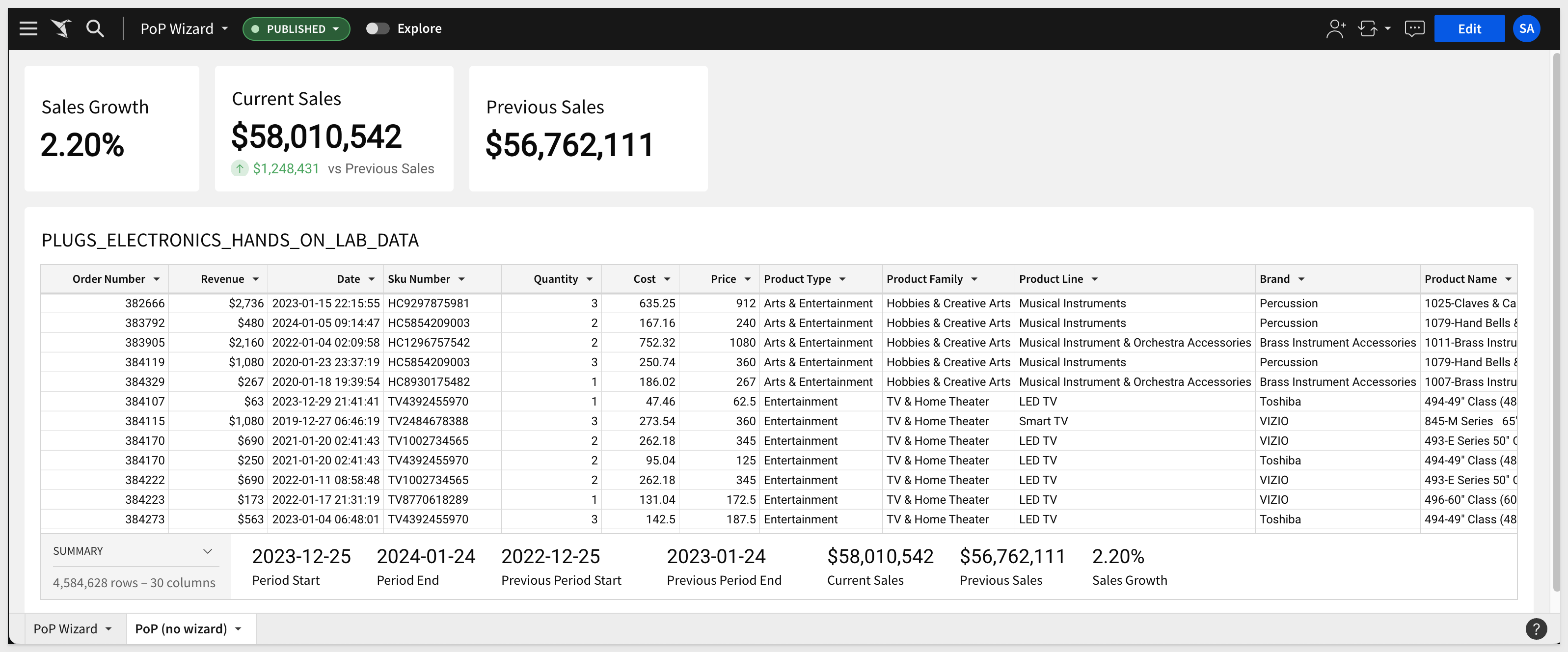
Our PoP analysis now looks like this and we are done:
This QuickStart on period-over-period calculations in Sigma provides valuable insights for effective data comparison across different time-frames.
While Sigma makes PoP analysis easy, there are a few key things to to keep in mind:
These guidelines help in making more accurate and business-relevant interpretations of data, enhancing the utility of Sigma's period-over-period calculations for your business.
Additional Resource Links
Blog
Community
Help Center
QuickStarts
Be sure to check out all the latest developments at Sigma's First Friday Feature page!