This QuickStart is part of a series of QuickStarts designed to instruct new users how to use Sigma to explore and analyze data using Visualizations (Viz).
We will be working with some common sales data from our fictitious company Plugs Electronics, reusing content we created in the QuickStart fundamentals 1 and 2.
Sigma supports a wide variety of types so be sure to check our documentation for the latest list:
Supported Visualizations Types: | |
|
|
For the latest list of supported Viz types, click here.
Target Audience
Sigma combines with the unlimited power of the cloud data warehouse and the familiar feel of a spreadsheet; no limit on the amount of data you wish to analyze. Sigma is awesome for users of Excel and even better for customers who have millions of rows of data.
Typical audience for this QuickStart are users of Excel, common Business Intelligence or Reporting tools and semi-technical users who want to try out or learn Sigma. Everything is done in a browser so you already know how to use that. No SQL or technical skills are needed to do this QuickStart.
Prerequisites
- A computer with a current browser. It does not matter which browser you want to use.
- Completion of the QuickStarts Fundamentals 1 and 2
- Access to your Sigma environment. A Sigma trial environment is acceptable and preferred.
- If have not already, you can sign up for a Sigma Trial here:
What You'll Learn
Through this QuickStart, we will walk through how to use Sigma to create beautiful charts and maps, changing configuration parameters to suit your needs.

Our starting point is the workbook created in the QuickStart, Fundamentals 2: Working with Tables
It is often easier to spot trends, outliers, or insights that lead to further questions when viewing data in a visualization.
Sigma makes it easy to create visualizations of your data while also enabling you to dig into the data that makes up those visualizations.
In Sigma, open the Workbook Fundamentals and place it in edit mode.
Visualization as Child
Our workbook has a page called Data; navigate to that and place the workbook in Edit mode.
Click on the table's icon, as shown below, and click Create Child Element.
Select Visualization from the drop list.
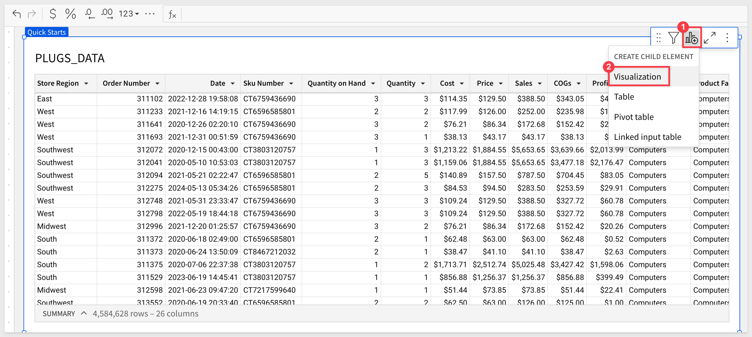
Sigma creates a new page element below the table as an un-configured placeholder for the new visualization.
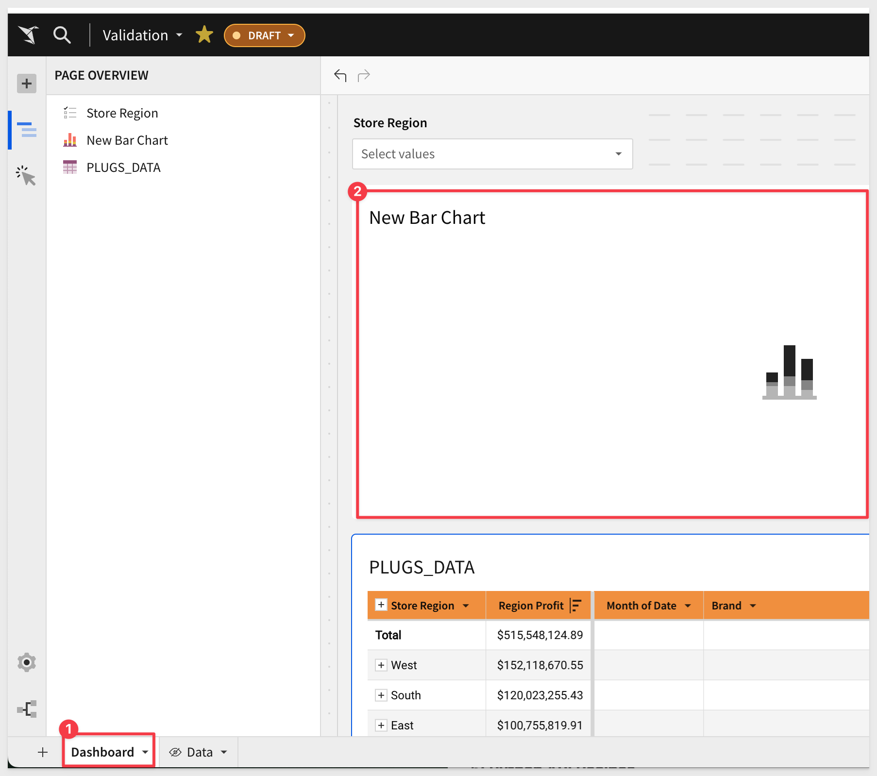
Move the Viz to the Dashboard page:
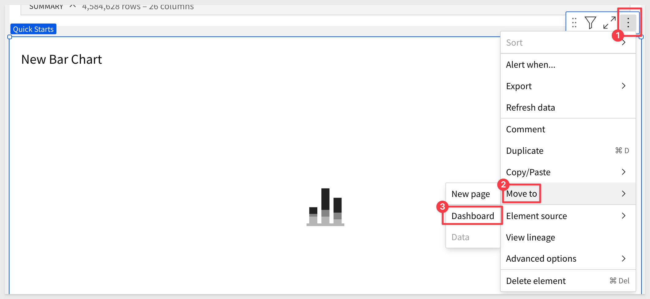
Drag the Viz above the table:
This placeholder is a child of the table, as it references everything in the parent table, making it easy to build whatever visualization we want from that data.
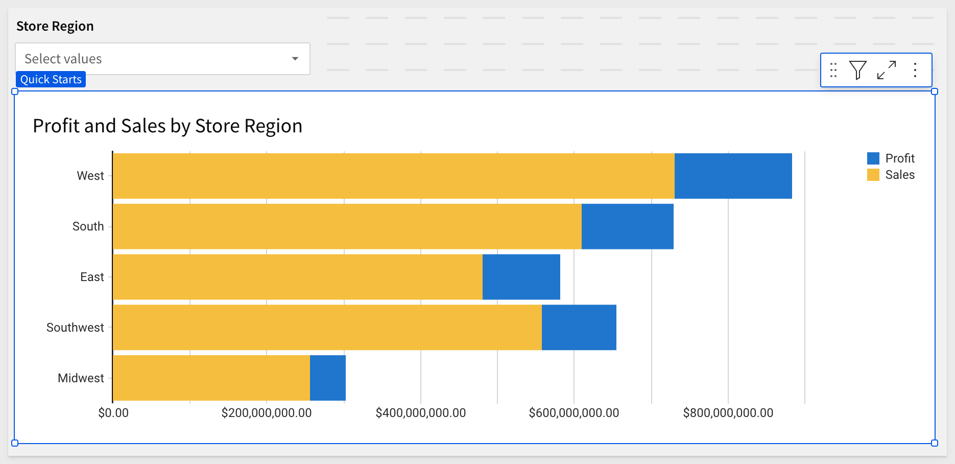
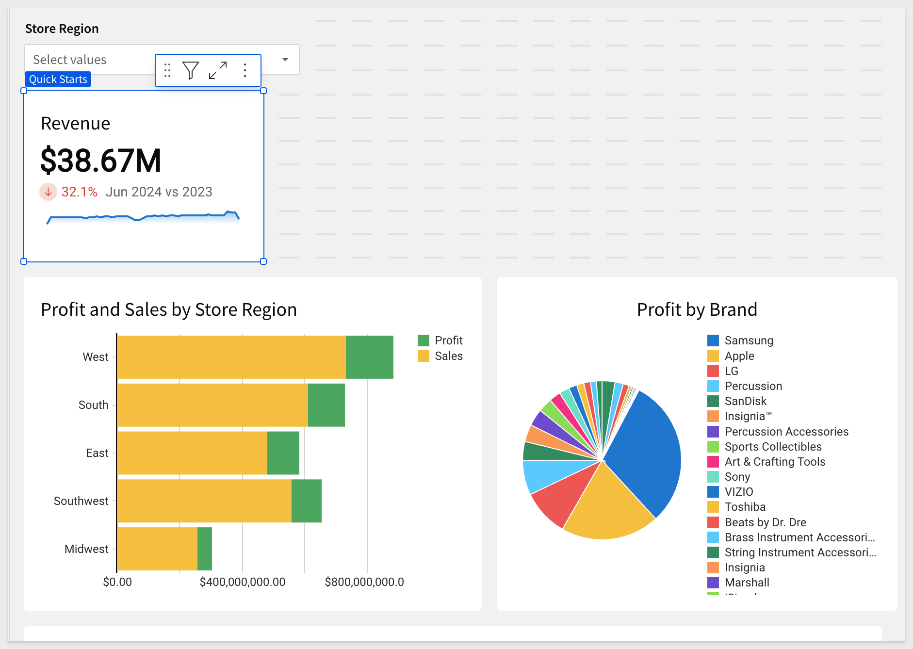
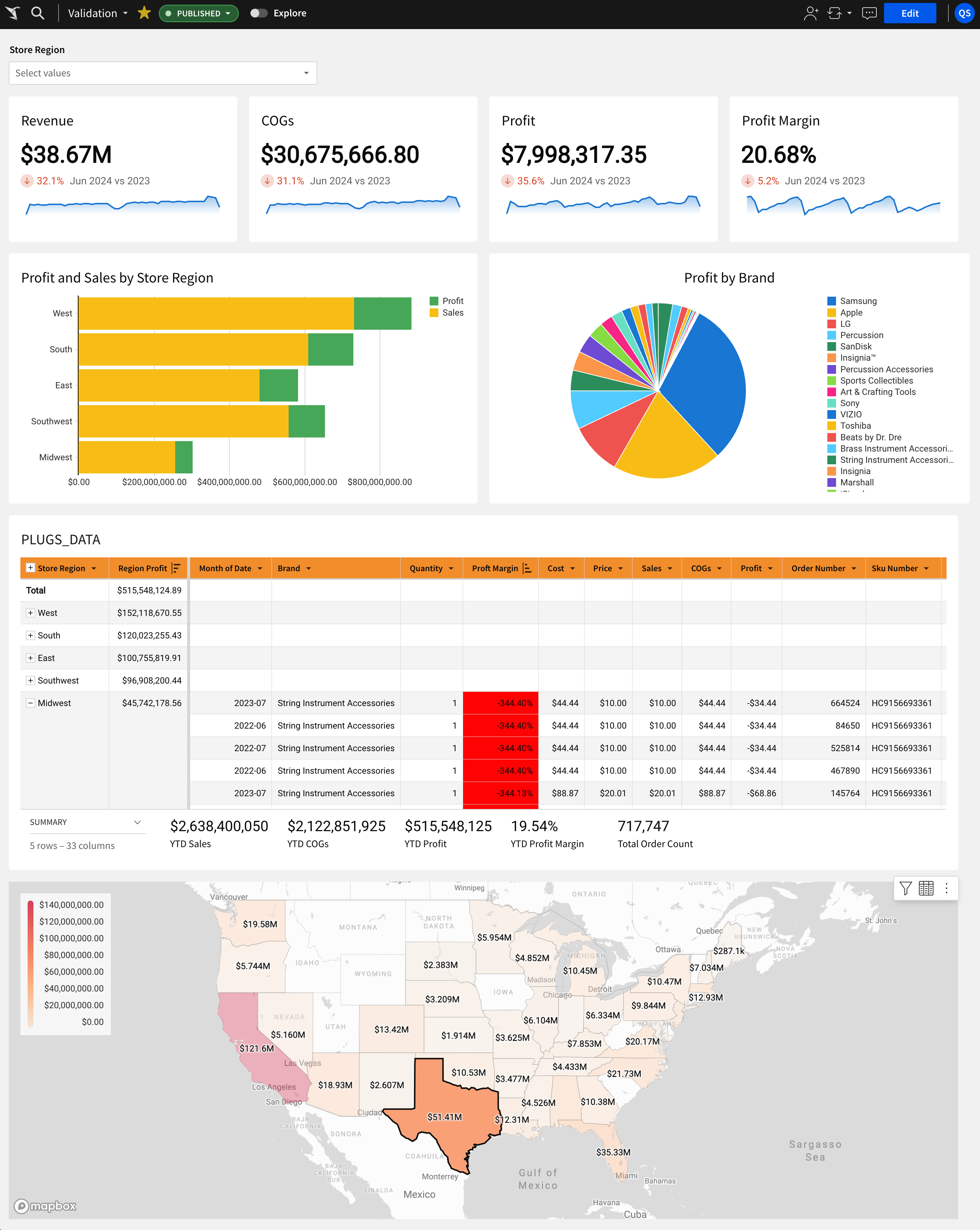
Rename this bar chart reflect Profit and Sales by Store Region.
Now that you have completed the first two QuickStarts in this series, you know how easy it is to use the element panel to configure elements on the canvas.
Use the element panel to configure the bar chart as shown below:
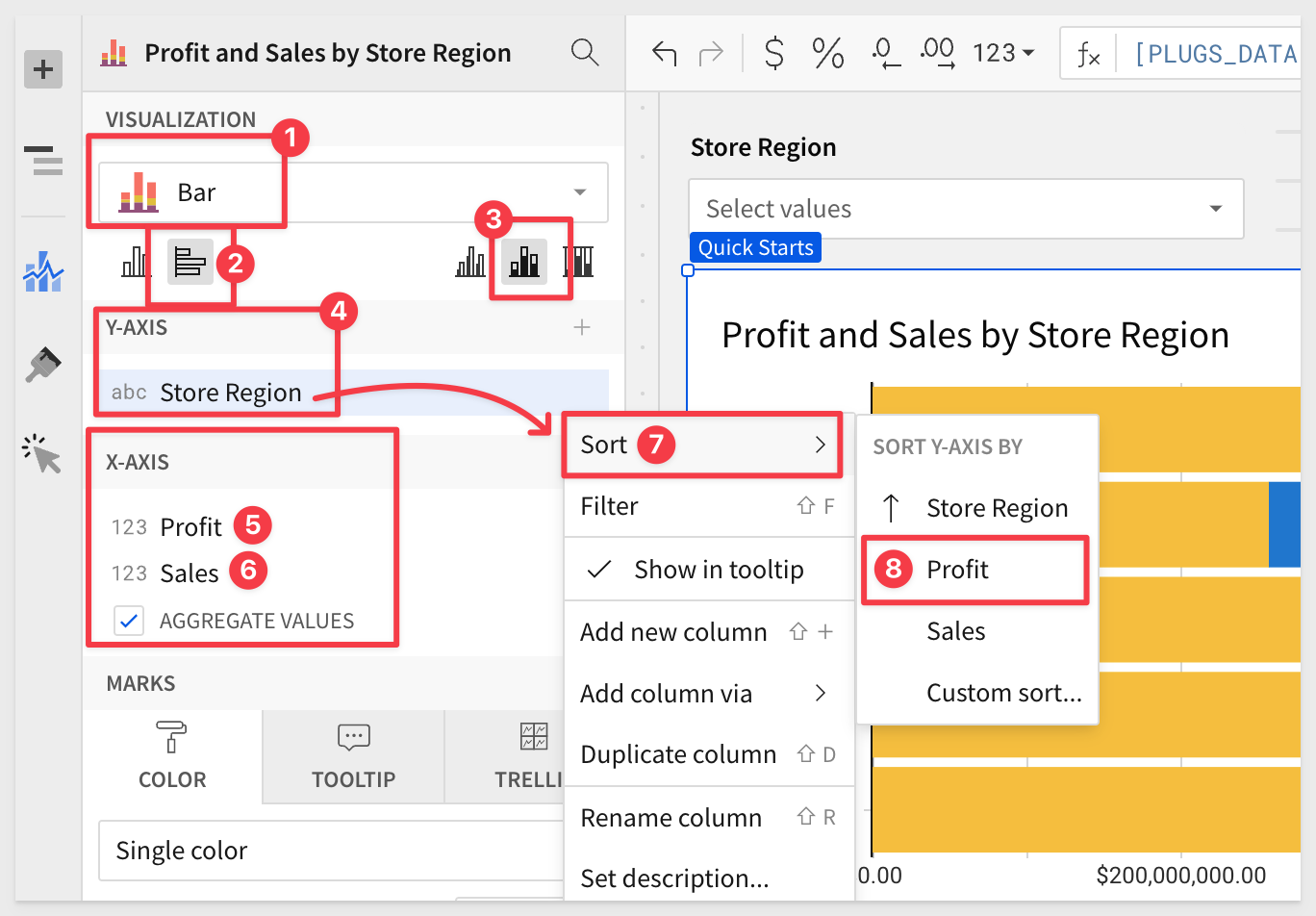
We have our first Viz:
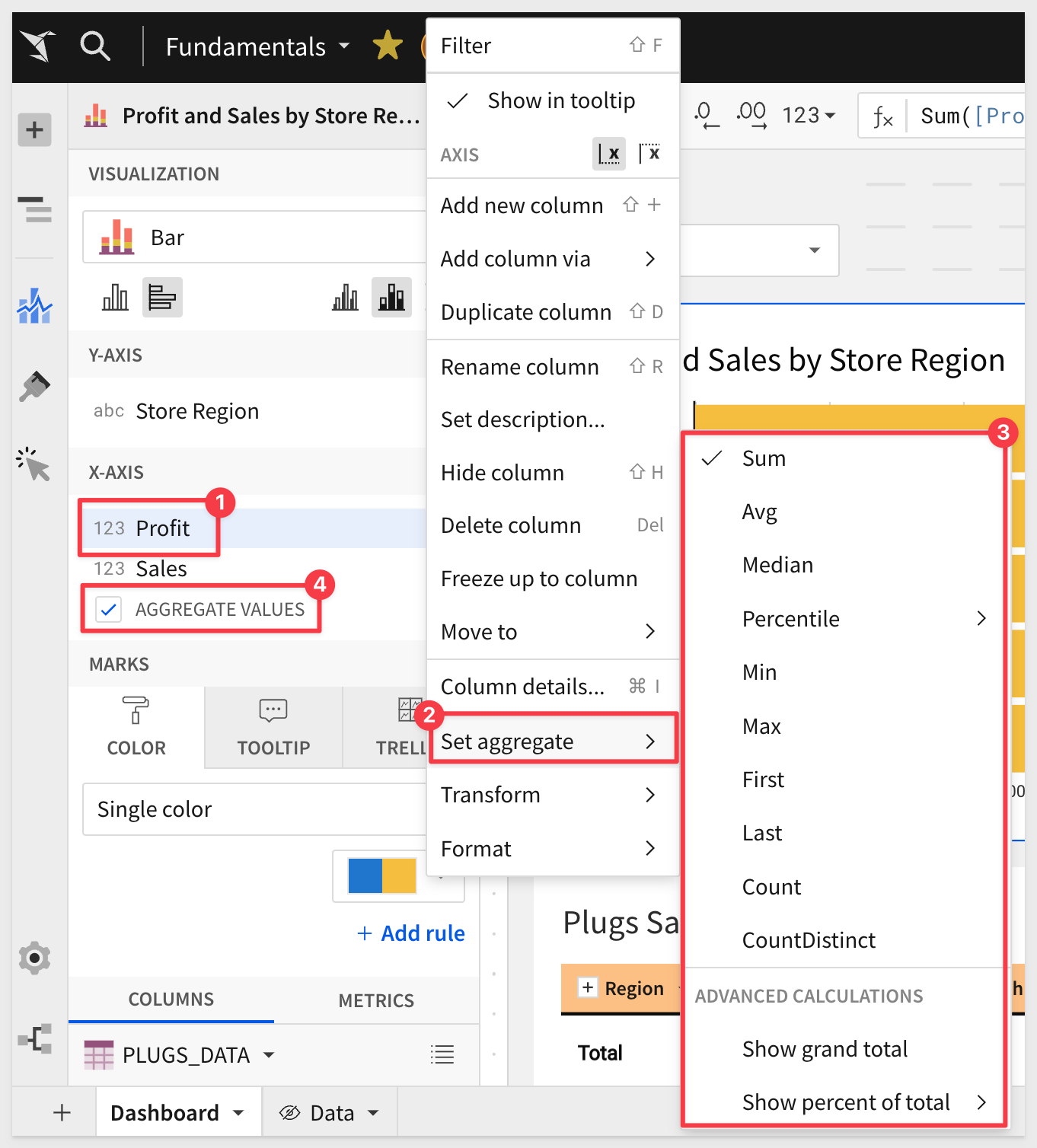
Customizations
We can further customize many of the bar chart's attributes using the Element panel > Chart icon:
Explore both the Chart and Paint Brush (below the chart icon) icons to see what can be customized for the selected chart.
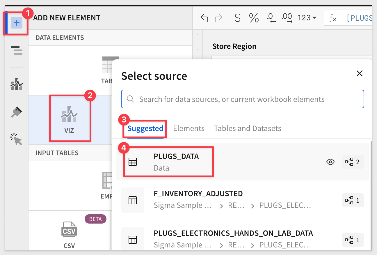
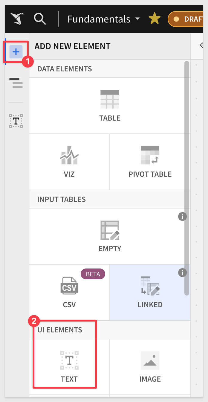
Adding a new Viz
Another way to create a new Viz is by selecting the + icon on the top left panel next to the Page Elements title, and selecting VIZ:
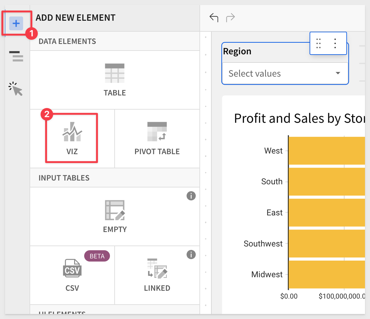
After selecting the ‘VIZ' icon, Sigma prompts us to select a source to use for that ‘Viz'.
We will use the same source selector that we used when we added a table in Fundamentals #2.
We now have a new chart below our bar chart.
Drag the new Viz to be side by side with the bar chart, and use the element panel to configure it as a pie chart:
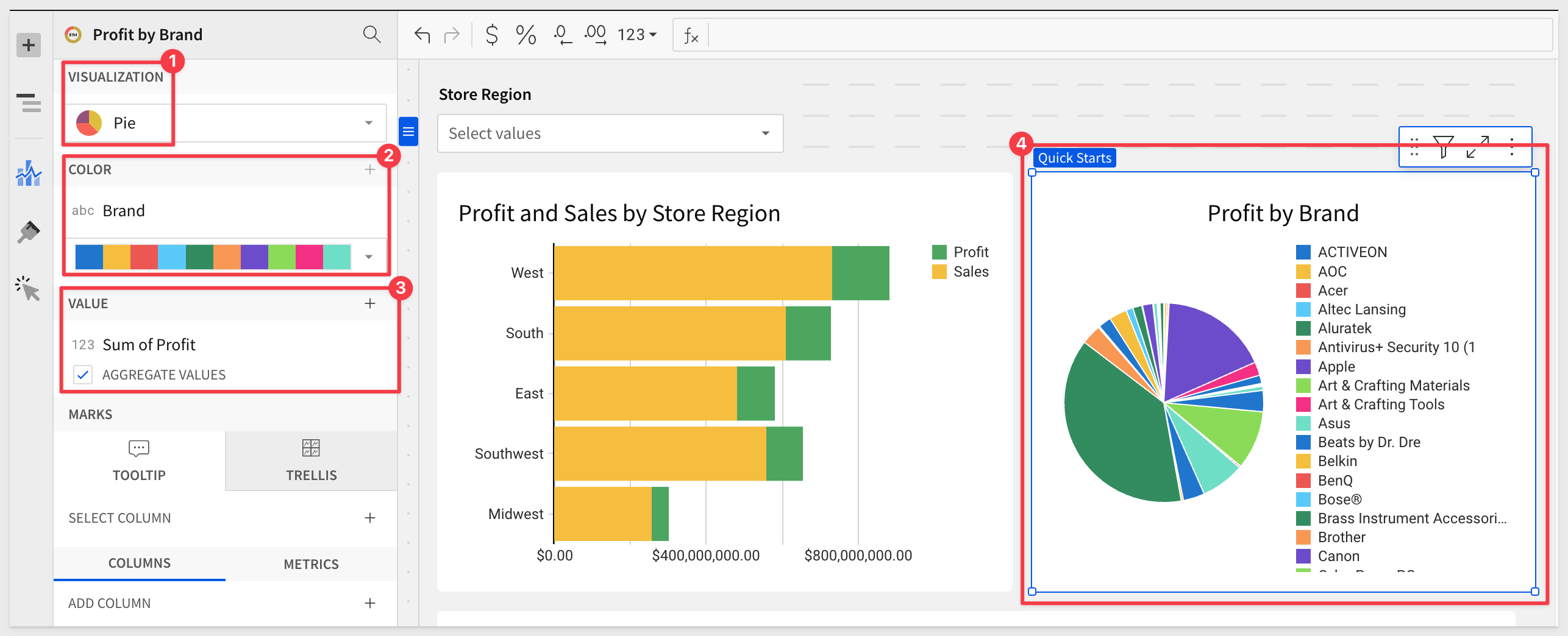
Sort the Brand column by Sum of Profit.
Now we have two charts:
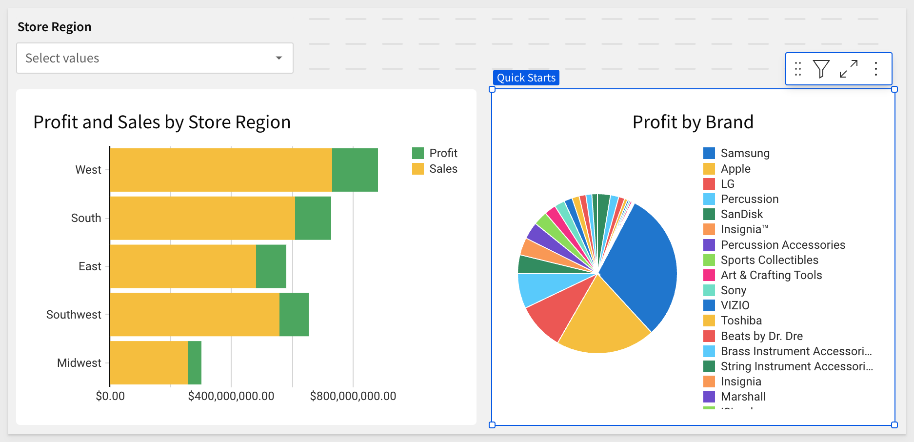
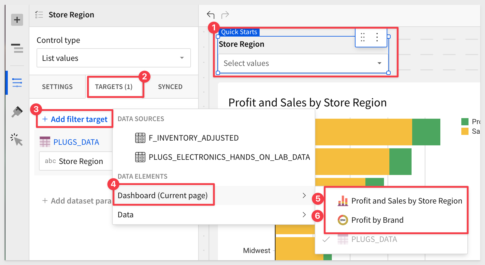
We want the two charts to change when the Region control is changed by the user.
This is done by adding the two new charts as Targets of the control.
Go ahead and add both the charts as targets:
Change the Region control to West. All three page elements change:
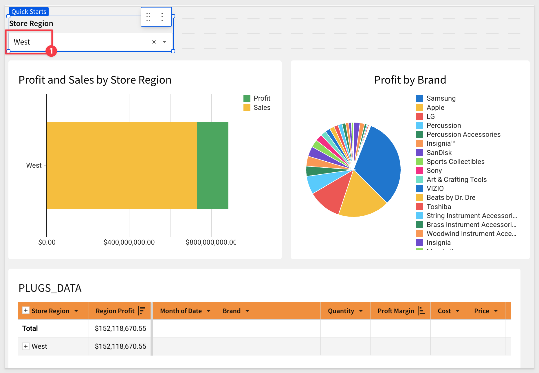
Clear the Store Region control.
Click Publish.
There are many different chart-type visualizations available to experiment with; we will not cover them all since they are all added and configured as we have already done.
As you have seen, there are many different types of visualizations available, and they all follow the same basic workflow.
Once you know how to create one, the others will be obvious.
For example, let's say we want a KPI that shows Revenue, and compare the current month with the same month from the previous year.
Add a new Viz, set its data source to the PLUGS_DATA table on the Data page, and change the VISUALIZATION type to KPI.
Now simply use the element panel as before to configure the KPI as shown below:
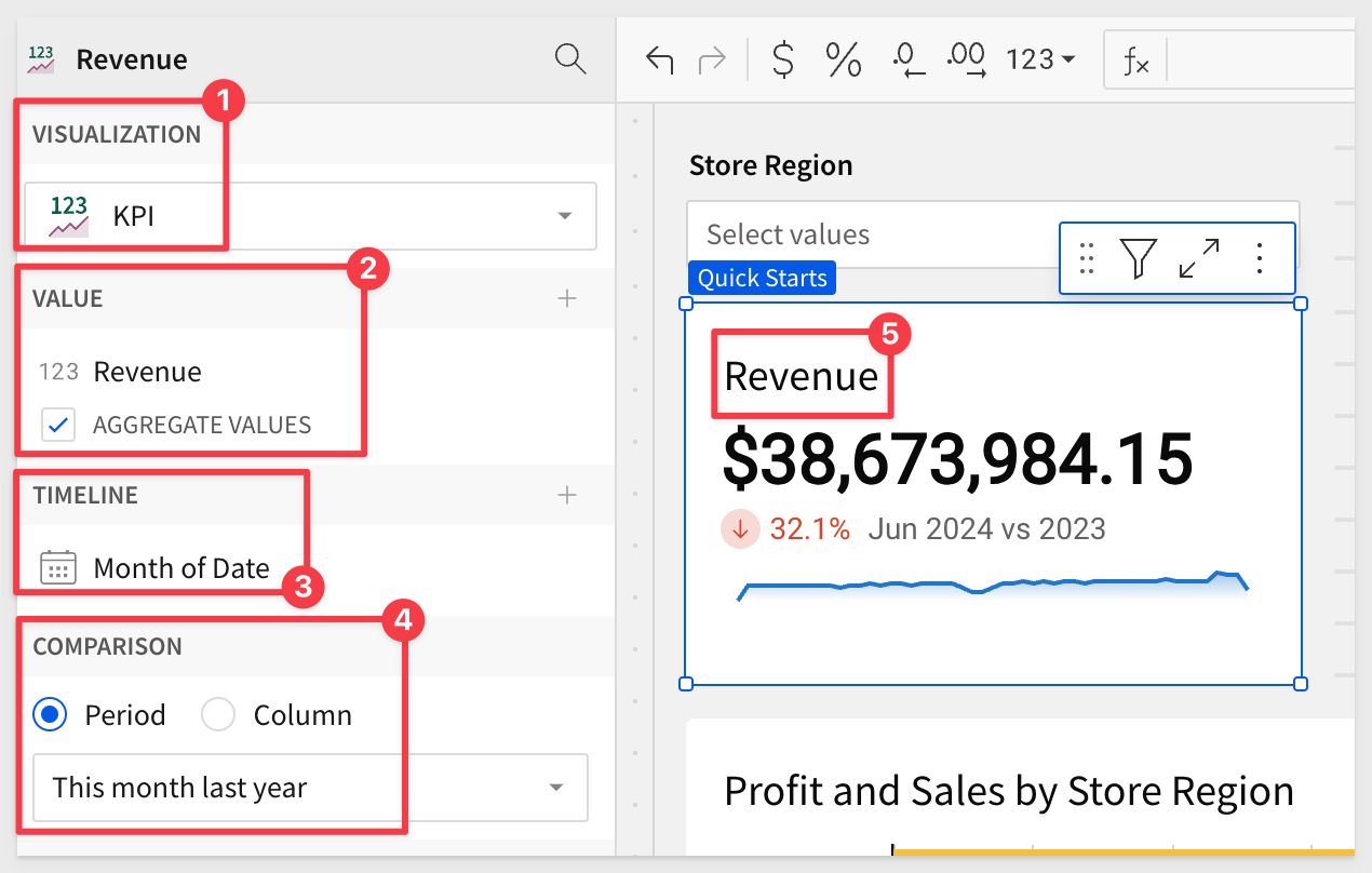
These steps are very much like ones that we have already done, which makes this straightforward.
The exception might be how to get the value formatted as in millions, instead of the default.
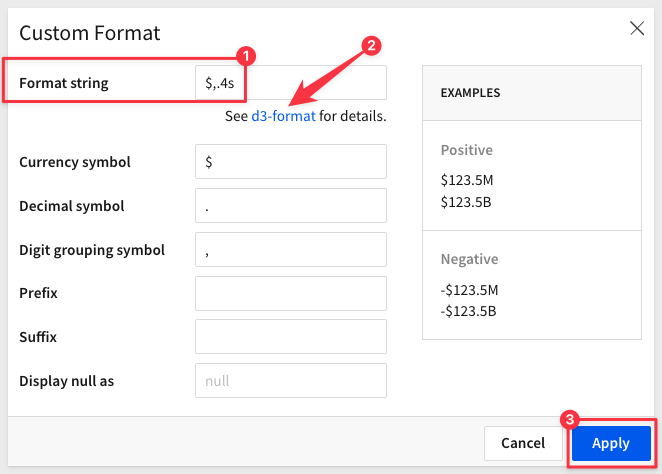
In the VALUE element, open the menu for Revenue > Format and select Custom:
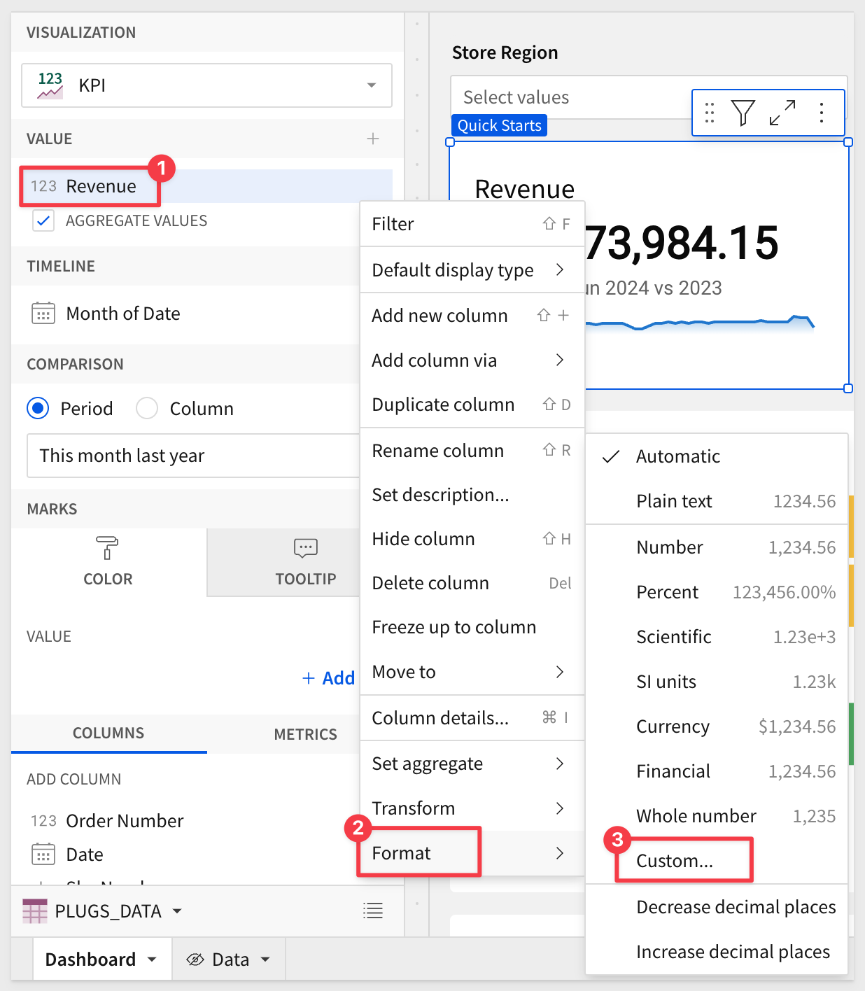
The Custom Format modal lets us adjust how the data is displayed using standard formatting, based on D3.js (D3).
D3 is a free, open-source JavaScript library.
The Dashboard should now look similar to this:
Click Publish.
Add other KPIs as you like; for example, COGS, Profit and Profit Margin would be good to add.
One way to do this is simply use the Revenue KPI menu and select Duplicate to quickly create copies.
COGS and Profit are done by swapping the VALUE column from Sum of Sales to COGS and Profit respectively.
However, this does not work for the Profit Margin column. Why not?
In looking at our Data page > PLUGS_DATA table, we have a column for Profit but that is profit in dollars. We are looking for margin.
We could add Profit Margin to our source data (and that is best practice) but in this case, we will add the formula in the KPI, just to demonstration that functionality exists.
With the target KPI chart selected, click the + and Add new column:
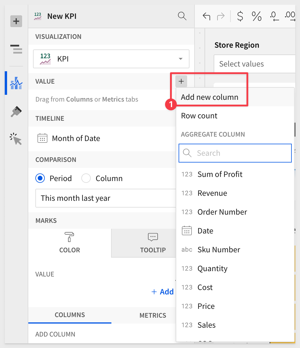
Use the following formula for the Profit Margin value:
Sum([Sales] - [COGs]) / Sum([Sales])
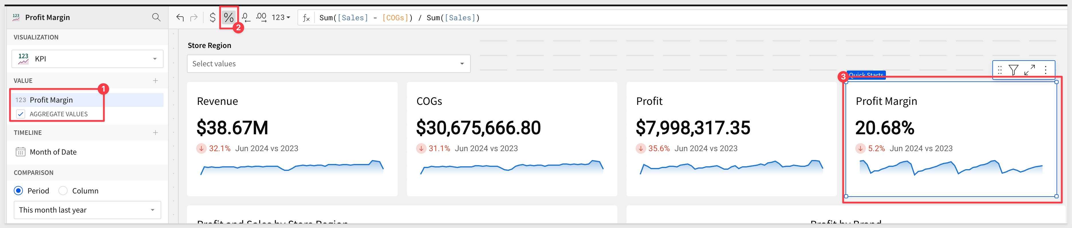
The Dashboard should now look similar to this:
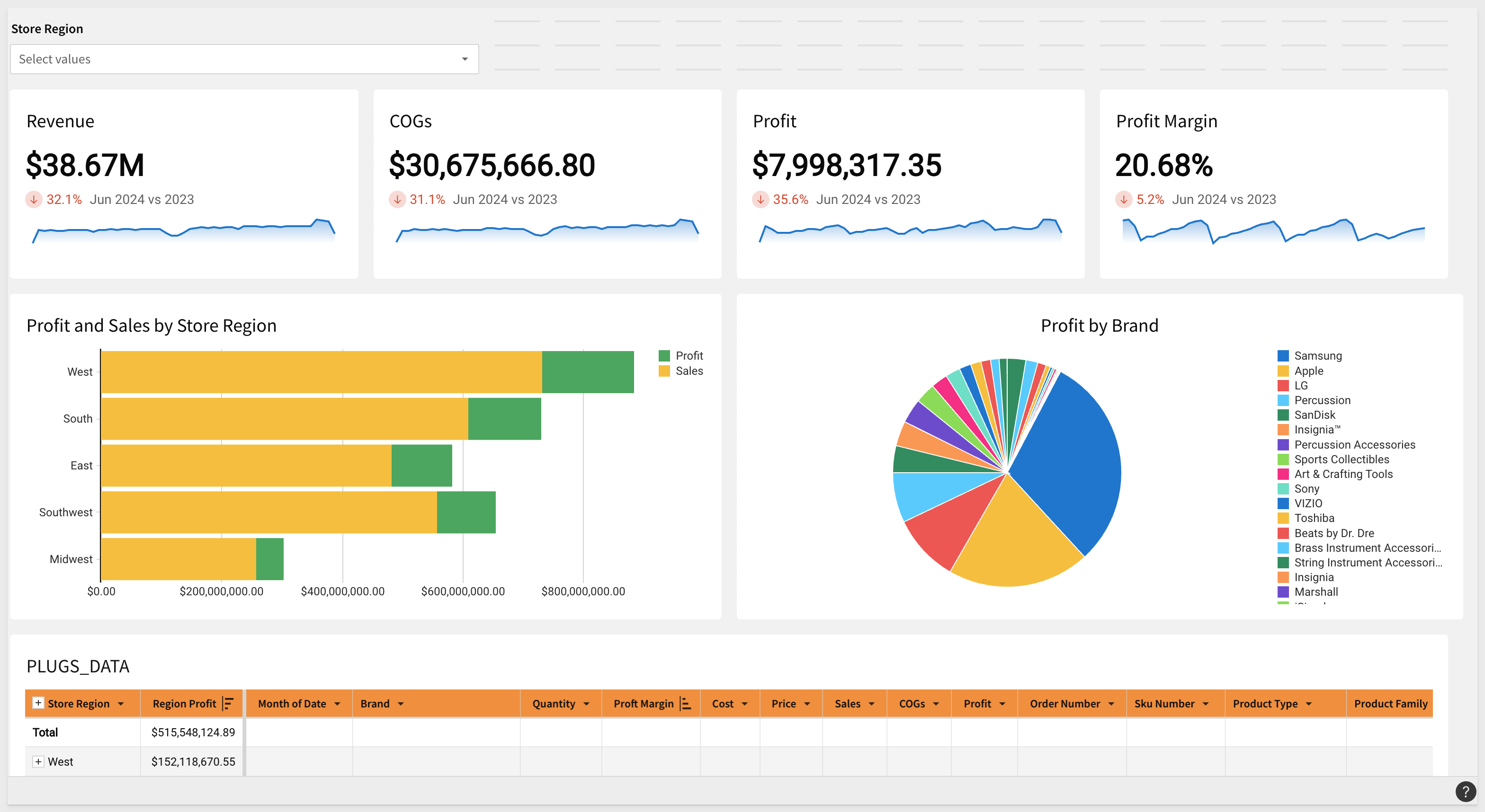
Click Publish.
Read more about KPI charts here.
Geographic data can tell a powerful story. Whether analyzing regional trends or plotting sites, maps are packed with insights generated from your location data.
Sigma Maps help contextualize geospatial information and provide greater understanding when analyzing data. With Sigma, you can create interactive maps using regions, latitude and longitude, or map paths and areas utilizing GeoJSON.
Workbooks support three distinct map types: Region, Point and Geography:
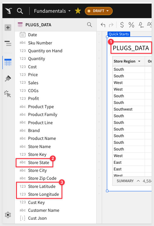
- Region: Require a single text column on the map's REGION field. For example, you can use a column "US State" to distinguish between "regions" or states in this example
- Point: Require a number column on both the map's LATITUDE and LONGITUDE fields. For example, you may want to show store locations on a map.
- Geography: Support datasets with geography data (WKT format) or variant data (GeoJSON format) and are typically used to illustrate geospatial objects on a map.
Our PLUGS_DATA table has columns for the Region and Point map types:
Json Data
You many have noticed there is a column called Cust Json that has some odd looking cell data in it:
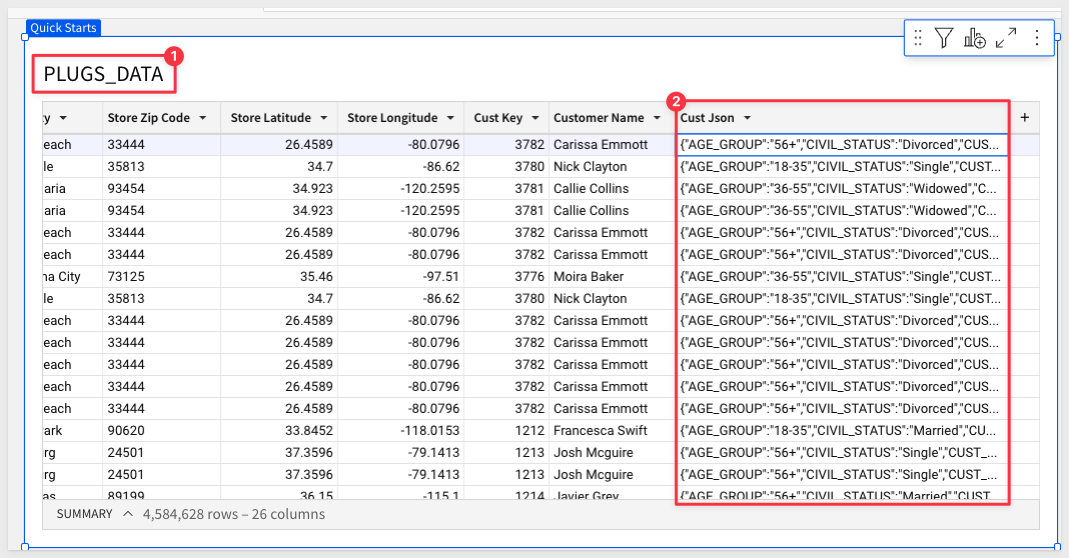
In the case of mapping, this json data contains state and region fields we might want to use for a map.
This data is stored in the warehouse using the Json format. It is common to see data stored this way and this can present a challenge as it needs to be transformed somewhere in an organizations data management workflows.
We have seen many instances where data is received from a third party in this format and everything slows down as importing it can be problematic.
Sigma can extract json data in seconds. To read more about that, see the Parsing JSON Data in Seconds QuickStart.
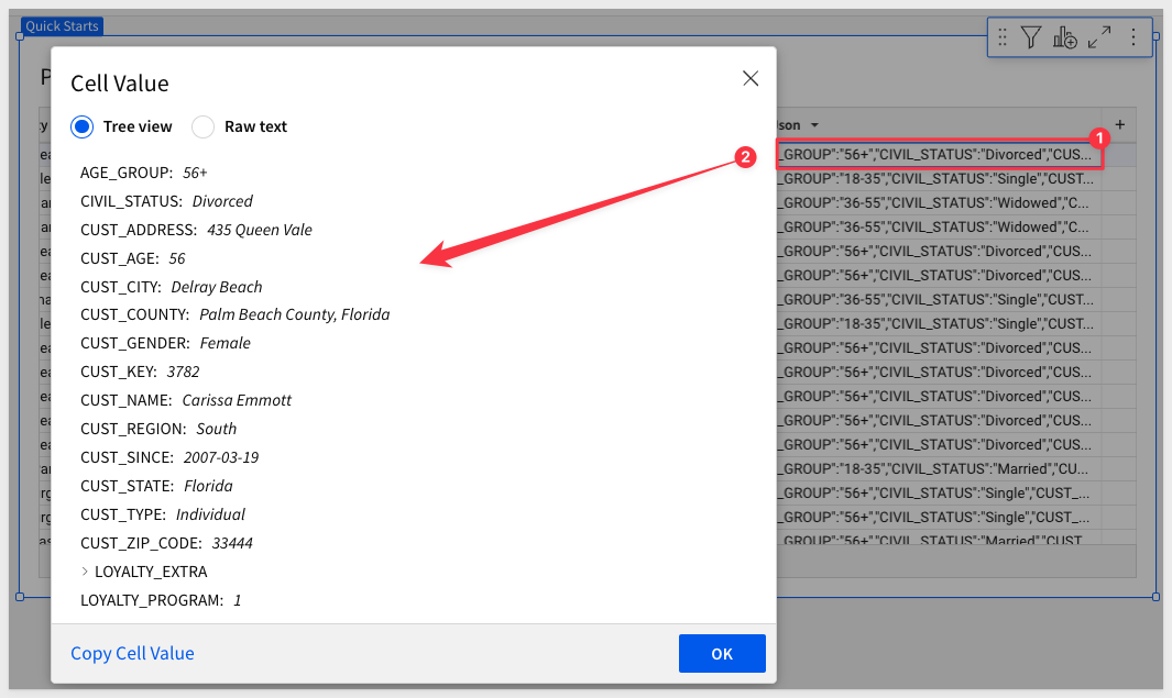
If we just want to see what is "inside" the json data, just double-click one of the column cells:
Since our PLUGS_DATA table already has Store State we can just use that for demonstration.
Map by Region (State)
Add a new Viz, set its data source to the PLUGS_DATA table on the Data page, and change the VISUALIZATION type to Map-Region.
Now simply use the element panel as before to configure the map as shown below:
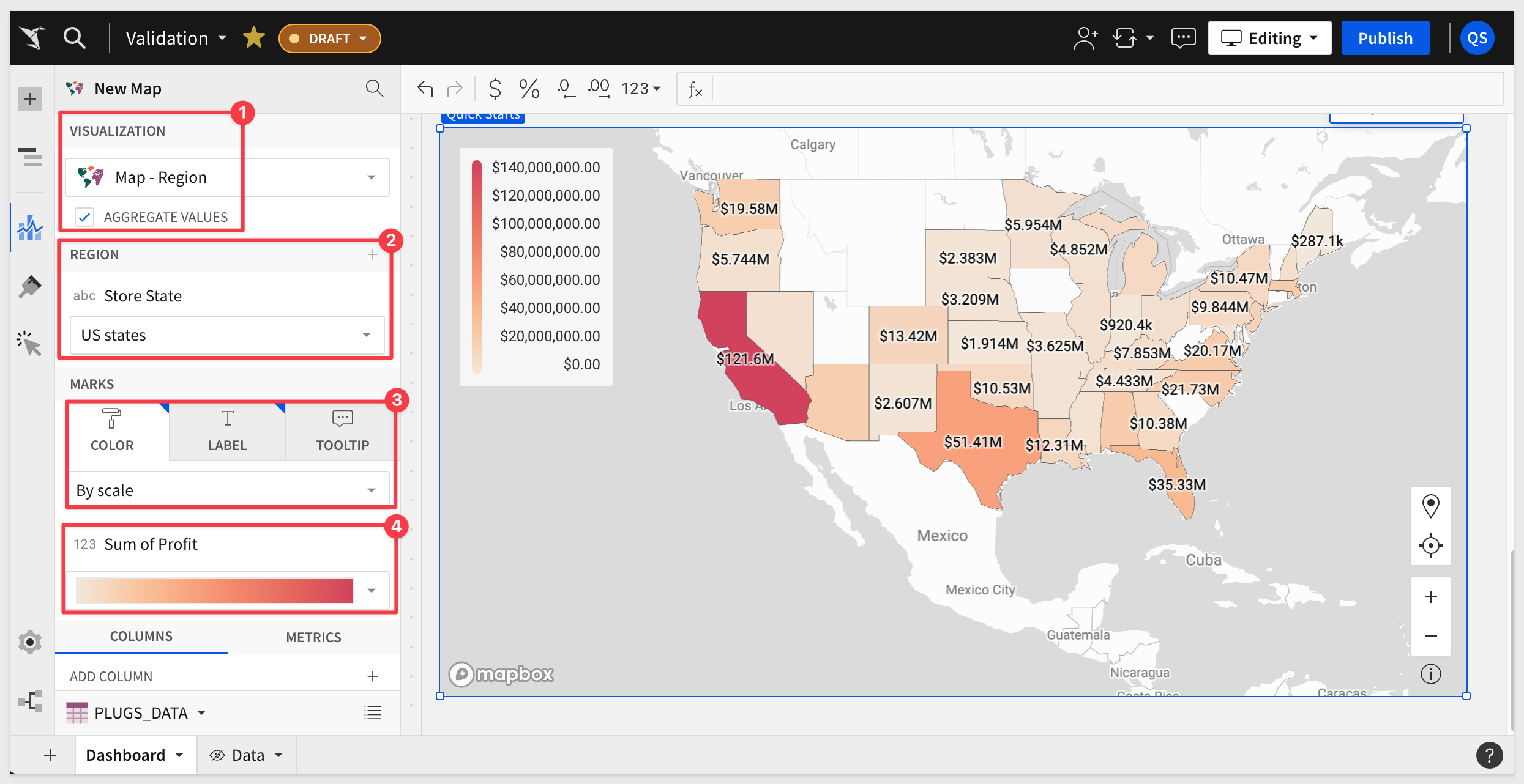
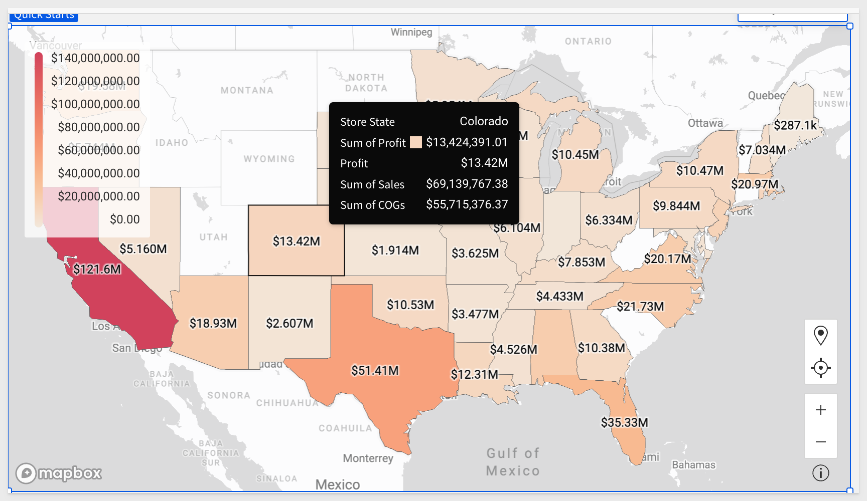
We also want to configure TOOLIP options in the element panel:
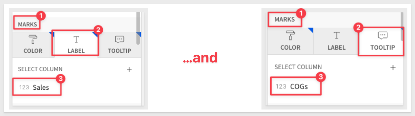
When you hover over each State, the values configured into our Tooltips are shown:
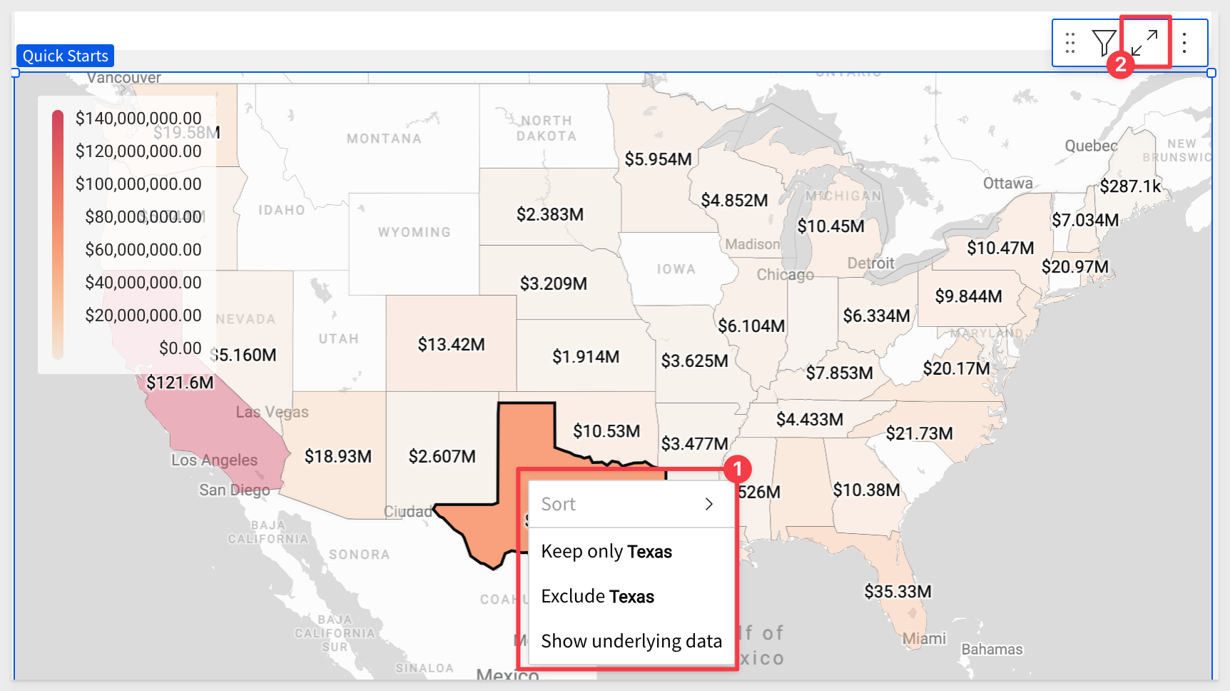
Right clicking on any State allows you to include/exclude it from the dataset or drill down to underlying data.
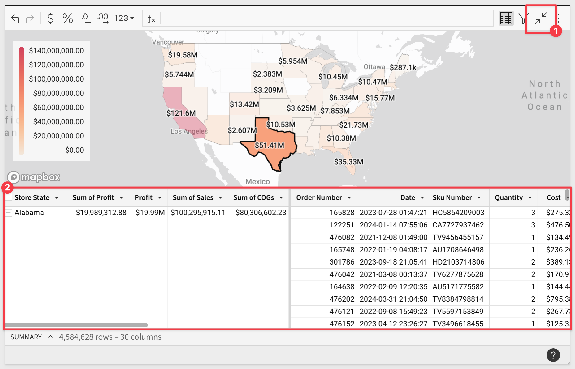
Click on the expand icon in the upper right corner of the map.
Now we can work with the underlying data, which has been grouped and aggregated for us, based on the map's configuration.
We can browse the data or duplicate it to create different views for our own analysis.
To revert back to the map view by clicking the  icon.
icon.
The Dashboard should now look similar to this:
Click Publish.
Adding a sentence at the top of a dashboard that summarizes important information is really easy in Sigma.
We do this by adding a Text element to the Dashboard:
In the function bar, copy and paste the following text:
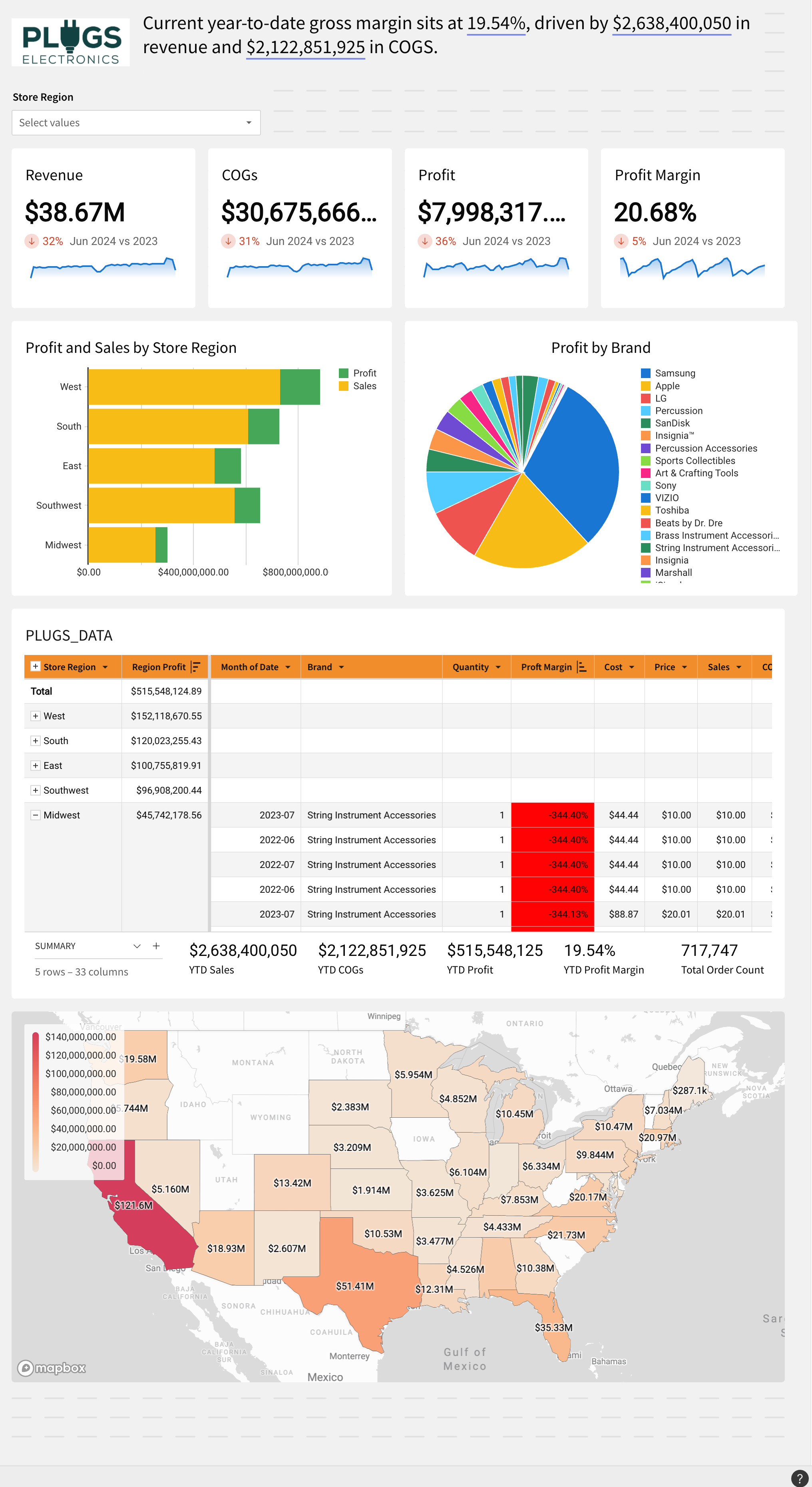
Current year-to-date gross margin sits at value, driven by value in revenue and value in COGS.
We left the word value in the text so that we can demonstrate how to make it dynamic.
After selecting the new text element, double-click on the first instance of the word value:
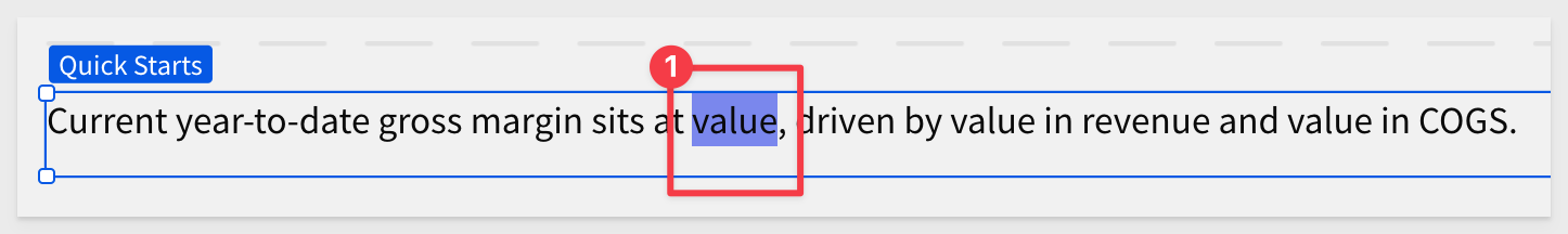
Press the = key on your keyboard.
This opens the function editor, where we can write a formula to be used in place of the text.
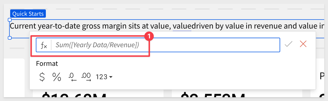
In this case, we need YTD Gross Margin. Since we have that in the dashboard table as a summary value already, we can just reference that.
[PLUGS_DATA/YTD Profit Margin]
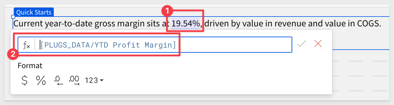
Now replace the other two instances of value with the correct values, using the summaries under the PLUGS_DATA table.
We now have a working example of dynamic text.

We can use the toolbar to change text size, colors and more.
To learn more about Dynamic Text, click here.
Click Publish.
Add a logo
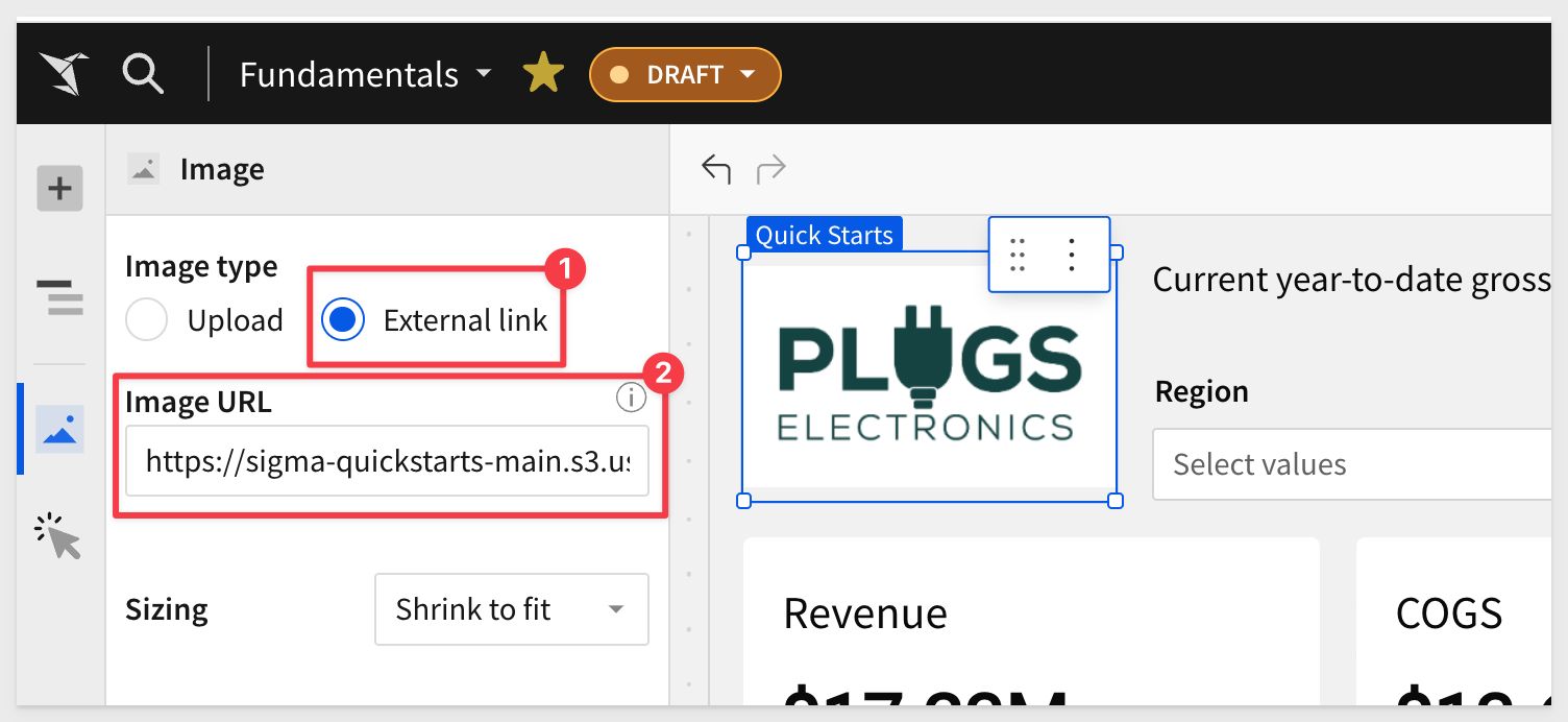
To wrap up this section, lets add a logo to the Dashboard.
Add another element to the Dashboard, using the Element panel > IMAGE.
Here is a sample image URL we can use:
https://sigma-quickstarts-main.s3.us-west-1.amazonaws.com/shared_images/plugs_logo.png
Configure it as follows, using this sample image (or any other image you prefer):
Click Publish and Go to published version.
After some repositioning of elements, our Dashboard should look something like this:
Click Publish.
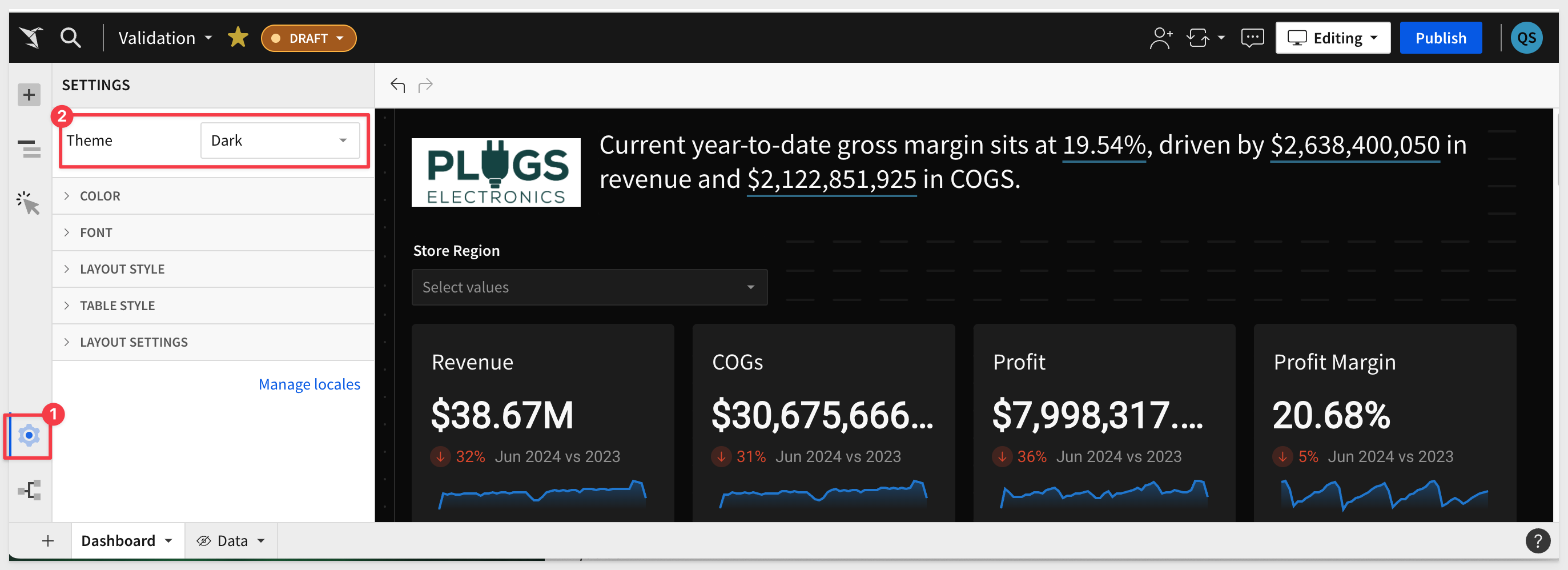
Now is a good time to pause and mention that Sigma workbooks can be stylized using Themes.
Sigma provides several preset themes we can just use right away.
With a just a few clicks, we can change our workbook to a dark theme:
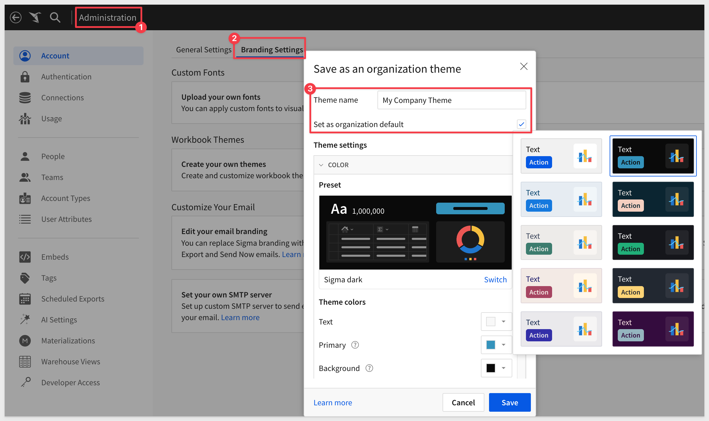
Administrators can set a default theme for all workbooks in an organization.
This is done in the Administration section of Sigma:
Creating custom themes is also supported.
Read more about workbook themes here.
Sigma also supports custom fonts for workbooks, worksheet visualizations, and dashboards. Custom fonts can be uploaded at the organization level and used on any workbooks, worksheet visualizations, and dashboards in that organization.
In this QuickStart we learned how to use Sigma to create beautiful charts, KPIs, maps and more.
Click here to move to the next QuickStart in this series.
Additional Resource Links
Be sure to check out all the latest developments at Sigma's First Friday Feature page!
Help Center Home
Sigma Community
Sigma Blog