This QuickStart is part of a series of QuickStarts designed to instruct new users how to use Sigma to explore and analyze data using pivot tables.
Through this QuickStart, we will walk through why to use a pivot table, how to use Sigma to create one, adding conditional formatting, and drilling down on table data.
We will be working with some common sales data from our fictitious company Plugs Electronics, reusing content we created in the QuickStart Fundamentals 1: Getting Around.
For more information on Sigma's product release strategy, see Sigma product releases.
Target Audience
Sigma combines with the unlimited power of the cloud data warehouse and the familiar feel of a spreadsheet; no limit on the amount of data you wish to analyze. Sigma is awesome for users of Excel and even better for customers who have millions of rows of data.
Typical audience for this QuickStart are users of Excel, common Business Intelligence or Reporting tools and semi-technical users who want to try out or learn Sigma. Everything is done in a browser so you already know how to use that. No SQL or technical skills are needed to do this QuickStart.
Prerequisites
- A computer with a current browser. It does not matter which browser you want to use.
- Completion of the QuickStart "Fundamentals 1: Getting Around"
- Access to your Sigma environment. A Sigma trial environment is acceptable and preferred.
- If have not already, you can sign up for a Sigma Trial here:

It is important to understand what a pivot table is and how it differs from a typical table that might use grouping to provide the desired result set.
A pivot table is an interactive way to quickly summarize large amounts of data. You can use a pivot table to analyze numerical data in detail and answer unanticipated questions about your data. A pivot table is especially designed for:
- Querying large amounts of data in a user-friendly way.
- Subtotaling and aggregating numeric data, summarizing data by categories and subcategories, and creating custom calculations and formulas.
- Expanding and collapsing levels of data to focus your results, and drilling down to details from the summary data for areas of interest to you.
- Moving rows to columns or columns to rows (or "pivoting") to see different summaries of the source data.
- Presenting concise, attractive, and annotated online or printed reports.
Tables tend to provide a flat organization of the data, although grouping and other features can make less obvious to users who are unfamiliar with the differences.
It is also important to understand that a strong case can be made to use tables instead of pivots. A discussion of this is outside the scope of a fundamentals QuickStart, but if you are interested, review the Sigma community post, Best practice 1 for that information.
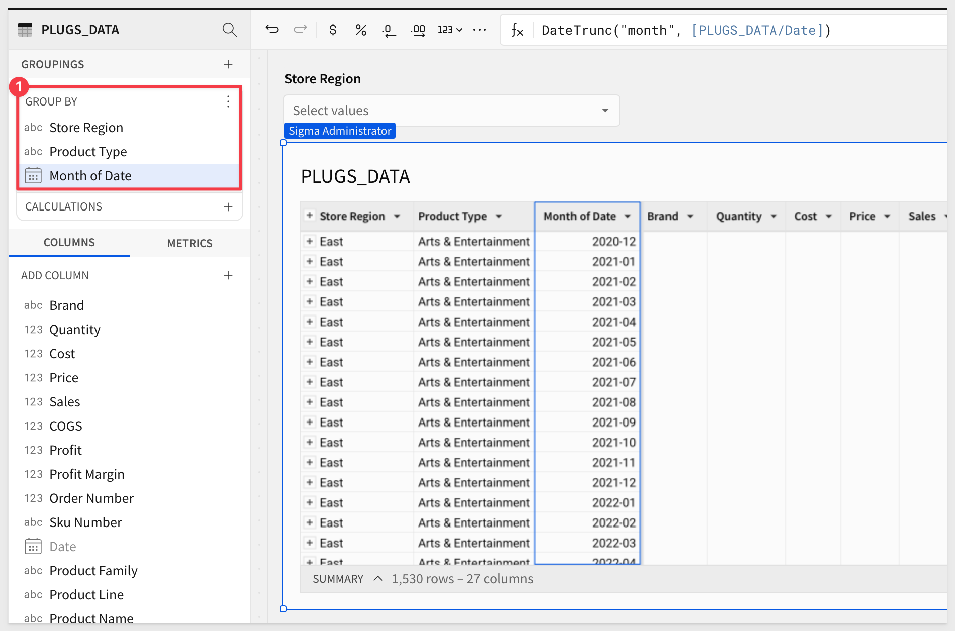
Lets assume we want to look at a breakdown of profit, margin and order quantities by store region, product type and month.
We have the required columns in our PLUGS_DATA table and could potentially satisfy the requirement by grouping the data, but the end result will not be easy for the viewer to interpret. They may have to make multiple clicks to orient the table to suit their interests.
Using standard table grouping, the output may look something like this. It is easy to see how this view of the data is useful:
Let's create a pivot table instead.
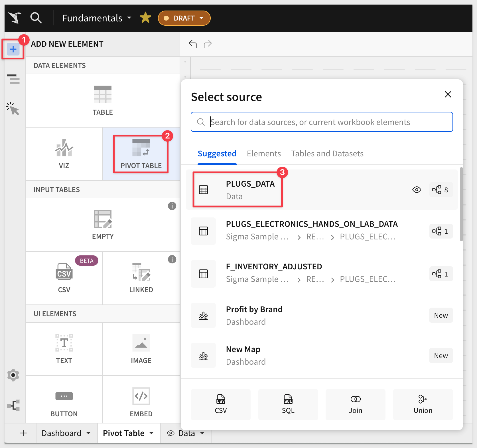
In Sigma, open the workbook Fundamentals and place it in edit mode. We should still have the page called Data that has the PLUGS_DATA table on it.
Add a New page and rename it Pivot Table.
Add a new element, PIVOT TABLE and select the PLUGS_DATA table from the Data page as its source.
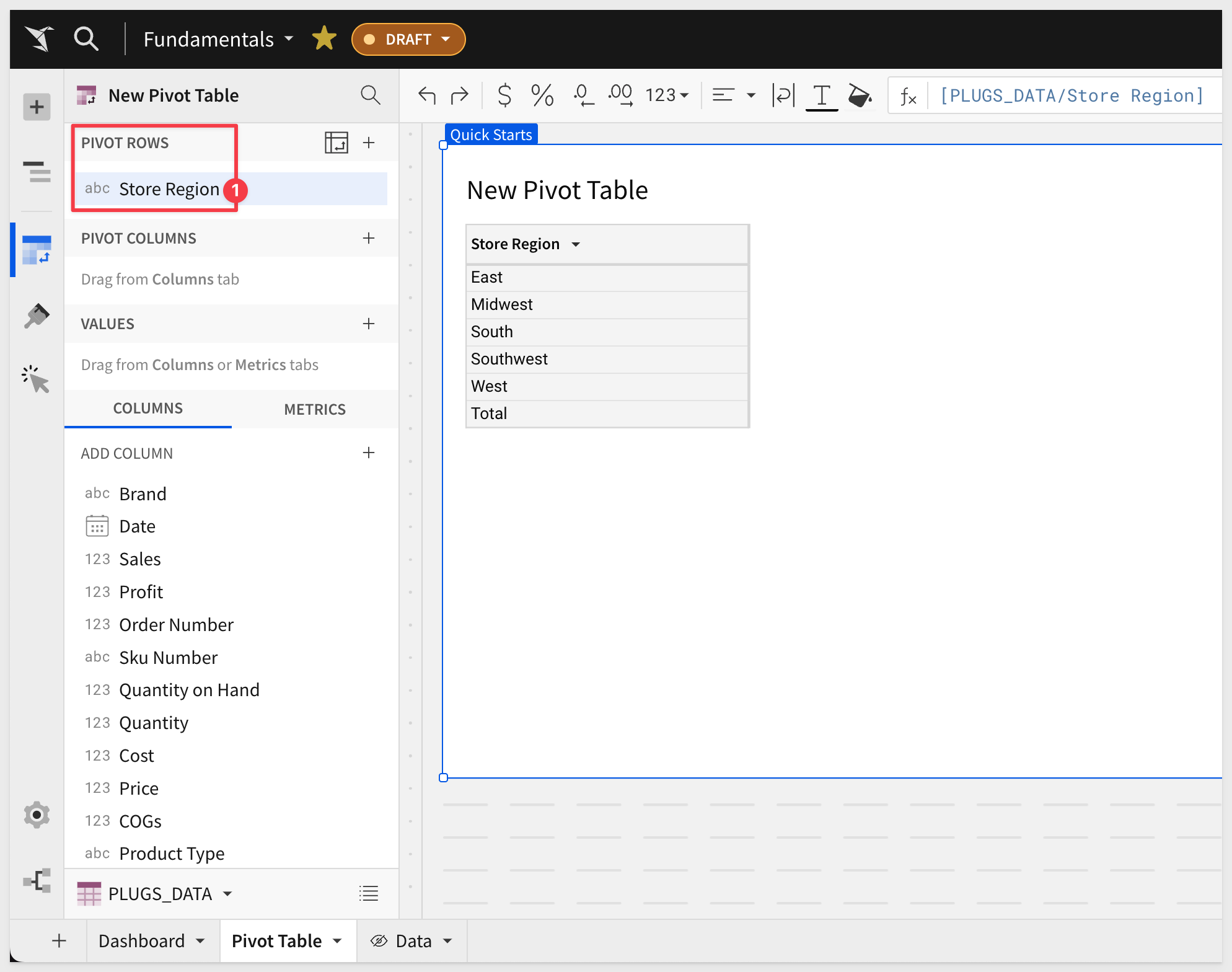
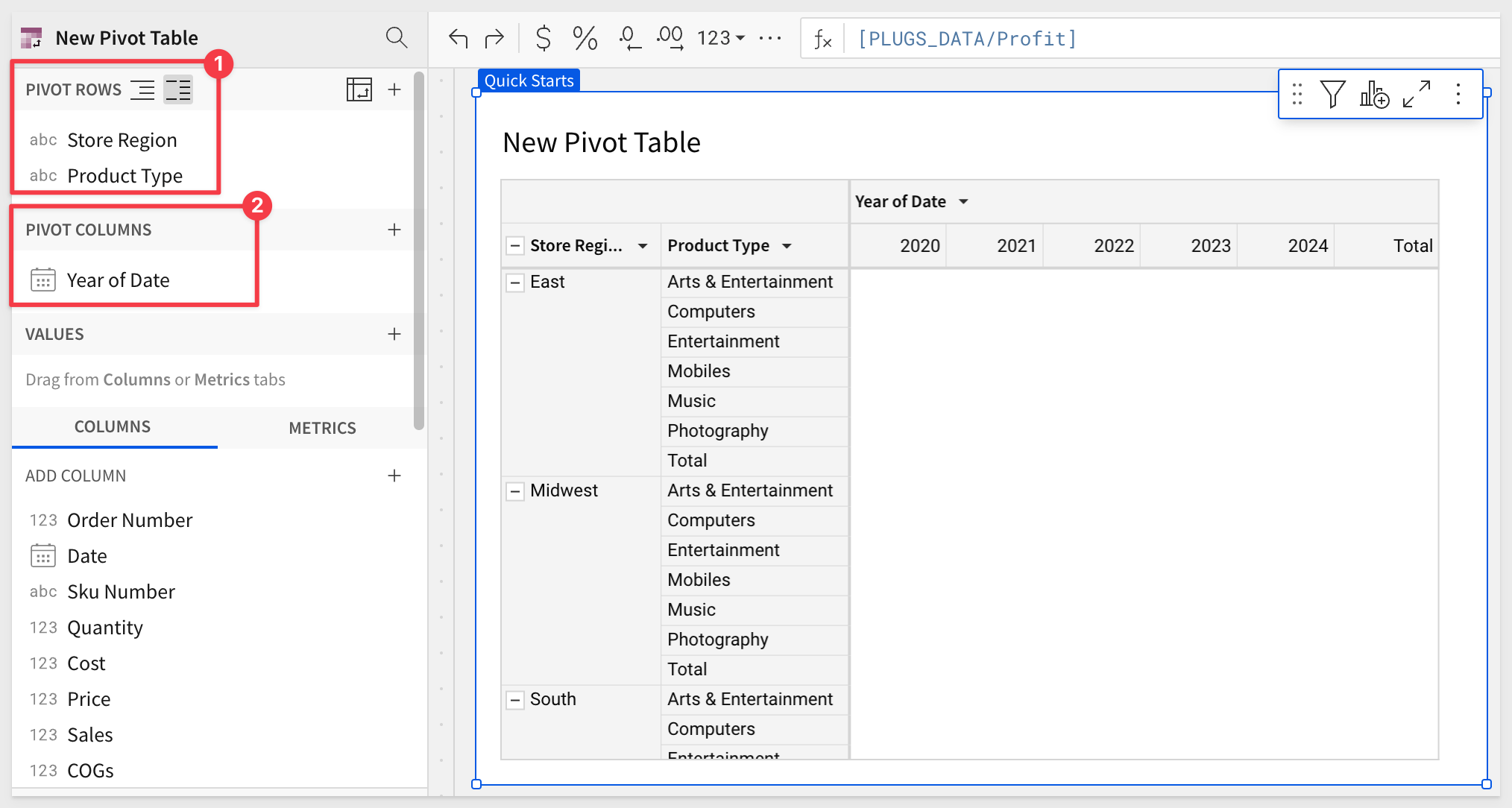
Drag the Store Region column to PIVOT ROWS in the element panel:
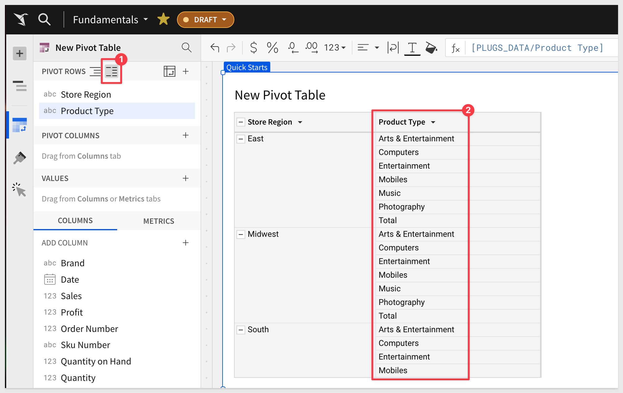
Do the same with Product Type:
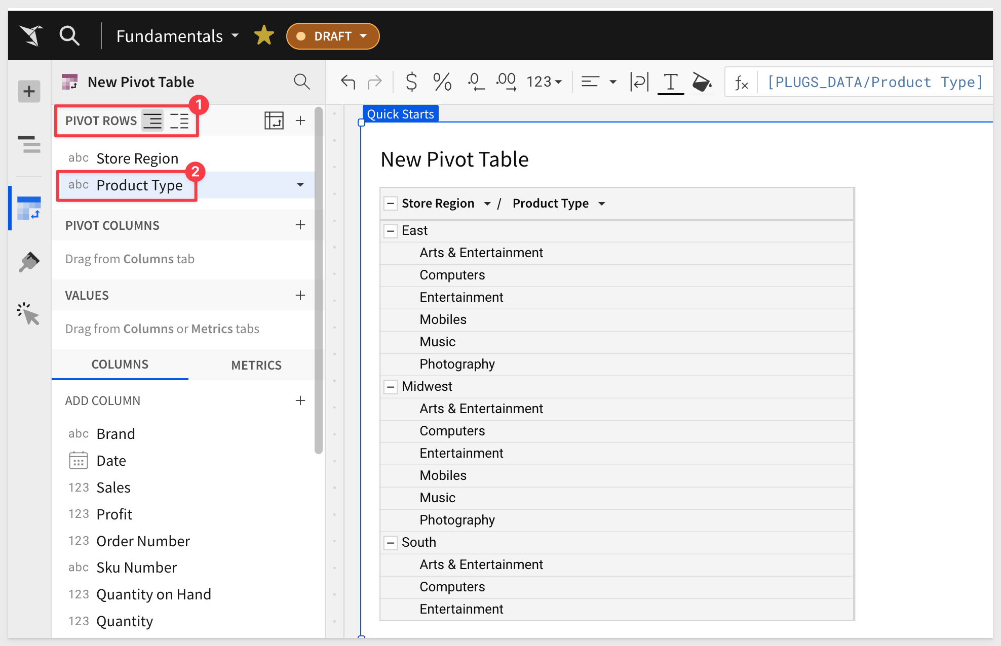
At this point, Product Type is nested under Store Region.
Click this icon (#1 in image below) to switch to columnar instead:
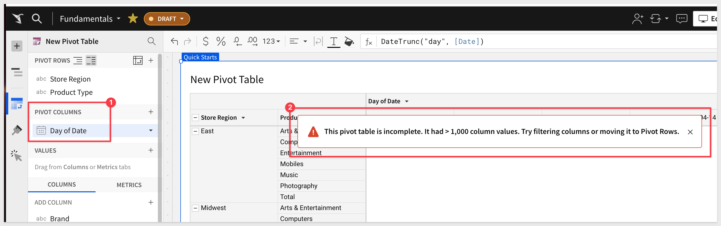
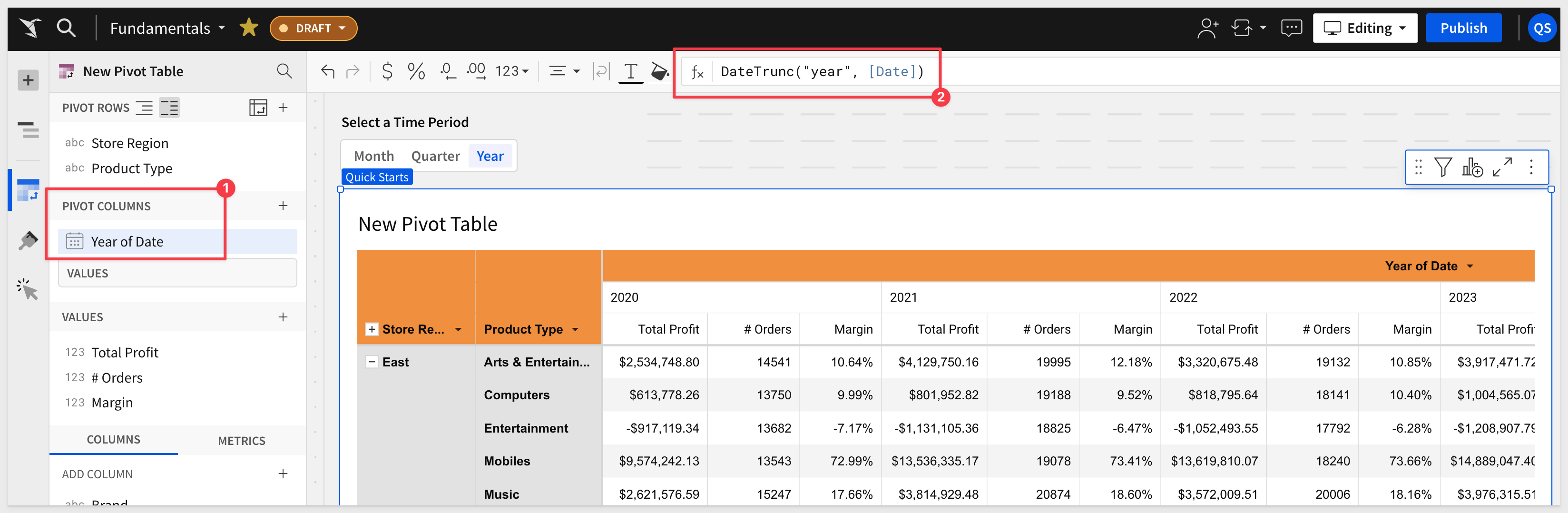
Add Date to the PIVOT COLUMNS section in the element panel.
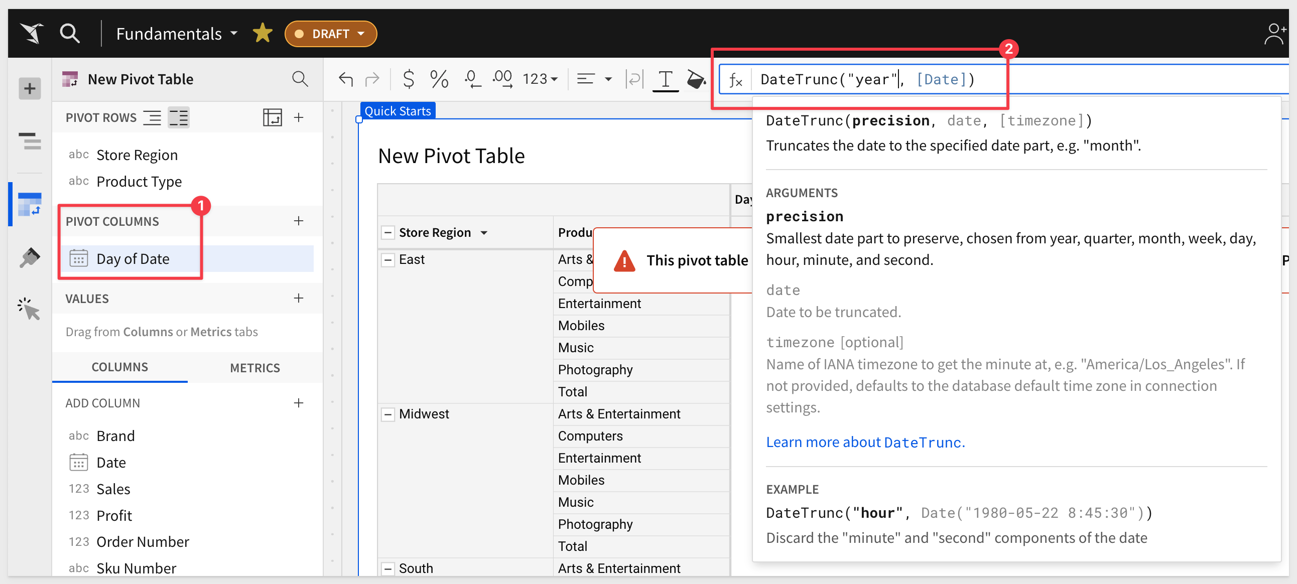
Sigma warns us that there more than 1,000 columns; we need to filter to reduce the number. This makes sense as we are currently using the Day of Date column. This needs to be a period of time like month, quarter or year.
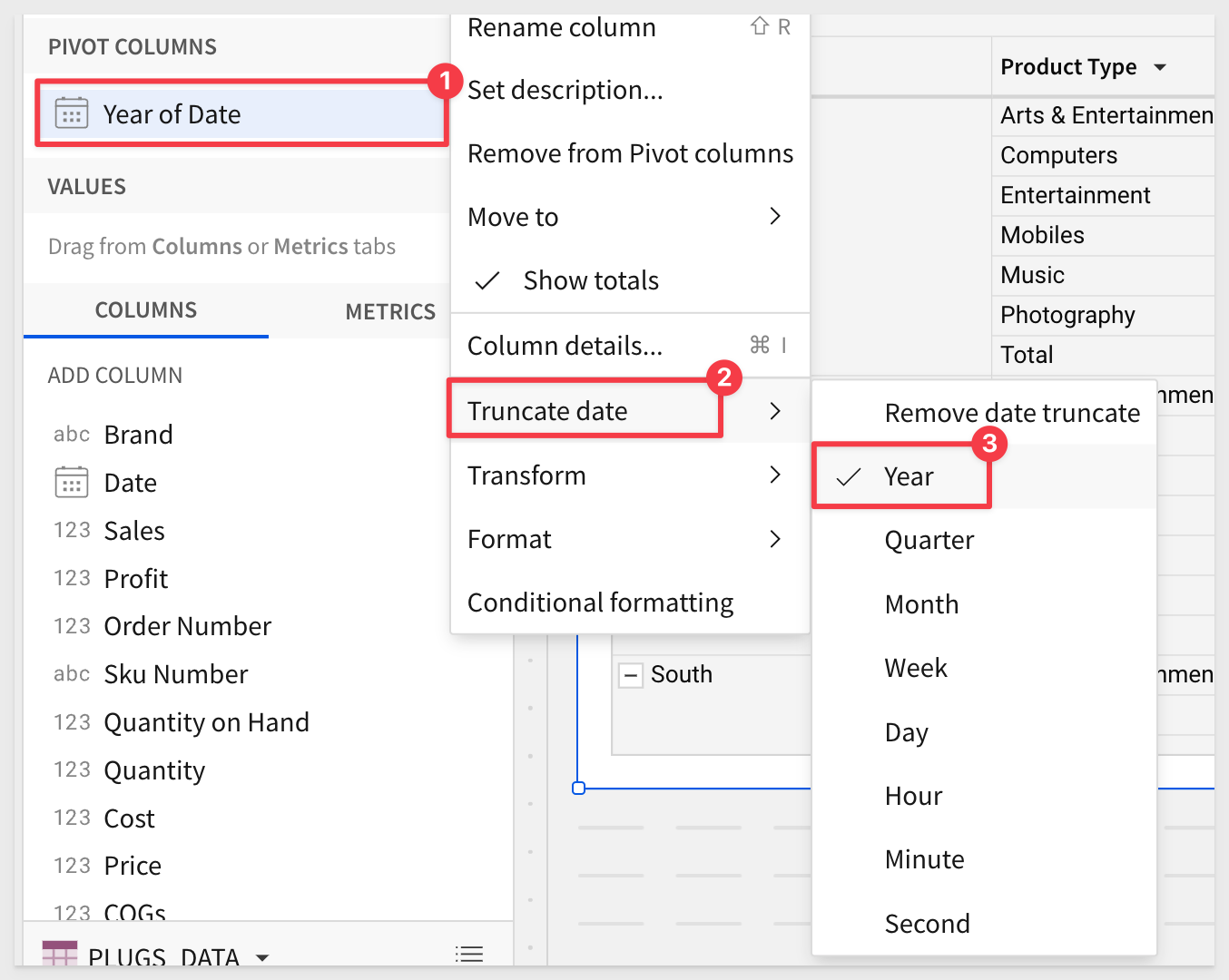
Lets adjust the Day of Date pivot column to year by using the DateTrnuc function:
DateTrunc("year", [Date])
Sigma has also provided all the most common functions (i.e., write the function for you!) as menu options off of a column, so you could have just applied that too:
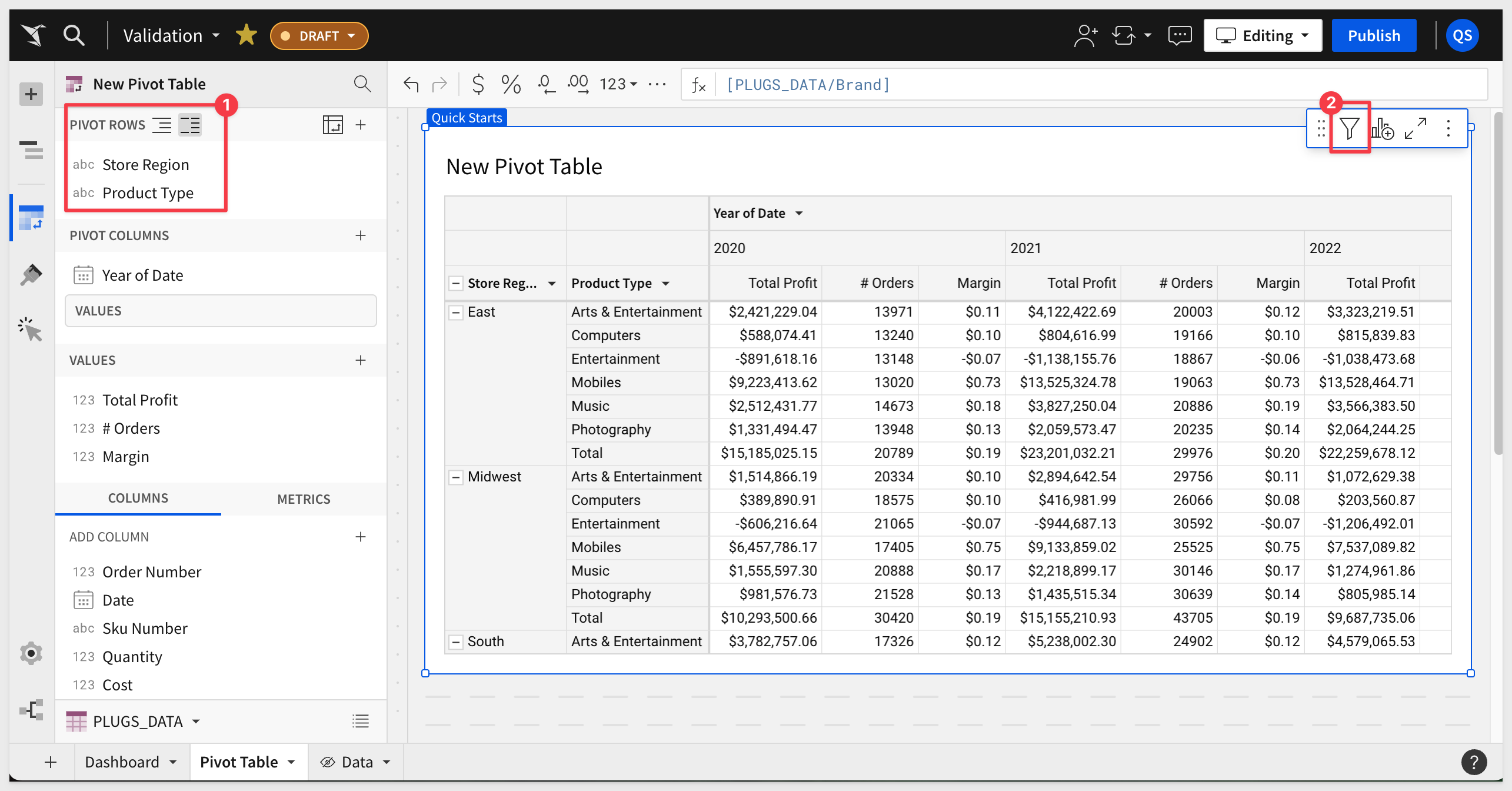
Our pivot table now looks like this:
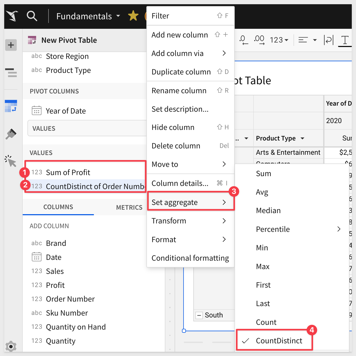
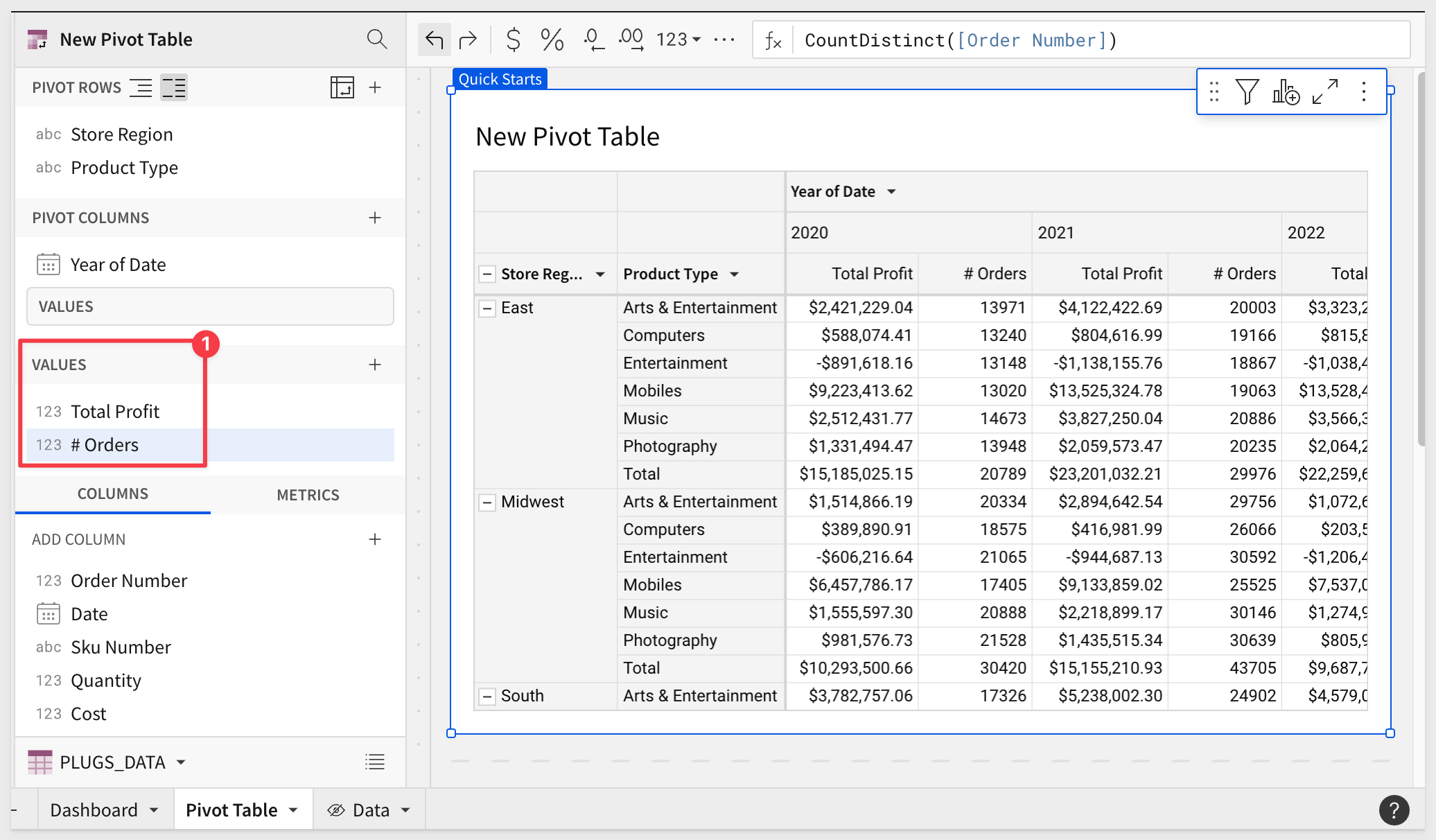
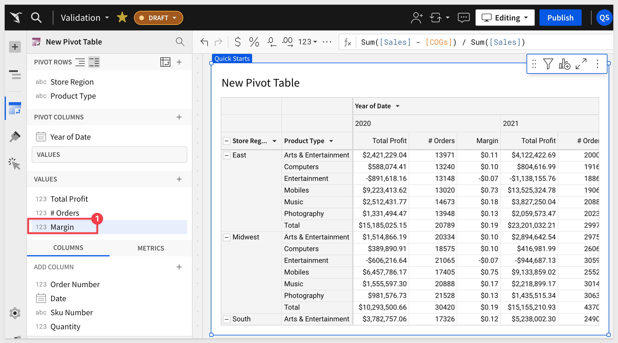
Add the Profit and Order Number columns to VALUES.
We need to set the aggregation method on the Order Number column to CountDistinct:
Rename these VALUE columns to Total Profit and # Orders.
Our pivot table now looks like this:
Missing Columns
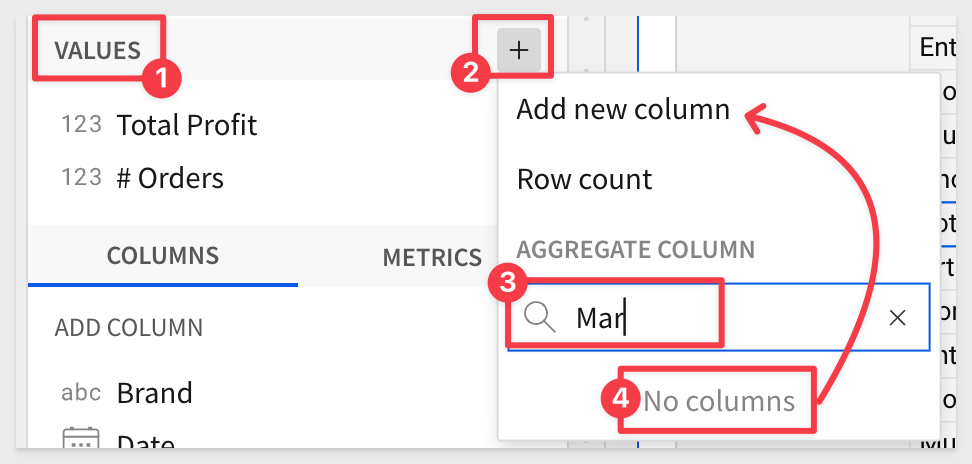
We want to include Margin in this pivot, but it does not exist in our PLUGS_DATA table.
Click the + icon in the element panel > VALUES and search for Mar; no columns exist so we can click Add new column:
Set the formula to:
Sum([Sales] - [COGS]) / Sum([Sales])
Rename the new column to Margin and set it to Percentage (%).
Our pivot table now looks like this:
Click Publish.
The presentation of the pivot is just the starting point for the user who most likely cares about spotting problems or trends and taking action.
Sigma allows users to access all the data they are permitted to see, so they get to use their business knowledge, unconstrained by the analytics.
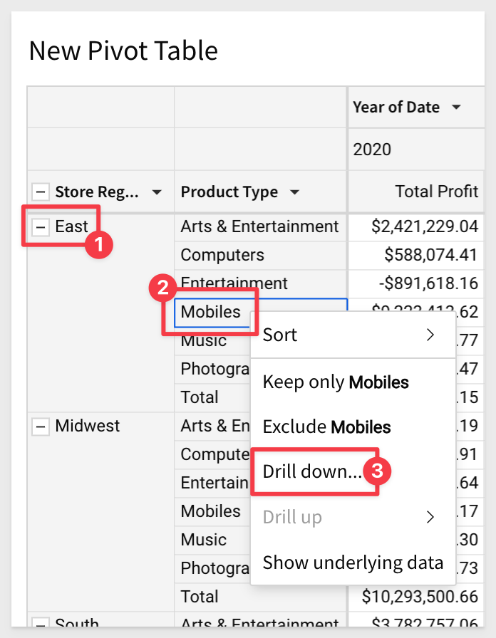
In the pivot table right click on East > Mobiles cell and select Drill down:
On the Drill down modal, select Brand:
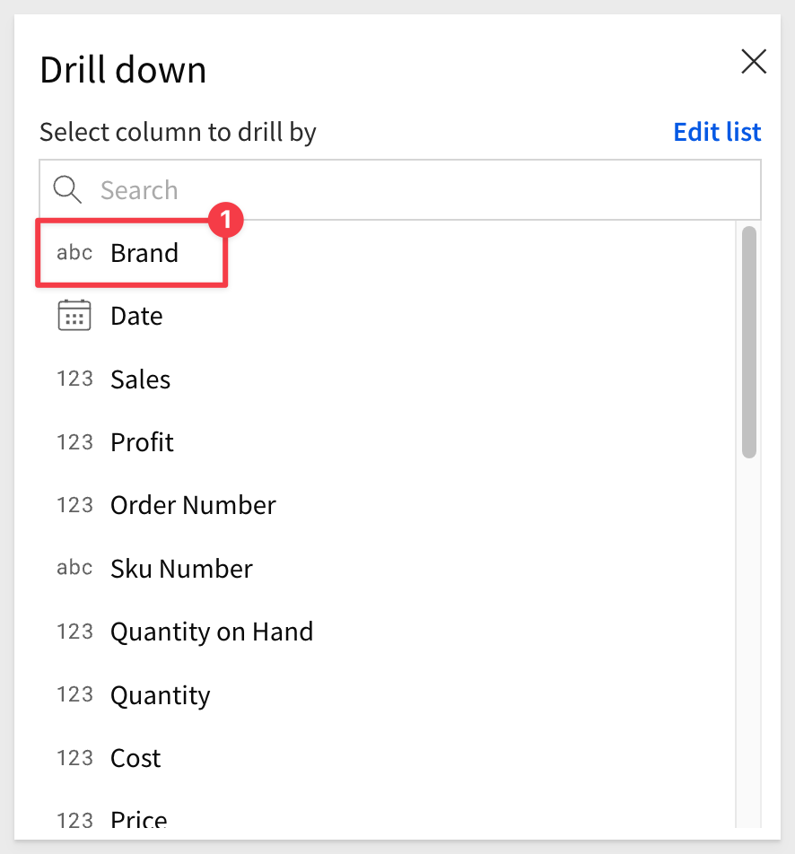
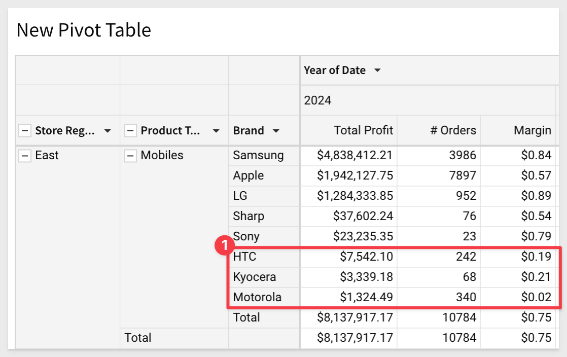
Brand is added to the pivot table and we can see sales figures accordingly.
We might want to see the most recent year first. That is simple enough.
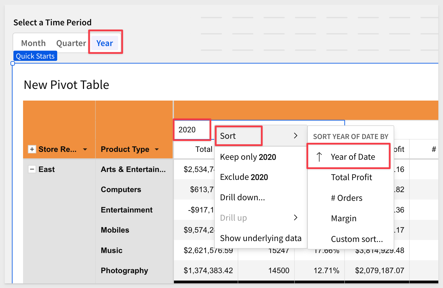
Click on the Year of Date > Year (ie: 2020) and select sort and descending (down arrow):
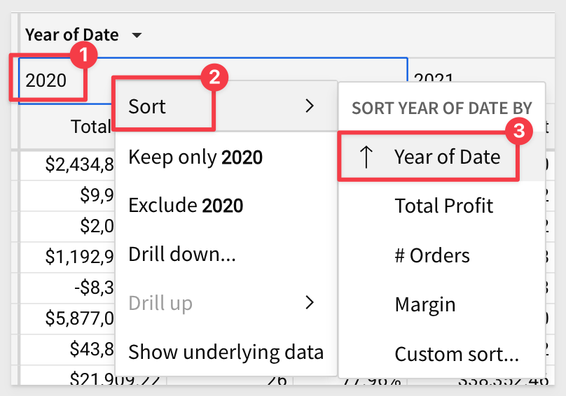
We also want to sort Brand by Total Profit, so we can more easily see the bottom dwellers:
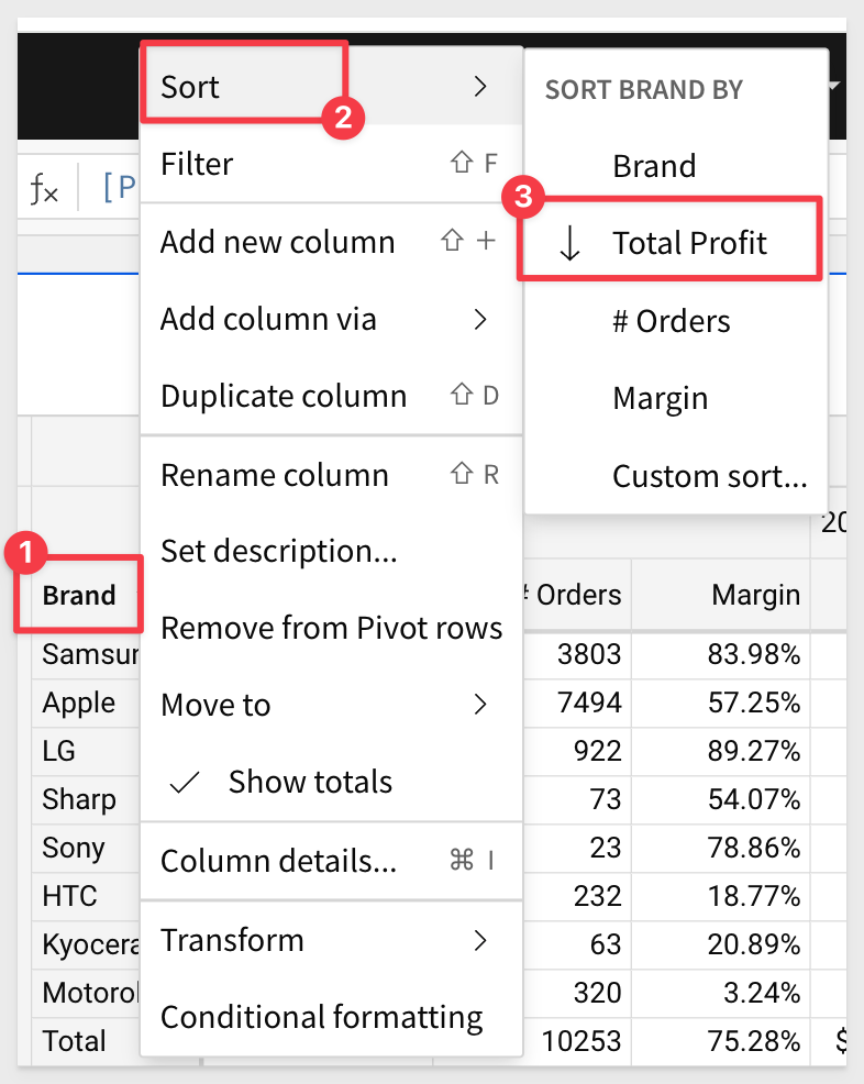
Now it is plainly clear which vendors are performing poorly:
The action of drilling down on Brand added the column as a pivot row (#1 in the image below). We can keep that or remove it just as easily using the Brand's column menu.
The drill down action also created two filters that we can keep, or disable as shown below (#2-#4).
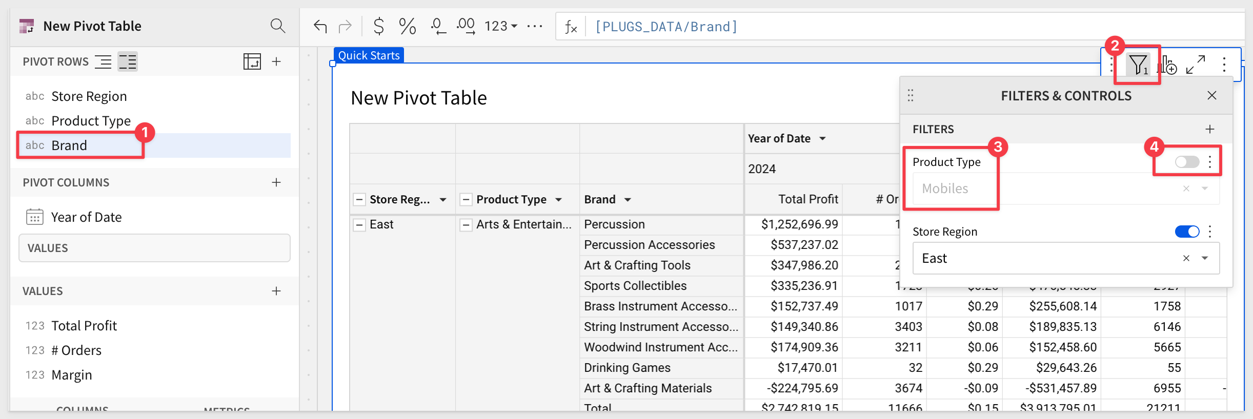
Our pivot table now looks like this (after disabling the two filters and removing the Brand pivot row.):
Click Publish.
Following the same workflow we used in the tables and visualization QuickStarts, we can apply customizations to our pivot table to make it easier on the user's eyes.
Using the Element panel > Paintbrush icon, we can adjust the various items in the pivot to suit our needs.
In the TABLES STYLES section, we can easily make adjustments as shown in the image below. Note that there are separate configurations for Header and Subheader in this section:
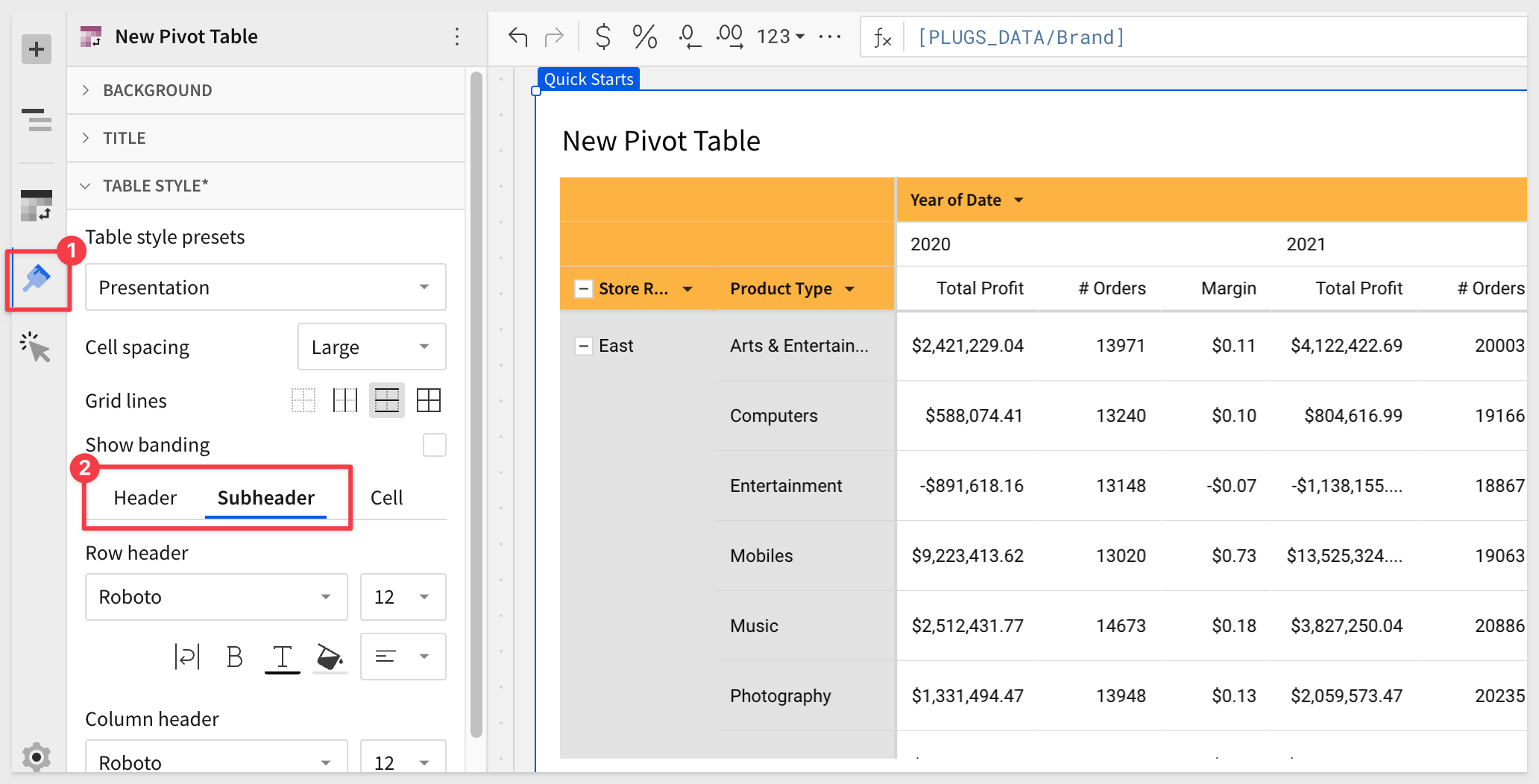
Each section will carry an asterisk when the defaults have been changed:
Experiment as much as you want. Each section has the option to Restore to default.
Click Publish.
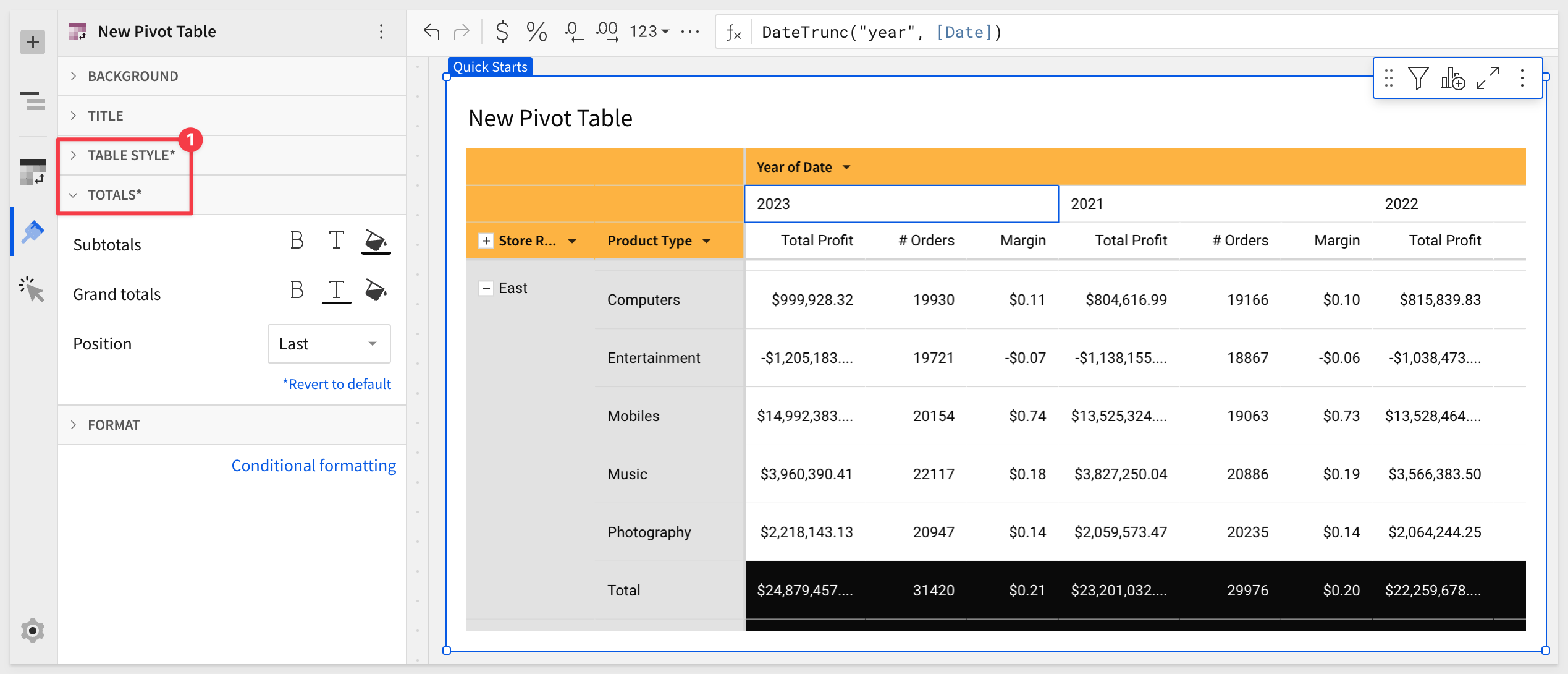
It may be useful to include a page control so that users can look at a subset of the data that interests them.
Lets add a control that allows users to select the time period that the pivot is using. There are many controls but we will use a segmented control in this case.
Add a new SEGMENTED CONTROL to the Pivot Tables page and drag it above the table.
In the tables fundamental QuickStart we used a table column to populate the list control (ie: East, West, South...).
We will do something a little different in this case, to demonstrate just some of the flexibility in Sigma.
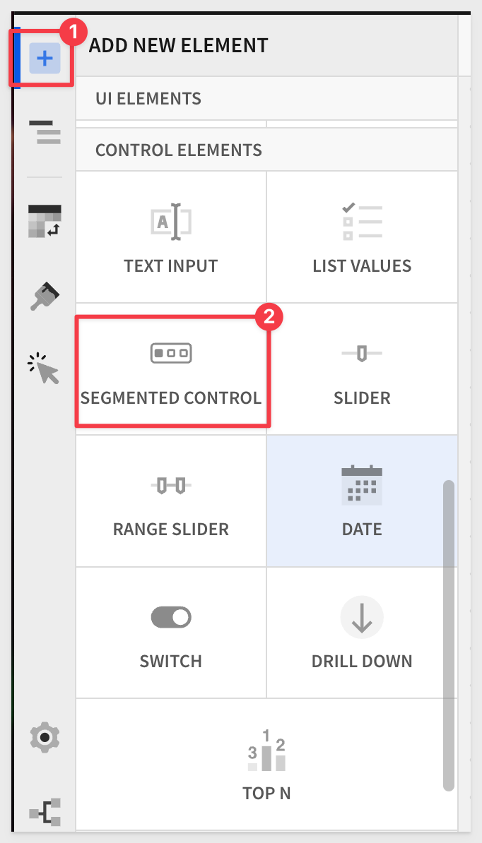
With the new control selected on the canvas, configure it as shown below:
The Control ID is a critical value as that is how we can reference the current value the user has set the control to.
Our control is now configured, but the pivot table is not aware of it yet.
We need to configure the pivot table to handle the time period values when the user changes the time period contol.
In the tables QuickStart, we just used a column (Store Region) in the table, and the user used a control to pick a valid value.
We do not have a column in this pivot for time period, but we don't need one either. We can use a function to work around that using the existing Date column.
Click anywhere on the pivot table to select it and then click the Year of Date on the element panel.
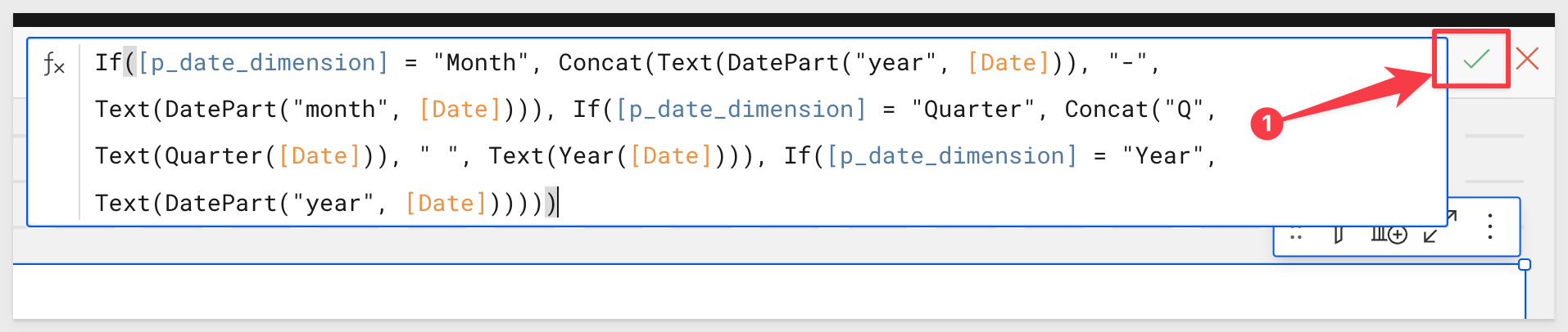
We want to replace formula (#2 in the image below) to the following code:
If([p_date_dimension] = "Month", Concat(Text(DatePart("year", [Date])), "-", Text(DatePart("month", [Date]))), If([p_date_dimension] = "Quarter", Concat("Q", Text(Quarter([Date])), " ", Text(Year([Date]))), If([p_date_dimension] = "Year", Text(DatePart("year", [Date])))))
Lets pause and explore the formula and it's parts.
Here is the code again, but formatted for readability:
1: Month Section of Code
If([p_date_dimension] = "Month", Concat(Text(DatePart("year", [Date])), "-", Text(DatePart("month", [Date]))),
Explanation:
Formats the date as YYYY-MM using DATEPART() to extract the year and month, ensuring correct sorting.
Creates a string value using the TEXT() function to combine year-month.
2: Quarter Section of Code
If([p_date_dimension] = "Quarter", Concat("Q", Text(Quarter([Date])), " ", Text(Year([Date]))),
Explanation:
Formats the date as Qn YYYY, where n is the quarter number, ensuring readability and correct sorting.
Creates a string value using the TEXT() function to combine "Q" and the quarter number plus the year in YYYY format.
3: Year Section of Code
If([p_date_dimension] = "Year", Text(DatePart("year", [Date])))))
Explanation:
Formats the date as YYYY, showing only the year.
After copy/pasting the code, click the green checkmark:
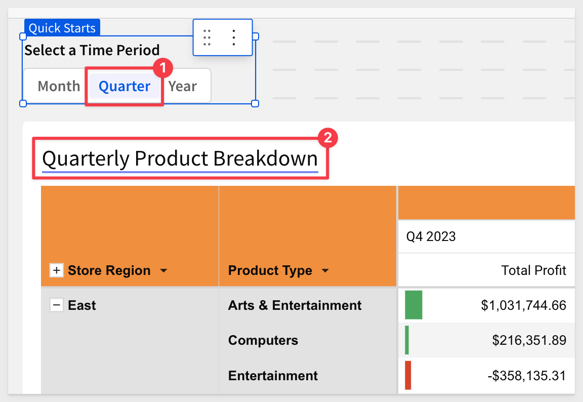
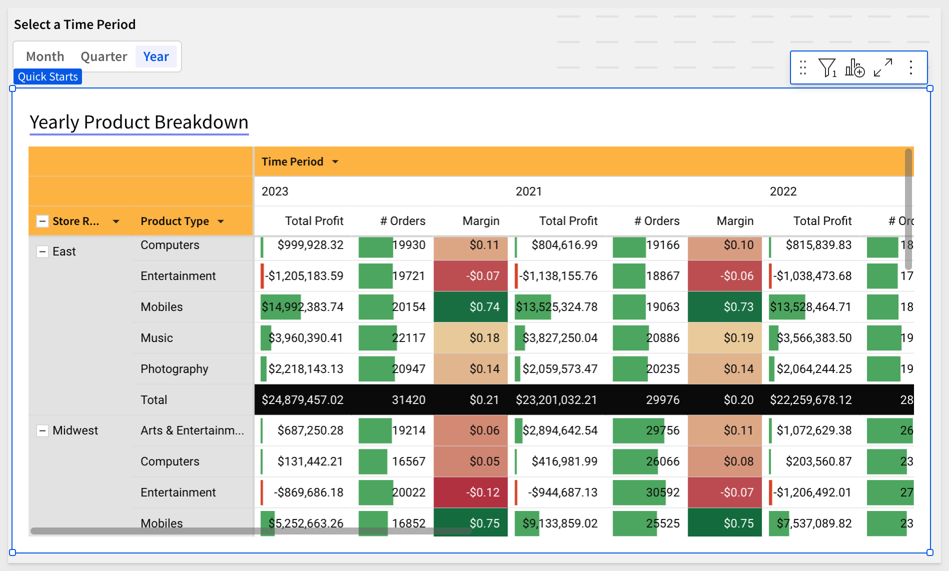
Clicking the Select a Time Period control > Year will make the pivot table display pivot columns in years.
Click one of the years, and change the sort from ascending to descending:
Clicking on Month or Quarter will orient the pivot columns accordingly.
Our pivot table can now be filtered by the time period control:
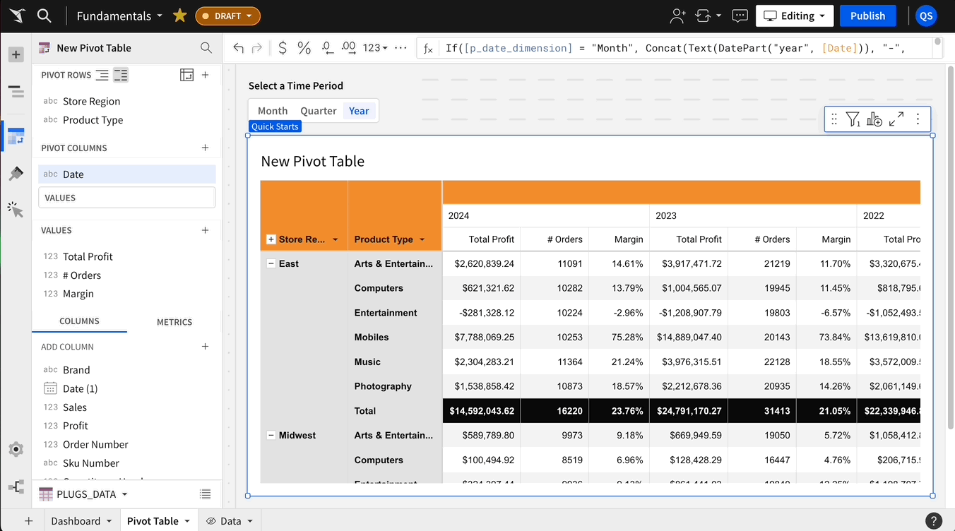
Rename the Calc column (in the pivot table > PIVOT COLUMNS section) to Time Period.
Click Publish.
Lets apply some conditional formatting to the pivot table, based on values in cells.
Color Scales
Click the pivot table to select it, then click the Paint brush icon in the element panel. Then click Conditional formatting:
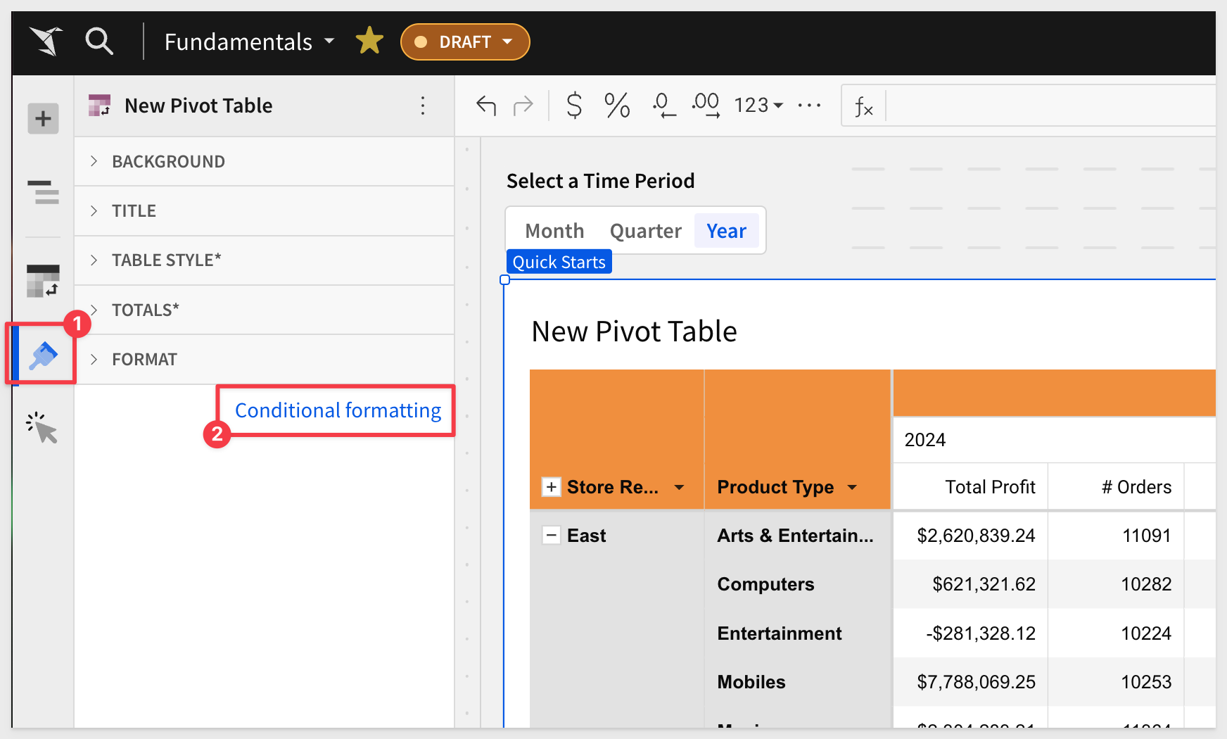
This opens the conditional formatting panel. We use this to create "rules" that will allow different styling effects to be applied based on the the evaluation of the rule.
For example; show all transactions in red where the margin in negative (sold at a loss).
In our case, we will configure a simple rule to drive the cell colors used in the Margin column:
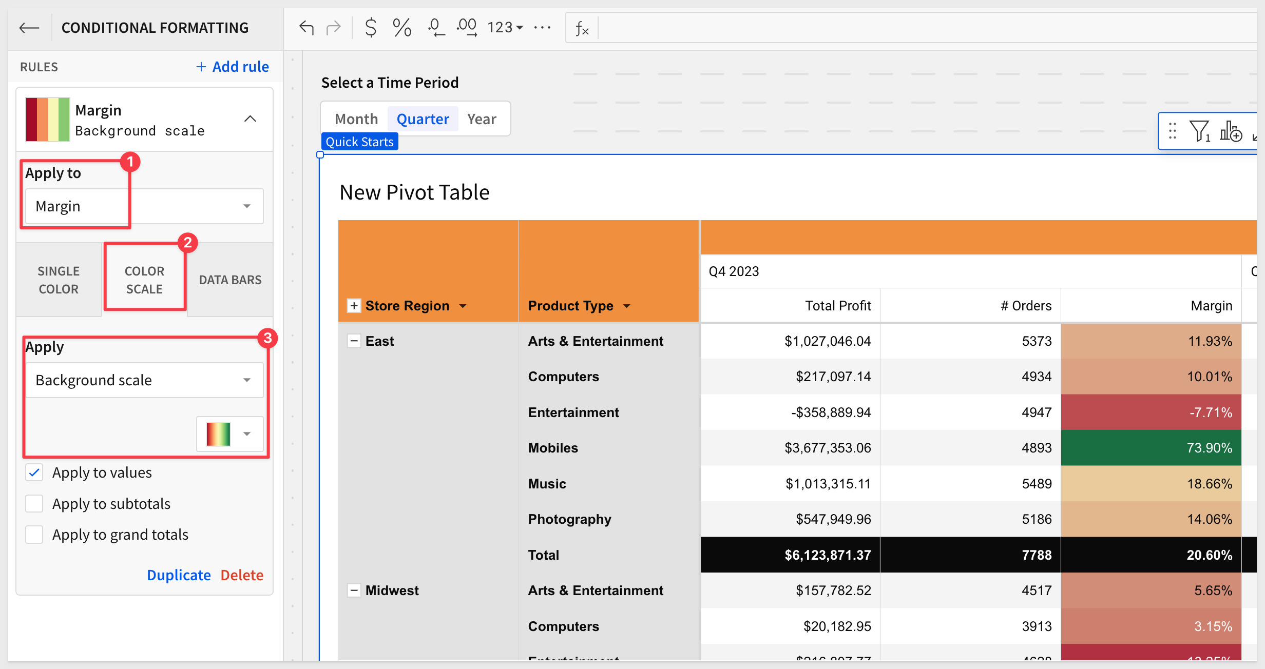
The rule is applied automatically and we now can see which products are green (happy) and which are red (sad).
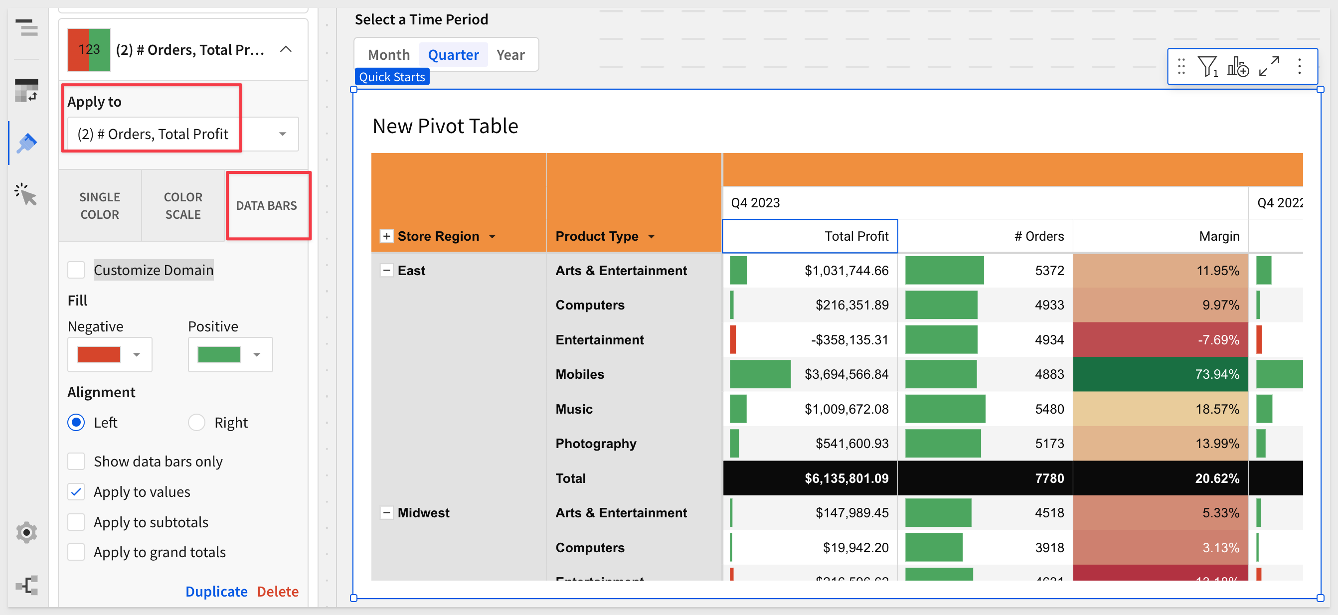
Data Bars
We can also apply a progress bar inside of a column's cells. This can be color based and include a min/max value range.
Click the link for Add rule.
Click the DATA BARS box.
Select the Total Profit and Order Qty columns.
Deselect the Margin column (if it is selected).
The fill colors are already set for us; we can just use those.
It we wanted to set min/max values, click the Customize Domain checkbox.
Our pivot table now looks like this:
Click Publish.
We did touch on this topic in the previous QuickStart (by referencing table summary values), but we want to reinforce an important point.
The Control ID for a Sigma control can be accessed anywhere in a workbook by using the name in a formula, to return the current value of the control.
For this example, we will dynamically adjust the title of the pivot table so that the user has a better idea of what the table represents, when a specific time period it set.
Click on the pivot table's title and backspace over it. Sigma now prompts you to either enter a title or press = to add dynamic text:
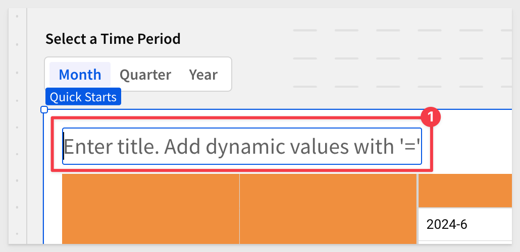
Our time period control's ID is p_date_dimension, so we can copy and paste the formula below to get it's current value, and append some text to it:
** Be sure to first type = and then paste the code.**
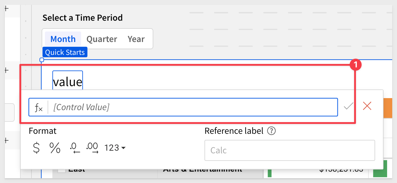
[p_date_dimension] & "ly " & "Product Breakdown"
Now we have a title that changes when the time period control changes:
Click Publish.
Our pivot table now looks like this:
To learn more about pivot tables in Sigma, see here.
In this QuickStart, we covered why you might use a pivot table, how to use Sigma to create one, add conditional formatting, and drill down on table data.
Click here to move to the next QuickStart in this series.
Additional Resource Links
Be sure to check out all the latest developments at Sigma's First Friday Feature page!
Help Center Home
Sigma Community
Sigma Blog