This QuickStart is part of a series of QuickStarts designed to instruct new users how to use Sigma to explore and analyze data using pivot tables.
Through this QuickStart, we will walk through why to use a pivot table, how to create one in Sigma, how to add conditional formatting, and how to drill down on table data.
We will be working with some common sales data from our fictitious company Plugs Electronics, reusing content we created in the QuickStart Fundamentals 1: Getting Around.
For more information on Sigma's product release strategy, see Sigma product releases.
### Target Audience The typical audience for this QuickStart includes users of Excel, common Business Intelligence or Reporting tools, and semi-technical users who want to try out or learn Sigma.
Prerequisites
- A computer with a current browser. It does not matter which browser you want to use.
- Completion of the QuickStart "Fundamentals 1: Getting Around"
- Completion of the QuickStart "Fundamentals 2: Data"
- Access to your Sigma environment. A Sigma trial environment is acceptable and preferred.
- If you have not already, you can sign up for a Sigma Trial here:

A pivot table is an interactive tool for quickly summarizing large amounts of data, allowing for deeper analysis and answering unanticipated questions. It is particularly useful for:
- Querying large datasets in a user-friendly way.
- Subtotaling, aggregating, and summarizing data by categories and subcategories.
- Creating custom calculations and formulas.
- Expanding and collapsing data levels to focus on specific details.
- Pivoting rows to columns (or vice versa) to view data from different perspectives.
- Presenting clear, concise, and well-annotated reports.
In contrast, standard tables typically offer a flat data structure. While grouping and other features can enhance organization, these differences may not be immediately obvious to all users.
It is also important to understand that there is a strong case for using tables instead of pivot tables.
A discussion of this is outside the scope of a fundamentals QuickStart, but if you are interested, review the Sigma community post, Best practice 1 for that information.
If we want to analyze total profit and order quantities over multiple years, categorized by store region and product type, we can retrieve the necessary columns from our Plugs_Store_Sales table on the Data page.
While grouping the data in a standard table could technically satisfy this requirement, the result may not be intuitive for the viewer. Users might need to make multiple clicks to rearrange the table to fit their needs.
For example, with standard table grouping, the output might look something like this:
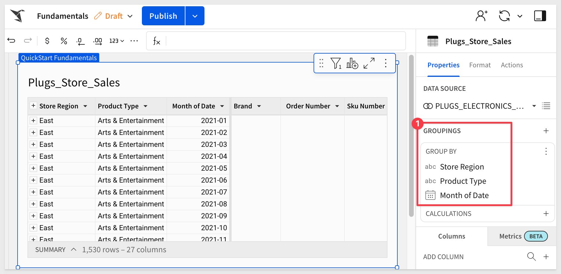
This view can be useful, but it may still require additional effort to navigate and interpret effectively.
Let's create a pivot table instead.
In Sigma, open the workbook Fundamentals and place it in edit mode. We should still have the page called Data that has the Plugs_Store_Sales table on it.
Add a New page and rename it Fundamentals 3.
Using the Element bar > Data add a new pivot table element to the page.
Click Select source and select the Plugs_Store_Sales table from the Elements > Data page.
Now we need to configure the pivot table.
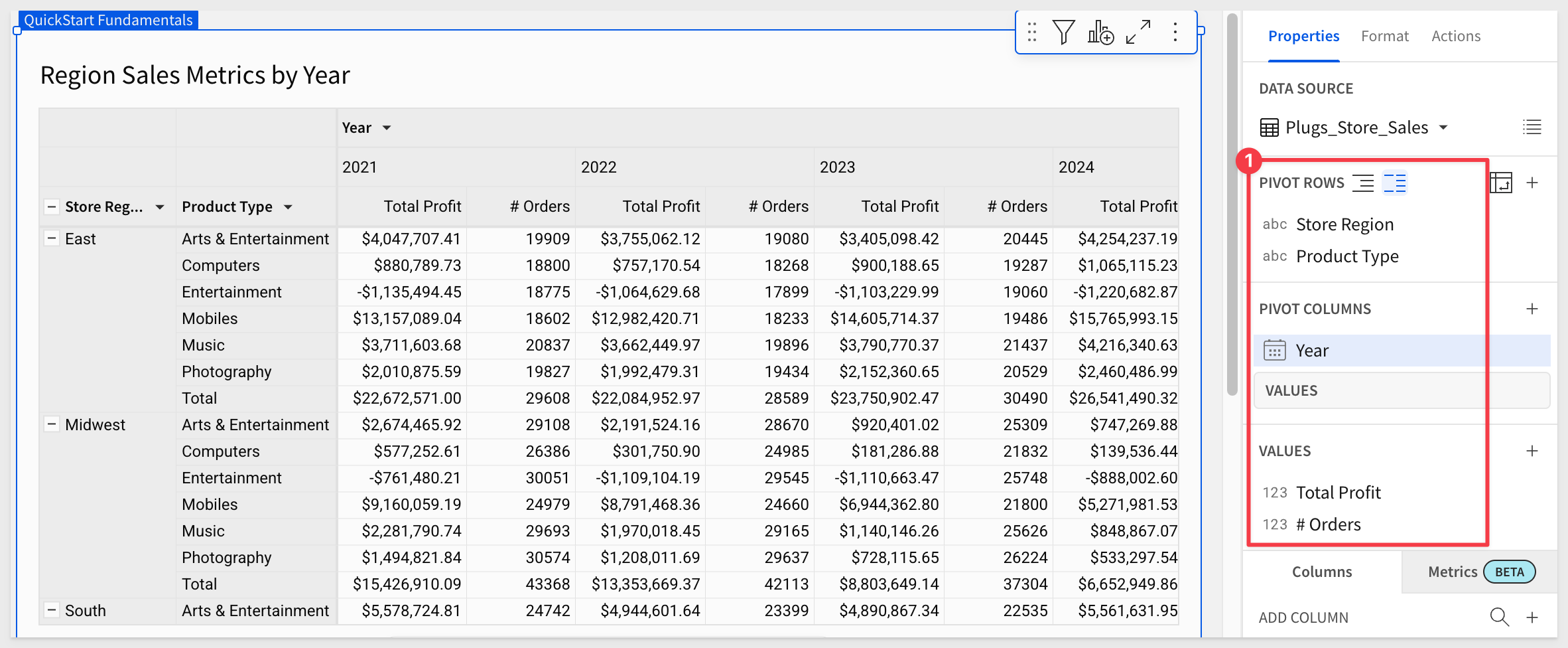
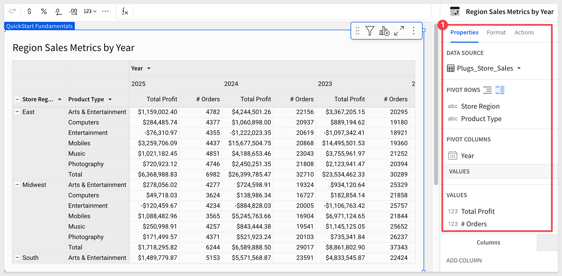
Drag the Store Region column to PIVOT ROWS in the Element panel.
Do the same with Product Type.
At this point, Product Type is nested under Store Region.
Click this icon (#3 in image below) to display the two columns separately.
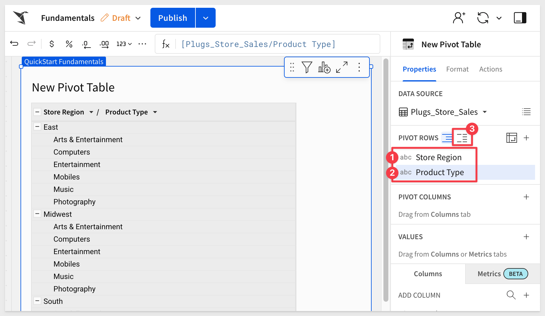
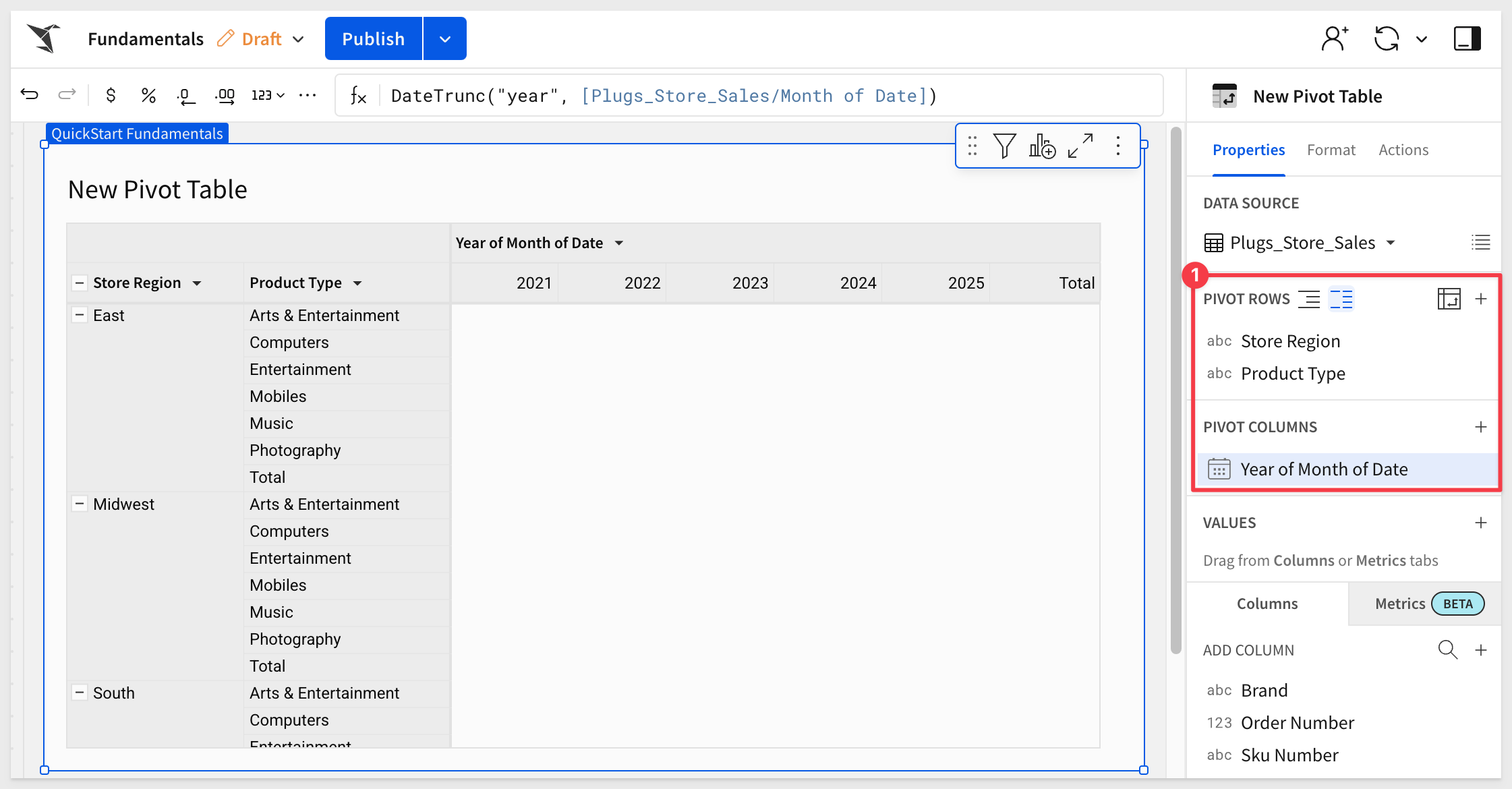
Add Month of Date to the PIVOT COLUMNS section in the element panel.
Let's adjust the Month of Date pivot column to Year by using the DateTrunc function:
DateTrunc("year", [Plugs_Store_Sales/Month of Date])
Our pivot table now looks like this:
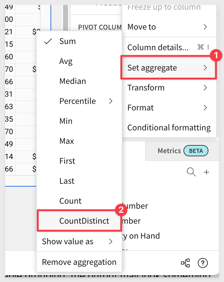
Add the Profit and Order Number columns to the VALUES grouping.
Set the aggregation method for the Order Number column to CountDistinct:
Rename these VALUE columns to Total Profit and # Orders.
Rename the pivot table's title to Region Sales Metrics by Year and also change the name of the Year of Month of Date column to Year.
Our pivot table now looks like this:
The presentation of the pivot is just the starting point for the user who most likely cares about spotting problems or trends and taking action.
Sigma allows users to access all the data they are permitted to see, so they get to use their business knowledge, unconstrained by the analytics.
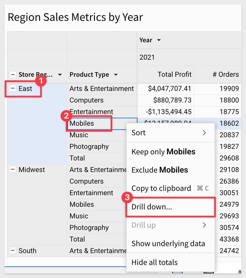
In the pivot table right click on East > Mobiles cell and select Drill down:
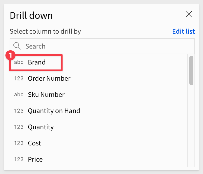
On the Drill down modal, select Brand:
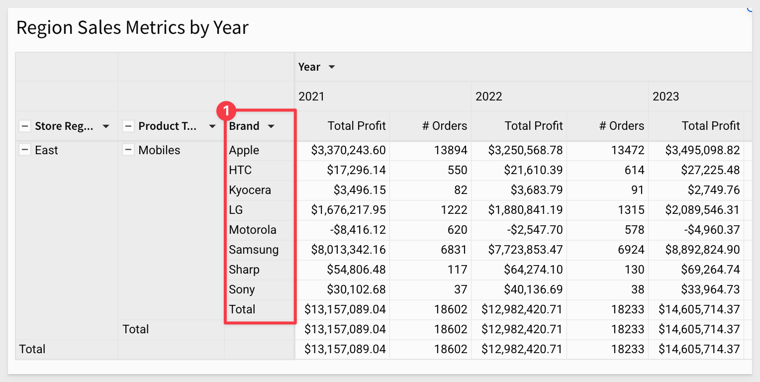
Brand is added to the pivot table, and we can see sales figures accordingly:
We might want to see the most recent year first. That is simple enough.
Click on the Year > Year (e.g., 2020) and select sort and descending (down arrow):
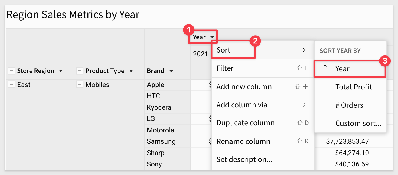
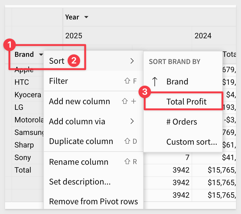
We also want to sort Brand by Total Profit, so we can more easily see the bottom dwellers:
Now it is clear which vendors are performing poorly:
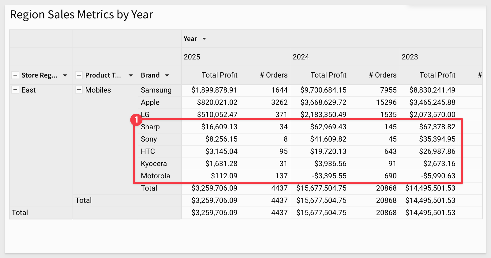
The action of drilling down on Brand added the column as a pivot row (#1 in the image below). We can keep that or remove it just as easily using the Brand's column menu.
The drill-down action also created two filters that we can keep or disable.
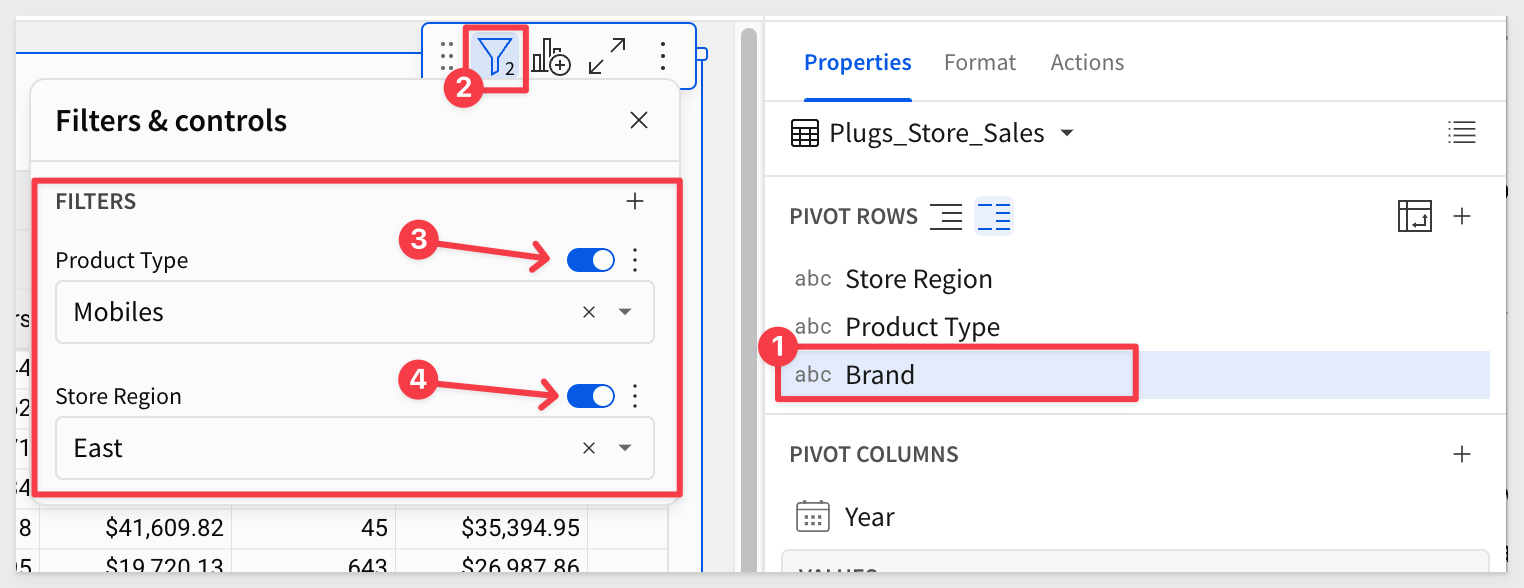
Our pivot table now looks like this (after disabling the two filters and removing the Brand pivot row.):
Click Publish.
Following the same workflow we used in the tables QuickStart, we can apply customizations to our pivot table to make it easier on the user's eyes.
In the Element panel > Format, we can adjust the various items in the pivot to suit our needs.
In the TABLES STYLES section, we can easily make adjustments as shown in the image below. Note that there are separate configurations for Header and Subheader in this section:
Each section will display an asterisk when the defaults have been changed:
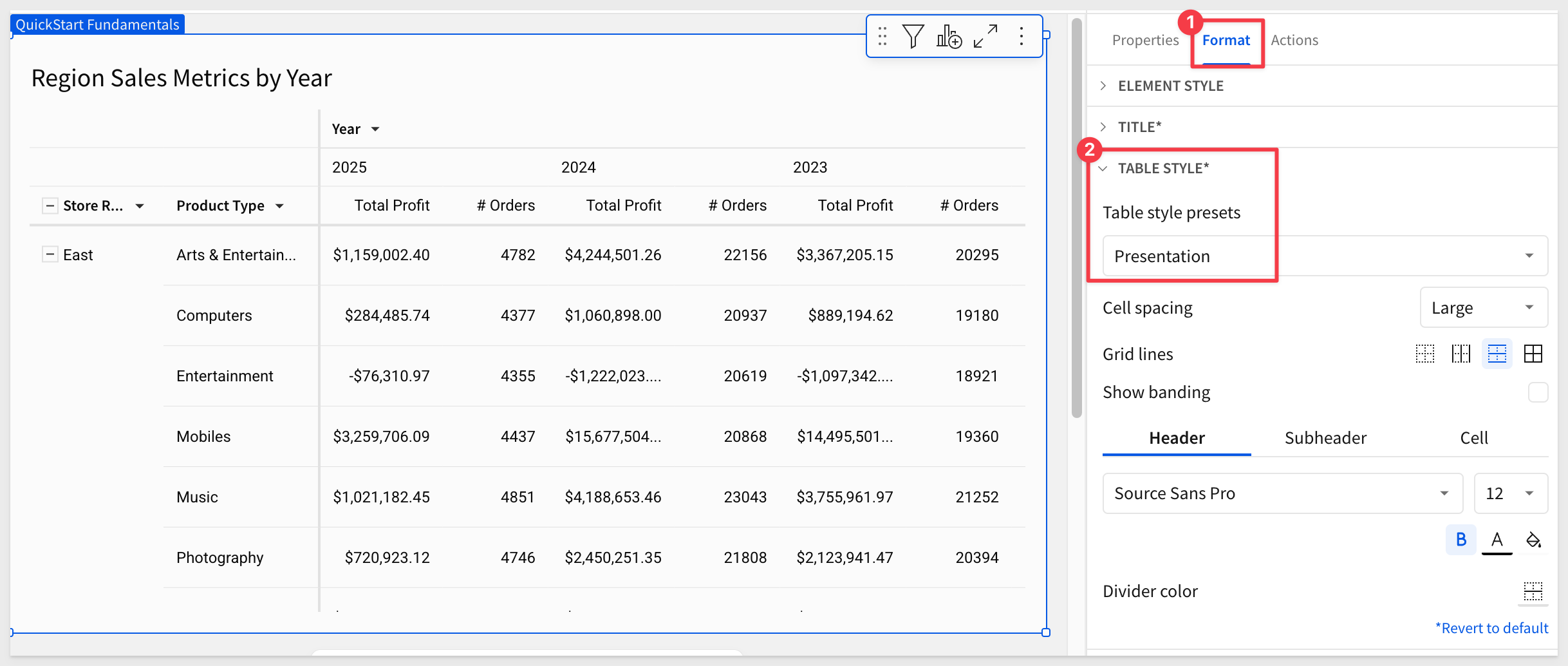
Experiment as much as you want. Each section has the option to Restore to default.
Click Publish.
Just like we did when working with standard tables, we can apply conditional formatting to the pivot table, based on values in cells.
Color Scales
Click the pivot table to select it, then click the Format in the Element panel.
Then click Conditional formatting:
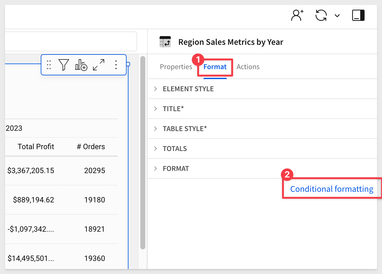
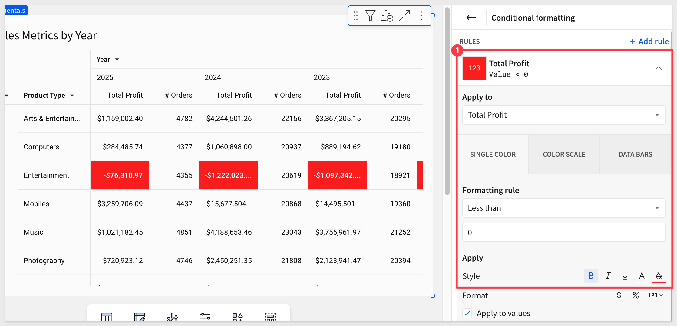
This opens the conditional formatting panel. We use this to create "rules" that will allow different styling effects to be applied based on the evaluation of the rule.
For example; show all transactions where the margin is negative (sold at a loss) with a red cell background and white/bold text.
In our case, we will configure a simple rule to drive the cell colors used in the Total Profit column.
The rule is applied automatically and we now can see which product types are underperforming:
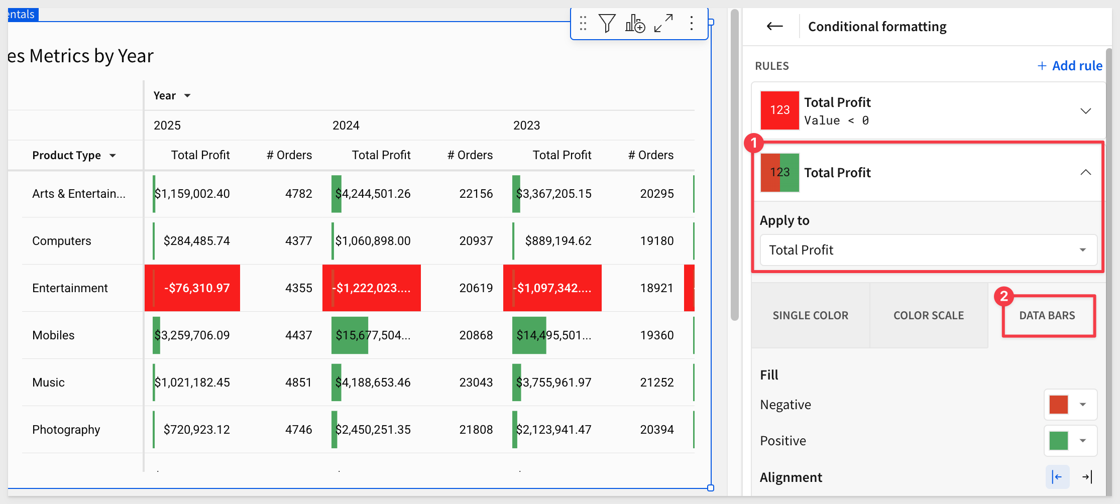
Data Bars
We can also apply a progress bar inside of a column's cells. This can be color based and include a min/max value range.
Click the link for + Add rule.
Click the DATA BARS box.
Select the Total Profit column.
The fill colors are already set for us; we can just use those.
If we wanted to set min/max values, we would click the Customize Domain checkbox.
Now we can see the relative profits of the product types that are making profits but the ones losing money are still front-and-center in full red.
Our pivot table now looks like this:
Click Publish.
There are many more features designed to improve the usability of pivot tables and to meet specific use cases.
Here are just a few examples that customers have found useful:
- Empty cell display value (on/off)
- Repeat row labels
- Swap pivot columns and rows
- Change the aggregation of values
- Display multiple pivot rows as separate columns
- Define values hierarchy in a pivot table
- Maximize a pivot table to view the flattened table
For more information, see Working with pivot tables
In this QuickStart, we covered why you might use a pivot table, how to use Sigma to create one, add conditional formatting, and drill down on table data and more.
The next QuickStart in this series covers using input tables in Sigma
Additional Resource Links
Be sure to check out all the latest developments at Sigma's First Friday Feature page!
Help Center Home
Sigma Community
Sigma Blog