This QuickStart is part of a series designed to help new users explore and analyze data in Sigma using charts.
We will be working with some common sales data from our fictitious company Plugs Electronics, reusing content we created in the QuickStart fundamentals 1 and 2.
Sigma supports a wide variety of types so be sure to check our documentation for the latest list:
Supported Charts Types: | |
|
|
For the latest list of supported chart types, see Intro to charts
For more information on Sigma's product release strategy, see Sigma product releases
If something is not working as you expect, here is how to contact Sigma support
### Target Audience The typical audience for this QuickStart includes users of Excel, common Business Intelligence or Reporting tools, and semi-technical users who want to try out or learn Sigma.
Prerequisites
- A computer with a current browser. It does not matter which browser you want to use.
- Completion of the QuickStarts Fundamentals 1 and 2
- Access to your Sigma environment. A Sigma trial environment is acceptable and preferred.
- If you have not already, you can sign up for a Sigma Trial here:
What You'll Learn
Through this QuickStart, we will walk through how to use Sigma to create beautiful charts and maps, changing configuration parameters to suit your needs.

Our starting point is the workbook created in the QuickStart, Fundamentals 2: Working with Data
It is often easier to spot trends, outliers, or insights that lead to further questions when viewing data in a chart.
Sigma makes it easy to create charts of your data while also enabling you to dig into the data that makes up those charts.
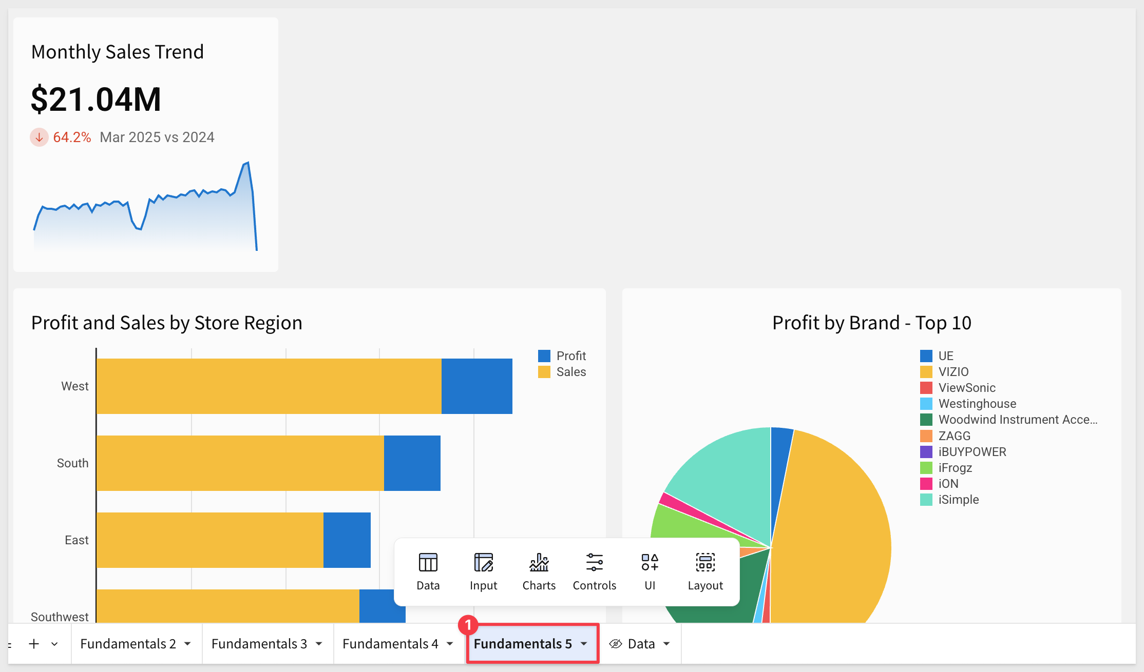
In Sigma, open the workbook Fundamentals and place it in edit mode.
Add a new page and rename it to Fundamentals 5.
Chart as child
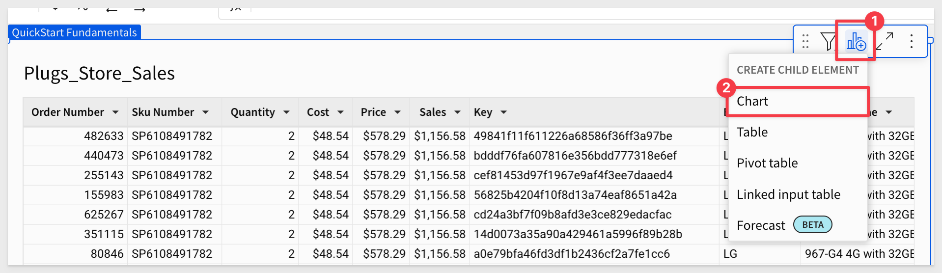
Our workbook has a page called Data; navigate to that.
Click on the icon as shown below, and select Create Child Element.
Select Chart from the drop list.
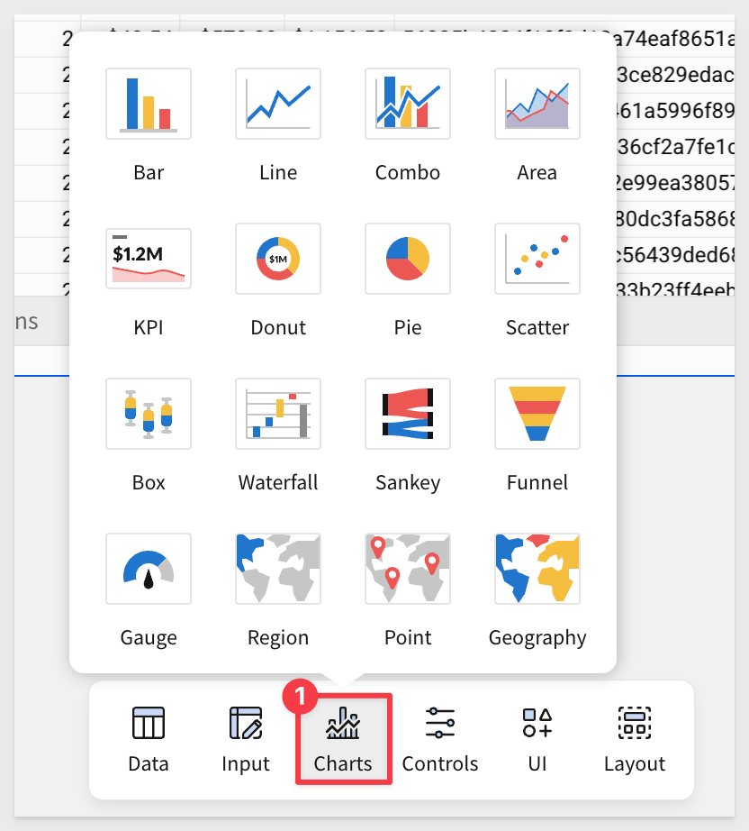
Sigma creates a chart element below the table. The chart now needs to be configured.
We used this workflow to demonstrate one way to add a chart, connecting it immediately to a source table. We could have also selected a chart from the Element bar and configured its data connection afterwards. Either way is fine:
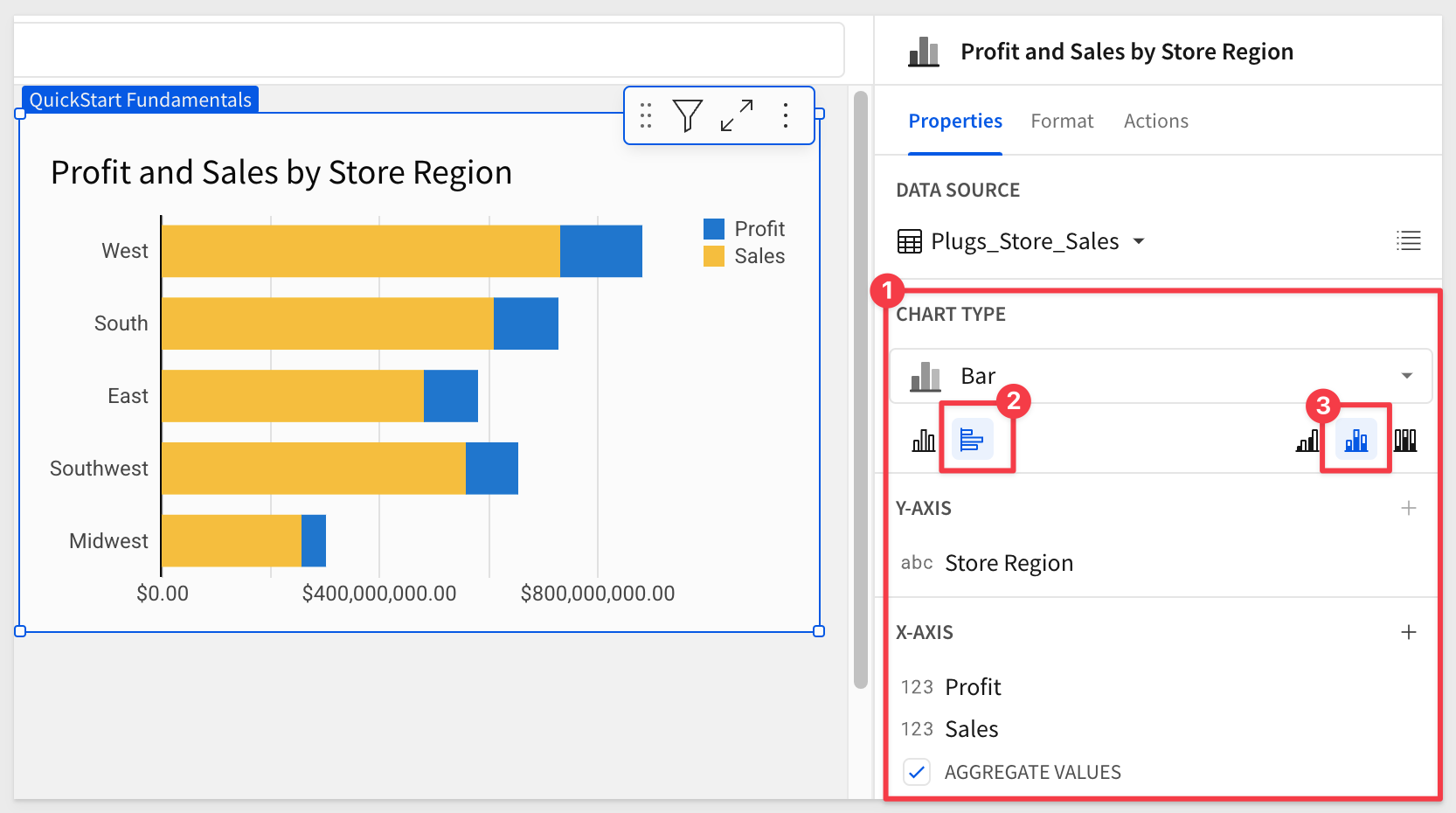
Move the chart to the Fundamentals 5 page.
Rename this bar chart to reflect Profit and Sales by Store Region.
Since you have completed other QuickStarts in this series, you know how easy it is to use the element panel to configure elements on the canvas.
Use the element panel to configure the bar chart as shown below:
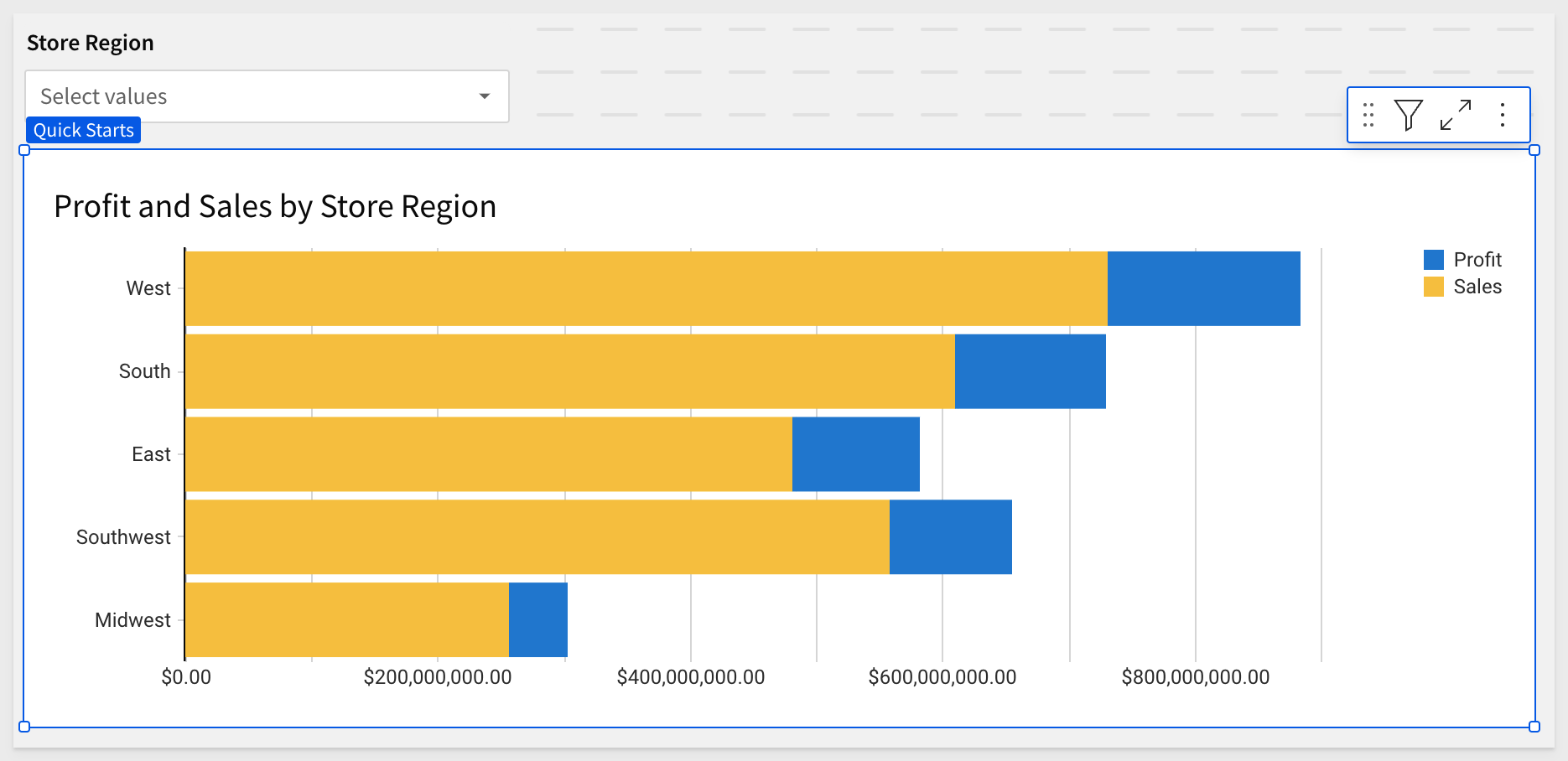
We have our first chart (sort by profit by right-clicking on any profit bar and selecting profit from the list):
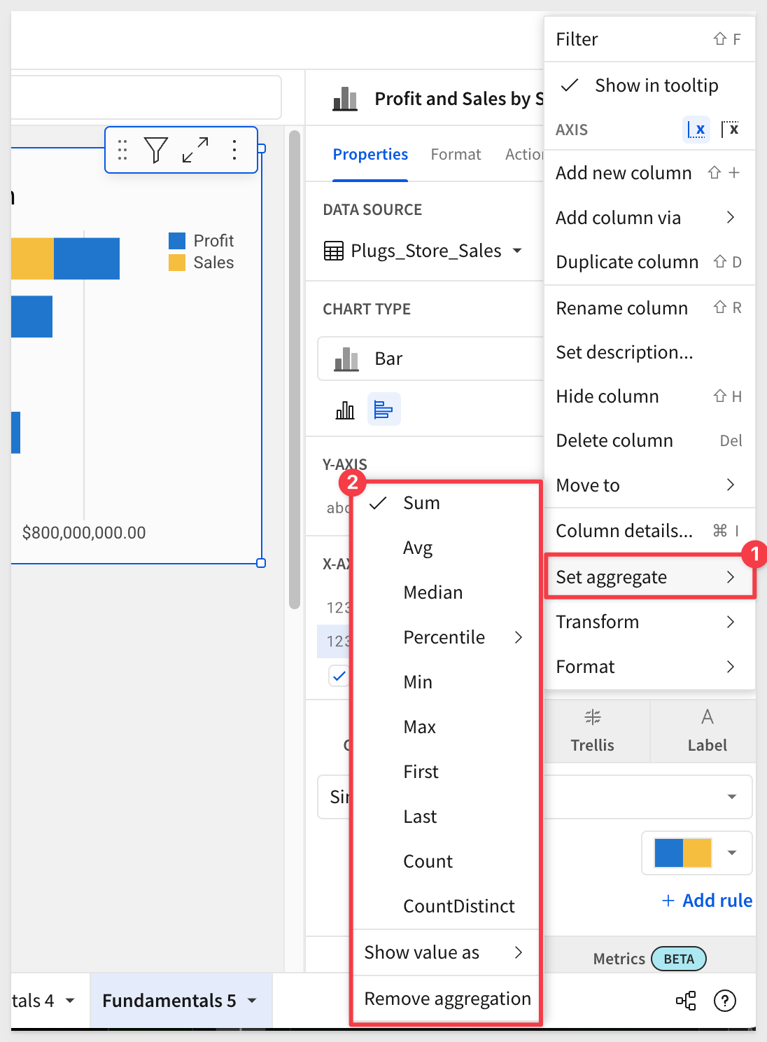
For example, opening the column menu for Sales in the X_AXIS group in the Element panel and selecting Set aggregate shows all the options:
Customizations
We can further customize many of the bar chart's attributes using the Element panel > Format menu.
For example, enable tool tips with a single click:
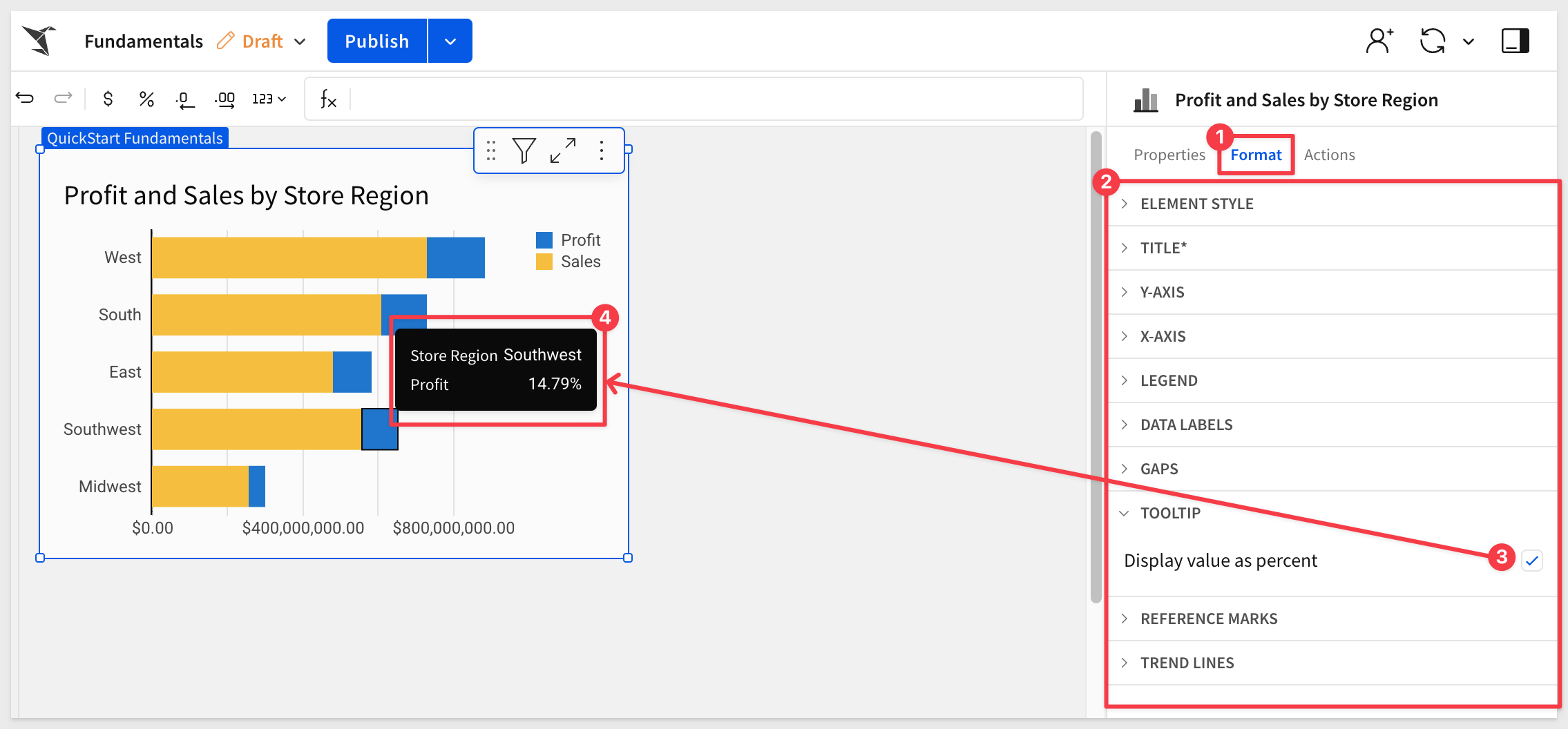
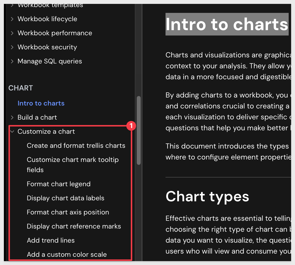
To learn more about the many chart format options, navigate to Intro to charts and look at the section under Customize a chart that interests you:
Adding another chart
This time, open the Element bar > Charts group and select a Pie chart. Drag it alongside the existing chart.
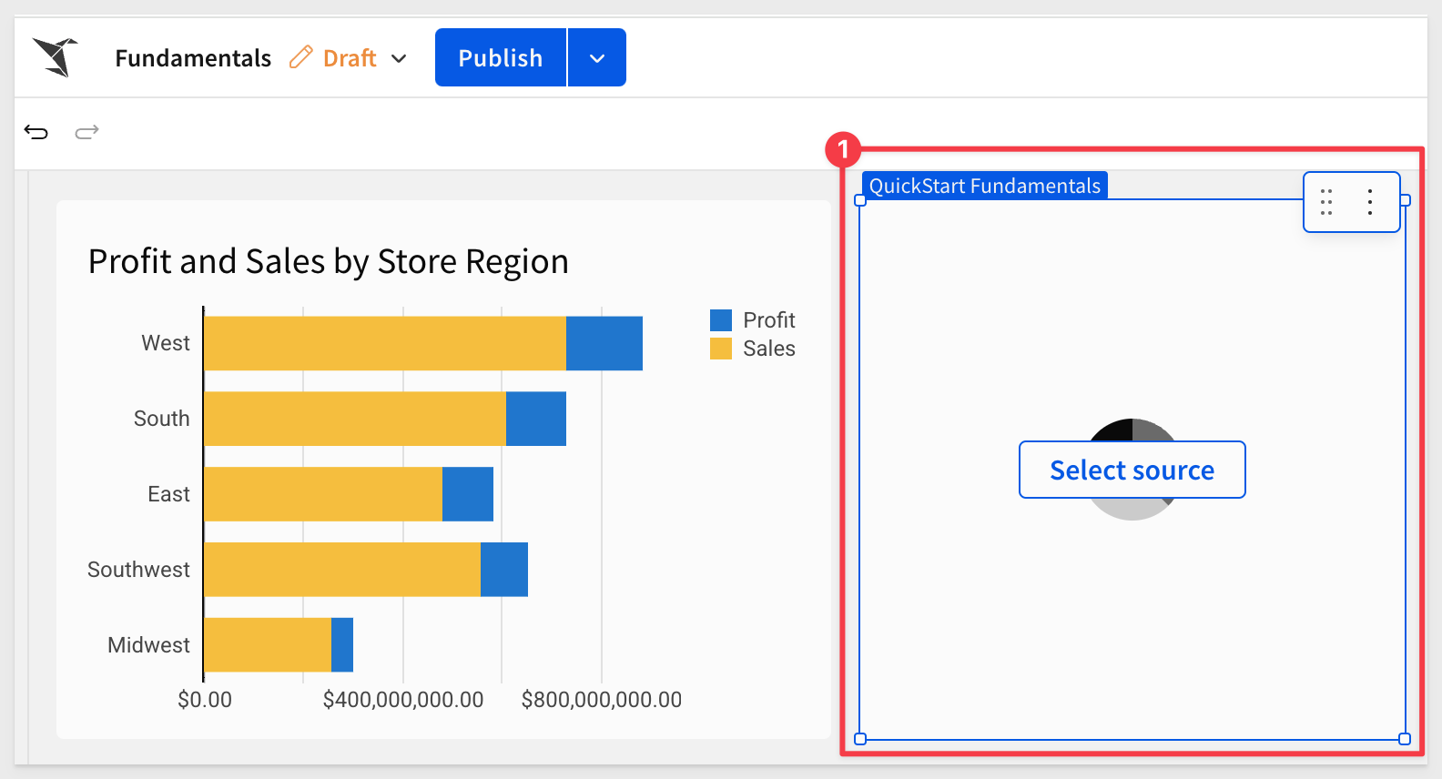
Click Select source, and choose the Plugs_Store_Sales table from the Data page.
Configure the pie chart as shown. Since the data has so many brands, let's assume (and filter for) the top 10 only:
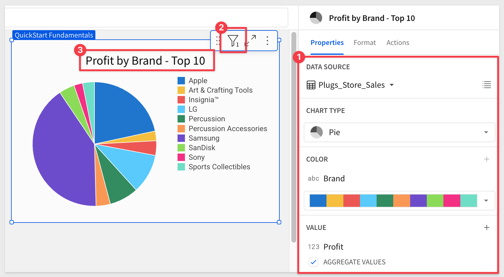
Click Publish.
There are many different chart types available to experiment with; we will not cover them all since they are all added and configured as we have already done.
Let's explore a few of the more popular ones.
As you have seen, there are many different types of charts available, and they all follow the same basic workflow.
Once you know how to create one, the others will be straightforward.
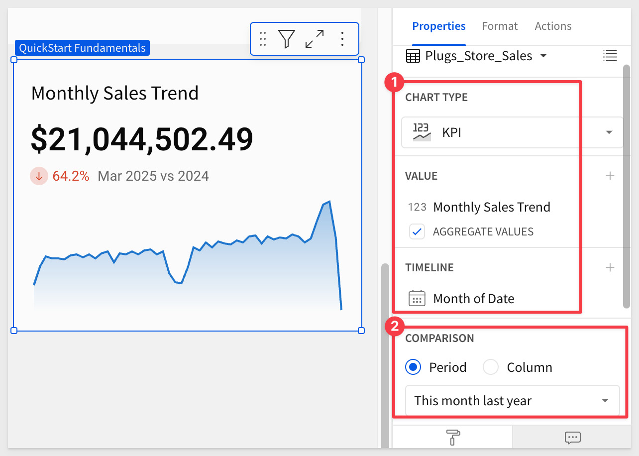
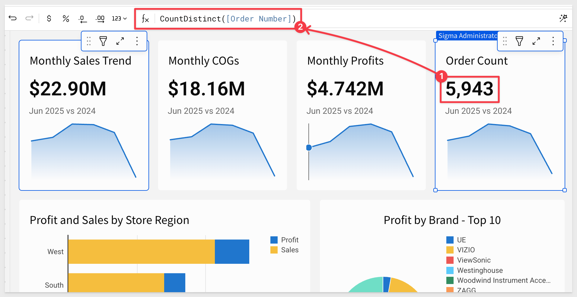
For example, let's say we want a KPI that shows Revenue, and compare the current month with the same month from the previous year.
Using the Element panel, add a new KPI chart, set its data source to the Plugs_Store_Sales table on the Data page.
Now simply configure the KPI as shown below. Use the Sales column for VALUE and rename it to Monthly Sales Trend. Also, set a Comparison period:
These steps are very much like ones that we have already done, which makes this straightforward.
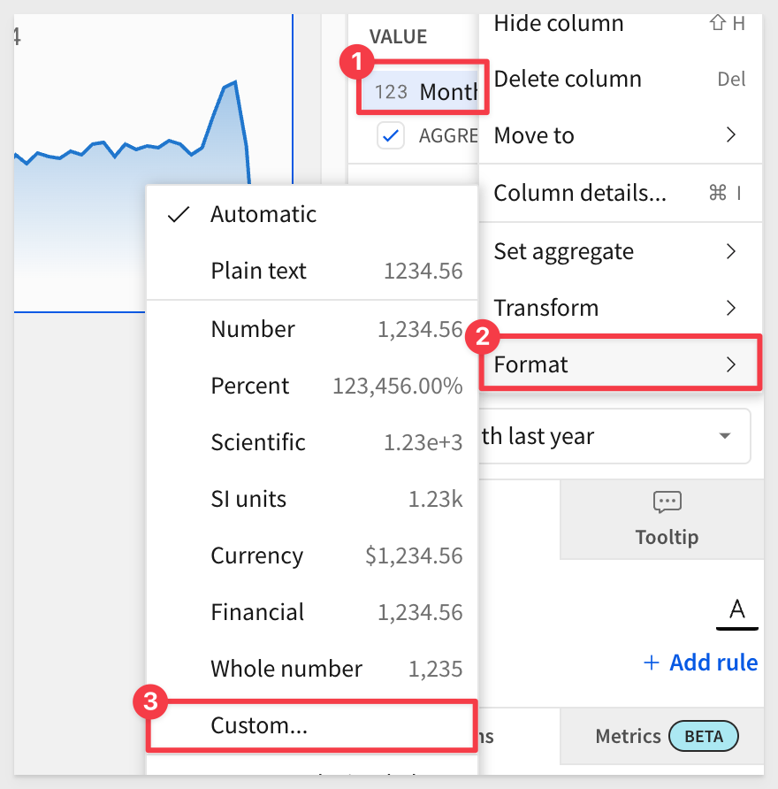
The exception might be how to get the value formatted as in millions, instead of the default.
In the VALUE element, open the menu for Sales > Format and select Custom:
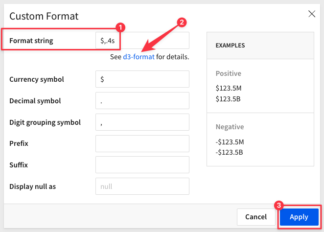
The Custom Format modal lets us adjust how the data is displayed using standard formatting, based on D3.js (D3).
D3 is a free, open-source JavaScript library.
Set the Format string to:
$,.4s
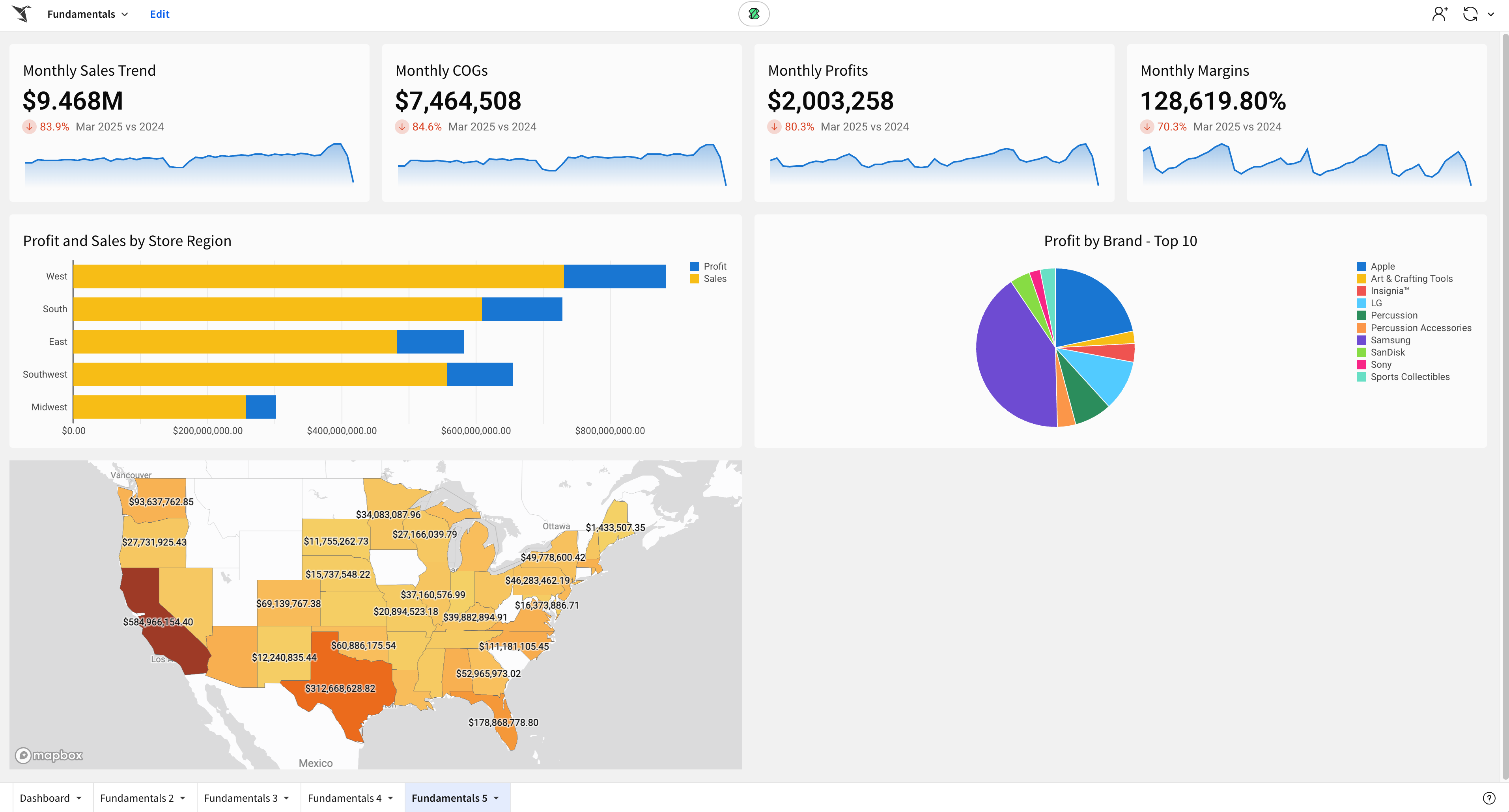
The Fundamentals 5 page should now look similar to this:
Click Publish.
More KPIs
Add other KPIs as you like; for example, COGS, Profit and Order Count would be good to add.
One way to do this is simply use the Monthly Sales Trend KPI menu and select Duplicate to quickly create copies.
COGS and Profit are done by swapping the VALUE column from Monthly Sales Trend to COGS and Profit columns respectively.
Order Count is the same as the others but the formula is not SUM but rather CountDistinct.
Select all four KPIs at once and drag them about the charts, resizing to suit.
The Fundamentals 5 should now look similar to this:
Click Publish.
For more information, see Build a KPI chart
Geographic data can tell a powerful story. Whether analyzing regional trends or plotting sites, maps are packed with insights generated from your location data.
Sigma Maps help contextualize geospatial information and provide greater understanding when analyzing data. With Sigma, you can create interactive maps using regions, latitude and longitude, or map paths and areas utilizing GeoJSON.
Workbooks support three distinct map types: Region, Point and Geography:
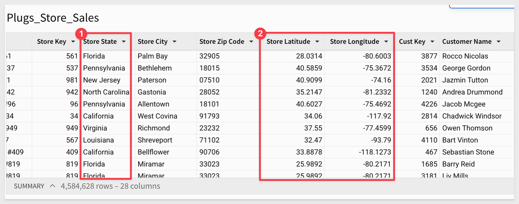
Our Plugs_Store_Sales table has the columns we can use for Region and Point map types:
Map by Region (State)
Add a Region chart, set its data source to the Plugs_Store_Sales table on the Data page, and change the CHART type to Map-Region.
Now simply use the Element panel to configure the map as shown below:
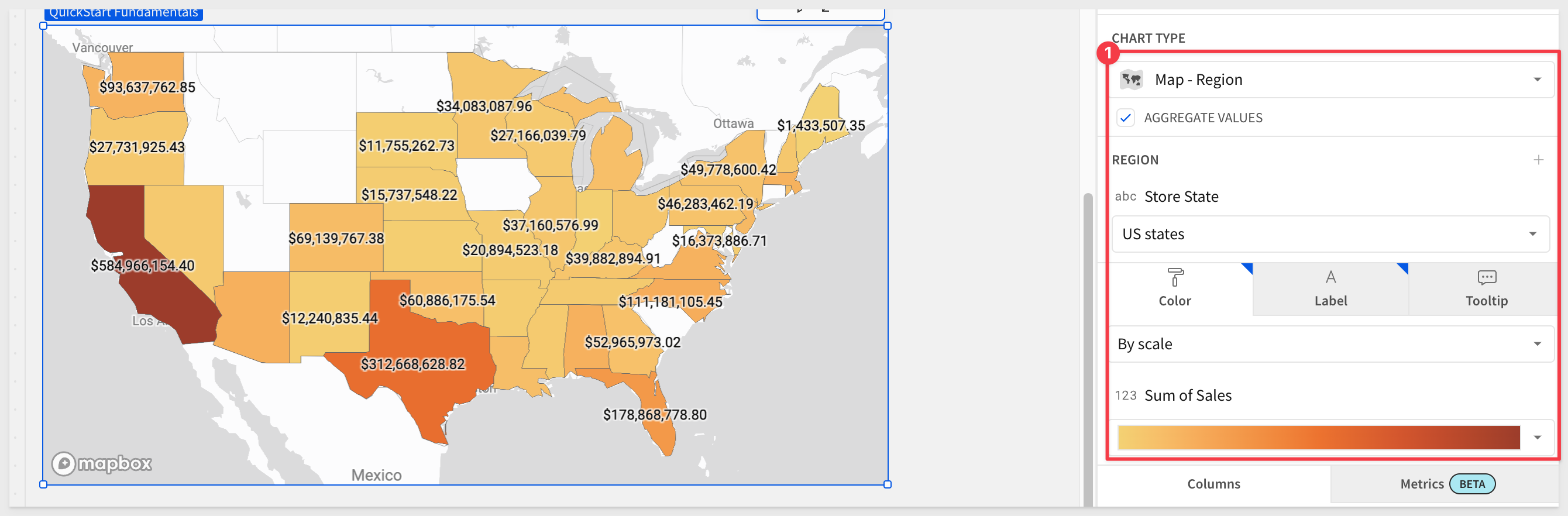
Right clicking on any state allows you to include/exclude it from the dataset or drill down to underlying data:
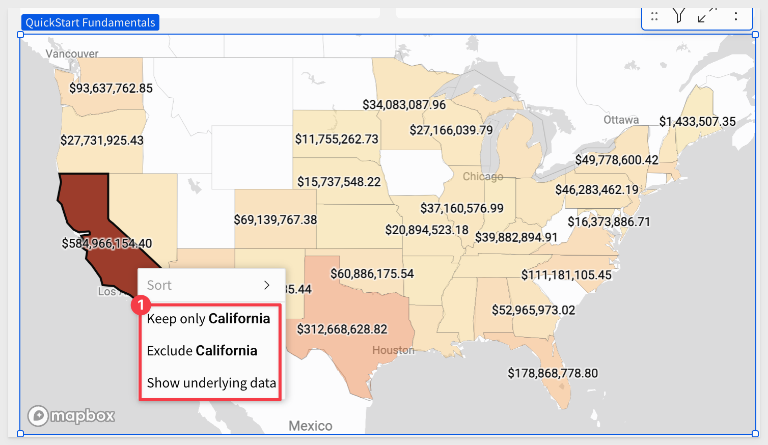
Click on the expand-contract icon in the upper right corner of the map:
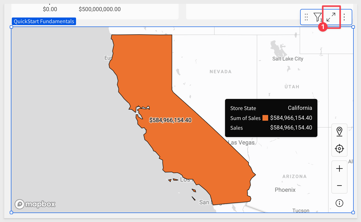
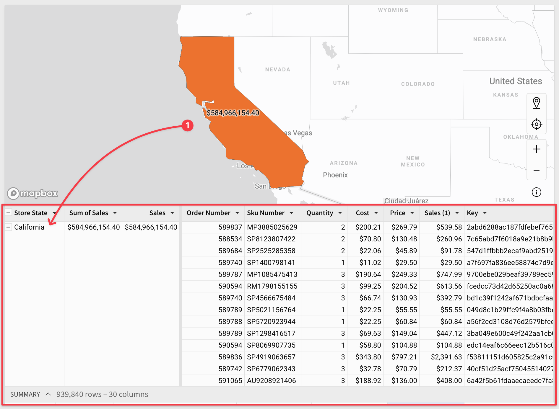
Now we can work with the underlying data, which has been grouped and aggregated for us, based on the map's configuration.
We can browse the data or duplicate it to create different views for our own analysis:
The Fundamentals 5 page should now look similar to this:
Click Publish.
Adding a map with pins representing store locations, color-coded by sales, takes just a few clicks.
By now, the steps should be really familiar so here is the end result, along with the element panel configuration:
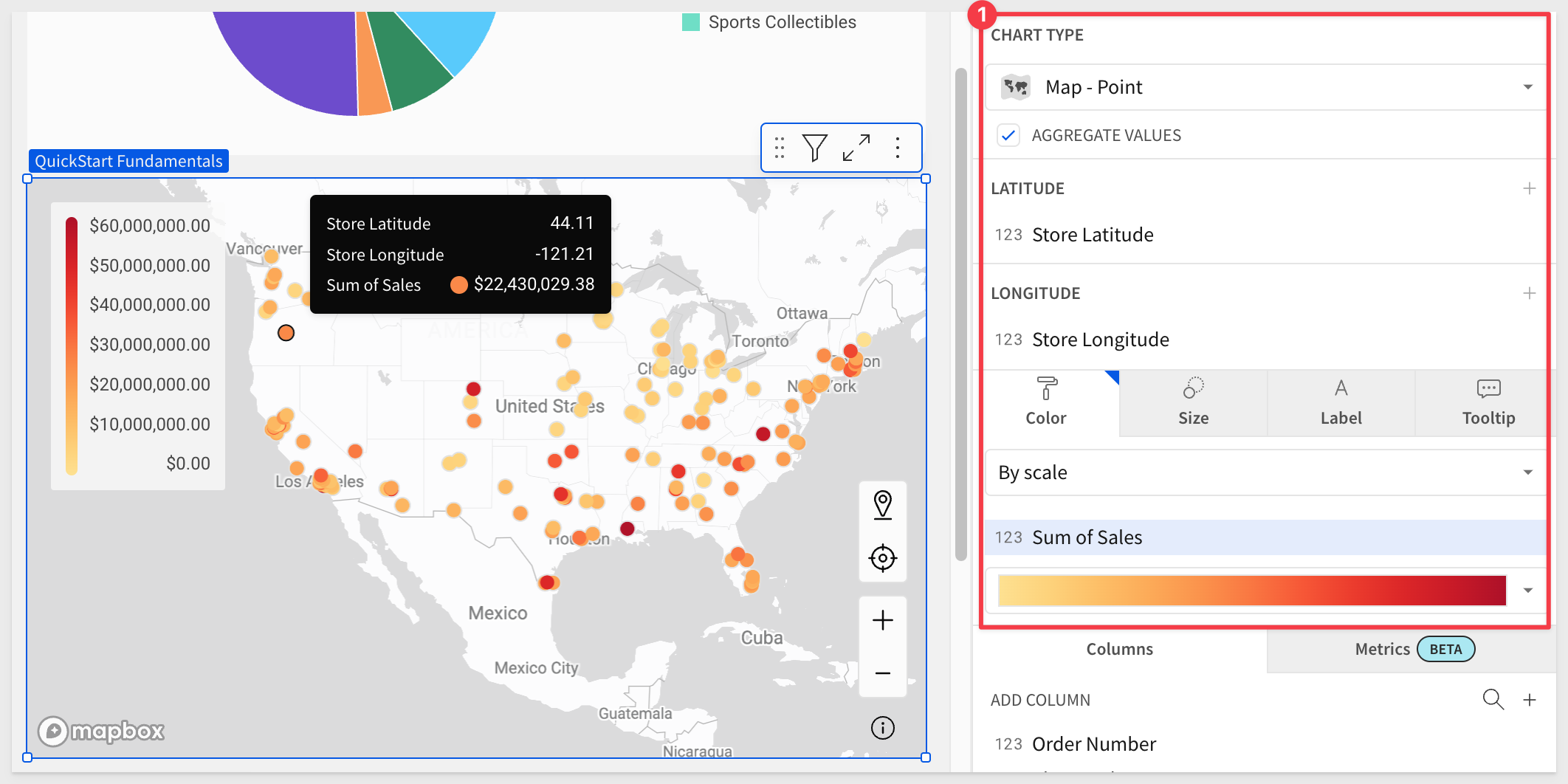
Click Publish.
There are many chart libraries available on the internet, and these can be the basis for adding a chart type that does not exist in Sigma via a Plug-in
For example:
Chart.js: Simple yet flexible JavaScript charting library for the modern web.
D3.js: Create custom dynamic visualizations with unparalleled flexibility
There is also a QuickStart on this topic; see Extend Sigma with Plugins
In the QuickStart, there are instructions on how to access the public git repository containing example plugins.
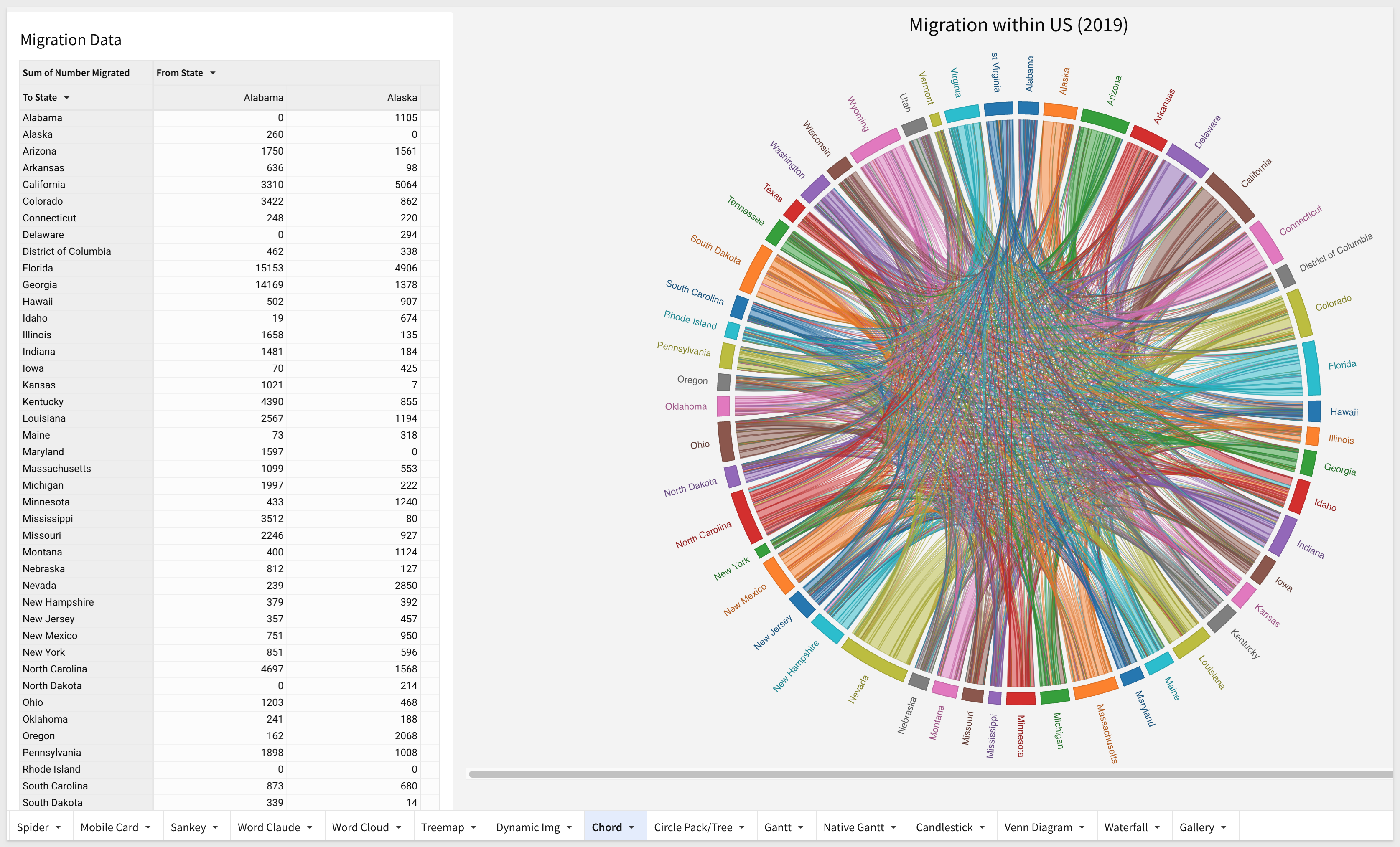
Some really amazing visuals can be created via plugin. For example:
In this QuickStart, we learned how to use Sigma to create beautiful charts, KPIs, maps and more.
The next QuickStart in this series covers using controls in Sigma
Additional Resource Links
Be sure to check out all the latest developments at Sigma's First Friday Feature page!