Meet Alex, a store manager at a busy retail location that sells ice cream. She's on the floor serving customers most of the day, checking inventory on her phone between interactions. Her rule: if it can't be done on her phone in a few minutes, it won't get done.
This QuickStart shows you how to build the storefront interface Alex uses to manage her store — complete with live inventory data, product filtering, and an operational notification center.
Why this interface works for Alex:
- No training required — looks like an app she already knows
- Fast — every interaction loads in seconds
- Role-aware — storefront and manager views in a single workbook
Build time: about 30 minutes.
What you'll build:
A data-driven storefront interface that allows users to:
- View live inventory and sales data filtered by store and date
- Browse products with images and live stock levels
- Filter products by category or name
- Monitor operational alerts with urgency filtering
- Switch between storefront and manager dashboard views
Along the way you'll learn how to:
- Build a lightweight data model with joined dimension tables and a calculated column
- Use the Repeated container element to generate card layouts from data rows
- Configure popover controls and date range controls in a shared page header
- Wire control targets across multiple tables
- Build a notification center with a boolean filter
- Use a segmented control and tab container with actions for role-based navigation
For more information on Sigma's product release strategy, see Sigma product releases
If something doesn't work as expected, here's how to contact Sigma support
Target Audience
This QuickStart is ideal for:
- Sigma users building operational interfaces for frontline staff (store managers, field technicians, warehouse operators)
- Developers and analysts who need to create repeating, data-driven UI elements efficiently
- Teams building operational applications where speed and simplicity are critical
Prerequisites
- Access to Sigma with Build or higher permissions
- Intermediate familiarity with Sigma workbooks, elements, and controls
- Understanding of basic data relationships (optional but helpful)

Before building the storefront interface, we need a lightweight data model. Rather than wiring up joins directly inside the workbook, we'll create a Sigma data model with two tables and configure relationships to PRODUCTS and STORES. This keeps the workbook clean and makes related columns available on demand wherever we need them.
Create a New Data Model
From your Sigma home page:
- Click
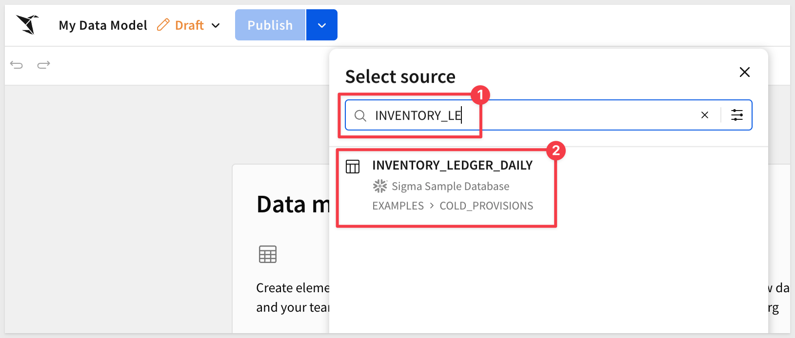
Create newand selectData model. - Using the
Element baradd a newTablefrom theDatagroup. - Search for
INVENTORY_LEDGER_DAILY. - Click to select the table from
EXAMPLES > COLD_PROVISIONS:
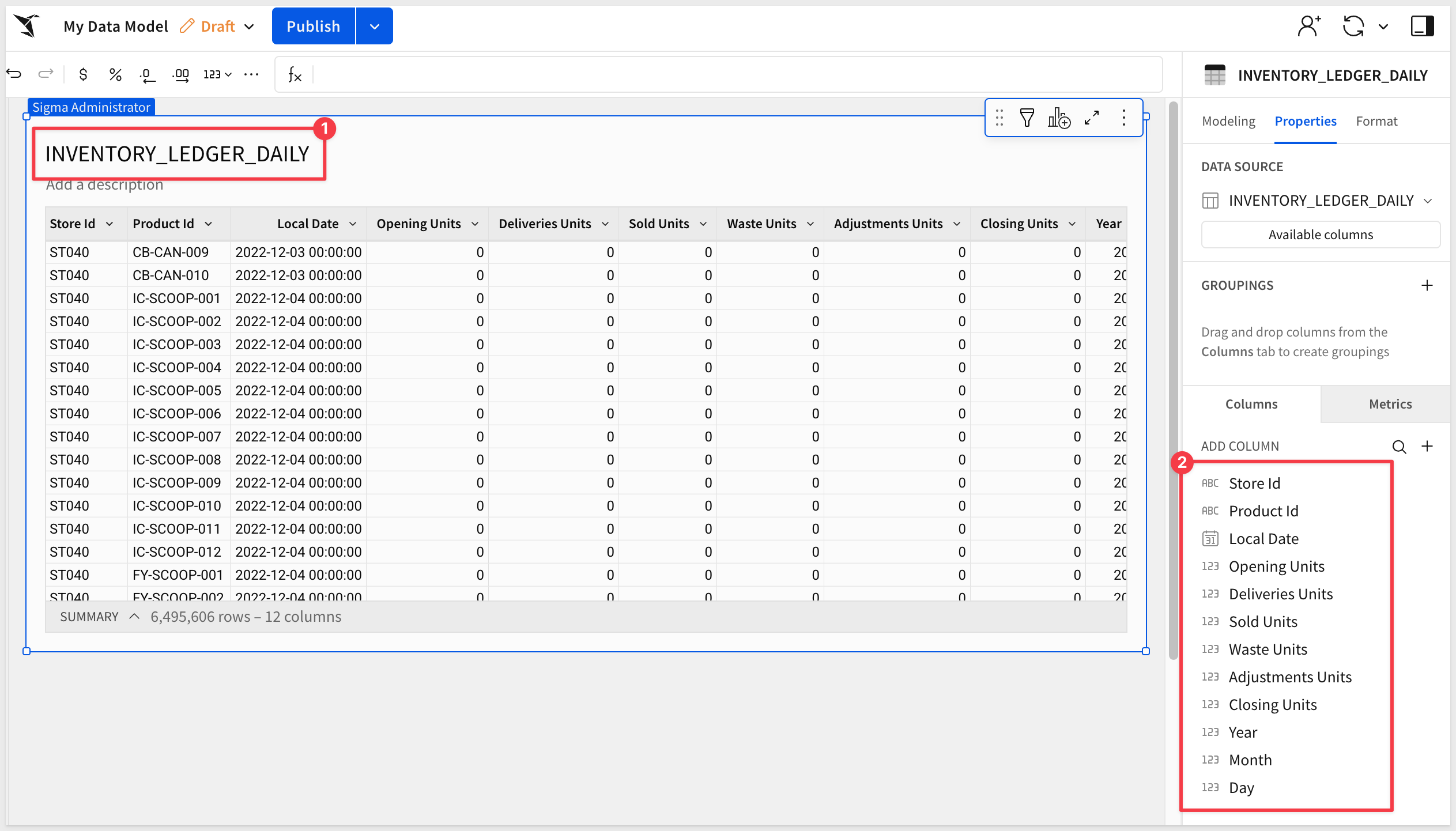
About the Daily Ledger Table
INVENTORY_LEDGER_DAILY is the fact table at the center of this data model. Each row represents one product at one store on one date, recording daily inventory activity: units sold, delivered, wasted, adjusted, and closing stock. We'll manually join it to PRODUCTS and STORES as dimension tables, making their columns available throughout the workbook:
Join Products and Stores to the Ledger
With INVENTORY_LEDGER_DAILY on the canvas, add relationships to the two dimension tables.
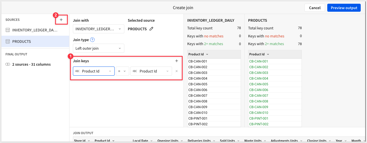
Join to PRODUCTS:
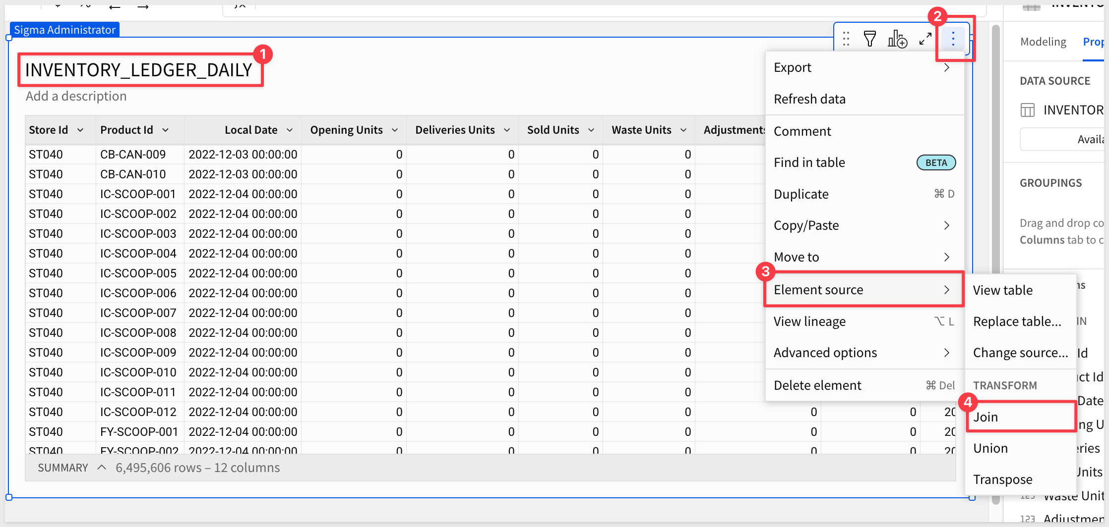
- Click on the
INVENTORY_LEDGER_DAILYelement to select it. - Click the
3-dotmenu to opens the tables menu. - Select
Element source>Join
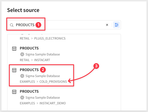
- Search for
PRODUCT, taking care to select the table fromEXAMPLES > COLD_PROVISIONS:
- Click
Select, leaving all columns selected. - Set the join key:
Product Id(INVENTORY_LEDGER_DAILY) =Product Id(PRODUCTS). - Leave the join type as
Left outer join. - Click the
+to add another table.
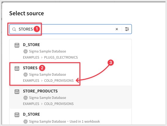
Join to STORES:
- Search for
STORES, taking care to select the table fromEXAMPLES > COLD_PROVISIONS: - Select
STORESfromCOLD_PROVISIONS.
- Set the join key:
Store Id(INVENTORY_LEDGER_DAILY) =Store Id(STORES). - Leave the join type as
Left out joinand clickPreview output:
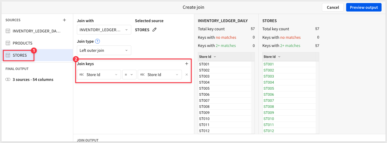
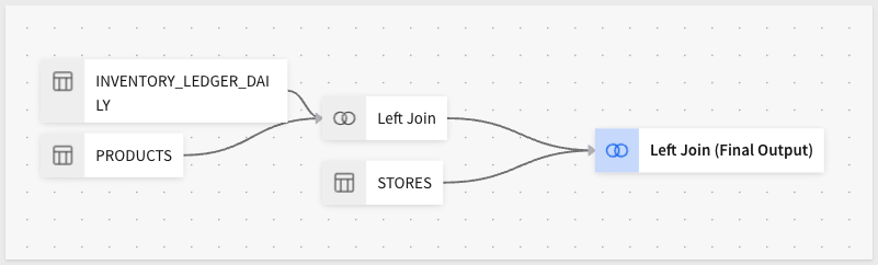
- Sigma shows the Lineage for the data model visually:
- Click
Done.
With both joins in place, columns like Store Name and Store Image Url (from STORES) and Product Name, Product Line, and Product Image Url (from PRODUCTS) will be accessible throughout the workbook.
Add the Notifications Table
NOTIFICATIONS feeds the notification center panel on the right side of the storefront. It's independent of the ledger and gets added as a separate element.
- Using the
Element baradd anotherTableto the workbook page. - Search for
NOTIFICATIONS, taking care to select the table fromEXAMPLES > COLD_PROVISIONS. - Click
Select.
Add the Is Urgent Calculated Column
The NOTIFICATIONS table has a Priority column with text values like critical, high, medium, and low. Controls like a switch or toggle require a boolean target, so we'll add a calculated column that converts critical priority to true.
- With the
NOTIFICATIONStable selected in the data model, click the+button at the top right of the column list to add a new column. - Name the column
Is Urgent. - Enter the following formula:
Sigma evaluates this as a boolean — rows where[Priority] = "critical"Priorityequalscriticalreturntrue; all others returnfalse.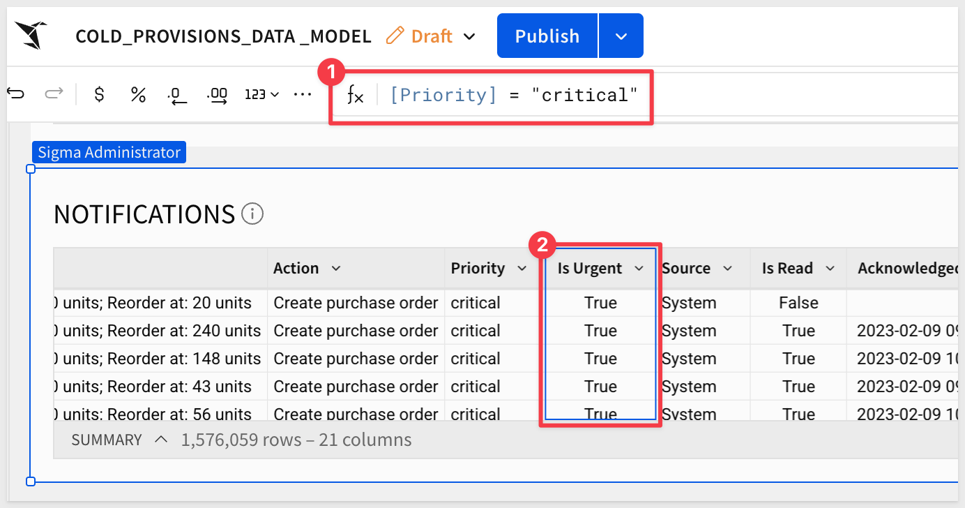
Rename the Data Model
- Rename the data model
COLD_PROVISIONS_DATA_MODEL. - Click
Publish.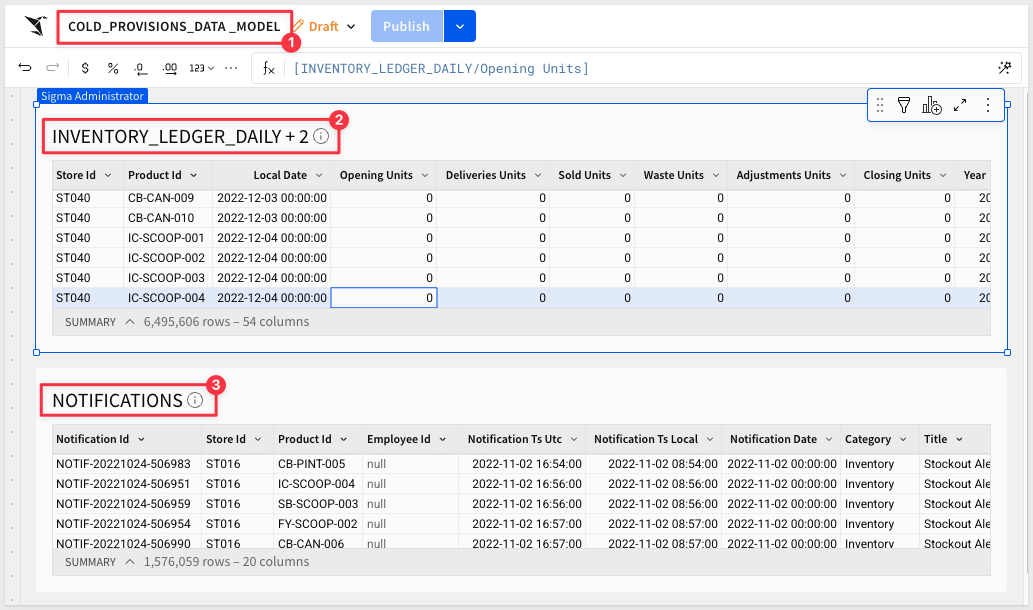
- Return to the Sigma home page. The data model is now ready to use as the data source for the storefront workbook. In the next section, we'll create a new workbook and connect it to this data model. Building the Header and Navigation
Create a New Workbook
- From the Sigma home page, click
Create newand selectWorkbook. - Click
Save asand name the workbookCold Provisions QuickStart. - Rename the default page to
Databy double-clicking the page tab. This page will hold the source table elements from the data model, making them available to any page in the workbook. - From the
Element bar, add aTableelement and search forCOLD_PROVISIONS_DATA_MODEL. SelectINVENTORY_LEDGER_DAILY + 2. - Add a second
Tableelement and selectNOTIFICATIONSfrom the same data model: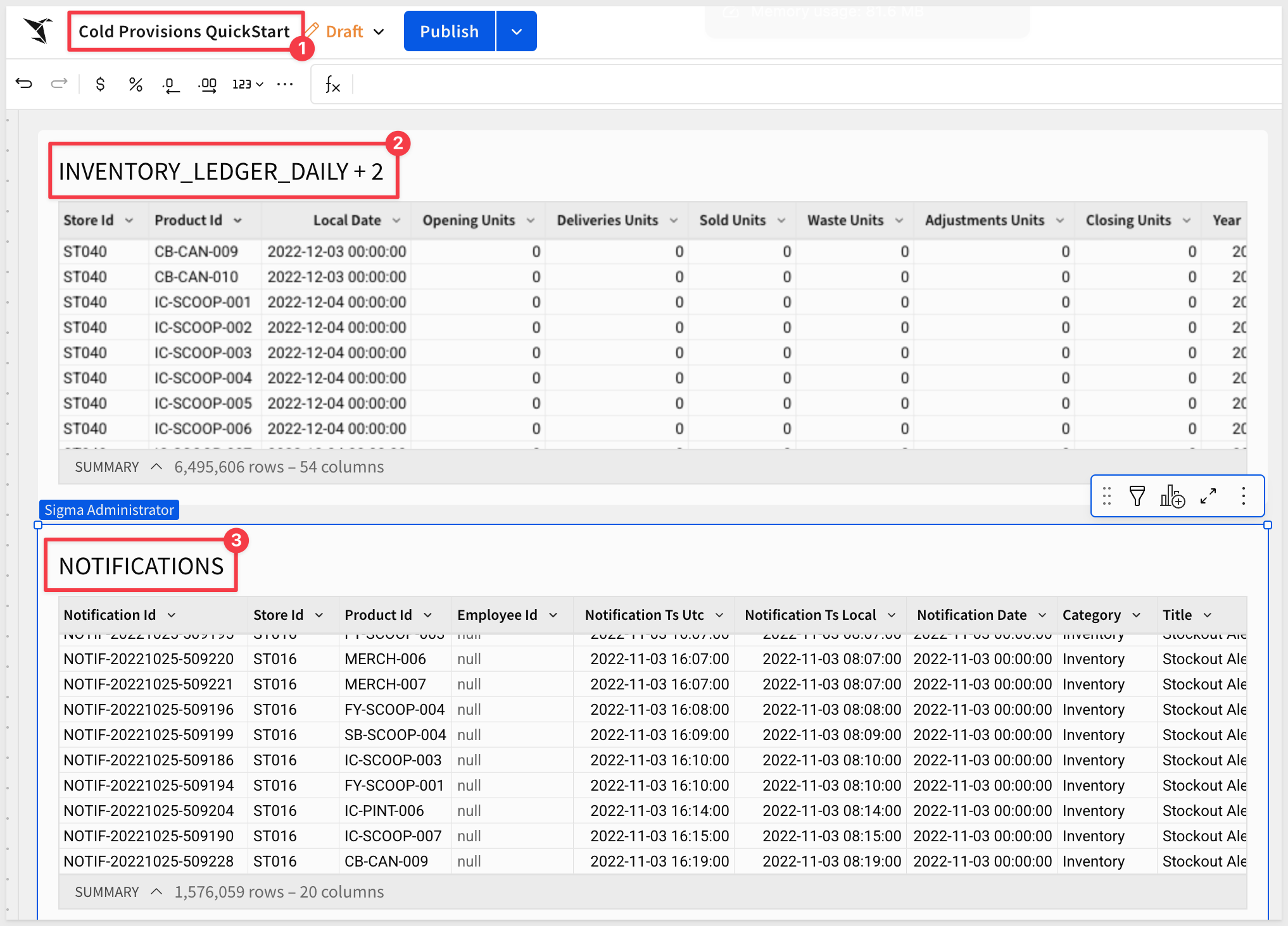
- Add a new page by clicking the
+next to the page tabs and rename itStorefront.Enable Page Headers
Sigma supports a common header, which is useful when we want to reuse it across multiple pages. - Click the
Workbook settingsbutton: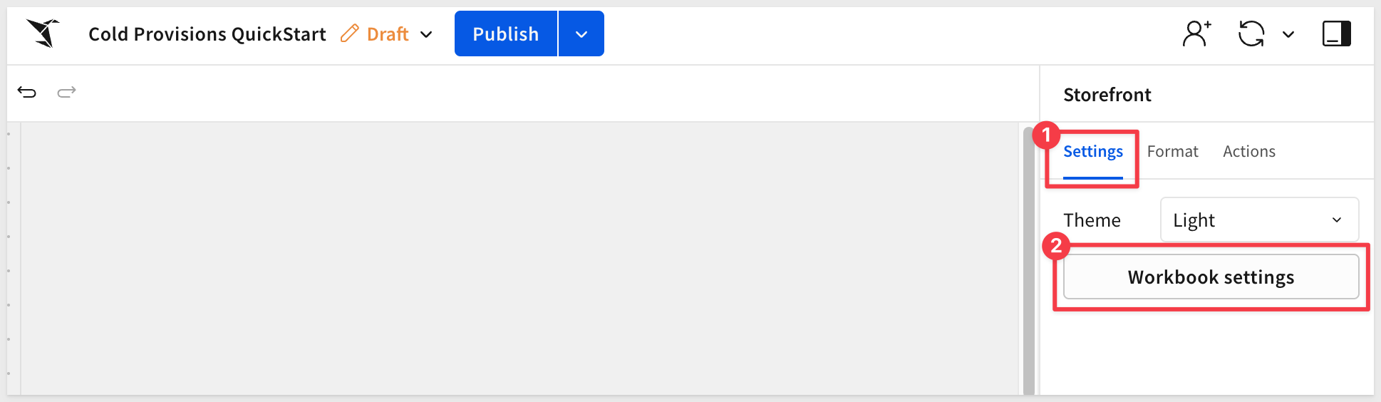
- Check the box to enable
Page header: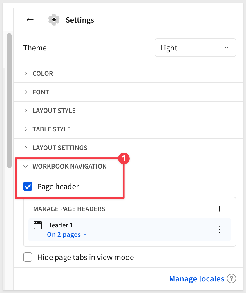
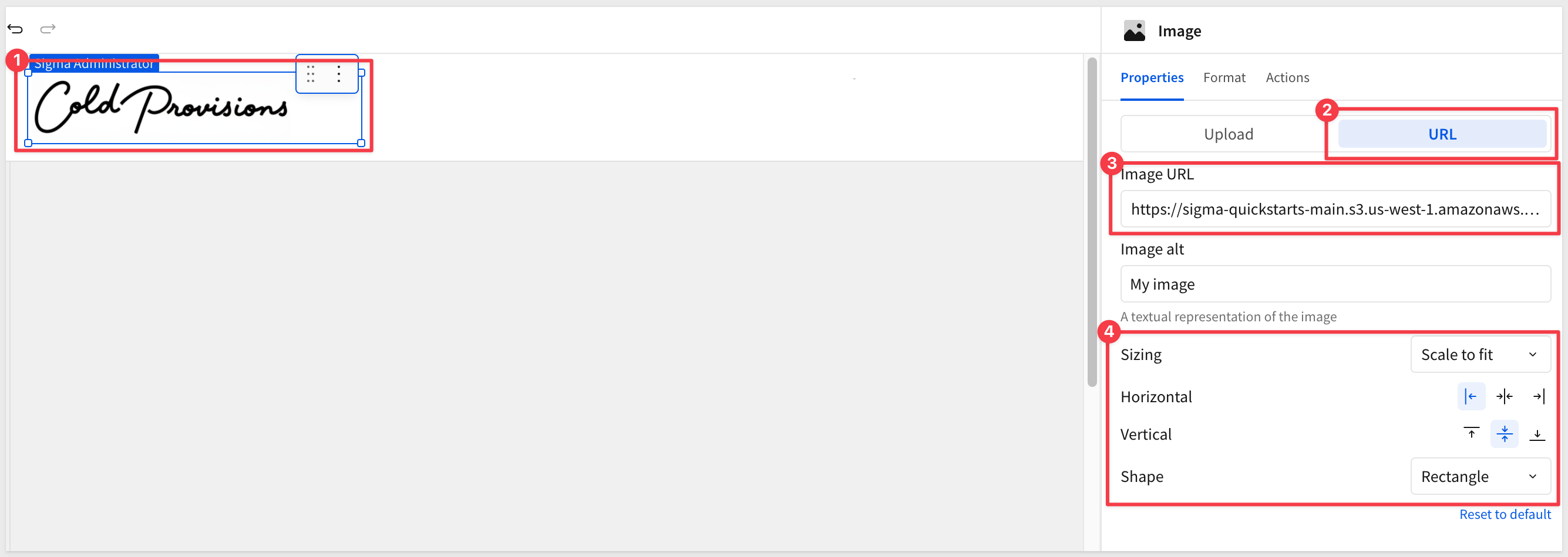
Add the Logo
The Cold Provisions logo is an image element placed in the top-left of the header. - From the
Element bar, drag anImageelement from theUIgroup onto the canvas at the top left. - In the right panel, set the image source to
URL. - Use the following URL:
https://sigma-quickstarts-main.s3.us-west-1.amazonaws.com/shared_images/cold-provisions-logo.png
- Rename the data model
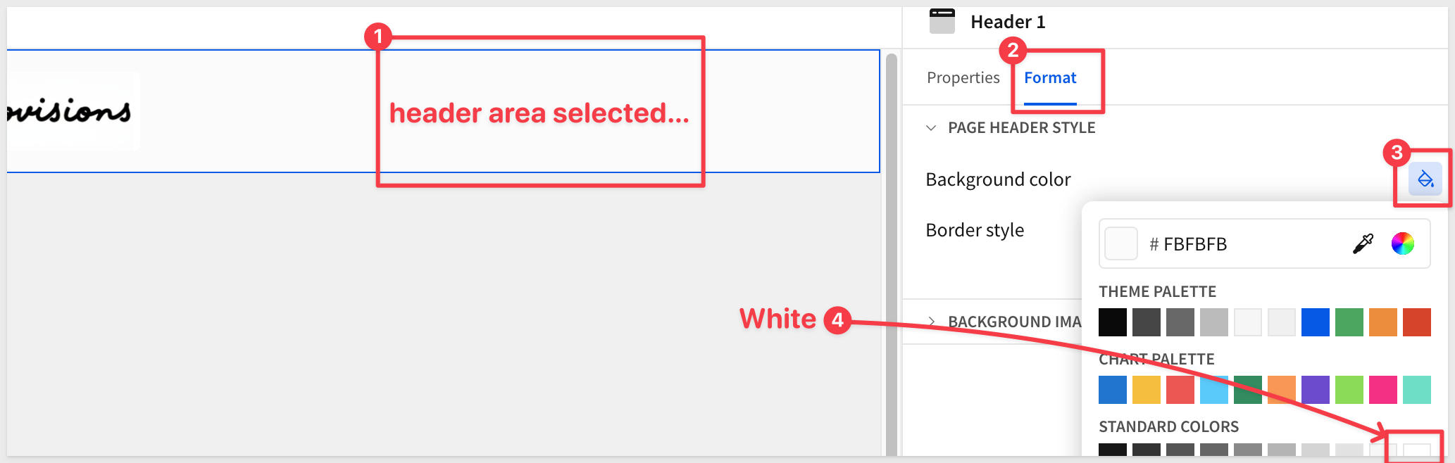
- Adjust the image width so the logo sits comfortably in the header without dominating the layout:
The logo background is white but the headers is not quite that so we can adjust it to match:
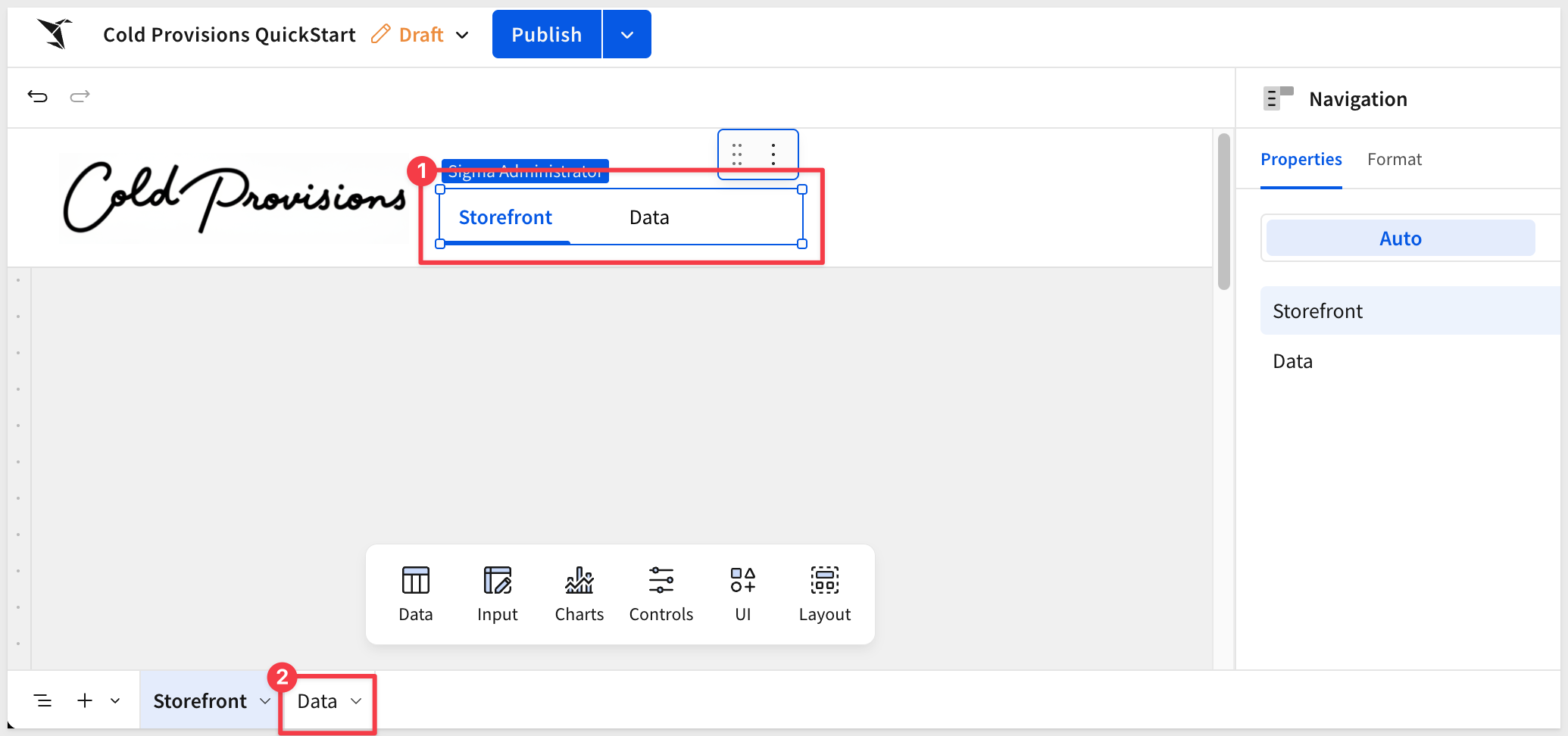
Add Navigation Text Elements
The navigation labels (Storefront, Finance, R&D) are text elements styled to look like a nav bar. For this QuickStart we're only building the Storefront page, so these are cosmetic—the tab switching behavior comes in a later section.
- From the
Element bar, drag aNavigationelement from theLayoutgroup onto the canvas to the right of the logo.
Storefront and Data pages are shown automatically. We could Hide the Data page tab, which would remove it from the control but let's just leave it since we won't have other pages in this demonstration:
For more information, see Use the navigation element to guide user exploration
The storefront needs to show the right data for the right store on the right day. Two controls in the page header handle this: a store selector and a date picker. Both will be placed in the shared page header so they're available across all pages in the workbook.
Store Selection Control
The store selector uses a popover—a floating panel anchored to a trigger button in the header. This keeps the header clean while still giving Alex a full list of stores to choose from on demand.
Add the popover to the header:
- On the
Storefrontpage, add aPopoverelement from theElement bar>Layoutgroup.
Sigma automatically creates a new page called Popover 1 to hold the popover's contents.
- Rename the
Popover 1page toStore Selector.
Add and configure the list control on the popover page:
- Navigate to the
Store Selectorpage. - From the
Element bar, add aListcontrol from theControlsgroup. - In the right panel, configure the following:
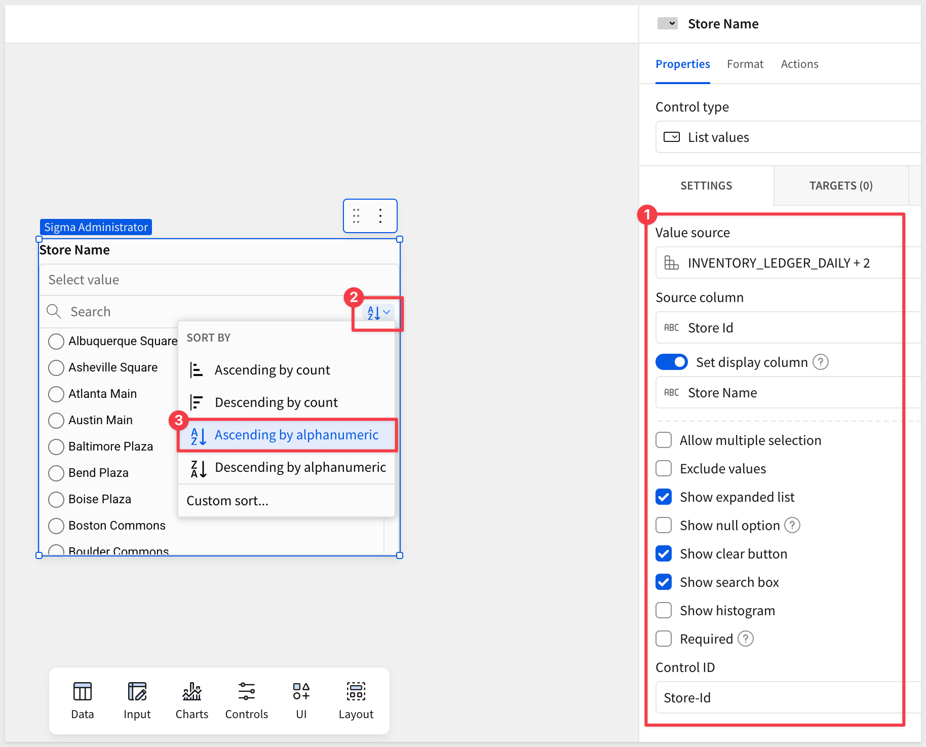
- Value source:
INVENTORY_LEDGER_DAILY + 2(from theDatapage) - Source column:
Store Name - Enable
Set display columnand set it toStore Name - Allow multiple selection:
unchecked - Show expanded list:
checked - Show clear button:
checked - Show search box:
checked - Control ID:
Store-Id
- Value source:
- Sort the list
Ascending by alphanumeric
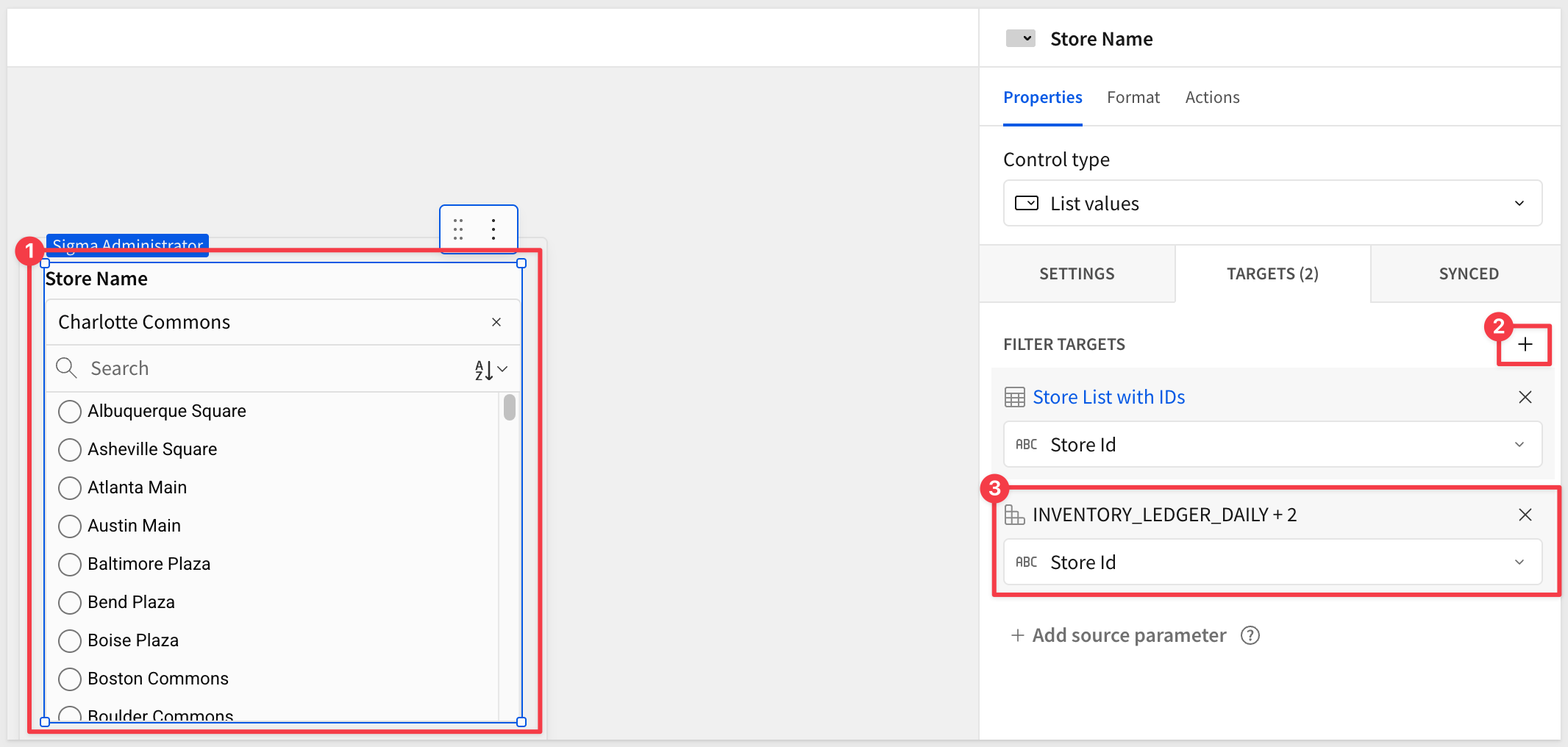
Now that we have the list we need a way to enforce a selection. Normally, a data model would have a Stores table but since we only have that data joined to the INVENTORY_LEDGER_DAILY table, we can use the flexibility of Sigma to get what we need, without the need for custom SQL (although we could do that too).
- On the
Datapage, create aChild tablefromINVENTORY_LEDGER_DAILY + 2:
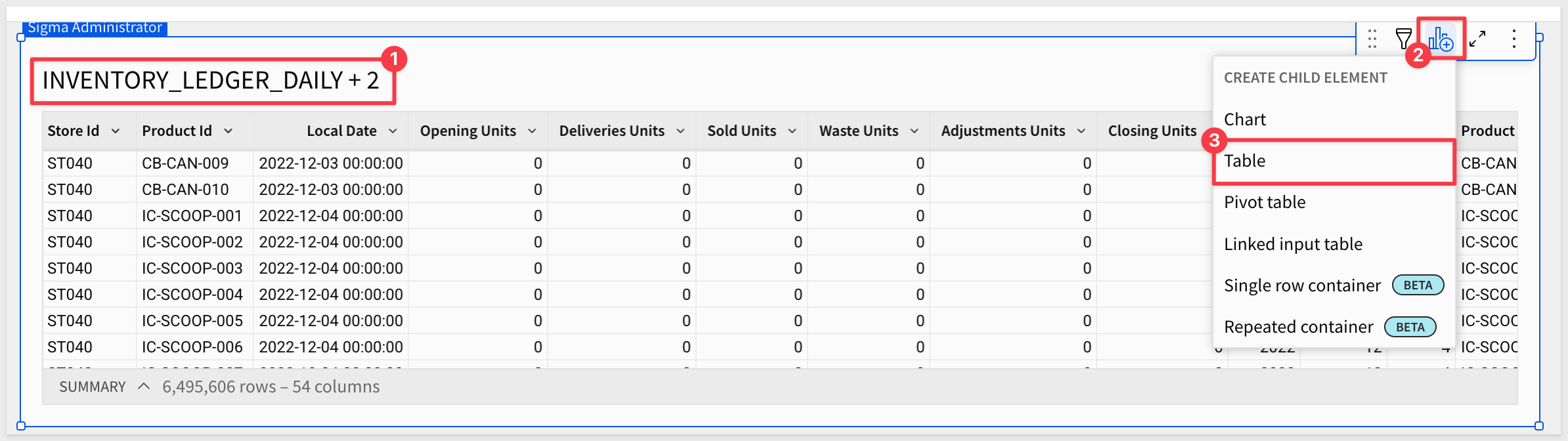
- Delete all the columns except
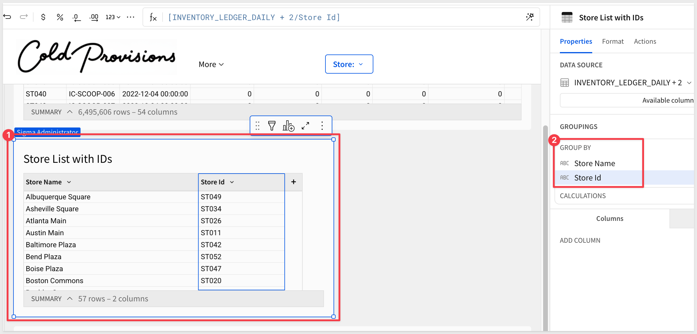
Store NameandStore IDfrom the child table. - Groups the child table by both remaining columns and rename the table
Store List with IDs
This gives us the one store and id for each location:
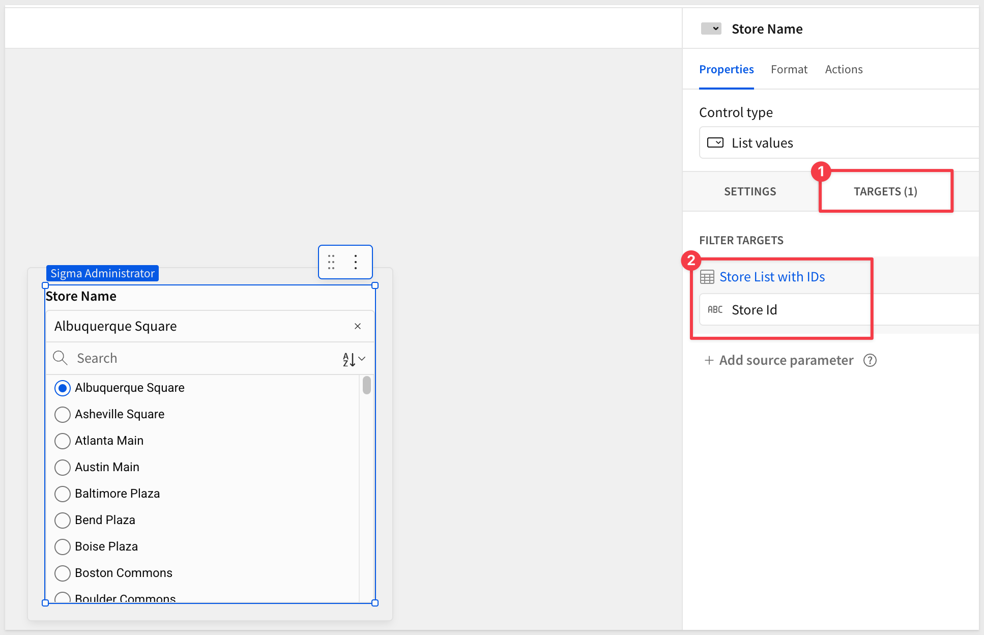
Now we need to set the Target for the list control on the Store Selector page:
Lastly, we need to set the store select Navigation control to use a formula so that when the user selects a store from the list, the table is automatically filtered.
With the navigation control selected, set the Text value in the Element panel to Store: and then press the = key to bring up the formula editor.
Use this formula:
[Store List with IDs/Store Name]
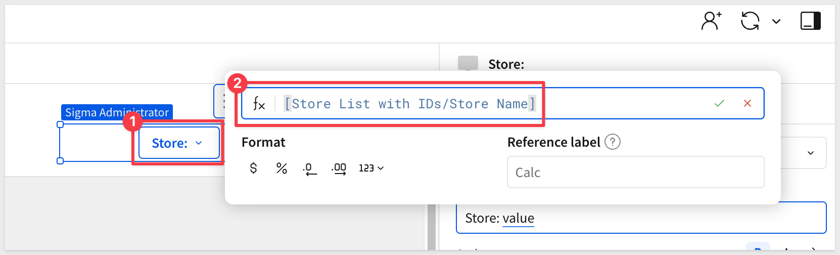
When a different store is selected, the control automtically filters the table on the Store Selector page and the navigation element shows the selected store name:
For more information, see Use popovers to simplify a workbook interface
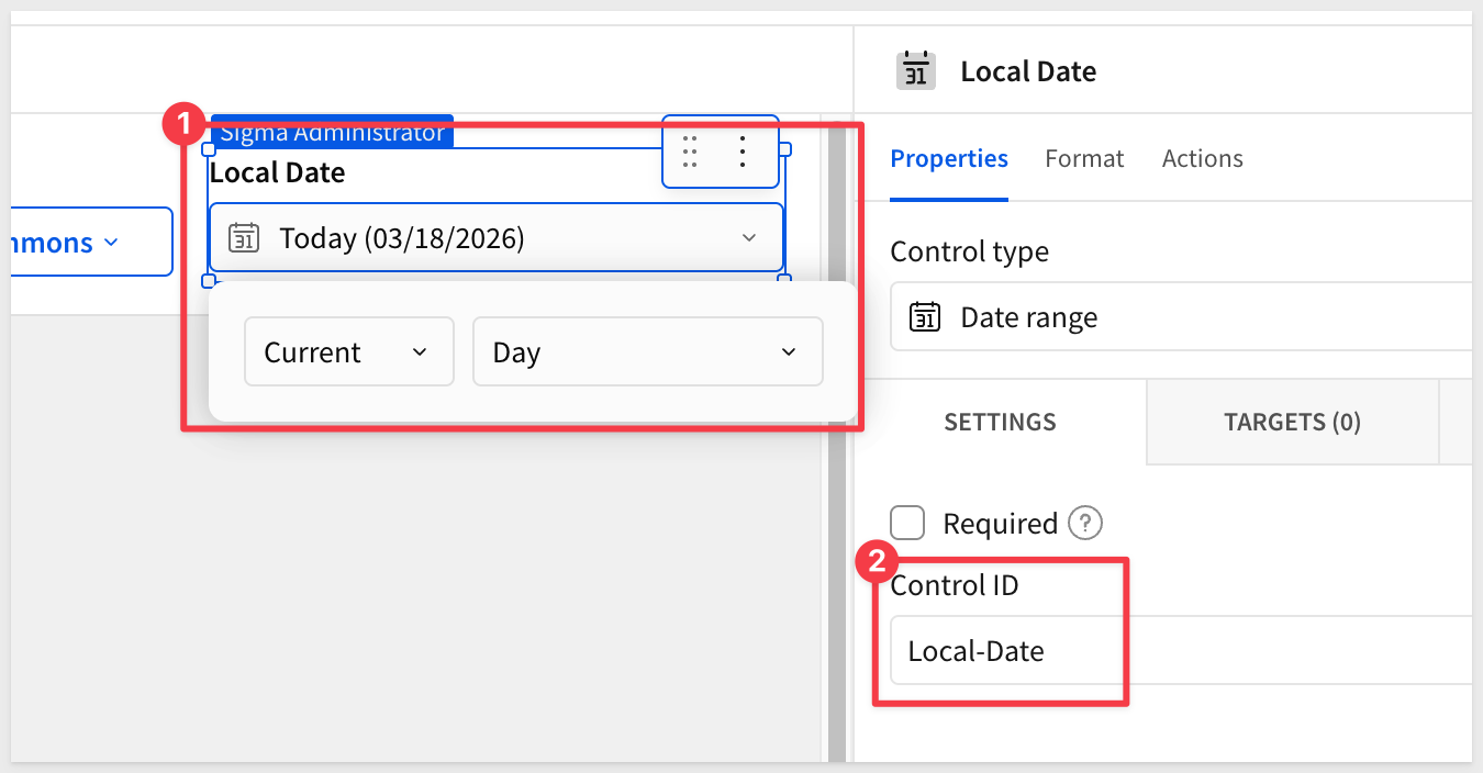
Date Control
The date control filters the storefront to a single day's inventory data. Defaulting to today means Alex always opens to live data without any manual selection.
- From the
Element bar, add aDate rangecontrol from theControlsgroup. - Set the default to
Current>Day. - Set the
Control IDtoLocal-Date.
Set Control Targets
Controls don't filter anything until they have targets — the specific table columns they act on. Let's wire both controls to INVENTORY_LEDGER_DAILY + 2 now so filtering works as soon as we build the repeater in the next section.
Store control target:
- Select the
Store Name (Stores)list control on theStore Selectorpage. - Click the
Targetstab in the right panel. - Click
+to add a filter target. - Select
INVENTORY_LEDGER_DAILY + 2and set the column toStore Id.
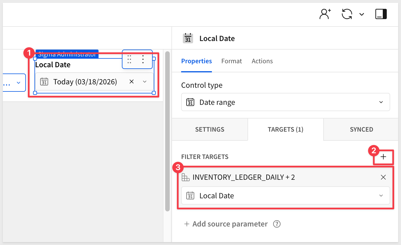
Date control target:
- Select the
Local Datedate range control in the header. - Click the
Targetstab in the right panel. - Click
+to add a filter target. - Select
INVENTORY_LEDGER_DAILY + 2and set the column toLocal Date.
- Select the
Albuquerque Squarestore and clickPublish.
This is the core of the storefront. The Repeated container element generates one product card per row in the filtered dataset—define the layout once and Sigma does the rest.
With the store and date controls already filtering INVENTORY_LEDGER_DAILY + 2, the repeated container will immediately show the right products for the selected store and day.
For more information, see Use repeated containers to generate layouts from data
Create the Repeated Container
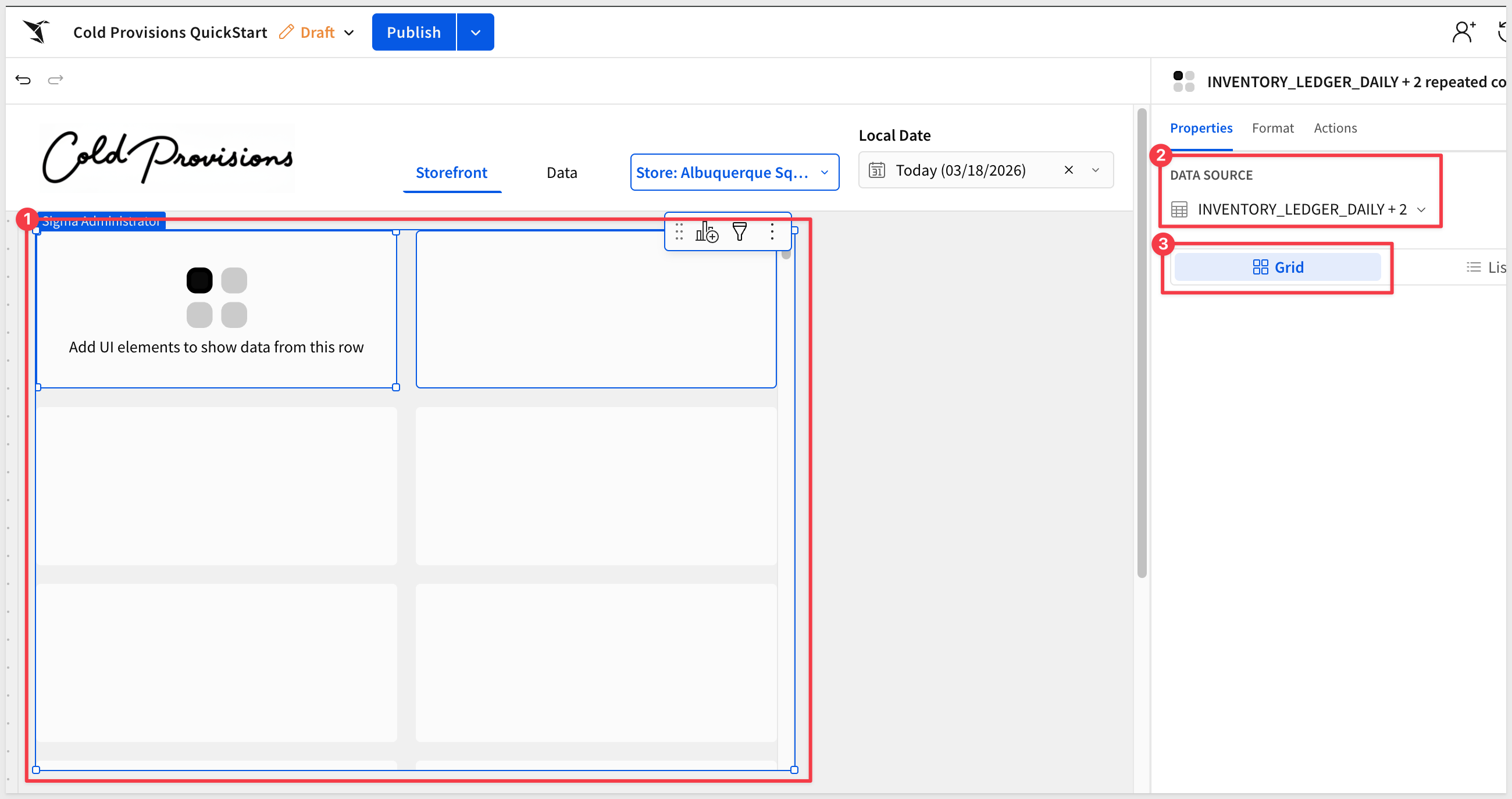
- On the
Storefrontpage, from theElement baradd aRepeated containerelement from theLayoutgroup. - When prompted for a data source, select
INVENTORY_LEDGER_DAILY + 2from theDatapage.
Sigma renders a default card for each row in the filtered dataset. The canvas shows a single card template—everything built inside this template will repeat for every product.
Expand the container to show two columns:
Structure the Card Layout
Each product card uses a container to control spacing and separate the image area from the text details below it.
- Inside the repeated container template, add a
Containerelement from theLayoutgroup:
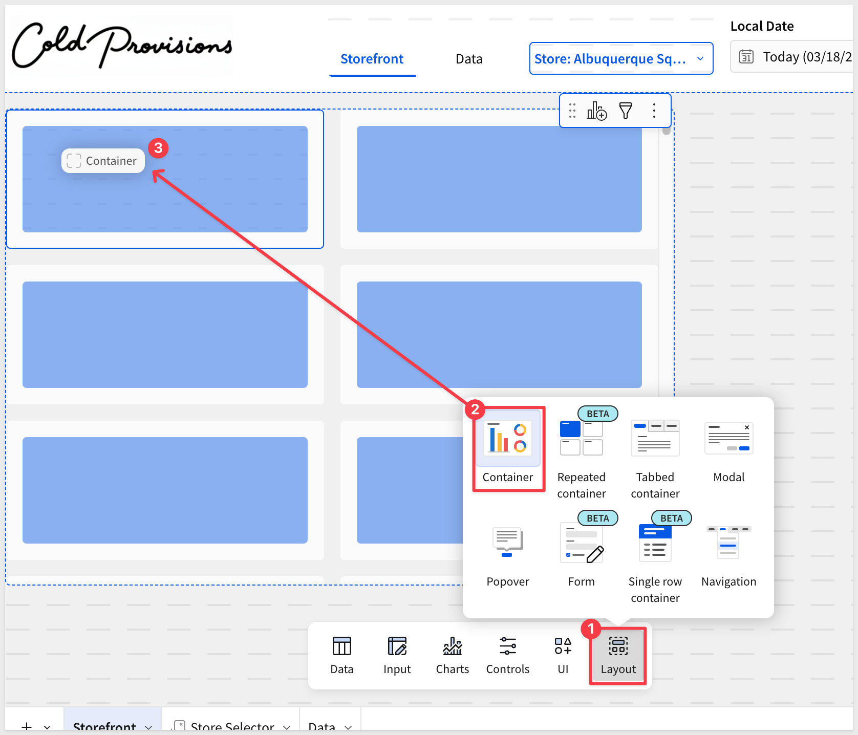
The container is automatically repeated to each area of the repeater.
- In the right panel under
Format, set the padding and gap values to give the card content comfortable spacing:
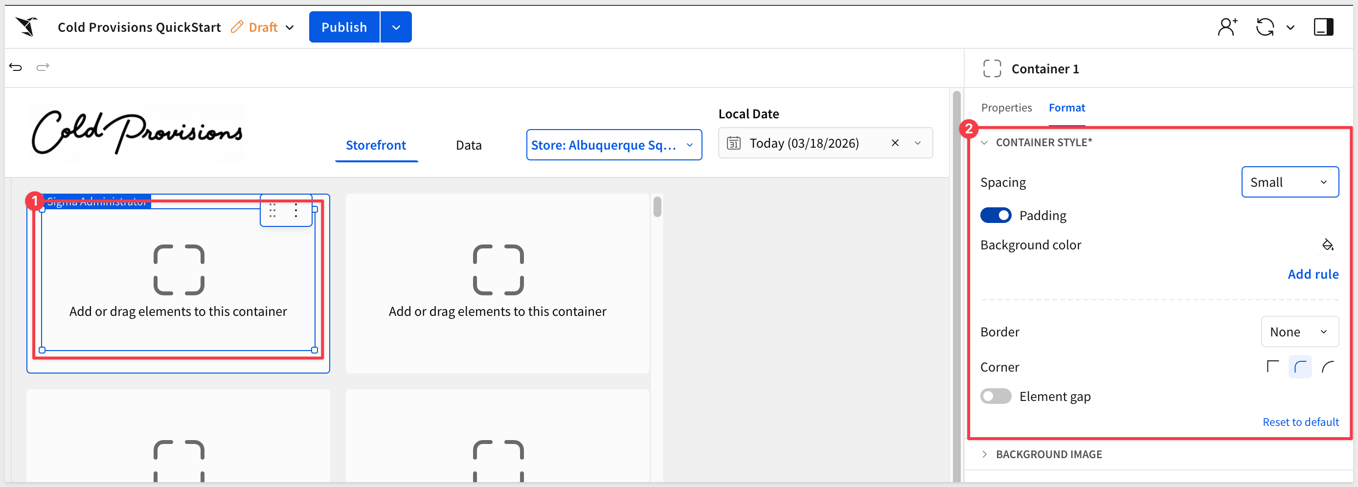
- Set the
Background colorto#FFFFFFcreate the card surface.
Add Product Images
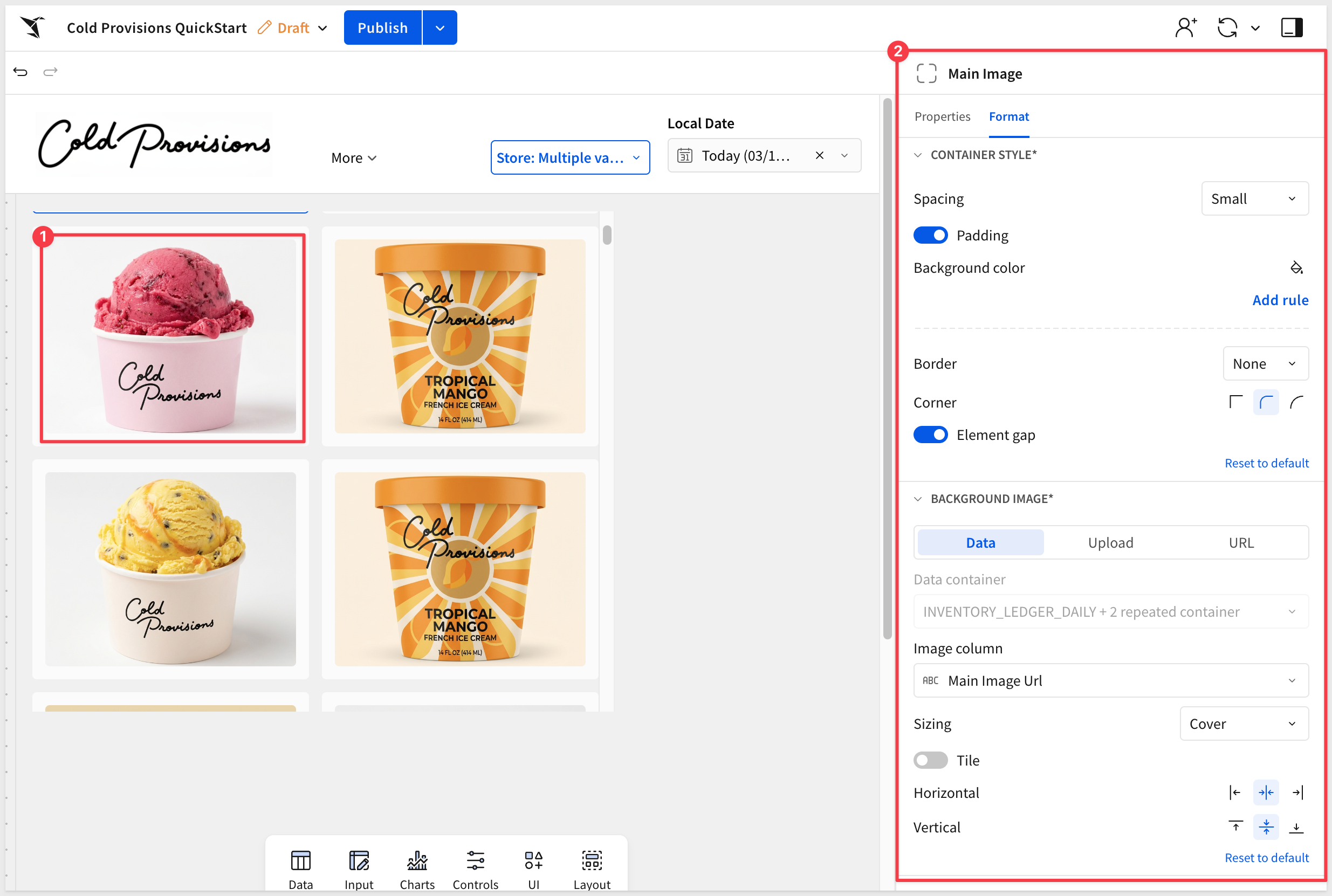
Product images are rendered as the background image of a dedicated container inside the card — not as a separate image element. This approach gives full control over sizing and cropping.
- Inside the card container, add another
Containerelement from theLayoutgroup. This will hold the product image. - Rename the container to
Main Image. - Configure the image element as:
Add Product Details
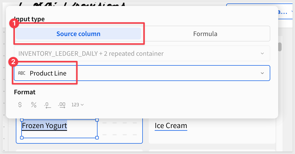
Each card displays the product line and product name as text elements, styled for scannability.
- Below the image, add a
Textelement for the product line. - Bind it to
Product Line(from thePRODUCTSrelationship).
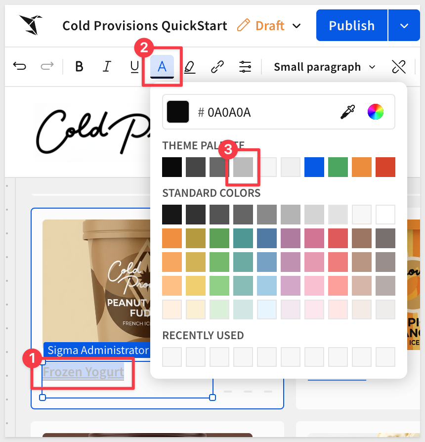
- Format the text to use a lighter color — this acts as a category label above the product name.
- Add a second
Textelement for the product name. - This time use a
Formula:copy-code
Upper([INVENTORY_LEDGER_DAILY + 2 repeated container/Product Name])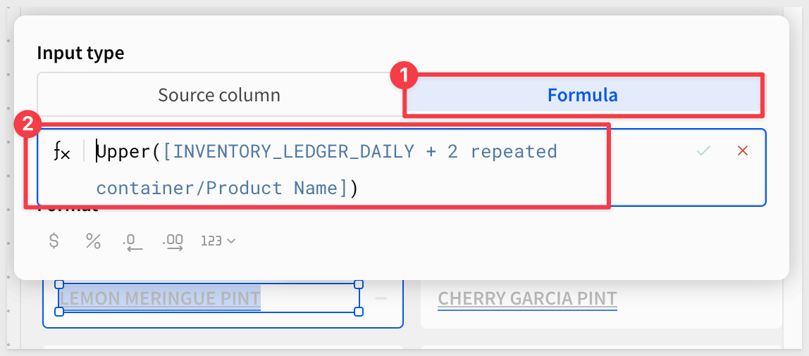 ### Create the Value List Each card shows two inventory metrics — units sold and units available — using a
 Value listelement. This element is purpose-built for displaying labeled key-value pairs in a clean row format. 1. Inside the card container, add aValue listelement from theUIgroup. 2. In the right panel, click+to add the first field and configure it: - Value source type:Source column- Value:Sold Units- Label:Sold: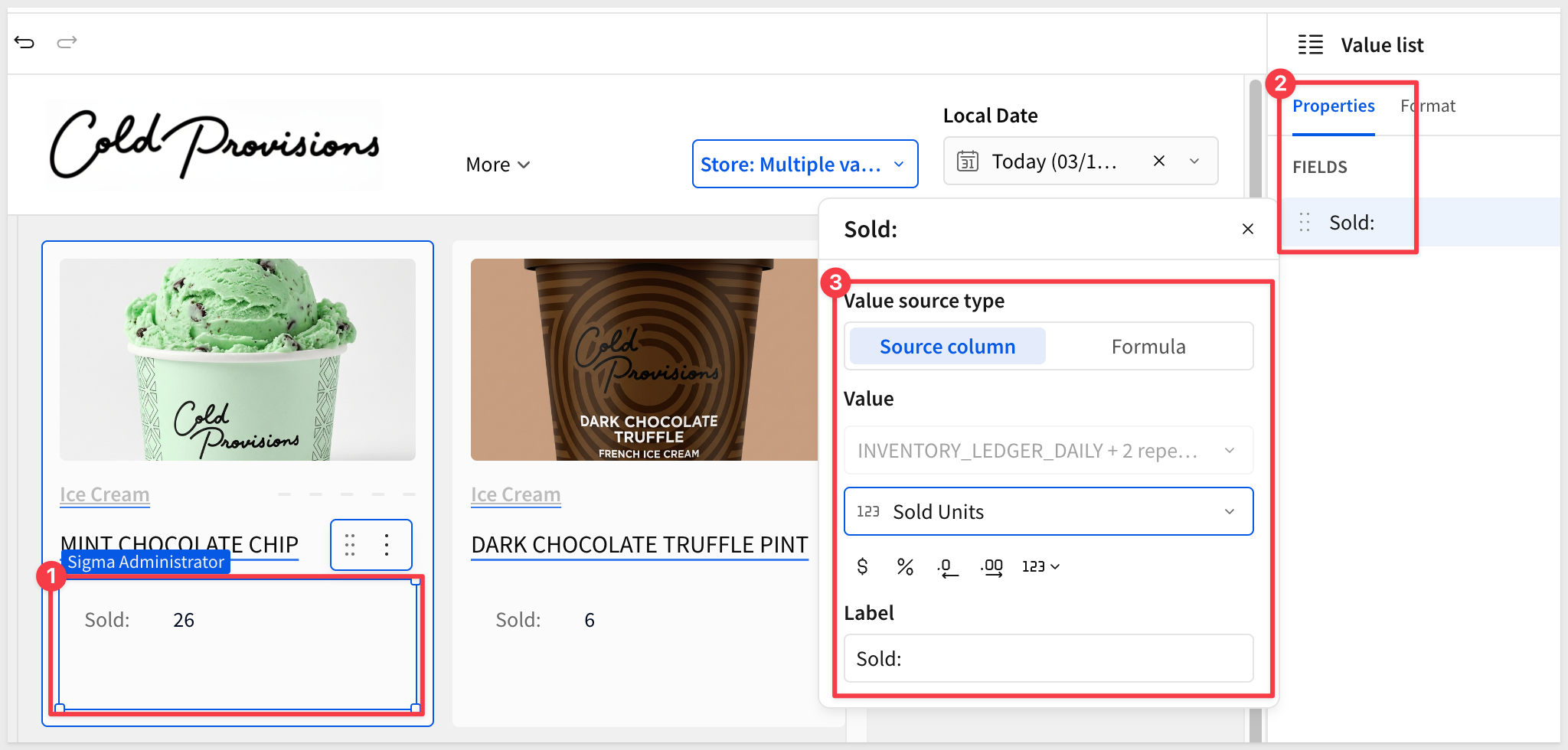 3. Click
 +again to add the second field and configure it: - Value source type:Source column- Value:Closing Units- Label:Available4. Adjust the properties of the field list element to suit: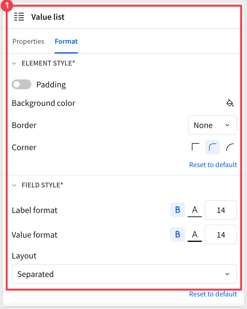 With all card elements in place, the repeated container renders a full grid of product cards filtered to the selected store and date.
 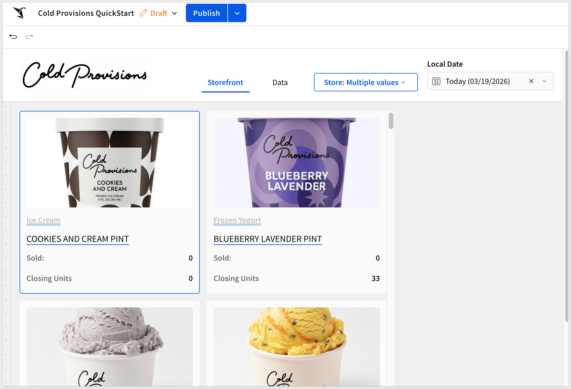 ## Adding Product Filtering Duration: 3 With the product cards rendering, we'll add two controls that let Alex narrow down what she's looking at: a category dropdown to filter by item type, and a text search to find specific products by name. ### Item Type Filter The item type filter is a list control that lets Alex switch between product categories — Ice Cream Pints, Scoops, Frozen Yogurt, and so on. It filters the repeated container directly. 1. On the
 Storefrontpage, add aList valuescontrol from theControlsgroup in theElement bar. 2. In the right panel, configure the following: - Value source:INVENTORY_LEDGER_DAILY + 2(from theDatapage) - Source column:Product Line3. Click theTargetstab and addINVENTORY_LEDGER_DAILY + 2as a filter target, mapping to the sameProduct Linecolumn.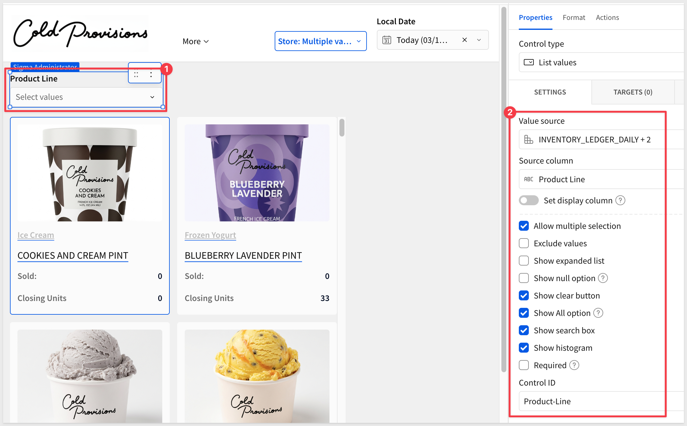 ### Product Search Control The product search lets Alex type a few letters to quickly find a specific product. It uses regex matching so partial strings work — typing "mango" surfaces all mango products. 1. Add a
 Text inputcontrol from theControlsgroup. 2. In the right panel, set the Control ID toProduct-Search.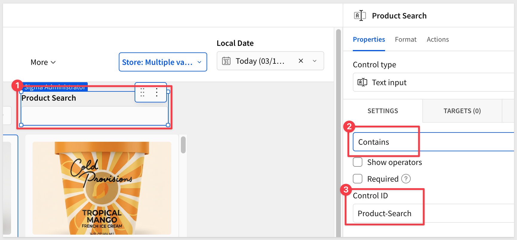 4. Click the
 Targetstab and addINVENTORY_LEDGER_DAILY + 2as a filter target. 5. Set the target column toProduct Name. 6. Set the match type toContains.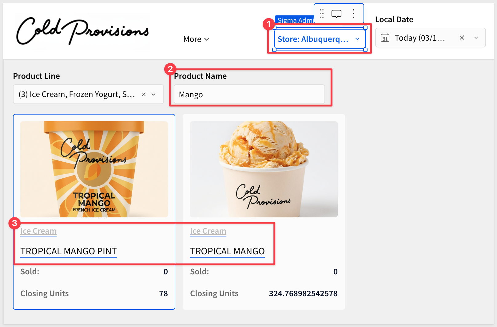 ## Creating the Notification Center Duration: 5 The notification center sits in a panel to the right of the product grid and gives Alex a live feed of operational alerts — low stock warnings, delivery arrivals, waste events, and more. It's built with a
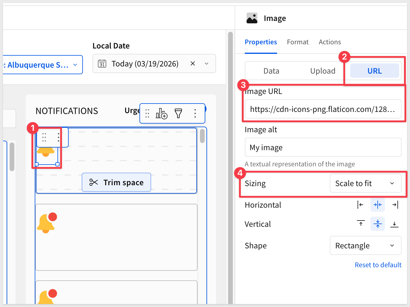
 Repeated containersourced from theNOTIFICATIONStable. ### Add the Notification Panel Container 1. On theStorefrontpage, add aContainerelement from theLayoutgroup and position it to the right of the product repeated container. 2. Inside it, add aTextelement and typeNotifications— this is the panel header. 3. Add aSwitchcontrol from theControlsgroup inside the same container, to the right of the header text. 4. In the right panel, configure the following: - Label:Urgent Only- Control ID:Urgent-Only### Build Notification Cards with a Repeated Container 3. Inside the notification container, add aRepeated containerelement from theLayoutgroup. 4. When prompted for a data source, selectNOTIFICATIONSfrom theDatapage. 5. In theFormattab, add a border to the card template to visually separate each notification.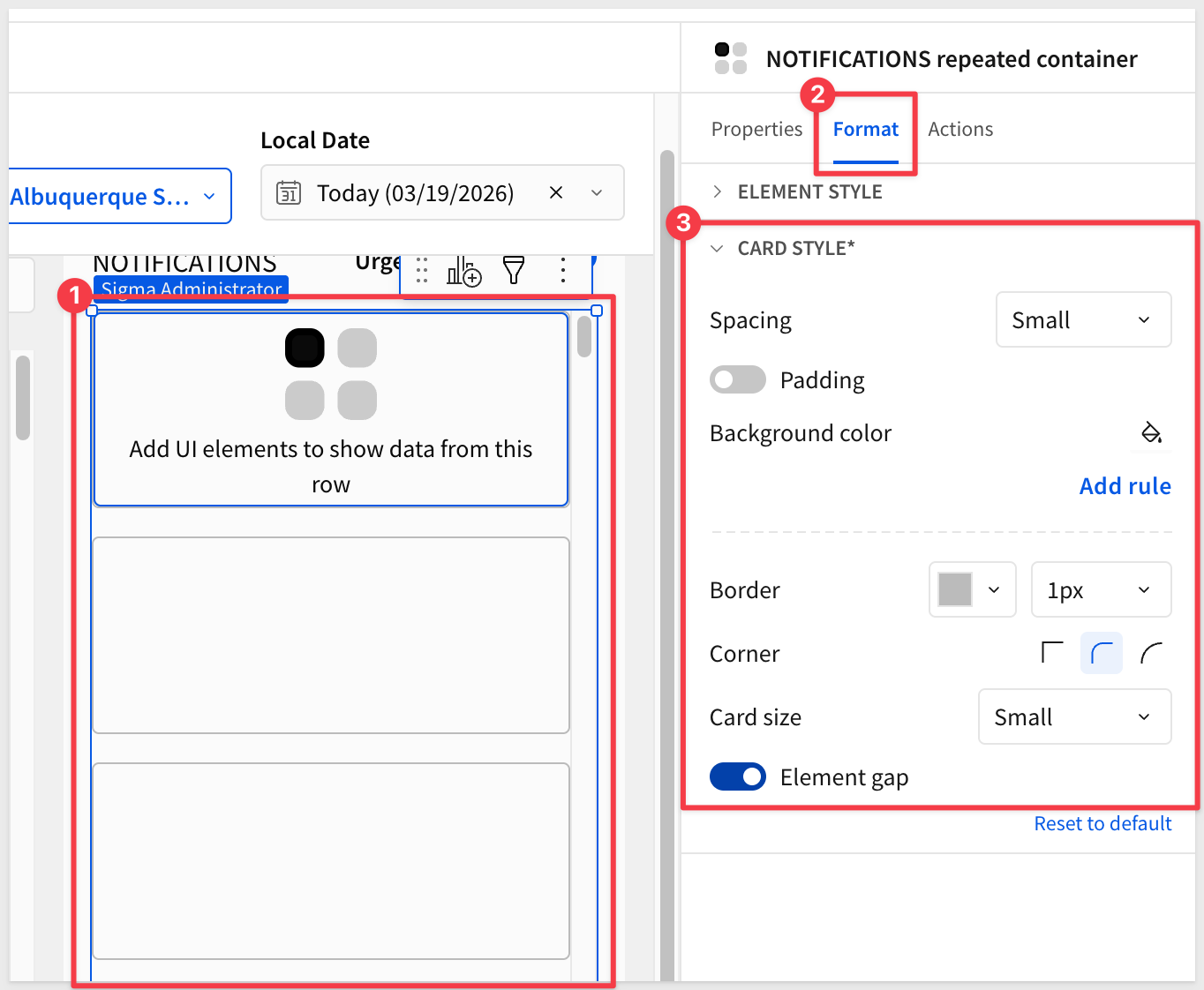 ### Add Notification Content Each notification card displays a category icon, title, category label, and date. Build these inside the repeated container template: 1. Add an
 Imageelement for the notification icon. Set a static URL as:copy-code
https://cdn-icons-png.flaticon.com/128/1827/1827370.png
- Add a
Textelement and bind it to theTitlecolumn fromNOTIFICATIONS. - Add a
Textelement and bind it to theBodycolumn fromNOTIFICATIONS. - Add a
Textelement and bind it toNotification DatefromNOTIFICATIONSusing a formula:copy-code
DateFormat([NOTIFICATIONS repeated container/Notification Date],"%m-%d-%Y")
5. Adjust the text formatting to suit: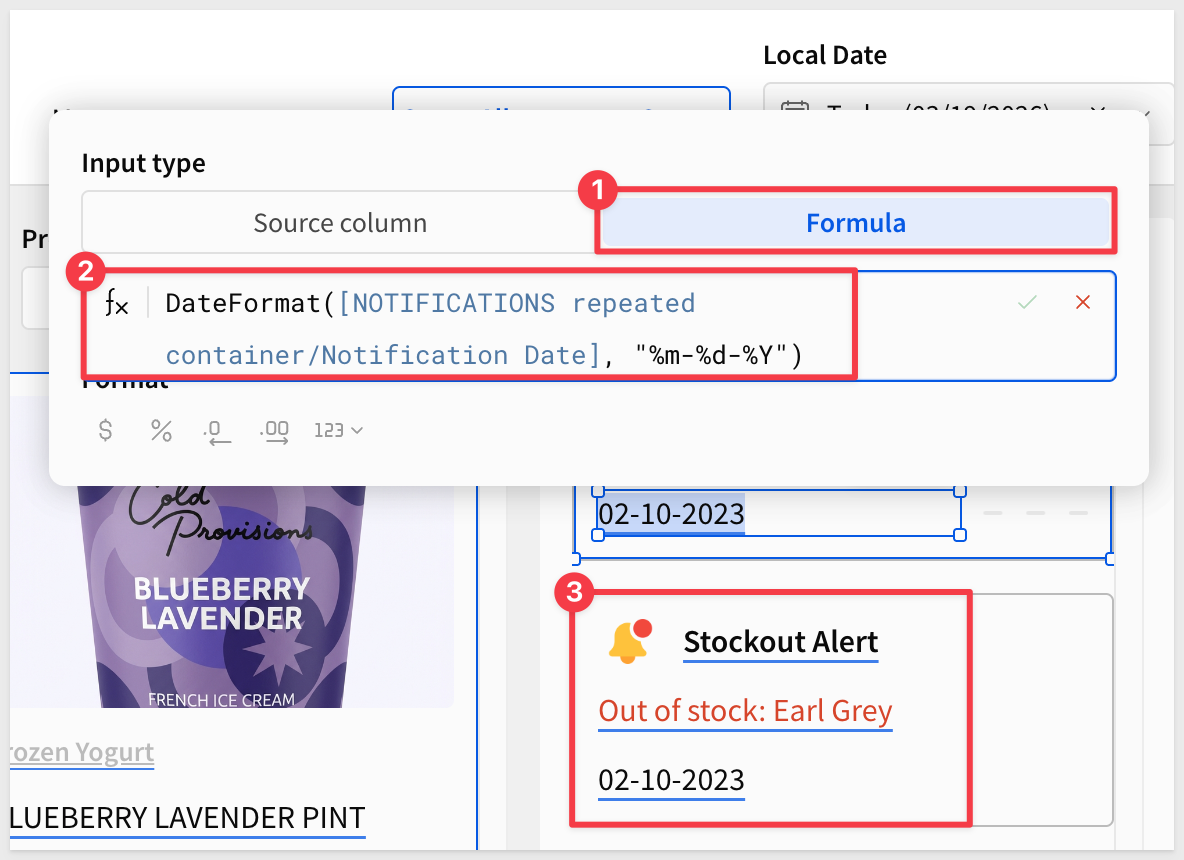 ### Add a Details Button 5. Add a
 Buttonelement from theUIgroup to the right side of the card. 6. Set the button label toDetails. 7. We could use this button to navigate to a notification detail view or open a modal or even use Sigma's [Report Builder]() to present a order form so that Alex could place an restocking order directly. For more information, see Reports overview There is also this QuickStart: Fundamentals 11: Pixel Perfect Reporting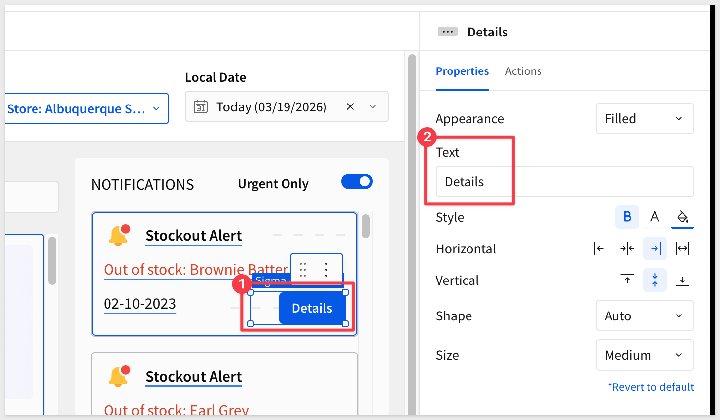 ### Wire Controls to Notifications Back in Section 4 we promised to add
 NOTIFICATIONSas a target for the store and date controls. Now that the notification repeated container exists, let's complete that: 1. Select theStore Name (Stores)list control on theStore Selectorpage. 2. ClickTargetsand addNOTIFICATIONS, mapping toStore Id.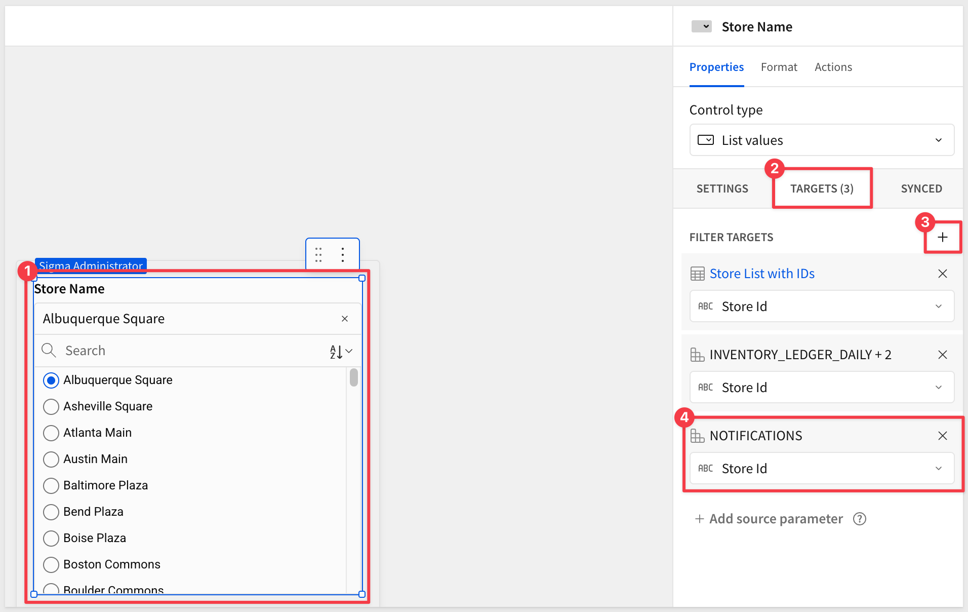 3. Select the
 Local Datedate range control in the header. 4. ClickTargetsand addNOTIFICATIONS, mapping toNotification Date.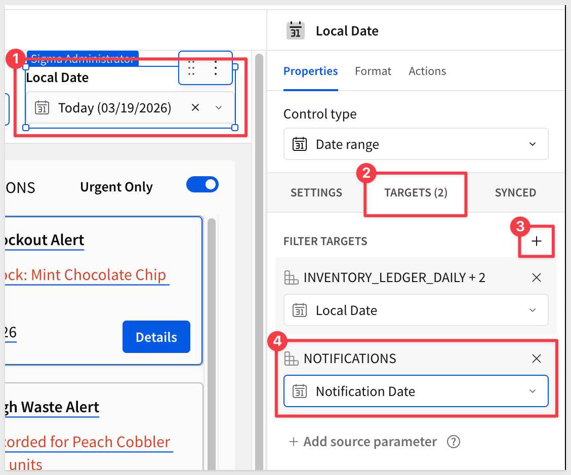 Urgent Only switch target: 5. Select the
 Urgent Onlyswitch control in the notification panel. 6. ClickTargetsand addNOTIFICATIONS, mapping toIs Urgent.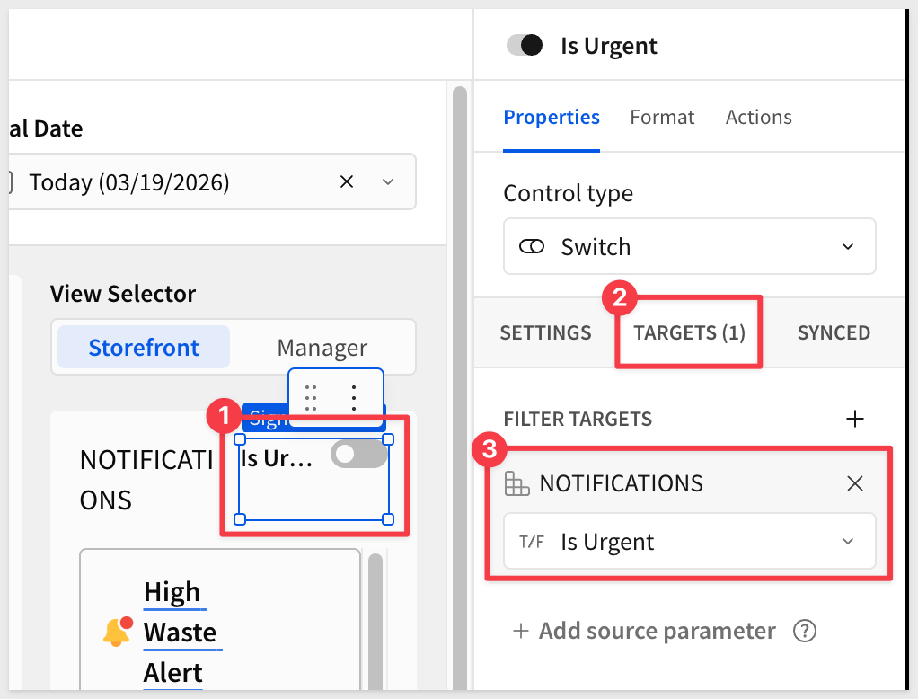 When the switch is on, the notification list filters to only critical-priority items — rows where
 Is Urgentistrue. ## Implementing Multi-View Navigation Duration: 4 The storefront and manager views show different content to different users — but they share the same data source and controls. We'll use a Tabbed containerto hold both views and aSegmentedcontrol to switch between them. ### Add a Tabbed Container 1. On theStorefrontpage, add aTabbed containerelement from theLayoutgroup. 2. Sigma creates a container with two default tabs. Rename themStorefrontandManager. The names are required so that we an navigate to them using a segmented control later. 3. Move the product repeated container and any related elements into theStorefronttab. Leave the notifications section outside of the tab container so that that it is always shown, regardless of the users role. 4. In theFormattab of the tabbed container, disableShow tab bar— navigation will be handled by the segmented control instead.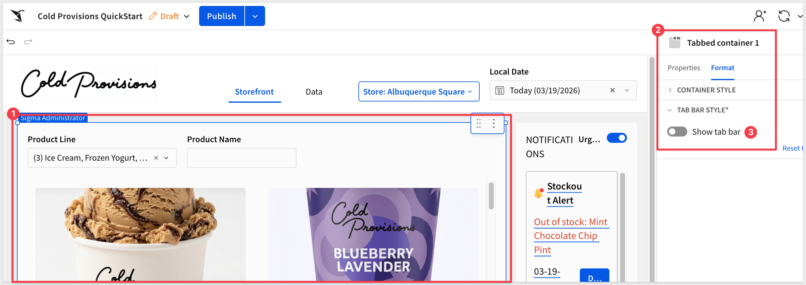 ### Add the Segmented Control 5. Add a
 Segmentedcontrol from theControlsgroup and place it above or alongside the notifications panel. 6. In the right panel, configure the following: - Value source:Manual list- Values:Storefront,Manager- Control ID:View-Selector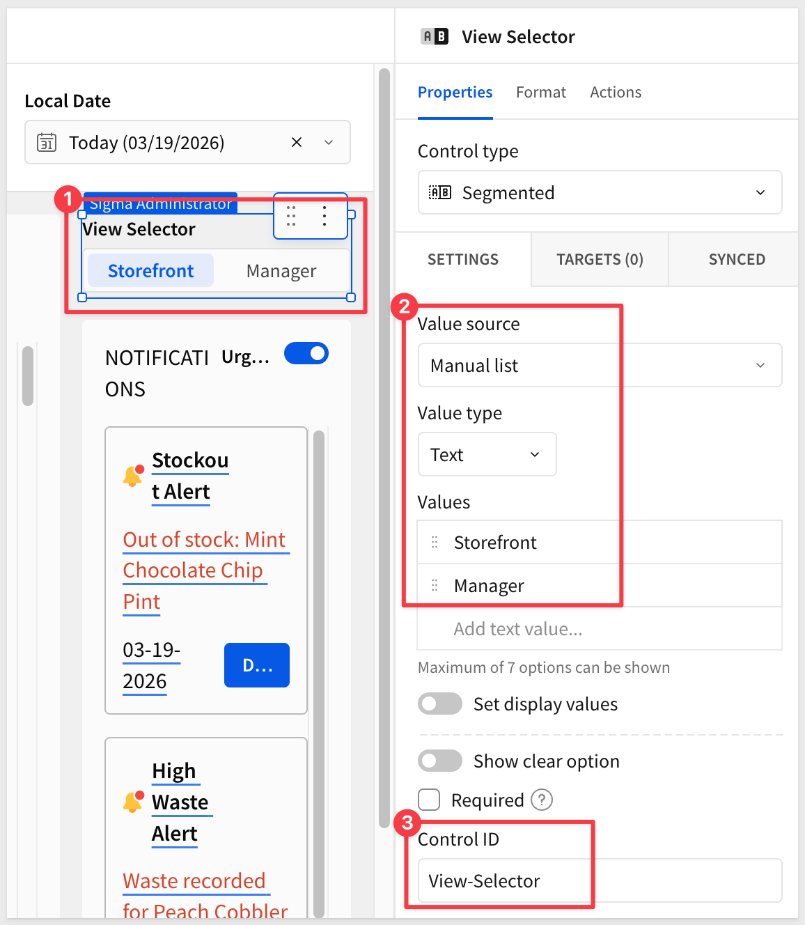 ### Configure View Switching Actions 7. With the segmented control selected, click the
 Actionstab in the right panel. 8. In the first action sequence, open the3-dotmenu and selectAdd condition. Add an action for when the value equalsStorefront: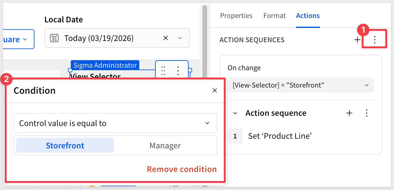 9. Configure the action to: - Action type:
 Select container tab- Target:Tabbed container 1 (Storefront)- Tab:Storefront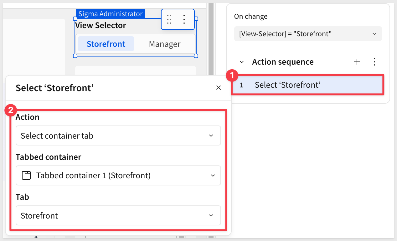 9. The the
 +to the right ofACTION SEQUENECESand add a second action for when the value equalsManager, adding a condition and action as before but targetingManagerinstead.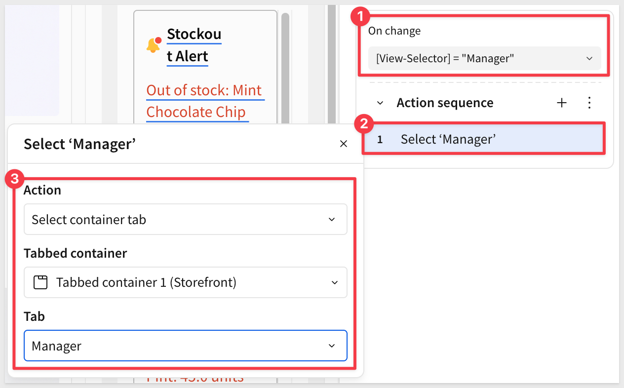 ### Manager View Placeholder The
 Managertab is intentionally empty for this QuickStart. In a full implementation it would contain summary KPIs, trend charts, and regional performance metrics — all built using the same techniques covered here. For example, the managers tab might look something like this, taking advantage of a more complete set of data: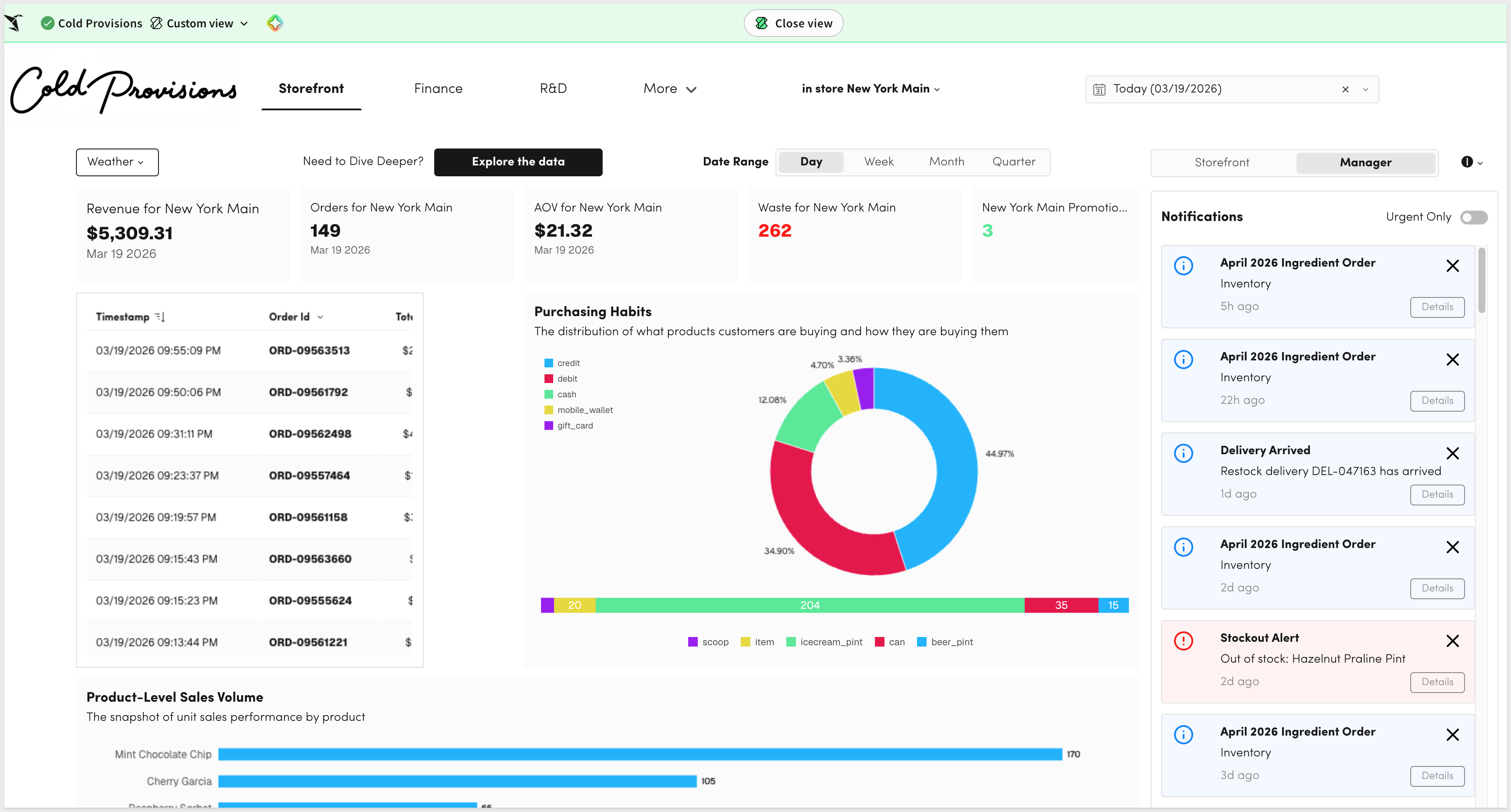 ## What We've Covered Duration: 2 In about 30 minutes, you built a fully functional storefront interface — a data model with joined dimension tables and a calculated column, repeating product cards with live inventory data, popover-triggered store and date controls, a notification center with urgency filtering, and role-based multi-view navigation — all without writing a single line of application code. What makes this pattern powerful isn't any one feature in isolation. It's the combination: the data model centralizes your joins and business logic once, the Repeated container turns a data table into a polished card grid in minutes, and controls with wired targets let a single filter cascade across multiple elements simultaneously. Together, they let you build what would otherwise require a dedicated front-end developer — in a fraction of the time. This same pattern applies wherever you need a focused, role-based operational interface. Field technicians checking equipment status. Sales reps reviewing their pipeline. Warehouse managers monitoring stock levels. The layout changes, the data changes, but the approach stays the same: a data model for the relationships, repeated containers for the cards, and controls to drive the filtering. Sigma is increasingly where operational work happens — not just where data gets reported. The techniques in this QuickStart are the building blocks for that. Additional Resource LinksBlog
Community
Help Center
QuickStarts
Be sure to check out all the latest developments at Sigma's First Friday Feature page!
Additional Resource LinksBlog
Community
Help Center
QuickStarts
Be sure to check out all the latest developments at Sigma's First Friday Feature page!